Free Gucci coloring pages: a collection of pages featuring the iconic interlocking GG monogram in decorative arrangements, fashion illustration pages showing Gucci-inspired accessories and silhouettes, handbag designs referencing the house’s signature styles, the distinctive green-red-green web stripe pattern, bee and botanical motifs associated with Alessandro Michele’s tenure as creative director, shoe and loafer illustrations referencing the Horsebit design tradition, sunglasses and accessories pages, the Flora print’s botanical elements, and the full visual vocabulary of one of the world’s most recognizable luxury fashion houses across its century of design history. All free, printable PDFs and online coloring for fashion enthusiasts of all ages.
Gucci was founded in Florence, Italy, in 1921 by Guccio Gucci, born March 26, 1881, in Florence, who died January 2, 1953, in Milan. Guccio Gucci had worked as a lift operator and luggage porter at the Savoy Hotel in London in the late 1890s and early 1900s, where he observed the fine leather luggage and travel accessories carried by the hotel’s wealthy guests from Britain, America, and Europe. Returning to Florence, a city with established traditions of leather craftsmanship dating back centuries, he opened a leather goods shop on Via della Vigna Nuova in 1921, selling leather luggage, handbags, and equestrian equipment.
Florence’s leather working tradition, and specifically its connection to equestrian culture through the workshops and tanneries that served Tuscany’s riding culture, gave the early Gucci brand its most enduring design language: the horsebit, the web stripe inspired by the surcingle strap of equestrian equipment, and the quality of leather goods associated with the sport of riding shaped the house’s visual identity from its founding through a century of subsequent design. The interlocking GG logo, the green-red-green web stripe, and the Horsebit hardware remain among the most globally recognized brand signals in fashion.
Gucci is currently owned by Kering, the French luxury goods conglomerate, and is Kering’s largest and most commercially significant brand.
These pages at ColoringPagesOnly.com cover Gucci’s design vocabulary across its key eras. All free, PDF or PNG, print or color online.


What’s Inside
The GG Monogram Pages
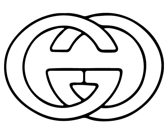
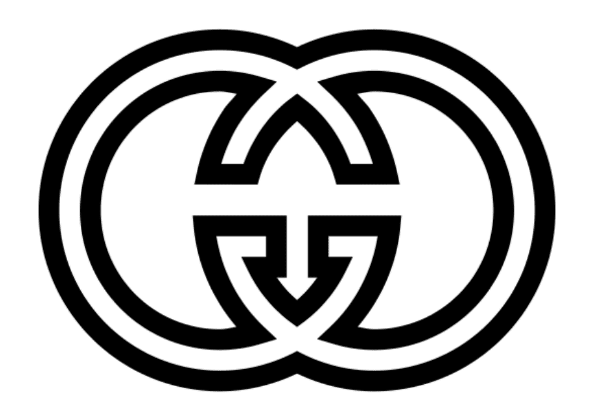
The interlocking double G monogram, referencing the initials of founder Guccio Gucci, is among the most recognized brand symbols in the global luxury industry. The two G’s, mirrored and interlocked so that each faces the other in a symmetrical arrangement, create a repeating pattern that has appeared on Gucci’s canvas products since the 1960s.
The GG canvas, now marketed as the GG Supreme canvas in its current iteration, uses the interlocked GG pattern as a dense surface print on coated canvas used for bags, travel goods, and accessories. The pattern’s visual density and its warm beige-and-brown colorway (the classic GG canvas) or tan-and-brown colorway (the GG Supreme canvas) give it a specific quality distinct from the logo’s appearance in gold hardware or embroidered form.
The coloring pages referencing the GG monogram present the symbol in standalone decorative compositions: the two interlocked G’s in large format, the GG pattern as a repeating design study, and the logo combined with other Gucci design elements in arranged compositions.
Coloring GG monogram pages: The classic GG canvas colorway uses warm tan or beige as the background color, with the GG logo rendered in a slightly darker warm brown. In the gold hardware version, the interlocked G’s use vivid warm gold applied carefully along each letter’s form. The standalone logo should have clean, clear outlines maintained throughout, with the two G forms reading as clearly distinct despite their interlocking.
Gucci Handbag Illustration Pages
The Gucci handbag as a fashion illustration subject offers the coloring collection’s most structurally complex pages: the specific construction of a structured leather bag, with its panels, hardware, handles, and seam lines, provides a detailed design study within a single, clearly defined form.
The Bamboo Bag, first created in 1947, is historically the house’s most significant accessory innovation: a bag with handles made from bamboo imported from Japan, heat-bent and shaped by craftsmen at a time when traditional handle materials were unavailable due to post-war supply shortages. The bamboo’s warm tan color, distinctive ring-jointed appearance, and smooth, curved arc when bent to handle shape give the bag an immediately recognizable design element that has been in continuous production since its introduction.
The Horsebit Bag, named for the metal horsebit hardware (a bar-and-ring configuration referencing the bit in a horse’s bridle) that appears on its flap or hardware details, connects to the equestrian design tradition established by the house’s founder. The horsebit hardware was first applied to the Horsebit Loafer in 1953 and subsequently appeared on bag hardware across multiple designs.
The GG Marmont, introduced under creative director Alessandro Michele beginning in 2015, brought the GG hardware to a soft quilted leather bag with a wide central flap, a design that became one of the house’s commercially dominant contemporary bags.
Coloring handbag pages: Leather goods typically use warm, sophisticated medium tones: warm tan or camel for natural leather, deep tan-brown for aged leather, vivid red-orange for the statement leather that Gucci has used in red leather goods, and near-black for black leather. Apply a base leather color across the main panels, then add slightly darker tones at the seam lines and panel edges to suggest the three-dimensional form. Hardware elements (buckles, clasps, horsebit) use vivid warm gold applied at full saturation, with slightly darker gold-amber on the hardware’s shadow-facing surfaces.
The Green-Red-Green Web Stripe Pages
The green-red-green web stripe, one of the house’s two or three most immediately recognizable visual signals alongside the GG monogram, consists of a central red stripe flanked symmetrically by two green stripes. It references the surcingle: the girth strap used in equestrian equipment that wraps around a horse’s midsection to secure the saddle blanket or hold equipment in position. The stripe’s equestrian origin connects it directly to the broader design philosophy that founder Guccio Gucci established.
The stripe appears on bags (typically as a central stripe across the front of a canvas bag or along the bag’s shoulder strap), on shoes (along the midsole or across the shoe’s upper), on luggage straps, and as a recurring accent element across the house’s accessories and ready-to-wear. Its color values are specific: the green is a medium, slightly yellow-shifted forest green rather than either vivid grass-green or deep bottle green. The red is a warm, vivid red without orange or purple shift.
Coloring web stripe pages: The central red stripe uses vivid warm red at full saturation. The flanking green stripes use medium forest green, slightly yellow-shifted. The stripe system’s effectiveness depends on the two colors being at equal saturation and equal visual weight: neither should appear bolder or more dominant than the other. The stripe typically appears against a cream or beige canvas background or against the natural tan of leather, both of which should be kept neutral to allow the red and green to read clearly.
Bee and Botanical Motif Pages
The bee as a Gucci decorative motif was significantly developed and amplified under creative director Alessandro Michele, who became creative director in January 2015 and held the position until November 2022. Michele’s Gucci was characterized by maximalist layering, vintage-inspired references, androgynous casting and styling, elaborate embroidery, and a visual language that mixed historical European decorative art with contemporary street culture references.
Within this aesthetic framework, the bee, with its historical connections to Florentine iconography (the Medici family used bees as a symbol) and to the broader European decorative tradition of naturalist botanical illustration, became one of Michele’s most-used single motifs. The Gucci bee appears embroidered on sneakers, printed on scarves and bags, cast in metal as bag hardware, and rendered in various scales and media across the Michele-era product range.
The bee’s visual, a compact body with a distinctive banded abdomen, transparent wings, and legs positioned for landing or foraging, translates naturally into embroidery because of its small scale and clear shape. Pages referencing the bee motif show this form in various scales, from the small embroidered bee of a shoe or small bag to the larger printed bee of a scarf or fabric design.
Coloring bee motif pages: The bee’s body uses alternating bands of vivid amber-gold and near-black across the abdomen: the distinctive yellow-and-black pattern that makes bees immediately recognizable. The thorax (upper body section between head and abdomen) is typically dark brown or near-black. The wings are transparent or very pale grey, rendered with the delicate wing structure visible. The Gucci bee often appears in gold embroidery thread rather than in naturalistic colors: the gold embroidery version applies warm, vivid gold across the entire bee form.
The Flora Print Pages
The Flora print was created in 1966 by Florentine artist Vittorio Accornero at the request of Rodolfo Gucci, who needed a design for a headscarf to give as a gift to Princess Grace of Monaco (Grace Kelly). Accornero produced a detailed botanical illustration covering the full surface of the silk square with flowers, insects, and butterflies in a composition that balanced botanical accuracy with decorative richness.
The original Flora design included more than 100 hand-drawn botanical elements: named flower species arranged without formal repetition, with insects and butterflies incorporated throughout the composition in the tradition of 18th-century botanical illustration. The warm, slightly muted color palette of the original scarf, with its ochre yellows, warm pinks, cream, and various greens, gives it the quality of an aged botanical plate.
The Flora print has been reproduced on Gucci products continuously since its creation, appearing on bags, shoes, ready-to-wear, and accessories across multiple creative director eras. Pages referencing the Flora print show individual botanical elements from the design or compressed compositions of the print’s most recognizable flower and insect elements.
Coloring Flora print pages: The botanical palette is warm and slightly muted rather than vivid: warm ochre-yellow for many of the flower centers, warm pink to soft rose for petals, cream and pale yellow-green for leaves and stems. The palette should feel like a vintage botanical illustration rather than a bright modern print: slightly aged in its warmth without being dull. Insects and butterflies within the composition use more vivid color accents.
Fashion Illustration and Outfit Pages
Fashion illustration pages showing figures in Gucci-inspired clothing provide the collection’s most wearable visual reference: the specific combinations of pattern, silhouette, and accessory that define the house’s aesthetic in each of its major creative eras. The Tom Ford era (1994-2004) is represented by sharp, minimal tailoring in deep jewel tones and satins. The Alessandro Michele era (2015-2022) is represented by layered maximalism: a Gucci scarf paired with a floral embroidered coat paired with a GG monogram bag.
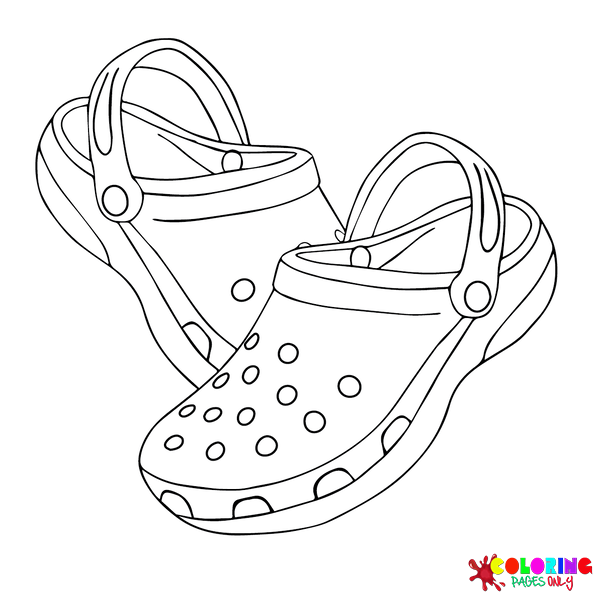
Shoe pages specifically illustrating the Horsebit Loafer (introduced 1953) show the house’s most enduring and most widely copied single shoe design: a low-heeled slip-on in the moccasin construction tradition with a distinctive metal bar-and-ring horsebit hardware across the vamp. The shoe appears in tan leather, in black leather, and in seasonal materials and colors, but the horsebit hardware remains its constant defining element.
Coloring fashion illustration pages: The clothing silhouette and fabric surfaces require the most sophisticated coloring decisions in the collection. Leather and suede goods use the specific surface qualities of those materials: leather is slightly reflective (apply a subtle highlight along the surface’s uppermost edge), suede is matte (apply evenly without any highlight). GG monogram canvas uses the warm beige-and-brown palette. Any sequin or embellishment surfaces use very pale silver or vivid gold at the specific positions where embellishments are indicated.
What These Pages Do
The history of Gucci as a brand is a specific and extensively documented example of how a luxury goods house builds and maintains a visual identity across a century of changing creative directors, corporate ownership transitions, and cultural contexts. The interlocking GG, the web stripe, the horsebit, and the bamboo handle are all design elements that were established in specific historical moments (the 1940s through 1960s) and have been maintained, reinterpreted, and emphasized differently by each subsequent creative director without being abandoned. This consistency across change is what distinguishes a fashion house’s visual identity from a single fashion season’s aesthetic.
The creative director’s role at a luxury fashion house is one of fashion’s most specifically analyzed professional positions: the director must generate consistent newness (each season requires genuinely new product) while maintaining the house’s established codes (the visual identity must remain recognizable as the same house across decades). The creative directors who have managed this most successfully at Gucci, including Tom Ford and Alessandro Michele, are studied in fashion education programs as models of brand stewardship.
The American Academy of Pediatrics identifies fine motor skill development as a key childhood milestone throughout early childhood. The GG monogram’s interlocking letter forms, the handbag’s panel and hardware detail work, the bee’s banded body pattern, the Flora print’s botanical element rendering, and the web stripe’s precise three-band color sequence all provide sustained fine motor challenge calibrated to the collection’s age range. The 2005 Art Therapy Journal study on structured coloring and anxiety reduction applies throughout.
Gucci coloring pages are particularly relevant to the fashion-interested audience of teenagers and young adults who engage with the luxury brand’s visual identity through social media, fashion media, and streetwear culture, where the GG monogram and web stripe have been reproduced, referenced, and subverted across multiple decades of fashion culture.
How to Color These Pages Well
The GG monogram’s two interlocking letter forms must remain clearly readable as two distinct letters. The interlocking design creates areas where the two G’s overlap, and the coloring choice in these overlap zones determines whether the logo reads as two letters or as an abstract pattern. Apply the base color consistently, then use slightly darker tones in the areas where one letter passes behind the other: this foreground-background differentiation makes the monogram’s structure readable.
The web stripe’s three-color sequence depends on the red and green being at identical visual weights. The stripe’s design symmetry requires the central red to read as exactly as bold as each flanking green, and vice versa. If the red appears stronger, the stripe reads as unbalanced. Apply both colors at the same pressure and the same saturation level. The green is medium forest green (not vivid grass-green and not dark bottle green): a specific tone that sits between the two extremes.
Leather goods on handbag pages require the three-zone value technique rather than flat color. A luxury handbag should not be colored as a flat rectangle of brown or tan: the panels have depth, the seams create shadow lines, and the hardware catches light in ways that a flat single-value application does not communicate. Apply the base leather color at full coverage. Then add slightly darker leather color along the seam lines and bottom panel edges (the shadow zones). Apply the hardware gold at full vivid saturation as the warmest, most vivid accent in the composition.
The bee’s banded abdomen requires alternating bands of warm gold-amber and near-black applied in sequence. The bee’s most recognizable feature is the alternating banding of its abdomen. Apply the base gold-amber color first across the entire abdomen area. Then apply the near-black banding as alternating stripes over the gold-amber base. The banding should be approximately equal-width between gold and black stripes. In the gold-embroidery version of the Gucci bee, apply vivid warm gold across the entire bee form without banding differentiation.
The Flora print’s botanical palette should be warm and slightly muted rather than bright and vivid. The Flora design references vintage botanical illustration, and its color palette should communicate age and sophistication rather than freshness and brightness. Apply a warm ochre-yellow for flower centers rather than vivid yellow. Apply warm soft pink for petals rather than vivid rose. Apply warm grey-green or sage green for leaves rather than vivid medium green. The finished result should read as a refined print, not as a children’s botanical illustration.
5 Creative Craft Ideas
The Savoy Origin Study
Guccio Gucci’s experience as a porter at the Savoy Hotel in London, where he observed wealthy guests arriving with fine leather luggage, directly inspired the leather goods house he founded in Florence in 1921. The Savoy Hotel at the Strand in London opened in 1889 and became famous as one of Europe’s premier luxury hotels by the turn of the 20th century.
Print the most formal Gucci logo-centered page in the collection. Color the GG logo in warm gold against a deep cream or ivory background.
On the backing card: “Guccio Gucci. Born March 26, 1881, Florence, Italy. Died January 2, 1953, Milan. Employed at the Savoy Hotel, London, approximately 1898-1902, as a lift operator and luggage porter. Observation: the leather luggage of wealthy European, British, and American guests. Return to Florence: the city’s established leather craftsmanship tradition. First shop: Via della Vigna Nuova, Florence, 1921. The Savoy Hotel: still operating, at the Strand, London. The leather goods shop became one of the world’s most recognized luxury brands. The connection: one man watching other people’s luggage.”
The Equestrian Heritage Page
The green-red-green web stripe, the horsebit hardware, and the bamboo bag all trace to Gucci’s foundational connection to equestrian culture. Florence and Tuscany had a significant riding culture in the early 20th century, and Guccio Gucci’s first products included equestrian equipment and luggage for the traveling sporting class.
Print a web stripe design page and a horsebit accessory page (shoe or bag). Color the web stripe in the canonical medium forest green and vivid warm red sequence. Color the horsebit in vivid warm gold.
Mount both: “The equestrian origin—the web stripe: inspired by the surcingle, the girth strap used in equestrian equipment. First appeared: 1950s.—thehorsebit: a metal bit-and-bar configuration referencing the bit in a horse’s bridle. First applied to a shoe: 1953. The Horsebit Loafer: one of the most copied shoe designs in fashion history. Still in production. Guccio Gucci’s first products: leather luggage and equestrian equipment. The horse never left the brand.”
The Flora Scarf Study
In 1966, Rodolfo Gucci commissioned artist Vittorio Accornero to create a design for a silk headscarf to give as a gift to Princess Grace of Monaco. Accornero produced a hand-drawn botanical illustration covering the full silk square with more than 100 named flower species, insects, and butterflies. The gift was given. The design became the Flora print: one of fashion history’s most continuously produced single-pattern designs, reproduced on Gucci products from 1966 to the present.
Print a botanical element page from the collection most closely referencing the Flora print. Color using the warm, slightly muted botanical palette: ochre yellows, warm pinks, sage greens.
On the backing card: “Flora print. Designer: Vittorio Accornero. Commissioned by: Rodolfo Gucci. Year: 1966. Original purpose: a silk headscarf as a gift for Princess Grace of Monaco (Grace Kelly). Elements: more than 100 hand-drawn botanical species, insects, and butterflies. First reproduction of Onofucci products: 1966. Continuous production: 1966 to present. Years in production as of 2024: 58. The scarf was made as a one-time gift. It became one of fashion’s most enduring print designs.”
The Alessandro Michele Transformation Page
When Alessandro Michele was appointed creative director of Gucci in January 2015, the house had been losing critical and commercial momentum. Michele’s first collection, presented five days after his appointment, was described by critics as transformative: a completely new aesthetic direction that was simultaneously backward-looking (referencing vintage, historical, and subcultural references) and genuinely new in its combination of those references.
Print a bee motif page or a page referencing Michele’s maximalist aesthetic (layered patterns, embroidered elements, botanical and animal imagery). Color using vivid, layered colors.
On the backing card: “Alessandro Michele. Appointed creative director: January 2015. First full collection: February 2015. Critical response: described as transformative, maximalist, romantic, and androgynous. Tenure: January 2015 to November 2022. Signature elements introduced: bee motif, extensive embroidery, GG Marmont bag, Flora print revival, androgynous casting, and vintage-inspired references. Gucci revenue during his tenure: grew from approximately €3.5 billion (2014) to €9.7 billion (2021). Departed: November 2022.”
The Bamboo Bag Innovation Page
In 1947, Italian material shortages following World War II made traditional leather handles unavailable. Gucci artisans sourced bamboo from Japan and developed a technique of heat-bending and shaping the bamboo into bag handles: a curved arc that was structurally strong, visually elegant, and completely unlike any previous bag handle material in the European leather goods tradition. The Bamboo Bag became the first truly iconic Gucci accessory.
Print the most bag-focused page in the collection. Color the bag body in warm tan leather with the bamboo handle in a distinctly different warm tan-golden tone, slightly darker and warmer than the leather.
On the backing card: “The Bamboo Bag. Year: 1947. Context: post-World War II material shortages made traditional leather handles unavailable. Solution: bamboo handles, sourced from Japan, heat-bent and shaped by cartisans. The result: a bag with handles unlike any previous European luxury accessory. Still in production as of 2024. The shortage that became an innovation: a design forced by circumstance that became one of the house’s most lasting signatures. 77 years in production.”
Frequently Asked Questions
Who founded Gucci and when? Gucci was founded in Florence, Italy, in 1921 by Guccio Gucci, born March 26, 1881, in Florence, who died January 2, 1953, in Milan. Guccio Gucci had worked as a lift operator and luggage porter at the Savoy Hotel in London in the late 1890s and early 1900s, where he observed the fine leather luggage and accessories of the hotel’s wealthy international guests. Returning to Florence, a city with an established tradition of leather craftsmanship, he opened a leather goods shop on Via della Vigna Nuova in 1921. His initial products included leather luggage, handbags, and equestrian equipment. The house he founded has been operating continuously since that year, making it more than a century old as of 2021.
What are Gucci’s most recognizable design symbols? Gucci’s most immediately recognizable design symbols include the interlocking double G monogram (GG), developed in the 1960s from founder Guccio Gucci’s initials; the green-red-green web stripe, inspired by the surcingle strap of equestrian equipment and first appearing in the 1950s; the horsebit hardware (a metal bar-and-ring configuration referencing horse bridle bits), first applied to the Horsebit Loafer in 1953; the bamboo handle of the Bamboo Bag, introduced in 1947; and the Flora print, a botanical illustration created in 1966 by Vittorio Accornero that has been reproduced continuously on Gucci products since its creation. Under creative director Alessandro Michele (2015-2022), the bee became an additional significant motif associated with the house.
What is the Gucci GG monogram, and how is it used? The GG monogram consists of two letter G’s arranged in a mirror-image, interlocking configuration that references the initials of founder Guccio Gucci. The monogram was developed in the 1960s and was applied to a coated canvas material that became standard for Gucci’s bags, travel goods, and accessories. This GG canvas (marketed in its current iteration as GG Supreme canvas) uses the interlocked GG as a dense repeating print pattern, typically in a warm beige or tan on a slightly darker brown background. The GG logo also appears as polished metal hardware on bag clasps, loafer hardware, belt buckles, and sunglasses frames, where it is rendered in gold-tone or silver-tone metal.
Who are the most significant creative directors in Gucci’s history? Several creative directors have significantly shaped Gucci’s visual identity across different periods. Tom Ford served as creative director from 1994 to 2004, dramatically reviving the brand from near-bankruptcy through a sharply modern, deliberately provocative aesthetic that transformed it into a global cultural force. Frida Giannini followed from 2006 to 2015, maintaining commercial momentum with a more romantic approach. Alessandro Michele, appointed in January 2015, radically transformed the house’s aesthetic toward maximalism, androgyny, vintage references, and extensive embroidery, significantly growing the brand’s revenue and cultural prominence during his tenure through November 2022. Sabato De Sarno was appointed in 2023 and introduced a cleaner, more restrained modern direction.
What is the Horsebit Loafer, and why is it significant? The Horsebit Loafer, introduced by Gucci in 1953, is a low-heeled slip-on shoe in the moccasin construction tradition distinguished by a metal bar-and-ring hardware element across the vamp (the front upper of the shoe) that references the horsebit used in equestrian bridle equipment. It was one of the first major luxury footwear designs to translate equestrian hardware into a fashion context. The shoe has been in continuous production since 1953, has been reproduced with minimal design change across more than 70 years, and is considered one of the most widely copied single shoe designs in fashion history. Its connection to both Gucci’s equestrian heritage and to the Italian leather goods tradition of Florence gives it a specific historical significance within the house’s design lineage.
What is the Flora print, and what is its origin? The Flora print is a botanical illustration design created in 1966 by Florentine artist Vittorio Accornero, commissioned by Rodolfo Gucci to create a silk headscarf as a gift for Princess Grace of Monaco (the actress Grace Kelly, who had married Prince Rainier III of Monaco in 1956). Accornero produced a detailed hand-drawn composition covering the full square of silk with more than 100 named flower species, insects, and butterflies in the tradition of 18th-century botanical illustration. The original warm, slightly muted palette of the design, with ochre yellows, warm pinks, and various greens, gives it the quality of a vintage botanical plate rather than a contemporary graphic design. The scarf was given as a one-time gift; the design became the Flora print, reproduced on Gucci bags, clothing, and accessories continuously from 1966 to the present.
What age group are these pages best suited for? Gucci coloring pages are primarily designed for older children, teenagers, and adults who have a specific interest in fashion and the luxury brand’s visual identity. The GG monogram pages, with their specific letter-form interlocking detail, require the fine motor precision and focused attention most accessible from ages eight and up. The handbag illustration pages, with their structured form and hardware detail work, are most rewarding for ages ten and older. The fashion illustration and outfit pages are most meaningful for teenagers and adults who can bring fashion context to their interpretation of the designs. The Flora print botanical elements and the bee motif pages have a broader age accessibility due to their naturalistic subject matter. Still, the coloring context of luxury fashion is most engaging for the teenage and adult audience that follows fashion culture.
Browse the full collection at ColoringPagesOnly.com. All pages free, no sign-up, PDF or PNG, print or color online.
Guccio Gucci watched wealthy travelers’ luggage at the Savoy Hotel in London in the late 1890s. He returned to Florence, a city where leather had been worked for centuries. He opened a shop in 1921. The shop sold leather luggage and equestrian equipment.
In 1947, material shortages after the war meant traditional handles were unavailable. His craftsmen used bamboo from Japan, bent by heat into curved handles. The bamboo handle became the most recognized design element the house had produced.
In 1953, the horseshoe hardware was applied to a loafer. The loafer has been in production every year since. In 1966, a botanical illustration was commissioned for a silk scarf for Grace Kelly. The scarf design is still on bags in 2024.
The GG monogram interlocks the two G’s of Guccio Gucci’s name. Both letters need to be read clearly. Apply the base color. Add slightly darker tones where one letter passes behind the other. The interlocking makes sense when the depth is visible.
Share your work on Facebook and Pinterest and tag #Coloringpagesonly. The equestrian heritage displays and the bamboo bag innovation pages are particularly worth sharing.
Color the monogram gold. Apply the web stripe in equal-weight green and red. The bamboo handles are warm tan, slightly darker than the leather. The horse is still in the brand.
