Flower Coloring Pages at ColoringPagesOnly.com covers over 620 pages across 23 sub-categories – individual flower species from the rose and sunflower to the columbine and crocus, compositional categories like bouquets, baskets, and flower pots, the seasonal cluster of spring flowers, and the more unusual nocturnal atmosphere of the Midnight Flowers collection. Flowers are among the most naturally suited subjects in the entire coloring page world: their radial symmetry produces compositions that are inherently balanced and satisfying to color, their layered petal structures create opportunities for shading and depth that reward careful technique, and the fact that most flowers carry specific, well-known canonical colors (roses are red, sunflowers are yellow, lavender is purple) gives colorists a clear reference point while leaving room for creative variation. Perhaps most importantly, flowers are one of the few coloring subjects where both complete accuracy to nature and complete creative freedom are equally valid approaches – a rose colored in its canonical red is a beautiful and satisfying result, and a rose colored in deep blue or vivid orange is an equally valid creative choice that does not feel like a mistake.
Every page in this collection is completely free to download as a PDF and print, or to color online directly in your browser.
The Major Species: Roses, Sunflowers, and the Classic Garden Flowers
The most beloved and most searched flowers in the world all have their own dedicated sub-categories here, with enough pages in each to cover the full range of poses, arrangements, and illustration styles associated with each species.
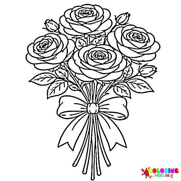
Rose is the largest individual sub-category in the entire Flower collection and consistently the most searched flower on the site – a reflection of the rose’s position as the most culturally significant flower in the Western world and, arguably, in the world as a whole. The rose has been cultivated for over 5,000 years, appears in the art and literature of virtually every culture that has encountered it, and carries an extraordinary density of symbolic meaning: love, beauty, passion, romance, grief, secrecy, politics (the Wars of the Roses), and devotion. In coloring page terms, the rose is also technically one of the most rewarding flowers to render because its bloom structure – the tightly spiraled center opening into successive layers of curving petals – offers natural opportunities for shading and depth that simpler flowers do not.
The rose coloring pages in this collection range from single-stem portrait compositions showing one bloom in full detail, to multi-rose arrangements showing buds in various stages of opening alongside fully open blooms, to decorative borders and patterns featuring the rose in more stylized, graphic treatments. The thorned stem with its compound leaves – the leaves themselves with their serrated edges and the distinctive shape of rose foliage – is as characteristic of the rose’s visual identity as the bloom itself, and pages that include the full stem from root to bloom offer the most complete rose coloring experience.
The canonical rose color palette is anchored by the classic red rose – a vivid, warm crimson red that ranges from the lighter scarlet of a newly opened bloom to the deeper burgundy-red of a mature flower in shadow – but roses naturally occur in the full range of warm colors (yellow, orange, peach, coral, pink of every shade, cream, white) as well as in the blue-violet range through human breeding, making creative color choices entirely botanically plausible for rose pages.
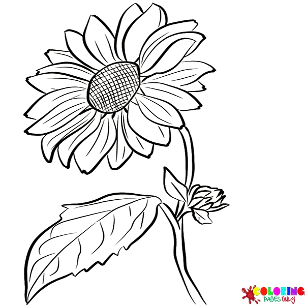
Sunflower brings the most compositionally bold and visually immediate flower in the collection. The sunflower’s design is architecturally distinctive: a tall, thick stem supporting a large circular head divided into two zones – the outer ring of ray florets (what we colloquially call the petals, though botanically they are complete tiny flowers) and the inner disc of hundreds of tiny tubular disc florets that, when mature, are arranged in the precise geometric spiral of a Fibonacci sequence. This mathematical perfection at the center of the sunflower makes the disc a particularly rewarding coloring target: the spiral arrangement of the disc florets, from the outer ring inward toward the center, produces a pattern that can be colored in alternating tones to make the spiral mathematically visible.
The canonical sunflower palette is immediately clear: the ray florets in vivid golden yellow (ranging from the brightest lemon-yellow in new blooms to the deeper gold-orange of mature flowers), the disc in a warm dark brown to near-black (the color of the seed-filled center of a fully mature sunflower) with lighter tan-brown tones in the transition zone between disc and ray florets, and the leaves and stem in a medium to dark green with a slightly rough, hairy texture suggested by the leaf’s irregular surface.
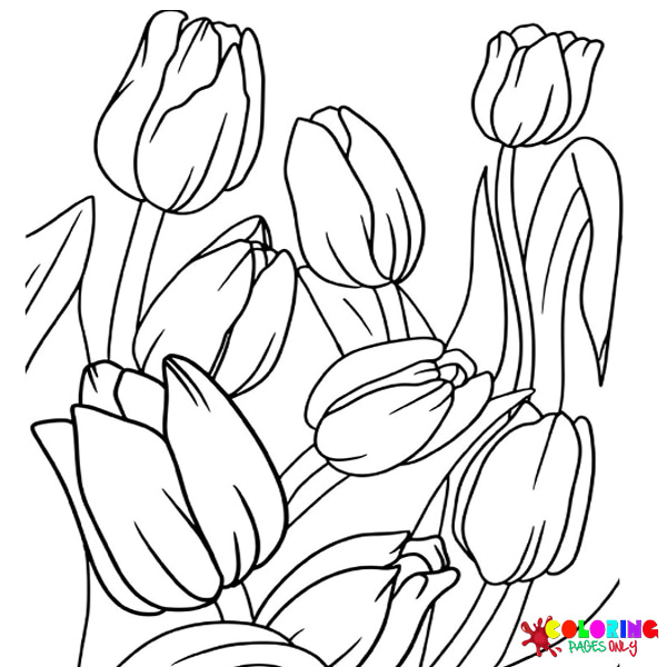
Tulip covers the clean, elegant cup-shaped bloom that has been one of the most culturally significant flowers in European history – the subject of the seventeenth-century Dutch tulip mania that produced the first recorded speculative financial bubble, and still the defining flower of the Netherlands, where over three billion tulip bulbs are produced each year. The tulip’s visual form is among the simplest of any flower in the collection: six petals (technically three petals and three sepals of identical appearance) forming a smooth cup or goblet shape above a single straight stem with two or three strap-like leaves. This simplicity makes tulip pages highly accessible to younger colorists, while the extraordinary range of tulip colors and patterns (solid reds, yellows, purples, pinks, whites; bicolored varieties with flame-like streaks; fringe-petaled parrot tulips; double-petaled varieties) makes them rewarding for colorists who want to explore color variation.
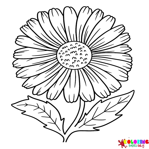
Daisy is among the most universally recognizable flower forms in the world – the simple composite flower with its ring of white ray florets surrounding a central yellow disc that appears spontaneously in lawns, meadows, and roadsides across temperate regions worldwide. The daisy’s immediate visual accessibility makes it the entry point for many young colorists’ first flower pages: its simple two-color structure (white petals, yellow center) requires only two decisions, making the coloring quick and satisfying. More complex daisy pages introduce the stem with its long, simple leaves, background meadow elements, and multiple daisy heads in a field composition. The Shasta daisy and the oxeye daisy are the most commonly depicted forms, with their larger size and more prominent white ray florets, but the smaller common daisy (Bellis perennis), with its button-like center and shorter petals, appears in meadow and lawn scenes.
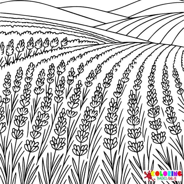
Lavender covers the aromatic flowering plant of the Mediterranean – the tall, slender spikes of tiny clustered florets in their unmistakable purple-violet that have made lavender fields one of the most photographed agricultural landscapes in the world (particularly the lavender fields of Provence in southern France and the Valensole plateau). Lavender pages range from single stem illustrations to the massed field compositions that show the full visual impact of lavender cultivation – thousands of parallel rows of purple against the warm tan of Provençal soil and the deep blue of a summer Mediterranean sky. The specific purple of lavender is not the vivid blue-purple of iris or the red-purple of wisteria but a softer, more gray-inflected medium purple – the color so characteristic that it has given its name to a specific shade: lavender as a color is derived directly from the flower.
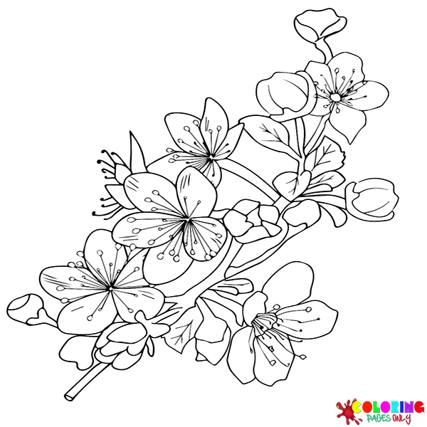
Cherry Blossom covers the sakura – the flowering cherry whose brief spring bloom is one of the most culturally significant natural events in Japan and increasingly celebrated worldwide. The concept of hanami (花見, “flower viewing”) – the Japanese tradition of gathering beneath flowering cherry trees to appreciate their beauty, eat, drink, and reflect on the transience of beauty – gives cherry blossom coloring pages a cultural depth that few other flower subjects carry. The bloom itself is visually very specific: five petals, each notched at the tip, in a pale pink ranging from almost white in some varieties to a deeper rose-pink in others, surrounding a central cluster of prominent stamens. The branches are dark gray-brown, often depicted in a spare, horizontal composition that gives the blossoms space to read as individual against the branch.
The most aesthetically powerful cherry blossom coloring pages show blossoms against a sky – pale pink flowers against a pale blue sky, with falling petals (hanafubuki, “flower blizzard”) creating the ephemeral, snow-like effect that is the defining visual metaphor of the Japanese cherry blossom season. Rendering falling petals convincingly – as irregular oval shapes caught in mid-air, casting tiny shadows on the blue sky – is one of the more technically specific coloring challenges in the Flower collection.
The Spring and Early-Season Flowers
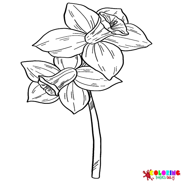
Daffodil covers one of the most reliably cheerful flowers of early spring – the Narcissus genus, with its distinctive trumpet-shaped central corona (the cup or trumpet) surrounded by a ring of six spreading petals. The daffodil’s two-zone structure makes it one of the most visually interesting flowers to color: the outer petals and the central trumpet are typically different colors, creating a natural two-tone effect that ranges from the classic all-yellow daffodil (golden petals, slightly deeper golden trumpet) to bicolored forms where white outer petals surround an orange or red-edged trumpet. The contrast between the trumpet and petals in bicolored daffodils is often quite dramatic, producing a coloring page result that feels like an abstract composition even when accurately rendered.
Crocuses cover the small, early-blooming bulb flowers that are among the first visible signs of spring in temperate climates – pushing up through snow or recently thawed soil in late winter before most other plants have stirred. The crocus’s small size and simple six-petaled cup form make it one of the more modest flowers in the collection visually, but its significance as a harbinger of spring and the fact that the world’s most expensive spice – saffron – is harvested from the stigmas of the saffron crocus (Crocus sativus) give it an outsized cultural importance relative to its physical scale. Crocus colors follow the plant’s natural range: purple in many varieties, the soft lilac-purple of the spring crocus, the golden yellow of the yellow crocus, and white – often with contrasting veining or striping that adds visual interest to the simple petal form.
Camellia covers the waxy, rose-like blooms of the Camellia genus – flowering shrubs that produce their blooms in winter and early spring, when few other plants are flowering, making them particularly valued in garden settings. The camellia is perhaps most famous as the source plant of tea (Camellia sinensis), whose leaves produce all true tea from green through oolong to black depending on processing method, but the ornamental camellias (Camellia japonica and Camellia sasanqua) are celebrated for their large, precisely structured blooms. The camellia’s petals are smooth and somewhat waxy, rather than the soft texture of roses, arranged in a geometric concentric pattern that – in some double-flowering varieties – approaches the complexity of a rose bloom while retaining a different, more architectural quality.
Daffodil and Crocuses connect naturally to the Spring Flowers sub-category, which covers the seasonal mix of early bloomers together rather than one species at a time – daffodils, crocuses, and tulips, and early cherry blossoms appearing together in the kind of mixed spring garden composition that represents the season’s explosion of color after winter’s restraint.
The Wildflowers and Garden Border Flowers
Sunflower, covered above, is the largest of the daisy family flowers, but the collection includes several smaller members of this diverse family. Black-eyed Susan covers the vivid yellow-orange wildflower of the North American prairies and roadsides – a member of the Rudbeckia genus whose name comes from the dark brown to near-black central disc that contrasts vividly with the golden-orange ray florets. The black-eyed Susan is compositionally very similar to a small sunflower (same two-zone structure of disc and ray florets, same color contrast) but with a more compact form, more deeply orange-gold petals, and the intensely dark disc that gives it its name. Coloring the disc as a genuine near-black – darker and more intense than the brown of a sunflower disc – is the key to capturing the black-eyed Susan’s specific visual identity.
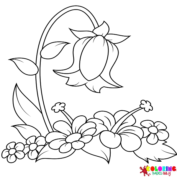
Columbine covers the Aquilegia genus – one of the most architecturally distinctive wildflowers in temperate regions, with its five petals each extending backward into a hollow spur (the tubular extension that holds nectar for hummingbirds and long-tongued insects). The columbine’s backward-pointing spurs give it an almost starfish-like radial symmetry that is entirely unique among common garden flowers, and the fact that the petals and spurs are often different colors (blue-purple petals with white spurs being a classic combination, or yellow petals with red spurs) makes columbine pages naturally bicolored in a distinctive way. Bellflower covers the Campanula genus – the bell-shaped flowers in blue, violet, and white that dangle from arching stems in meadows and garden borders, named for their characteristic downward-hanging, bell-shaped bloom.
Buttercup Flower covers the small, vivid yellow wildflower of the Ranunculus genus – the flower whose association with cheerfulness and simple country meadow beauty is one of the most universally understood in temperate cultures. The buttercup’s five glossy yellow petals and the way they reflect light (the specific shininess of buttercup petals, produced by a specialized cell layer beneath the surface, is the basis of the traditional “do you like butter?” game of holding the flower under someone’s chin) make it one of the simplest but most vivid wildflower coloring subjects.
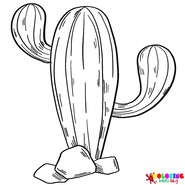
Cactus extends the Flower collection beyond the typical soft-petaled garden flower into the succulent and desert plant world. The cactus is a Flower sub-category because cacti produce some of the most spectacular blooms in the plant world – large, vivid, often jewel-like flowers that emerge from the otherwise spiny, photosynthetic stems. Cactus coloring pages capture both the distinctive body forms of cacti (the columnar saguaro, the rounded barrel cactus, the pad-and-joint structure of the prickly pear, the hairy old man cactus) and, where depicted, their extraordinary blooms in vivid reds, oranges, pinks, and yellows against the desert landscape.
Compositions and Contexts: Flowers in Arrangement and Setting
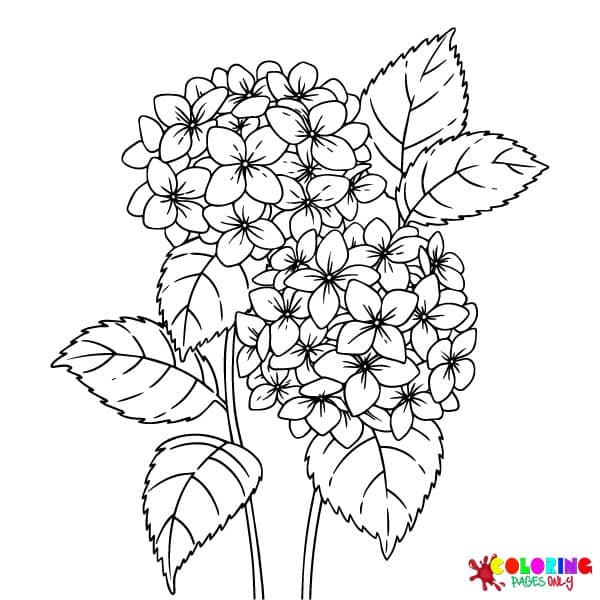
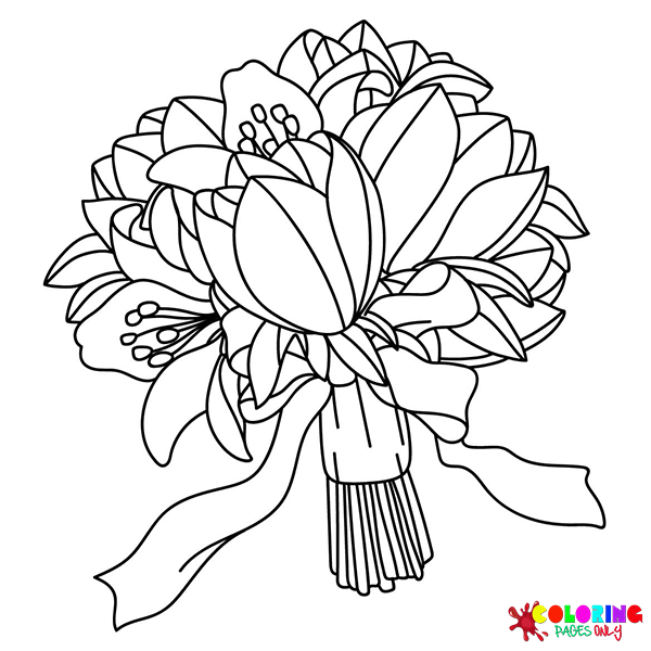
Flower Bouquet moves from individual species to the arranged composition – flowers gathered and combined by human hands into a unified presentation. Bouquet pages introduce a coloring challenge that single-species pages do not present: the management of multiple different flower types within a single composition, each with its own canonical colors and petal structures, arranged so that they complement rather than compete with each other. The basic principle of bouquet coloring is the same as the basic principle of bouquet making: contrast and harmony. High-contrast bouquets (deep red roses alongside white baby’s breath, for example) create drama; harmonious bouquets (soft peach roses alongside cream carnations and blush pink peonies) create elegance.
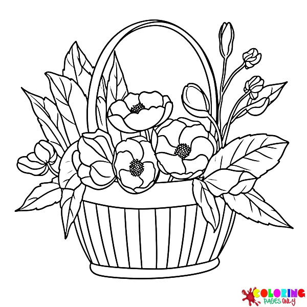
The wrapping or vase that contains a bouquet page provides a coloring element that is entirely free from canonical constraint – the brown of kraft paper wrapping, the vivid pattern of florist’s paper, the ceramic texture of a vase – and this freedom can be used to create a compositional anchor color that frames the bouquet’s flower colors and ties the overall page together. Flower Basket adds the woven container as a primary element – the interlaced pattern of wicker or woven reed providing a naturally geometric coloring target in warm tan, brown, and golden tones that complements the organic flower colors above.
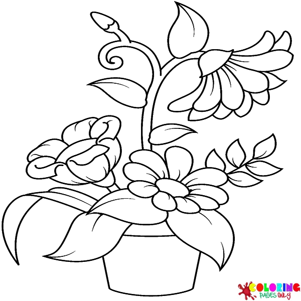
Flower Pot brings the domestic context – the planted pot on a windowsill, balcony, or garden terrace, combining the growing plant with its ceramic or terracotta container in a home-setting composition. Flower pot pages are among the most immediately relatable in the collection because most people have encountered potted plants in domestic settings, and the canonical terracotta pot (the warm, unglazed orange-red clay of the classic garden pot) provides one of the most specific and satisfying coloring targets in the entire Flower collection – a red-orange warm enough to feel earthy and natural against the green of plant stems and leaves.
Blooming Flowers focuses specifically on the moment of opening – the transitional state between bud and full bloom that is often the most visually perfect moment in a flower’s life. A bloom in the process of opening shows the tightest inner petals still curled and protected, the outer petals just beginning to spread, and the overall form caught between the compact energy of the bud and the relaxed fullness of the open flower. This in-between state produces compositionally interesting pages where the same species can be shown in multiple stages simultaneously. Spring Flowers covers the seasonal mixed composition – daffodils, tulips, crocuses, cherry blossoms, and other early bloomers appearing together in the kind of mixed spring garden that represents the season as a totality rather than any individual species.
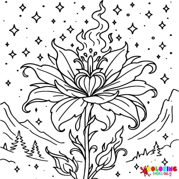
Midnight Flowers: The Collection’s Most Distinctive Sub-Category
Midnight Flowers is the most visually and atmospherically distinctive sub-category in the entire Flower collection – and one of the most distinctive in the entire site. Where every other flower sub-category works with the standard coloring page convention of dark lines on a white background (the flowers colored in their vivid natural tones against the white of the page), Midnight Flowers inverts this entirely: dark, night-time compositions in which flowers are depicted in the luminous, glowing quality of flowers seen in moonlight or in the blue-black atmosphere of deep night.
The Midnight Flowers coloring experience is fundamentally different from any other flower page on the site. Instead of starting with a white background and adding color, the colorist is working against an implied dark background – which in practice means that the most effective approach is to use the darkest blues, blue-blacks, and deep indigos for the background elements of the composition, and to render the flowers themselves in lighter, more luminous tones that suggest them glowing in the darkness rather than absorbing and reflecting daylight. White flowers against a deep blue night sky, pale lavender against near-black foliage, soft gold against deep indigo – this inverted palette relationship produces finished pages that look unlike anything else in the Flower collection.
The Midnight Flowers palette is built around the cool blue spectrum of night light: the specific blue-black of a moonlit garden sky, the cool silver-white of moonlight on white petals, the deep blue-green of foliage in darkness, and the occasional accent of a warm gold or amber from a nearby light source (a garden lantern, a lit window) that creates the only warm note in an otherwise very cool composition. Flowers that work particularly well in this context are those with naturally pale or white blooms – moonflowers, white roses, white camellias, jasmine – which read as genuinely luminous against dark backgrounds, as well as flowers with naturally blue or purple tones (lavender, iris, morning glory, wisteria) which deepen beautifully into the blue-black spectrum of the night palette.