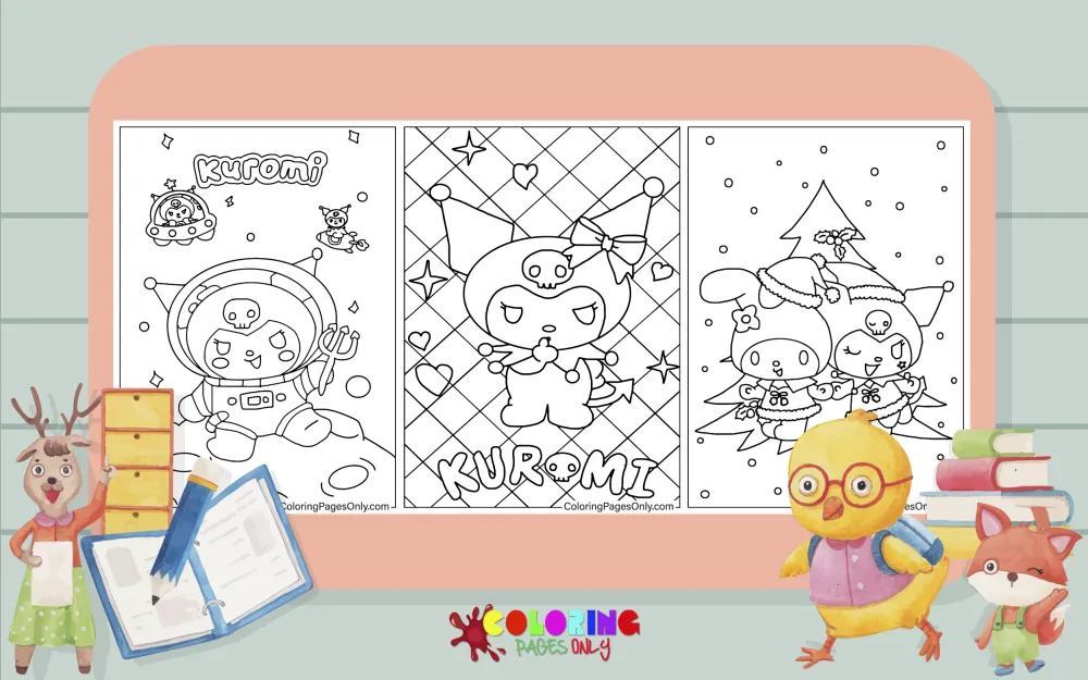
Kuromi Coloring Pages at ColoringPagesOnly.com brings together 70+ free pages based on the Sanrio character who became one of the most searched coloring subjects of the mid-2020s – Kuromi alone, Kuromi with her companion Baku, Kuromi with My Melody, holiday Kuromi, Kuromi in various moods and situations, and crossover pages with Hello Kitty and Hangyodon. Download any page as a PDF to print, or color online in your browser. The full Sanrio collection is at Sanrio Coloring Pages.


Who is Kuromi?
Kuromi is a Sanrio character who first appeared in the 2005 anime series Onegai My Melody, where she was introduced as My Melody’s rival. She is a white rabbit-like creature who wears a black jester’s hat with a pink skull emblem on the front and has a small black devil tail. Her expression in most official artwork leans toward the mischievous or scheming – eyebrows angled inward, mouth in a slight smirk – which is a deliberate visual contrast to My Melody’s round-eyed sweetness.
Kuromi’s official personality, according to Sanrio, is that she loves heavy metal music, writing in her diary, and mischief-making – but that she also has a soft, romantic, secretly sweet side that she works hard to conceal. This gap between her tough-looking exterior and her genuinely tender interior is a significant part of her appeal. She represents the “villain who isn’t really a villain” archetype that resonates particularly strongly with tweens and teens who identify with being misunderstood.
Her companion animal is Baku – a small tapir-like creature with a stubby nose and a round, docile face that provides visual contrast to Kuromi’s sharper edges. Baku follows Kuromi in most of her media appearances and has become a recognizable secondary character in his own right.
Kuromi’s mainstream popularity surged dramatically between 2022 and 2025, driven partly by the broader “dark kawaii” aesthetic trend on social media – a visual style that combines cute Sanrio-style design language with black, purple, and skull motifs. She went from a niche Sanrio character to one of the brand’s top sellers globally, with fan communities across every major social platform.
What’s in This Collection
The 70+ pages cover Kuromi across several distinct types of pages.
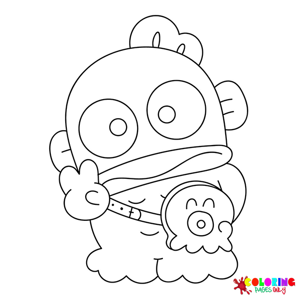
Kuromi solo pages form the largest group – pages showing Kuromi alone in various poses, expressions, and situations. Kuromi Sitting, Kuromi Running, Kuromi Smiling, Kuromi Standing, Happy Kuromi, Sad Kuromi Face, Angry Kuromi, Naughty Kuromi, Curious Kuromi, Lovely Kuromi, Pretty Kuromi, Adorable Kuromi, Charming Kuromi, Cool Kuromi, Evil Kuromi, Funny Kuromi, Hello Kuromi, and Love Kuromi cover the full range of Kuromi’s expressions and emotional register. These solo pages are the most directly useful for anyone learning Kuromi’s canonical colors and face structure.
Kuromi with Baku – Kuromi and Baku, Kuromi with Baku, Coloring Page Kuromi with Baku – show the main character and companion pair together. Baku’s round, pale form provides a strong visual contrast to Kuromi’s sharper-angled design.
Kuromi with My Melody – Kuromi with My Melody, Melody with Kuromi, Ice Cream Kuromi with Melody, Christmas Melody with Kuromi, Christmas Kuromi with Melody, Christmas Kuromi with My Melody – pair Kuromi with her Sanrio rival/companion My Melody. These are among the most popular pages in the collection because the contrast between the two characters’ design languages (Kuromi’s dark aesthetic vs. My Melody’s pink-and-white warmth) creates naturally interesting coloring compositions.
Kuromi, with objects and props, covers her specific interests and personality attributes. Kuromi with Book and Kuromi Writes Book place her in her diary-writing persona – the activity most associated with her character beyond mischief-making. Kuromi with Guitar connects her to her love of heavy metal music. Kuromi, with a broomstick, extends her witch-adjacent aesthetic. Evil Kuromi with Magic Key and Kuromi with a Book of Black Magic bring out the darker, more magical elements of her character. Kuromi with Heart shows her soft romantic side. Kuromi with Rubik is a more playful, intellectual prop that sits slightly outside her typical character elements.
Holiday and occasion pages cover the seasonal versions of Kuromi. The Christmas cluster is the largest – Christmas Kuromi, Santa Kuromi with Gift Christmas, Christmas Kuromi Coloring Pages – along with Kuromi Halloween for the season that most naturally fits her aesthetic. Kuromi Cupid and Cute Kuromi Cupid give her a Valentine’s Day form. Cake Kuromi, Bubble Tea Kuromi, and Boba Kuromi place her in the food-and-drink aesthetic pages that are consistently popular in Sanrio coloring page searches.
Sanrio crossover pages – Hello Kitty Kuromi, Hangyodon and Kuromi, Kuromi with My Melody – bring her into the same frame as other Sanrio characters. Hangyodon (the anthropomorphic fish character) is a somewhat unusual pairing with Kuromi, reflecting the broader collector culture of Sanrio character fandom.
Kuromi Princess and Kuromi Baby are the two alternate-form pages – Kuromi rendered in different character registers, the princess page with royal costume elements, and the baby page with the chibi-rounded proportions of infant character illustration.
Mamezuku Kuromi refers to a specific bean-shaped or miniaturized Kuromi form that appears in certain Sanrio merchandise lines – a simplified, round version of the character that is different from her standard design.
Coloring Tips
Kuromi’s canonical palette is unusually simple for a Sanrio character: white body, black hat, and pink skull and inner ear markings. The restraint of the color scheme is part of what makes her design work – the black-and-white creates a stark graphic quality that her Sanrio contemporaries don’t have, and the pink skull is the single warm accent that prevents the whole design from reading as purely dark. If you stay true to this palette, the character is immediately recognizable. If you change it, the character becomes a generic rabbit.
White on white paper is the central coloring challenge with Kuromi’s body. Pure white fur against white paper will disappear unless you introduce shadow values. The solution used in most Kuromi fan art is to apply a very light blue-grey or lavender-grey in the shadow areas – the underside of her chin, the areas under her hat brim, the inner curves of her limbs. Keep the lightest areas as the raw paper. The gradient from shadow grey to paper-white suggests the rounded, three-dimensional form of her body without requiring a flat gray fill.
The black hat should be genuinely dark – not a middle grey, but a proper deep black or near-black. The hat is the strongest graphic element in Kuromi’s design, and its darkness is what makes the pink skull pop as an accent. If the hat is too light, it reads as grey, and the skull disappears into the composition. Use the darkest value of your coloring tool for the hat, saving your slightly lighter dark tones for shadow areas elsewhere.
The pink skull on her hat is the single most important accent color in the entire design. It sits against black, which means it will pop at almost any saturation level – but the specific pink that reads as most canonical is a medium-warm pink rather than a hot pink or a pale blush. Think of it as closer to bubblegum pink than to magenta or baby pink. The inner ear markings should match this same pink exactly, creating color consistency across the character’s body.
For Kuromi with My Melody pages, the color relationship between the two characters is one of the most satisfying in the Sanrio universe: Kuromi’s black, white, and pink against My Melody’s white, pink hood, and red bow. The two characters share a white body and a pink accent but otherwise sit at opposite ends of the cute-to-dark spectrum. On pages where they appear together, keeping Kuromi’s pink accent and My Melody’s pink hood the same shade – or deliberately making them slightly different pinks – changes how the pair reads. The same pink suggests kinship; different pinks emphasize their distinctness.
For holiday pages, Kuromi’s aesthetic works naturally with certain holiday palettes and fights others. Halloween is her most natural holiday – the black, orange, and purple of Halloween suit her dark aesthetic perfectly. The Christmas pages require more deliberate thought: Kuromi’s canonical black-and-white against the red-green-gold of Christmas creates a strong contrast that can read as intentionally subversive (Kuromi as the anti-Christmas presence) or simply as a color clash. One approach is to use a red-and-black palette for the Christmas Kuromi pages rather than the traditional red-and-green, leaning into the dark-Christmas aesthetic that her character implies.
For Boba Kuromi and Bubble Tea Kuromi, the drink cup is the color opportunity. Bubble tea comes in every color imaginable – taro purple, matcha green, strawberry pink, brown for classic milk tea, and the multicolored spectrum of fruit teas. These pages invite you to choose a specific drink type and commit to it: a taro boba page would have a purple cup with dark boba pearls, a strawberry version would have a pink-to-red gradient with lighter pearls. The combination of Kuromi’s black-and-white with a vibrant colored cup makes these among the most naturally appealing color compositions in the collection.
5 Activities with Your Kuromi Pages
Color Kuromi and My Melody as deliberate complements. Print one of the Kuromi-with-My-Melody pages – Kuromi with My Melody, Ice Cream Kuromi with Melody, or Christmas Kuromi with Melody. Before you start, decide whether you want the two characters to feel harmonious or contrasting. For harmonious: use the same shade of pink for both Kuromi’s skull/ear markings and My Melody’s hood – keeping the shared element identical makes them read as friends despite their design difference. For contrasting: give Kuromi a slightly cooler, darker pink and My Melody a softer, warmer pink – the distinction emphasizes that these are two characters with different personalities sharing a frame. Color the page twice, once each way, and compare. The exercise teaches how a single color decision across two figures changes the entire emotional register of the composition.
Color the full expression range. Print Angry Kuromi, Sad Kuromi Face, Happy Kuromi, Curious Kuromi, and Naughty Kuromi. Color all five pages using exactly the same body palette – the same white-to-grey body shadows, the same black hat, the same pink skull. The challenge is maintaining perfect color consistency across five different expressions. When all five are finished, display them together as a series. The same character in the same colors looks radically different from page to page based on expression alone – this is what makes Kuromi’s character design sophisticated despite its apparent simplicity.
The canonical vs. alternate palette experiment. Print two copies of the same simple Kuromi page – Kuromi Sitting or Kuromi Smiling. Color the first in Kuromi’s exact canonical colors: white body, black hat, pink skull. Color the second in a completely different palette of your choice – purple body, silver hat, gold skull; or pale blue body, dark navy hat, coral skull. Display them side by side. The first version is immediately recognizable as Kuromi. The second version is a technically interesting illustration that no longer reads as the specific character. This experiment shows how character recognition in Sanrio design is almost entirely color-dependent – the form communicates the character, but the colors confirm it.
Color the Bubble Tea and Boba pages as a flavor series. Print Bubble Tea Kuromi and Boba Kuromi. Choose two different drink flavors and color each page as a specific boba tea variety: taro milk tea (the cup should be purple, with darker purple boba pearls), strawberry milk tea (pink cup shading to pale pink milk, with bright red strawberry pieces), matcha (a muted green cup with dark boba), or classic brown sugar milk tea (warm amber cup with dark caramel-brown boba). Research the real visual appearance of each drink type before you start if you are unfamiliar with them – the specificity of getting the actual drink color right is what makes the page feel intentional rather than arbitrary. Kuromi’s canonical colors provide the same anchor on both pages, so the drink cup is the only variable between them.
Build the villain’s story. Print Evil Kuromi, Evil Kuromi with Magic Key, Kuromi with a Book of Black Magic, Kuromi with a Broomstick, and Kuromi Halloween – the five pages that lean most strongly into her mischievous, slightly villainous character elements. Color all five in a consistent darker version of her canonical palette: deep shadow greys on her body rather than light ones, the hat as true black, the skull as a slightly deeper saturated pink rather than the lighter bubblegum shade. Then write five captions – one sentence per page – telling the story of what Kuromi is doing in each image, treating the five pages as consecutive panels from a short Kuromi adventure story. The coloring choices support a darker mood; the captions add the narrative dimension.
