Car Logo Coloring Pages
Explore 100+ free car logo coloring pages featuring Ferrari, Lamborghini, Porsche, Mercedes-Benz, BMW, Toyota, Ford, Tesla, Rolls-Royce, Volkswagen, and dozens more iconic automotive brands from around the world – available as free printable PDF and interactive online coloring for kids, car enthusiasts, and designers of all ages.
A car logo is not a decoration. It is a compressed story – a few square centimeters of carefully considered shape, symbol, and color that carries the entire weight of a brand’s history, values, and identity every time it appears on a hood, a steering wheel, or a showroom wall. The Mercedes-Benz three-pointed star represents Gottlieb Daimler’s founding vision of dominating land, sea, and air transport. Ferrari’s prancing horse was taken from the personal emblem of World War I Italian air ace Francesco Baracca and given to Enzo Ferrari by Baracca’s mother for good luck. Subaru’s six stars depict the Pleiades star cluster – Subaru being the Japanese word for “unite” and a poetic reference to that constellation. Every logo in this collection tells a story this specific, this intentional, and this deeply connected to the human history of the automobile.
At ColoringPagesOnly.com, our collection of 100+ free car logo coloring pages brings the world’s most recognizable – and some of its most unexpected – automotive emblems to your coloring table. From the legendary Italian supercar brands to the everyday commuter vehicles that have become icons of reliability, from historic American muscle car badges to the pioneering logos of the electric vehicle era, this collection spans more than a century of automotive design history across six continents. Every page is completely free to download as PDF, JPG, or PNG, and available to color online directly in your browser.
Whether you are a child who knows every car on the road by its badge, a teenager studying graphic design, an adult who grew up with a particular brand in the family driveway, or a car enthusiast who simply wants to spend an afternoon with the logos of vehicles you love, this collection is for you. The engines are running.
What’s Inside Our Car Logo Coloring Pages Collection?
Our collection spans the full global spectrum of automotive manufacturing – organized here by the regional traditions and brand stories that give each logo its meaning and its visual character.
Italian Supercar Logos – The Prancing Horse, the Bull, and the Trident
No logos in the automotive world carry more emotional weight than those of Italy’s great performance car brands – and our collection features all of them.
The Ferrari Logo depicts the Cavallino Rampante – the prancing horse – on a yellow shield, yellow being the color of Modena, the city where Ferrari was founded in 1947. The story behind the horse is one of motorsport’s most touching: Countess Paolina Baracca, mother of the World War I ace whose personal emblem the horse originally was, suggested to Enzo Ferrari that he use it on his racing cars for good luck. Ferrari added the yellow background; the rest is legend. The Ferrari logo rewards a coloring approach of confident, saturated application – the prancing horse in solid black against vivid yellow, with the red, white, and green vertical stripe of the Italian flag at the top of the shield.
The Lamborghini Logo features a charging bull – a symbol chosen by founder Ferruccio Lamborghini, who was a Taurus and deeply passionate about bullfighting. Lamborghini’s cars are named after famous fighting bulls (Miura, Diablo, Murciélago, Aventador, Huracán), and the bull on the badge faces forward with the energy and determination that characterizes the brand’s entire design philosophy. The Maserati Logo features a trident inspired by the fountain of Neptune in Bologna’s Piazza Maggiore, near where the Maserati brothers opened their first workshop in 1914. The trident’s three points are said to represent the brothers Alfieri, Ettore, and Ernesto Maserati.
German Automotive Excellence – Engineering Made Visible
Germany’s automotive industry has produced some of the most geometrically sophisticated and symbolically rich logos in the world.
The Mercedes-Benz Logo – the three-pointed star enclosed in a circle – is one of the most recognized symbols on Earth. Its three points represent Gottlieb Daimler’s ambition to power transport on land (the bottom point), at sea (the lower-left point), and in the air (the upper-left point). The star was first used as a trademark in 1909, and the encircling ring was added when Mercedes merged with Benz & Cie in 1926 to form Mercedes-Benz. The logo’s deceptive simplicity – three equal lines meeting at a perfect central point – is a masterclass in geometric minimalism that has made it instantly recognizable for nearly a century.
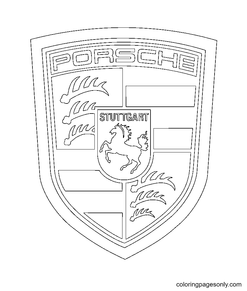
The Volkswagen Logo – the V above the W, enclosed in a circle – was designed in 1938 by Franz Xaver Reimspiess, who won an internal company competition with a prize of 100 Reichsmarks. “Volkswagen” means “people’s car” in German, a name that reflects the brand’s original mission to produce an affordable vehicle accessible to ordinary German citizens. The Porsche Logo combines the coat of arms of the state of Baden-Württemberg with the crest of the city of Stuttgart, and the horse at its center is no accident: Stuttgart’s name derives from the Old German Stuotgarden, meaning “stud farm,” making the horse the most historically appropriate emblem imaginable for a performance car manufacturer based in that city.
American Icons – Power, Heritage, and the Open Road
American automotive logos carry a different kind of weight – less aristocratic heritage, more democratic aspiration, and the mythology of the open road.
The Ford Logo – the oval blue badge with Ford’s signature in white – has been one of the world’s most recognized corporate symbols since the modern version was standardized in 1927. Henry Ford founded his company in 1903 with $28,000 raised from twelve investors, and his introduction of the moving assembly line in 1913 at the Highland Park plant fundamentally changed manufacturing worldwide. The Ford oval’s deep, saturated blue and clean white lettering make it one of the most satisfying logos in the collection to color – straightforward, bold, immediately recognizable.
The Chevrolet Logo – the bowtie – is one of American automotive culture’s most debated design mysteries. The origin of the bowtie shape has never been definitively established: theories include that co-founder William Durant saw a similar pattern on French wallpaper, that it was derived from a newspaper advertisement, and that it was inspired by a cross in a Swiss hotel. Whatever its origin, the Chevrolet bowtie has appeared on cars since 1913 and is among the most widely recognized automotive symbols in the world. The Mustang Logo features a galloping horse – specifically a mustang, the wild horse of the American West – that perfectly captures the free, powerful spirit of Ford’s most iconic pony car, first introduced in 1964. The Corvette Logo depicts crossed flags – a checkered racing flag and the American flag – that communicate the model’s dual identity as an American sports car and a racing heritage vehicle.
The Dodge Logo (both old and new versions appear in our collection) captures the evolution of one of America’s most performance-oriented brands. The GMC Logo, GM Logo, Chrysler Logo, Ram Logo, Hummer Logo, Pontiac Logo, and Lincoln Logo round out an American brand collection that spans the full range of domestic automotive design – from working trucks to luxury sedans to the muscle car era’s most dramatic styling.
Japanese Precision – Logos Built on Balance and Symbolism
Japanese automotive logos are among the most thoughtfully symbolic in the world, often embedding layers of meaning into forms that appear geometrically simple.
The Toyota Logo – three overlapping ellipses – was adopted in 1989 for the company’s 50th anniversary. The two perpendicular ellipses in the center represent the heart of the customer and the heart of the Toyota product, united in an overlapping embrace; the outer ellipse represents the world embracing Toyota. The negative space within the logo also forms the letter T. Toyota is currently the world’s largest automaker by volume, having surpassed General Motors in 2008. The Honda Logo – a stylized H – belongs to the company founded by Soichiro Honda in 1948, a man who had previously built piston rings for Toyota and who famously sent a letter to Henry Ford asking for a job in the 1930s. Honda is the world’s largest manufacturer of internal combustion engines.
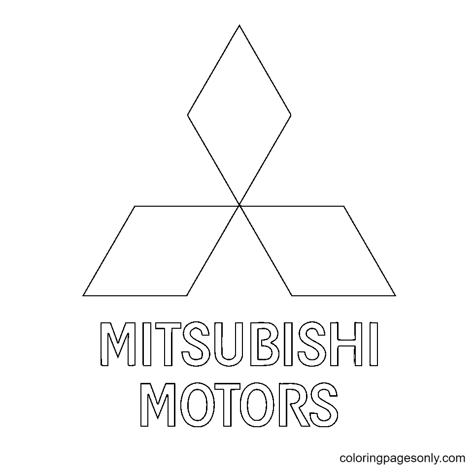
The Subaru Logo – six silver stars on a blue field – represents the Pleiades constellation. The six stars represent six companies that merged to form Fuji Heavy Industries (Subaru’s parent company): the large star represents Fuji Heavy Industries itself, and the five smaller stars represent the five merging companies. The Mitsubishi Logo – three diamond shapes arranged in a triangular formation – derives directly from the company’s name: mitsu means “three” in Japanese, and hishi means “water chestnut,” whose diamond shape gave rise to the term for the geometric form. The company was founded by Yatarō Iwasaki in 1870 as a shipping company, long before it produced automobiles.
The Lexus Logo, Infiniti Logo, Nissan Logo, Mazda Logo, and Suzuki Logo complete the Japanese lineup – each with its own geometric precision and symbolic depth that rewards careful, attentive coloring.
Korean and European Mainstream Brands
The Hyundai Logo – a stylized H – is commonly interpreted as two figures shaking hands, representing the company’s relationship with its customers, as well as the first letter of the brand name. Kia‘s name comes from Chinese characters meaning “to rise from Asia” – a bold declaration of intent for a brand that has become one of the world’s most award-winning automotive designers. The SsangYong Logo features twin dragons, reflecting the Korean brand’s heritage and its aspiration for strength and longevity.
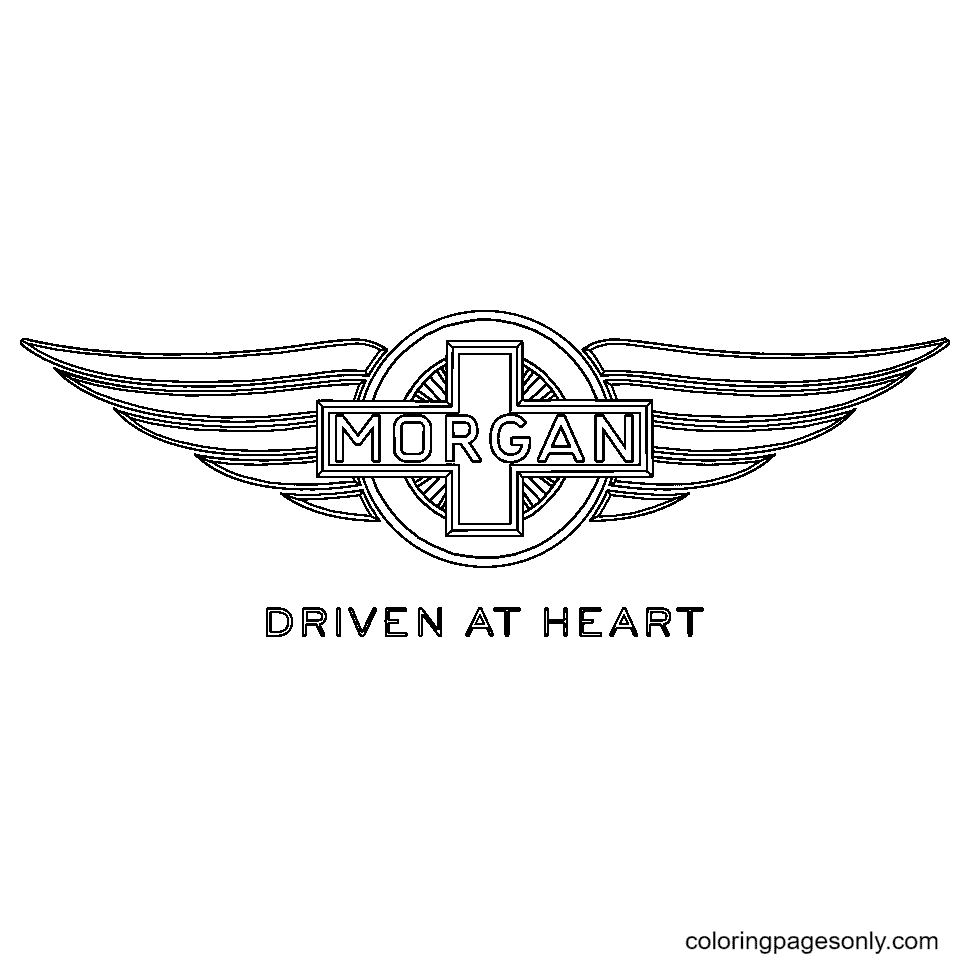
European mainstream and premium brands form one of the richest sections of the collection. The Volvo Logo uses the ancient chemical symbol for iron – a circle with an arrow pointing to the upper right – reflecting the brand’s Swedish origins in a country with a strong iron and steel industry tradition; the symbol also happens to be the symbol for Mars, the Roman god of war, which suits a brand that built its reputation on safety and durability. The Renault Logo has evolved from a radiator cap ornament on early 20th-century cars to the bold, diamond-shaped lozenges of the modern brand – one of the most dramatically redesigned automotive logos in recent history. The Skoda Logo features a winged arrow – symbolizing progress, flight, and the brand’s Czech heritage that dates to 1895 when Václav Laurin and Václav Klement began producing bicycles. The Seat Logo, Citroen Logo, Peugeot Logo, Fiat Logo, Lancia Logo, Saab Logo, Opel Logo, Vauxhall Logo, Smart Logo, Dacia Logo, Mini Logo, MG Logo, Morgan Logo, Lotus Logo, and Jaguar Logo complete a European collection that spans more than a century of automotive design.
British Heritage Logos – Royalty, Power, and Elegance
British automotive logos occupy a unique cultural position – combining aristocratic heritage with engineering excellence in ways that no other national tradition quite replicates.
The Rolls-Royce Logo features the interlocked RR monogram alongside the Spirit of Ecstasy – the famous hood ornament designed by sculptor Charles Sykes in 1911, depicting a woman leaning forward into the wind with her arms outstretched behind her like wings. The Spirit of Ecstasy is said to have been inspired by Eleanor Thornton, secretary to Rolls-Royce patron Lord Montagu of Beaulieu. The Jaguar Logo – the leaping cat – was adopted in the 1940s to communicate the speed, grace, and predatory elegance that the brand’s engineers were building into their vehicles. The Land Rover Logo presents a simple, unadorned wordmark that communicates through restraint – a brand so confident in its reputation that the logo itself needs to do very little beyond identifying the vehicle.
Electric Era and Emerging Brands – The New Automotive Vocabulary
The Tesla Logo – an angular T shape – represents a cross-section of an electric motor’s stator, making it the only major automotive logo that depicts the technology inside the vehicle rather than an external symbol. Tesla, founded in 2003 by Martin Eberhard and Marc Tarpenning and later joined by Elon Musk, Jia-Wei Tang, and Ian Wright, has used its logo’s clean, modern geometry to communicate a fundamental break from automotive tradition. The Tesla logo page is one of the most popular in the collection for children interested in science and technology, and for adults who drive or aspire to drive one.
Asian, African, and Global Brand Logos
The Tata Logo, Mahindra Logo, and Maruti Suzuki Logo represent India’s automotive industry – one of the world’s largest and fastest-growing. Tata Motors is India’s largest automobile manufacturer and the owner of Jaguar and Land Rover since 2008. The Proton Logo and Perodua Logo represent Malaysia’s national automotive industry. The Great Wall Logo, Geely Logo, Chery Logo, FAW Logo, SAIC Logo, DFM (Dongfeng) Logo, JAC Logo, Emgrand Logo, Roewe Logo, and Zotye Logo represent China’s extraordinary automotive expansion – China has been the world’s largest automobile market since 2009 and the world’s largest EV market, producing more electric vehicles than the rest of the world combined.
Why You’ll Love Our Car Logo Coloring Sheets
100+ logos available free, always. Every page downloads as PDF, JPG, or PNG at no cost – no sign-up, no subscription, no restrictions for personal or educational use. PDF delivers the sharpest print quality. JPG is ideal for quick single-page sessions. PNG supports digital coloring and transparent-background creative projects.
Color online or print at home. Our built-in online coloring tool works in any browser – perfect for tablets and screen-based creative sessions. Print on standard A4 paper for a traditional, hands-on experience. Both options are always available, always free.
One of the most globally diverse coloring collections available. Our car logo pages represent brands from Germany, Italy, France, the United Kingdom, Japan, South Korea, the United States, India, Malaysia, China, Russia, Romania, Sweden, the Czech Republic, Spain, and beyond. Coloring these logos is literally a journey around the world’s automotive cultures.
Fascinating stories behind every single logo. Unlike character coloring pages, where the interest is in the illustration itself, car logo pages carry a second layer of value: every logo is a gateway to a story about a founder, a country, a historical moment, or a design philosophy that rewards research and discussion.
Incredible Benefits of Car Logo Coloring Pages
Teaches Graphic Design Principles Through Real-World Examples
Car logos are among the most rigorously designed objects in the world of commercial art. Each one has been refined through decades of iteration, tested across dozens of contexts (embossed on metal, printed in black and white, reproduced at millimeter scale), and optimized for instant recognition at high speed from behind a windshield. Coloring these logos develops an intuitive understanding of the design principles that make them work: the role of symmetry in the Mercedes star and the VW emblem, the use of negative space in the Toyota overlapping ellipses, the power of a single bold geometric form in the Chevrolet bowtie. A 2019 study published in the International Journal of Art & Design Education found that children who engaged in structured analysis and reproduction of real-world logos showed significantly stronger understanding of graphic design concepts – symmetry, proportion, visual hierarchy, and brand consistency – than children who worked only with abstract design exercises.
Builds Automotive and Global Brand Literacy
Understanding the major automotive brands – their countries of origin, their product positioning, their historical significance – is a form of genuine cultural and commercial literacy that has practical value throughout adult life. Children who recognize the difference between a Toyota and a Lexus (the latter being Toyota’s luxury division, launched in 1989 to compete with Mercedes-Benz and BMW in the American market), or who know that Land Rover and Jaguar are both owned by India’s Tata Motors, or who understand that Seat is Spain’s national car brand (founded in 1950 as Sociedad Española de Automóviles de Turismo), have a more sophisticated understanding of how the global economy works than children who have never been invited to think about these questions. Car logo coloring pages create the conversation; the learning follows naturally.
Develops Geometric Precision and Fine Motor Control
Automotive logos are among the most geometrically demanding coloring subjects available. The three-pointed star of Mercedes-Benz requires precise equal-length arms meeting at a perfect central point. The overlapping circles of Toyota require confident, clean arcs that stay smooth through their entire curve. The bowtie of Chevrolet requires two identical rhombus shapes perfectly aligned on a shared horizontal axis. Achieving a convincing version of any of these logos requires the kind of deliberate, precise fine motor application that occupational therapists identify as one of the highest-value coloring skill levels – and that directly transfers to handwriting precision, technical drawing, and manual dexterity in everyday tasks.
Introduces Children to Engineering, Design, and Entrepreneurship
Behind every car logo is a founder’s story – often a story of extraordinary persistence, technical innovation, and entrepreneurial courage. Soichiro Honda was rejected for a job at Toyota and started his own company with no formal engineering degree. Ferruccio Lamborghini was a tractor manufacturer who started making sports cars after a disagreement with Enzo Ferrari about the quality of Ferrari’s clutches. Elon Musk joined Tesla as a later investor and drove the company through near-bankruptcy in 2008 before it became the world’s most valuable automaker. These stories, introduced naturally in the context of coloring a logo, plant seeds of curiosity about engineering, design, business, and what it takes to build something that lasts.
Promotes Mindfulness Through Geometric Focus
Logo coloring pages offer a particular quality of meditative focus that differs from character and landscape coloring. The geometric precision required – keeping lines straight, curves smooth, shapes symmetrical – demands a quality of concentrated attention that quiets mental noise effectively. A 2005 study published in Art Therapy: Journal of the American Art Therapy Association found that structured coloring activities significantly reduced anxiety in adult participants; the additional requirement of geometric precision in logo coloring creates an even more absorbing focus state, as the coloring’s technical demands occupy the analytical mind while the creative decisions about color and approach occupy the intuitive mind simultaneously.
Expert Coloring Tips for Car Logo Pages
These techniques move from beginner to advanced – work through them as your confidence and precision grow:
Study the logo’s symmetry before you begin. Most car logos are built on precise symmetry – bilateral (mirror-image left-right), rotational (the same form repeated around a central point), or both. Before laying down any color, identify the symmetry axis or axes of your logo and use them as guides for your coloring. For the Mercedes three-pointed star, the three symmetry axes run through each point of the star to the midpoint of the opposite side. For the Toyota triple ellipse, the vertical axis of symmetry runs through the center of the stacked forms. Understanding the symmetry of a logo makes it significantly easier to color it accurately – and significantly more satisfying when the finished result is balanced and precise.
Use metallic effects for chrome and silver logos. Many of the most iconic car logos are primarily metallic in their real-world appearance – the Mercedes star, the Rolls-Royce RR, the Lexus L, the BMW roundel’s chrome ring. To suggest a metallic effect with colored pencils or markers, use three distinct tones rather than a single grey: a very light near-white highlight on the surfaces facing the light source (typically the top and left-facing surfaces of raised elements), a medium warm grey for the primary metal surface, and a cool dark grey or blue-grey for the shadow areas facing away from the light. A thin highlight line running along the sharpest edge of the metal form – the peak of the Mercedes star’s points, the top edge of a chrome ring – elevates the metallic illusion significantly.
Match brand colors precisely for the most authentic result – or deliberately break from them. Car logos have specific, proprietary colors that are among the most precisely specified in all of commercial design. Ferrari’s yellow is a specific warm golden yellow (Pantone 116 C). Mercedes-Benz’s star appears primarily in silver against black. BMW’s roundel uses white and two specific shades of blue derived from the Bavarian state flag – one lighter, one darker – separated by a white cross. Volkswagen uses a specific deep blue (Pantone 280 C) for its oval. Using reference materials (official brand websites, Wikipedia logo articles) to match these precise colors produces results that feel genuinely authentic and develops color-matching skills directly. Alternatively, deliberately reimagining a familiar logo in a completely unexpected palette – a silver Ferrari horse on black, or a BMW roundel in sunset oranges and reds – is a legitimate creative exercise that graphic design educators call “brand reinterpretation” and that consistently produces the most striking finished pages.
Use layering to create depth in shield and crest designs. The most complex logos in the collection – Porsche, Ferrari, Maserati, Lamborghini – feature heraldic crests with multiple visual layers. Color the background layer first (the entire shield or crest shape in its base color), then add the mid-ground elements (the internal divisions, color fields, and secondary shapes), then add the foreground elements (the central motif – the horse, the bull, the trident) last. This layering sequence ensures that each element reads as being in front of the elements behind it, giving the finished crest the three-dimensional, embossed quality that the best heraldic logo coloring achieves.
For wordmark logos, treat the letterforms as geometric shapes. Many car logos in this collection are primarily typographic – Ford, Tesla, Jeep, Mini, Volvo, Lancia, and others present the brand name in a distinctive typeface as the primary logo element. These logos reward a different approach than symbolic logos: rather than thinking of the letters as text to be read, think of them as a series of geometric shapes to be filled with color. Pay particular attention to the consistency of the color inside enclosed letter forms (the inside of the O in Ford, the interior space of the A in Lancia), which should be identical in tone to the adjacent letterforms for a clean, professional result.
Build the Lamborghini bull with directional strokes. The charging bull of Lamborghini is the most dynamic and challenging illustrative element in the entire logo collection – it depicts a living animal in mid-charge with genuine anatomical detail. Color it in two passes: first, establish the overall form with a warm dark golden-yellow base across the entire animal, then use a slightly darker amber-brown in the shadow areas (under the neck, between the legs, along the underside of the body) and a lighter yellow-gold on the highlighted surfaces (the top of the back, the upper flank, the top of the head). Apply all color strokes in the direction of the animal’s body hair – flowing backward from the head toward the tail – to give the bull a sense of texture and life that flat, directionless strokes cannot achieve.
3 Creative Craft Ideas with Car Logo Coloring Pages
World Automotive Map Poster
Create a large-format educational display that maps the world’s major car brands to their countries of origin – a wall poster that is simultaneously a piece of automotive art, a geography lesson, and a brand design showcase.
Begin with a large piece of poster board or foam board at least A2 size (420 × 594 mm). Draw or print a simple outline world map on the surface – continent shapes only, without internal borders – and fill the ocean areas with a light blue wash. Then select one car logo page per major automotive manufacturing country: the Ford logo for the United States, the Toyota logo for Japan, the Volkswagen logo for Germany, the Ferrari logo for Italy, the Renault logo for France, the Tata logo for India, the Geely logo for China, the Hyundai logo for South Korea, the Volvo logo for Sweden, the Fiat logo for Italy (alongside Ferrari), and so on.
Color each logo carefully – using the brand’s canonical colors wherever possible – and cut each one out cleanly along its outline. Mount each logo on the map in the approximate geographic location of the brand’s headquarters, connected to a small printed label with the brand name, founding year, and one sentence of the founding story. Use a fine-tip marker to draw a thin connecting line from each logo to its label if needed for clarity.
The finished poster works as a bedroom or classroom wall display that teaches automotive geography, brand recognition, and world geography simultaneously – and it is genuinely beautiful, the kind of display that generates conversation and curiosity every time someone looks at it carefully.
Car Brand Logo Identification Game
Transform the car logo coloring pages into a family or classroom game that teaches brand recognition and logo knowledge through competitive, cooperative play – a quiz format that rewards the knowledge children have been building by coloring and discussing the logos over time.
Prepare the game by printing two sets of ten to fifteen selected logo pages – choose a mix of widely recognized brands (Toyota, Ford, Mercedes-Benz, Honda) and more challenging ones (Zenvo, Lancia, Holden, Proton) to create graduated difficulty. Color one complete set carefully – these become the “answer cards.” Leave the second set uncolored – these become the “question cards,” showing only the black-and-white logo outline.
To play: the question-card player draws a logo card and shows it to the group without revealing the brand name. Other players race to correctly identify the brand, earn a point for correct identification, and earn a bonus point if they can name the country of origin. For an additional challenge, use the world automotive map (from the craft above) as the answer verification tool – the player who identifies a logo correctly must place a marker on the correct country on the map to claim their point.
This game directly develops brand literacy and visual recognition skills in a social, competitive context that children find genuinely engaging – and it rewards the accumulated knowledge that comes from coloring, researching, and discussing the logos over time. Keep score and track which logos consistently stump the group, then research those brands together as a post-game learning activity.
Personal Car Logo Notebook Cover
Turn a plain school notebook or sketchbook into a personalized automotive showcase by covering it with carefully colored car logo pages – a craft that produces a genuinely useful everyday object and one of the most conversation-starting notebook covers in any classroom.
Select five to eight car logo pages from the collection – choose brands that mean something personally (the car in your family’s driveway, a dream car, a brand from your parents’ home country, the logo of a car you admire for any reason). Color each logo with meticulous care, aiming for the most accurate brand colors you can achieve through research and color mixing.
Once all logos are colored, scan or photograph each one and resize them digitally to fit together in a collage arrangement that fills the dimensions of your notebook cover – or work directly with cut paper if digital tools aren’t available. Arrange the cut-out logos on the notebook cover in an overlapping, slightly angled composition (like a real sticker collection) rather than a rigid grid. Glue each logo in place with a glue stick, then apply a sheet of clear contact paper over the entire surface to protect the finished work and give it a professional laminated finish.
For school notebooks, add your name in a clean, hand-lettered font on the front in a space left deliberately clear among the logos – making the notebook immediately identifiable as yours while the logos make it immediately identifiable as interesting. This craft develops the visual composition skills used by professional graphic designers, builds fine motor precision through the careful coloring work, and produces a daily-use object that reflects genuine personal taste and accumulated automotive knowledge.
Frequently Asked Questions About Car Logo Coloring Pages
What is the story behind the Ferrari prancing horse logo? The prancing horse (Cavallino Rampante) on the Ferrari logo was originally the personal emblem of Count Francesco Baracca, Italy’s most celebrated World War I fighter ace, who painted it on his aircraft. After Baracca’s death in combat in 1918, his mother, Countess Paolina Baracca, met young racing driver Enzo Ferrari at the 1923 Circuit of Savio race and suggested he use her son’s horse emblem on his racing cars for good luck. Ferrari adopted it and added the yellow background, yellow being the color of his hometown of Modena. The cavallino has appeared on every Ferrari since the company’s founding in 1947.
Why does the BMW logo look like a spinning propeller? The popular interpretation that BMW’s blue-and-white roundel represents a spinning aircraft propeller is a myth that BMW’s own communications have addressed – though it is understandable given that BMW (Bayerische Motoren Werke, or Bavarian Motor Works) did manufacture aircraft engines during World War I. In reality, the blue and white quarters of the roundel are derived directly from the flag and colors of the German state of Bavaria, where BMW was founded in 1916. The propeller interpretation appears to have emerged from a 1929 BMW advertisement that depicted the roundel against a spinning propeller background – and the visual coincidence was compelling enough that the myth has persisted for nearly a century.
What do the three stars on the Volkswagen logo mean? The Volkswagen logo – V over W, enclosed in a circle – does not carry the same layer of symbolic meaning as many other automotive logos. It was designed in 1938 by Franz Xaver Reimspiess for an internal company competition, with the winning prize of 100 Reichsmarks. The letters simply stand for “Volkswagen” – “people’s car” in German – which was the founding mission of the brand. The circular enclosure gives the logo a sense of completeness and unity. Over the decades, VW has refined the proportions and weight of the letters, most recently with a significant modernization in 2019 that made the logo flatter and more suitable for digital applications.
Which is the world’s oldest car brand represented in this collection? Several brands in the collection have legitimate claims to very early founding dates. Peugeot (founded 1882 as a tool company, producing cars from 1889), Fiat (founded 1899), Mercedes-Benz (Benz & Cie founded 1883, Daimler-Motoren-Gesellschaft founded 1890, merged 1926), Ford (founded 1903), and Rolls-Royce (founded 1906) all represent more than a century of continuous automotive production. The Škoda brand traces its origins to 1895 as a bicycle manufacturer. MG (Morris Garages) was established in 1924. Deciding which brand is “oldest” depends on how you count – whether the founding of the parent company, the first automobile produced, or the establishment of the brand as an independent entity.
What is the meaning of the Subaru logo stars? The Subaru logo features six silver stars against a blue field, depicting the Pleiades star cluster (known in Japanese as Subaru). The name Subaru means “unite” in Japanese, reflecting the merger of six independent companies into Fuji Heavy Industries in 1953. The large star represents Fuji Heavy Industries, while the five smaller stars represent the five companies that merged to form it. The use of a celestial motif was deliberate – the founders wanted to suggest ambition, clarity, and a perspective that extends beyond the immediate horizon.
What colors should I use for the most iconic logos in this collection? The canonical colors are worth researching precisely: the Mercedes-Benz star appears primarily in silver-chrome on a black or dark background; BMW uses white and Bavarian blue with a chrome outer ring; Ferrari’s shield is vivid Pantone 116 yellow with a black horse and Italian tricolor stripe; Volkswagen uses deep Pantone 280 blue with a white logo; Toyota’s triple ellipse appears in red on white, or silver on dark backgrounds; Ford’s oval is deep Windsor Blue (a specific proprietary shade) with white lettering; Porsche’s crest combines black, gold, red, and black with a black horse on yellow; Lamborghini’s bull is golden-yellow on black. For each of these, reference official brand guidelines or high-resolution logo images online for the most accurate color matching.
Are these car logo pages suitable for graphic design students and adults? Absolutely – and graphic design students in particular will find significant value in the collection. Analyzing and reproducing real-world logos at the quality level that the best logo coloring achieves requires understanding of geometric construction, color theory, brand identity principles, symmetry, proportion, and the relationship between form and meaning. Many design educators use logo reproduction exercises as foundational training precisely because logos represent the most concentrated, highest-stakes application of design principles. Coloring a car logo with full attention to its geometric structure, its canonical colors, and the symbolic story it tells is, in its own small way, a design education exercise.
Can these pages be used in school for a geography or design project? Yes, and this is one of the most educationally rich applications of the collection. A geography teacher can assign each student a car brand from a different country and ask them to color the logo, research the brand’s founding story and country of origin, and present it to the class. An art or design teacher can use the logos as the basis for an exercise in geometric construction, color theory, and brand analysis. A business studies class can use them to discuss brand identity, global marketing, and the automotive industry. The breadth of the collection – representing brands from more than 20 countries across six continents – makes it one of the most geographically diverse coloring resources available for educational use.
Getting started is simple: browse the full car logo collection right here at ColoringPagesOnly.com, choose your favorite brands – start with the logos of the cars you see every day, or go straight for the Italian supercar emblems if you dream big – and download them instantly, always free, always without sign-up. Print at home on standard A4 paper, or use our online coloring tool directly in your browser. New logos are added to the collection regularly, so come back whenever you want a fresh set.
Every car on the road began as an idea in someone’s mind – a vision of speed, or comfort, or affordability, or beauty, or utility – and then became a vehicle, and then became a brand, and then became a logo that millions of people recognize instantly without thinking about why. These coloring pages are an invitation to slow down and think about why: to look closely at a symbol that most people pass at 100 kilometers per hour and ask what it means, where it came from, and who made the decisions that gave it its final form.
Pick up your colors. Choose your brand. And take a closer look at the most familiar symbols on the road.
Share your finished artwork with us on Facebook and Pinterest – we especially love seeing the metallic effect work on the luxury badge pages, and the creative palette reinterpretations of logos in unexpected color combinations. Tag #Coloringpagesonly and join our community of car lovers, designers, and curious colorists of all ages.
Color the badge. Learn the story. Know the road.
Explore more from our vehicle and design collections: