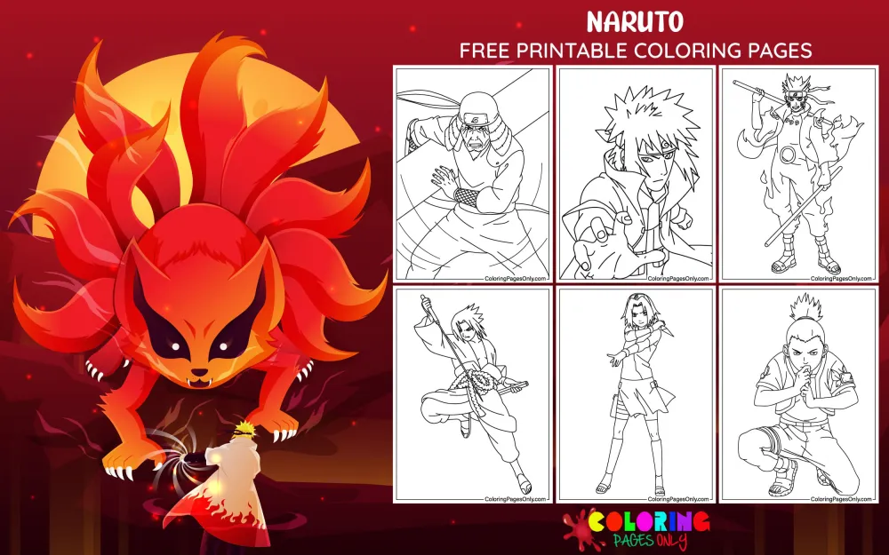
Naruto coloring pages featuring Naruto, Sasuke, Sakura, Kakashi, and the Hidden Leaf Village. Free PDF download or color online. No account required.
Naruto Uzumaki never hid in the shadows – and neither does this collection. Naruto Coloring Pages at ColoringPagesOnly.com brings together 70+ free pages spanning the full Naruto universe: individual character pages for Naruto across Part I, Shippuden, and his adult Hokage years; power form pages covering Sage Mode, Nine-Tails Chakra Mode, and Six Paths Sage Mode; character pages for Sasuke, Kakashi, Sakura, Gaara, Itachi, Jiraiya, and Might Guy; Akatsuki group scenes, battle compositions, Japanese cultural themes, and holiday variants. Download any page as a free PDF to print at home, or color online directly in your browser.
For the full cast, visit Naruto Coloring Pages. To explore more anime series, the complete Anime Coloring Pages hub connects to Demon Slayer, Dragon Ball, My Hero Academia, Attack on Titan, and 20+ other series.


-compressed")


What Is Naruto?
Naruto is a manga series created by Masashi Kishimoto, first serialized in Weekly Shonen Jump in November 1999 and running for 72 volumes until November 2014. The anime adaptation, produced by Studio Pierrot, premiered on October 3, 2002, and ran for 220 episodes. Its sequel series, Naruto: Shippuden, aired from February 2007 through March 2017 across 500 episodes. The follow-up series Boruto: Naruto Next Generations continues the story into the next generation. Together, the franchise has placed over 250 million manga copies in circulation worldwide – one of the best-selling manga series ever published.
The story follows Naruto Uzumaki, a young boy in the Hidden Leaf Village (Konohagakure) who was born with the Nine-Tailed Fox demon – Kurama – sealed inside him, a fact that caused most of the village to shun him throughout his entire childhood. His singular declaration, made in the very first chapter and repeated across hundreds of episodes, is that he will become Hokage: the village’s strongest ninja and its leader. That outsider-to-legend arc, executed with genuine emotional commitment over fifteen years of storytelling, is why the series still resonates decades after it began.
Kishimoto’s design philosophy for Naruto was built around deliberate contradiction. He made Naruto’s orange jumpsuit as bright and visible as possible – a direct inversion of the ninja tradition of concealment and stealth. Where a real shinobi would wear dark clothing to disappear, Naruto announces himself at maximum volume. That visual choice encodes his personality directly into his appearance. Sasuke’s dark navy and near-black palette works the same way in the opposite direction: cool, contained, introspective, and heavy with grief. The two central characters are having a color temperature argument before they’ve said a single word to each other.
The series is classified as shonen manga targeting teenage boys – but its actual audience has always been broader. Adults who grew up watching Shippuden through the 2000s and early 2010s remain a deeply engaged part of the fanbase through the Boruto continuation, the video game adaptations (Naruto Shippuden: Ultimate Ninja Storm series), and a merchandise market that never stopped. Naruto is one of the longest-sustained multigenerational anime fandoms in the world.
Character Guide – Canonical Colors and Design
Naruto Uzumaki – Three Canonical Eras
Naruto’s appearance changes meaningfully three times across the franchise, and each version reflects who he is at that stage of the story.
Part I (ages 12–13): The iconic orange-and-blue jacket – orange as the dominant color with blue at the collar, cuffs, and upper sleeve panels. Orange pants. A blue forehead protector bearing the Hidden Leaf Village symbol. Blue sandals. The white Uzumaki clan spiral on the left chest, and the larger red Uzumaki crest on the back. Spiky blond hair. Blue eyes. And the six whisker marks – three on each cheek – that are the single most critical detail to render accurately on any Naruto portrait page. Kishimoto placed them there so that viewers would understand at a glance, without needing context, that this kid was different from everyone around him.
Part II / Shippuden (ages 15–17): The jumpsuit grows up. Orange remains the dominant color, but the blue panels are replaced with black – black collar, black upper sleeves, black waistband. The overall effect is warmer and more serious than Part I’s brighter orange-and-blue combination. Noticeably taller. The same whisker marks, the same blue eyes, the same spiky hair – but a weight to the design that wasn’t there before.
Adult / Seventh Hokage: An orange-and-black striped jacket – vertical stripes – worn over his Hokage robes in formal settings. The orange remains the dominant visual signal, tying him back across decades to the twelve-year-old who declared he’d become the greatest ninja in the village.
Naruto’s Power Forms – Color as Canonical Information
Several pages in this collection show Naruto in different powered-up states. Each form has a specific canonical color that communicates the nature and cost of that power:
Initial Jinchuriki Form (early series): Kurama’s chakra floods outward as a red bubbling cloak over Naruto’s body. The red is a dark, intense vermilion – not orange, not pink, not cherry. His eyes shift to red with slit fox pupils. The whisker marks thicken and darken noticeably.
Nine-Tails Chakra Mode (Shippuden): A golden chakra shroud wraps Naruto’s entire body. This is a warm metallic gold – not yellow paint, not orange, but a genuine luminous gold that radiates from the skin outward. He can extend chakra arms from this form in a distinctive dark golden outline.
Sage Mode: The most visually recognizable powered-up appearance in the collection, and the one with the single most important coloring detail: the orange pigmentation around the eyes. Not a full facial mask – a toad sage marking that radiates from the eye sockets in a warm orange-brown tone. His eyes shift to amber-orange with horizontal toad-like pupils. If you’re coloring a Sage Mode page and those eye markings aren’t right, the form won’t read as Sage Mode, no matter how accurate everything else is. This is always the priority element.
Six Paths Sage Mode (peak Shippuden): The most complex form in the collection. An orange-yellow haori with ragged, flame-like edges – similar in shape to his father, Minato’s Hokage haori – over a black undergarment with six magatama markings along the neckline. His eyes become orange-red with slitted pupils. The six whisker marks thicken dramatically to resemble the ☰ trigram pattern. Two horn-like protrusions of chakra rise above his head. The chakra shroud releases energy that visually resembles flickering flames.
Baryon Mode (Boruto): A burning red-orange form – hotter and more consuming than the gold tones of earlier power states. Both Naruto and Kurama are burning their lifespans as fuel. Kurama dies after this mode is used. It is the last major power form in Naruto’s current story arc, and the one that carries the highest emotional cost of any transformation in the franchise.
Sasuke Uchiha
Jet black hair. Outfit in dark navy to near-black throughout most of the series. Every design choice pushes cool, contained, and heavy – the visual opposite of Naruto in every possible dimension.
The most important coloring detail in any Sasuke page is the Sharingan eye: red iris with three black tomoe – three comma-shaped marks arranged in a ring around the pupil within the red iris. Those three marks are what identify the three-tomoe Sharingan and separate it from every other eye technique in the franchise. The Mangekyō Sharingan that develops later has a more complex geometric pinwheel pattern specific to Sasuke’s bloodline. By the end of Shippuden, one eye shows the Rinnegan – purple with visible concentric rings, a completely different visual language from the red Sharingan.
The Curse Mark, when activated, spreads dark, branching markings from his neck down toward his arm and shoulder – dark navy or near-black against his skin, visible when he draws on its power.
Kakashi Hatake
Three elements make Kakashi instantly recognizable from a distance: silver-grey spiky hair that defies gravity, a dark face mask that covers his nose and mouth at all times, and a forehead protector worn tilted down over his left eye to conceal his Sharingan. Revealing his full face was one of the most anticipated community moments in the series’ entire run.
His standard outfit is the grey-blue-green jōnin vest – the standard flak jacket of Hidden Leaf jōnin – over a dark long-sleeved undershirt. That vest color is a specific military olive tone with a slight blue-green cast: not bright blue, not pure grey, but the muted institutional color of professional combat gear. The face mask is near-black or very dark grey. His silver hair reads as a slightly warm light grey – not white, not cool platinum.
When the Sharingan is revealed, the left eye becomes a bright red iris with three black tomoe, identical to Sasuke’s three-tomoe Sharingan, because Kakashi received it from his late teammate Obito.
Sakura Haruno
Sakura has two distinct canonical looks. In Part I, she wears a red Chinese-style qipao dress with white shorts – red as the primary color, clean and saturated. In Shippuden, her outfit shifts to a red top with white design elements, black shorts, and long boots, with her hair worn longer. Her hair color is pink: a vivid, clear medium pink rather than a desaturated pastel or a pale blush. Her eyes are green.
Gaara of the Sand
Gaara carries the most distinct color palette of any character in the main cast. His skin is extremely pale – close to paper-white, communicating at a glance that this is someone who has never slept. The dark circles under his eyes are a permanent deep grey-purple, the permanent visual consequence of the insomnia caused by his tailed beast. His hair is a sandy-red – a warm reddish-sand tone that references both his sand manipulation abilities and his name. The kanji “愛” (love) marked on his forehead appears in a dark red-brown.
His primary outfit is a dark brownish-black. The sand gourd he carries on his back is warm beige-tan. The sand he controls is colored like genuine desert sand – warm ochre and beige rather than the grey-brown of beach sand.
Itachi Uchiha and the Akatsuki
The Akatsuki cloak is one of anime’s most recognizable group visual identifiers: a black base with large stylized red cloud markings distributed across the fabric. The red of those cloud patterns is a specific deep red – not orange-red, not crimson, not scarlet. When coloring any Akatsuki group page, every member’s cloak must use the same consistent red for the cloud markings. That visual consistency is what makes the Akatsuki read as a unified organization rather than a collection of individuals who happen to dress similarly.
Itachi’s signature technique, Amaterasu, produces black flames. Rendering black flames on a coloring page requires careful edge treatment – the flame shapes need slightly brighter edge handling than the deepest blacks surrounding them, so the fire reads as fire rather than shadow.
Pain (Nagato) has styled orange-red hair and the Rinnegan: purple with concentric rings. That purple is a medium-to-dark purple – not lavender, not Sharingan red. The concentric ring pattern is what identifies it as Rinnegan and distinguishes it from every other eye technique in the series. Multiple metal piercings across his face and ears complete the look.
Might Guy
Guy’s bright green jumpsuit is the loudest color in the franchise outside of Naruto’s orange. Vivid, saturated green – not muted, not olive, not forest green. Bowl-cut black hair. And the orange leg warmers – orange against green is a complementary color pairing, and Kishimoto placed it there deliberately. The contrast is the entire visual joke and the entire visual statement at the same time. Eight Gates form: skin turning red from internal strain, steam rising off the body, and the canonical sunset sky behind him in vivid orange-red.
Jiraiya
White spiky hair with a red element – either a red headband or red stripes, depending on the specific depiction. Large red facial markings running down from his eyes. An outfit combining green and red elements, with his signature scroll accessories. The toad Fukasaku, who frequently appears with him in Sage Mode training pages, is rendered in warm brown-green with a lighter underbelly.
Coloring Tips
The orange-versus-dark contrast is the franchise’s fundamental visual rule. Before opening any character page, identify whether the subject belongs to the warm palette (Naruto, Might Guy, Rock Lee, Jiraiya) or the cool palette (Sasuke, Itachi, Akatsuki members). Every coloring decision on that page should reinforce rather than blur this distinction. On pages showing both Naruto and Sasuke together, push their color temperatures as far apart as your medium allows – Naruto’s orange as warm and vivid as possible, Sasuke’s darks as cool and deep as possible. The visual tension between them is a color temperature argument first, and a personality and narrative argument second.
For Sage Mode eye markings – precision over area. The orange pigmentation around Naruto’s eyes in Sage Mode covers a relatively small portion of the total page area, but it carries the entire meaning of the form. Apply it last, after everything else is established. Use a warm burnt-orange that’s slightly darker and more earthy than Naruto’s standard jumpsuit orange – the tone should read as a natural pigment change, not as war paint. Keep the edge between the marking and Naruto’s normal skin tone crisp rather than blended; a soft fade loses the aesthetic specificity that makes Sage Mode identifiable.
For Sharingan and Rinnegan pages – the eye is the entire subject. Any page built around a close-up of Sasuke’s Sharingan, Kakashi’s Sharingan, or Pain’s Rinnegan is a page where the eye is the composition’s focus, and everything surrounding it is context. The Sharingan needs multiple distinct visual layers: a dark outer ring, the red iris, the three black tomoe patterns in their specific arrangement, and a small white highlight at the center that gives the eye its characteristic intensity. The Rinnegan needs a clear purple base with visible concentric ring lines – without those rings, it’s just a purple eye.
For Akatsuki cloak pages – consistency is the signal. Before touching any Akatsuki member’s cloak, establish your red for the cloud pattern using one consistent color choice. Apply that exact same red to every cloak on the page. Visual consistency is what makes the Akatsuki read as an organization with a uniform, rather than a group of individuals who happen to own similar garments.
For energy technique pages – Rasengan versus Chidori: Naruto’s Rasengan is a spinning orb of blue-white chakra energy – vivid medium blue that lightens toward white at the center and the spinning edges. Sasuke’s Chidori is crackling yellow-white lightning – brighter and more electric than the Rasengan’s blue, with sharp, angular branching rather than a smooth sphere. On battle scene pages showing both techniques simultaneously, those two energy colors create their own warm-versus-cool opposition, mirroring the larger palette relationship between the two characters.
For the Japanese cultural theme pages (February 2026 batch): The kimono, Japanese garden, Mount Fuji, and festival lantern pages place Naruto in traditional Japanese settings rather than battle environments. The background elements – cherry blossoms, wooden architecture, stone lanterns, pine trees – should be rendered in the muted, classical tones of traditional Japanese woodblock print aesthetics: dusty rose for sakura, cool grey-blue for Mount Fuji’s peak, warm cream and red-orange for lanterns, deep green-grey for pine. Naruto’s orange jumpsuit against those muted, restrained backgrounds creates a deliberate contrast – the loud, contemporary, untraditional ninja standing in spaces that value understatement. That contrast is what makes these pages conceptually interesting rather than decorative.
5 Activities
The warm-versus-cool color temperature duel. Print one Naruto page and one Sasuke page from the collection. Before starting either, establish a strict rule: every element of Naruto’s composition uses only warm colors (oranges, yellows, warm reds, warm skin tones), and every element of Sasuke’s uses only cool colors (dark blues, blacks, cool greys, cool skin tones). Complete both pages following this rule without exception – even incidental background details should stay in their respective temperature range. Once both are finished, place them side by side. The result makes visible something the franchise communicates visually but rarely states explicitly: Naruto and Sasuke’s entire aesthetic relationship is a color temperature argument. Their personalities, narrative roles, and emotional arcs are all encoded in warm versus cool.
Map Naruto’s power forms as a color progression. If the collection includes pages for multiple power states, print one of each and color them in sequence: normal orange jumpsuit, Sage Mode with orange eye markings and toad pigmentation, golden Nine-Tails Chakra Mode shroud, orange-yellow Six Paths Sage Mode haori with black markings, and burning red-orange Baryon Mode. Line the completed pages up in order. The sequence makes the franchise’s power escalation visible as a physical color progression – and shows how each form has its own distinct color signature that communicates both the nature and the cost of that power level.
The Akatsuki cloak technical rendering study. Print any Akatsuki group page. The challenge is rendering the black cloak with red cloud markings so that it reads as three-dimensional fabric with natural drape, rather than a flat black surface with red shapes applied on top. The technique: apply the black base across the entire cloak in two value layers – slightly lighter at surfaces that face directly toward the viewer, deeper at the folds and shadow areas. Then apply the red cloud pattern over this value-varied black, subtly reducing the red’s intensity where it crosses into the darker fold areas. The finished result should suggest real cloth hanging and folding rather than a costume drawn flat.
Whisker marks as a visual storytelling study. Print two Naruto portrait pages – one showing him in a calm or normal state, and one showing a power form or emotionally heightened moment. Color both in their accurate canonical palettes and compare specifically the whisker marks. In the normal state: three relatively thin, evenly spaced lines per cheek. In power or emotional states: the marks thicken, darken, and grow slightly longer. That physical change – which Kishimoto deliberately built into the character design as a visual indicator of Kurama’s chakra influence – is one of the most compact pieces of character storytelling in the series. The same face communicates meaningfully different information depending on the rendering of six small marks.
Design a new Hidden Village visual identity. The Naruto franchise builds each of its five major villages around a distinct visual palette and elemental identity: Konohagakure (Hidden Leaf) – greens and browns, forest environment; Sunagakure (Hidden Sand) – tan and ochre, desert; Kirigakure (Hidden Mist) – grey-blue, coastal; Kumogakure (Hidden Cloud) – white and grey, mountain peaks; Iwagakure (Hidden Stone) – brown-grey, rocky terrain. On a blank page, design a new Hidden Village: name it, define its geographic environment and primary element affinity, and establish a color palette for its standard shinobi uniform. Then design a single shinobi character for that village – hair, outfit, headband variant, and one signature technique – following the franchise’s convention that a character’s color palette should reflect both their village identity and their individual personality. This is the full character design workflow that Kishimoto applies to every major Naruto character, and working through it directly reveals how much intentional visual thinking underlies what appears to be a very large cast of distinct individuals.
