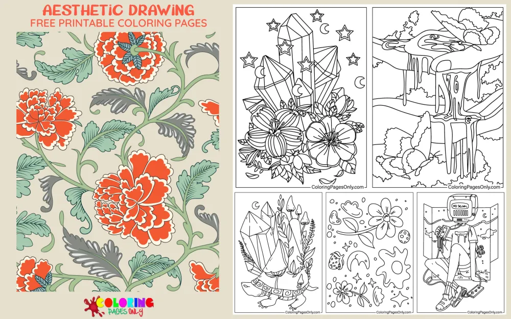
Free aesthetic drawing coloring pages: 50+ pages featuring cottagecore botanical arrangements with mushrooms and wildflowers, celestial compositions with moon phases and constellation maps, lo-fi cozy study scenes with candles and open books, dark academia library imagery, soft pastel dreamscapes with clouds and stars, coquette-style designs with bows and roses, goblincore forest floor arrangements with crystals and moss, vintage object compositions with cameras and letters, Art Nouveau-inspired flowing botanical borders, and the full visual vocabulary of contemporary aesthetic visual culture as it has developed across social media since the early 2010s. All free, printable PDF and online coloring for teens and adults.
The word “aesthetic” in its contemporary online usage derives from a philosophical tradition stretching back to Alexander Gottlieb Baumgarten’s 1750 text Aesthetica, which established aesthetics as a formal philosophical discipline concerned with the nature of beauty and sensory experience. Immanuel Kant’s Critique of Judgment (1790) further developed aesthetic theory as an inquiry into how human experience generates judgments of beauty. In the centuries between Kant’s treatise and the present day, aesthetics as a formal discipline was largely the domain of philosophy departments and art criticism.
The colloquial contemporary usage of “aesthetic” as a noun describing a specific mood-defined visual style emerged primarily from Tumblr culture between approximately 2010 and 2017, where users created image collections and mood boards organized around specific visual and emotional registers rather than around subject matter. A collection of images sharing soft, muted colors, botanical elements, and scenes of rural domestic life formed a “cottagecore aesthetic.” A collection sharing deep warm browns, gothic architecture, candlelight, and old books formed a “dark academia aesthetic.” These aesthetic categories spread through Pinterest, Instagram, and TikTok and became one of the primary organizational frameworks through which teenagers and young adults communicate personal identity and visual preference.
Aesthetic drawing coloring pages translate this visual tradition into coloring format: not single characters or scenes but compositions organized around a consistent mood, color family, and selection of symbolically loaded objects that together produce a specific emotional atmosphere.
These 50+ free pages at ColoringPagesOnly.com cover the major aesthetic categories in coloring form. All free, PDF or PNG, print or color online.


What’s Inside
Cottagecore Aesthetic Pages
Cottagecore is a visual and lifestyle aesthetic centered on an idealized version of rural, pastoral, domestic life: cottage dwellings with overgrown gardens, wildflower meadows, mushrooms in dewy morning grass, herb bundles drying in rafters, bees on clover, and the soft, warm palette of sunlight through linen curtains. The aesthetic emerged on Tumblr in the late 2010s. It reached peak mainstream cultural visibility during 2020 and 2021, when large numbers of people under pandemic lockdown conditions found the imagery of unhurried rural life particularly resonant.
Botanically, cottagecore pages draw on a specific selection of plants that carry particular connotations: wildflowers (daisies, clover, poppies, chamomile) rather than cultivated hothouse varieties, edible mushrooms and toadstools with their specific rounded cap-and-stem silhouette, ferns and mosses suggesting damp woodland environments, and cottage garden flowers (roses climbing walls, hollyhocks, sweet peas) that suggest a domestic garden allowed to grow in a less controlled way than formal garden design.
The mushroom, specifically, has become one of the central visual symbols of the cottagecore aesthetic: the Amanita muscaria (the red-capped, white-spotted toadstool of fairy-tale illustration) appears with particular frequency, valued for both its visual distinctiveness and its associations with woodland magic.
Coloring cottagecore pages: The palette is warm, slightly muted, and naturalistic. Wildflowers use fully saturated but not overly vivid colors: warm yellow for buttercups and chamomile centers, soft pink for clover and wild rose, and white with a warm cream undertone for daisies. Mushroom caps range from warm tan-brown (for common field mushrooms) to vivid red with white spots (for the iconic Amanita muscaria style). Foliage and stems use a range of greens: warm yellow-green for the most sunlit leaves, cooler medium green for the main foliage mass, and deeper blue-green for the shadowed areas. The overall palette should feel warm and natural, not neon or oversaturated.
Celestial and Moon Phase Pages
Celestial aesthetic pages draw on the visual vocabulary of astronomical observation as filtered through art history, tarot tradition, and contemporary social media visual culture: moon phases rendered in a series of crescents and circles across the page, constellation maps with connecting lines between stars, planets with their rings, sun faces with rays, and the specific iconography of celestial bodies in combination with botanical elements (flowers growing from moons, vines around planets).
The moon phase sequence is among the most widely tattooed and most widely searched decorative motifs of the 2010s and 2020s. The specific sequence from new moon (dark circle) through waxing crescent, first quarter, waxing gibbous, full moon, waning gibbous, last quarter, and waning crescent back to new moon represents a complete lunar cycle of approximately 29.5 days. It has become a secular visual emblem of cyclical time and natural rhythm.
Constellation pages reference the International Astronomical Union’s 88 recognized constellations, the most commonly depicted being the zodiac constellations (Orion, Scorpius, Leo, etc.) and the most visually interesting from an illustration standpoint. The lines connecting stars in constellation maps are artistic conventions rather than scientifically meaningful distances: they were defined by astronomers across many cultures to organize the night sky into recognizable patterns.
Coloring celestial pages: Deep midnight blue or near-black for the background, applied at full coverage where the page includes a sky area. Stars are small, vivid white or pale gold dots applied with the finest available tool. The moon in full phase pages uses pale warm cream-gold for the full circle, graduating slightly darker at the edges to suggest its spherical quality. Constellation lines are very thin, pale gold or silver, applied carefully between the star positions.
Dark Academia Aesthetic Pages
Dark Academia is a visual aesthetic centered on the specific atmosphere of Gothic university architecture, old libraries, candlelit study desks, and the particular mood of scholarly immersion in classic literature, philosophy, and art history. Its characteristic elements include: leather-bound books and open manuscript pages, quill pens and ink bottles, candles in candlesticks, hourglasses, globes, anatomical diagrams, wax seals, and the architectural details of Gothic stone arches and leaded windows.
The color palette is dark. Academia’s most distinctive feature: deep warm browns (leather, aged wood, parchment), dark forest green (velvet, aged brass verdigris), burgundy and deep red (wax, wine, heavy curtains), and gold (bookbinding, candlelight, gilding). The palette communicates warmth through darkness, coziness through enclosure, and seriousness through antiquity.
Dark Academia emerged as an aesthetic category on Tumblr approximately 2017-2019, drawing on visual inspiration from fictional settings including the wizarding world of Harry Potter, the elite schools of Donna Tartt’s 1992 novel The Secret History, and the architectural traditions of Oxford and Cambridge universities.
Coloring dark academia pages: Warm dark brown for wooden furniture, book covers, and architectural elements. The paper of open books is aged, warm cream rather than clean white. Candlelight, if present, creates a warm amber-gold glow at the light source, graduating outward through warm orange-gold to warm tan before reaching the surrounding darkness of the room. Any fabric elements (velvet curtains, book cloth) use the deep jewel tones of dark Academia: burgundy, forest green, or dark navy.
Lo-Fi Cozy Study Scene Pages
The lo-fi aesthetic in visual form draws primarily on the specific visual language of the “lo-fi hip hop” genre as popularized on YouTube through channels like ChilledCow (now Lofi Girl), which streams a continuous looped animation of a girl studying at a desk by a window with rain or snow visible outside, warm interior lighting, a cat nearby, and headphones in. This specific composition has become a shorthand for a specific emotional state: focused, calm, pleasantly melancholy, cozy.
Lo-fi aesthetic pages show variations of this scene: a desk with an open book, a steaming cup of tea or coffee, a plant on the windowsill, rain on the glass, soft, warm indoor light against the cool darkness of the window exterior. The scene is about a specific quality of time: the late-afternoon or early-evening study session with the specific comfort of being inside while the weather happens outside.
Coloring lo-fi pages: Warm amber-gold for interior lighting, applied as a warm cast across all indoor surfaces: the desk, the book pages, the steam from the cup, the skin of any figure present. The window exterior is cool: deep grey-blue for rain clouds or deep blue-black for evening sky. The plant on the windowsill is medium vivid green. The cup is the warmest element: apply a very vivid warm amber-orange to any visible liquid surface.
Botanical Art Nouveau Pages
Art Nouveau (New Art) was a visual art and design movement that flourished approximately 1890 to 1910 across Europe, characterized by flowing organic lines, intricate botanical motifs, stylized feminine figures with dramatically elaborate hair, and the integration of decorative and functional elements. Its most celebrated practitioners include Alphonse Mucha (1860-1939), whose poster designs defined the movement’s visual language; Gustav Klimt (1862-1918), whose painting The Kiss (1907-1908) is among the most recognized works of the period; and Aubrey Beardsley (1872-1898), whose black-and-white illustrations for publications like The Yellow Book established a more sinister register within the same organic line tradition.
Art Nouveau’s botanical elements are specific: not the accurately depicted specimens of scientific botanical illustration but highly stylized plant forms where the organic quality of growth (curling tendrils, unfurling fronds, petals in mid-opening) is emphasized and elongated into a decorative pattern.
Coloring Art Nouveau pages: Gold is the most important color in Art Nouveau-inspired pages: warm, vivid gold for decorative borders, frame elements, hair details, and jewelry. The botanical elements use deep jewel-tone colors: vivid cobalt blue for irises, deep purple for wisteria, and vivid warm red for poppies. The background sections use either the deep warm colors associated with Mucha’s characteristic gold-and-burgundy palette or the cool linear areas of Beardsley’s black-and-white tradition. Skin tones in any figure elements are pale, warm, and idealized.
Coquette Aesthetic Pages
Coquette is a visual aesthetic centered on a specifically feminine visual register: bows, pearls, roses, lace, pink and red color palette, ballet imagery, and the particular visual language of early 20th-century femininity filtered through contemporary irony and reclamation. The aesthetic draws visual inspiration from fashion photography of the 1950s and early 1960s, Lolita fashion from Japan, and the specific visual world of Lana Del Rey’s visual output from approximately 2011 onward.
Its central visual elements are: hair bows (large, often red or pink), pearl jewelry, roses, both fresh and pressed, lace details, ballet slippers and ribbons, vintage perfume bottles, and the specific pink-and-red color palette that signals femininity without the pastel softness of the kawaii aesthetic.
Coloring coquette pages: The ribbon and bow elements use vivid red or deep rose-pink at full saturation, the most vivid warm color in the composition. Pearl elements are warm off-white with a very subtle grey-blue on the shadow side of each pearl. Roses use the full range from pale blush pink through vivid warm red. The background and surrounding elements use a pale, slightly warm pink or cream as the base tone.
What These Pages Do
The aesthetic movement in contemporary visual culture, whatever philosophical purists might make of its distance from Baumgarten and Kant’s original uses of the term, represents a genuine and significant development in how teenagers and young adults communicate and process identity, preference, and emotional experience. Organizing images into aesthetics is a form of curatorial self-expression: the selection of a “cottagecore aesthetic” or a “dark academia aesthetic” is a statement about the emotional register in which a person wants to inhabit their interior life. Aesthetic drawing coloring pages translate this curatorial impulse into a hands-on creative activity.
The meditative quality of detailed aesthetic drawing pages, with their complex botanical patterns, intricate celestial arrangements, and elaborate decorative borders, is directly supported by the documented research on structured coloring. The 2005 Art Therapy Journal study on structured coloring and anxiety reduction found measurable calming effects from focused coloring activity in both adolescents and adults. Aesthetic pages, designed specifically to evoke calm, coziness, or reflective mood states, amplify this effect through the emotional associations of their visual elements.
The American Academy of Pediatrics identifies fine motor skill development as a key childhood milestone throughout early childhood. The intricate linework of Art Nouveau-inspired borders, the precise star positioning of constellation maps, the individual petal rendering of botanical arrangements, and the detailed layering of cottagecore compositions all provide sustained fine motor challenge calibrated to the older audience these pages primarily serve.
Aesthetic drawing pages are also the collection most explicitly connected to social media sharing culture. The finished pages are designed, essentially, to photograph well: their carefully balanced compositions, their mood-specific color palettes, and their intrinsic connection to widely shared visual aesthetics make them natural subjects for social media documentation. Sharing a finished cottagecore mushroom page on Pinterest or Instagram is a continuation of the same aesthetic curation that the aesthetic movement began on Tumblr.
How to Color These Pages Well
Choose the full palette for the specific aesthetic before beginning and commit to it. The single most important decision in coloring an aesthetic page is the palette selection. Each aesthetic has a specific color family: cottagecore uses warm naturalistic tones with soft greens and warm earth colors; dark Academia uses deep browns, dark greens, and burgundy; lo-fi uses warm amber interior light against cool blue-grey exterior; celestial uses midnight blue and gold; coquette uses vivid reds and pinks with off-white. Select all the colors needed for the full composition before applying any color to the page. Inconsistent palette choices break the aesthetic’s emotional coherence.
Muted tones rather than vivid primary colors serve most aesthetic styles better. With the exception of coquette (which benefits from vivid reds and pinks) and celestial (which uses vivid gold against deep navy), most aesthetic styles use tones that are either slightly desaturated, slightly darkened from their fully vivid version, or slightly warmed from their pure hue. Cottagecore browns are warm rather than cool. Dark academia greens are deep and slightly grey-shifted rather than bright and vivid. Lo-fi light is amber rather than pure yellow. Slightly reduce the saturation of all colors by applying at slightly lower pressure than maximum.
Background tone sets the entire aesthetic before any detailed element is colored. In celestial pages, the midnight blue background is the first and most important color decision: it determines how every other element reads in relation to it. In dark academia pages, the warm dark brown of the background surfaces establishes the warmth that makes the candlelight meaningful. In cottagecore pages, the warm cream or pale green of the background establishes the soft, naturalistic atmosphere. Always color the background first, then work the detailed foreground elements into the established atmosphere.
Gold is the most important accent color across multiple aesthetic styles. Art Nouveau uses gold for decorative elements and borders. Celestial pages use gold for stars and the moon. Dark Academia uses gold for candlelight, book gilding, and brass details. Cottagecore uses gold for honey, autumn leaves, and warm sunlight details. Keep the most vivid warm gold available reserved specifically for these gold accent applications rather than using it as a general warm color. The gold accent reads as meaningful and precious only when it is the warmest, most vivid element in the composition.
Soft blending at transitions between adjacent color areas creates the dreamy quality many aesthetics require. The cottagecore, lo-fi, and soft pastel aesthetic styles specifically benefit from gentle transitions between adjacent color zones rather than hard-edged outlines. Where two color areas meet, apply a small amount of the lighter color over the edge of the darker color at minimum pressure, creating a soft gradient. This technique is most effective with colored pencils, where the blending can be done directly on the page. The result reads as the specific, softly lit quality that distinguishes aesthetic drawings from harder-edged illustration styles.
5 Creative Craft Ideas
The Personal Aesthetic Board
Pinterest and Instagram “aesthetic boards” organize images around a specific mood and visual identity. Print five or six pages from the collection that share a consistent aesthetic register (five cottagecore pages, or five dark academia pages, or five celestial pages). Color all using the same carefully chosen palette.
Mount all five or six completed pages on a large backing sheet in an overlapping, collage-like arrangement, not in a grid. The arrangement should feel curated rather than organized. Add small handwritten labels for the aesthetic: “Cottagecore: warmth, nature, slowness, wildflowers, mushrooms, bees.” or “Dark Academia: books, candlelight, stone arches, Latin, autumn, the specific smell of old libraries.”
The finished display is a physical aesthetic board.
The Season-to-Aesthetic Translation
Each of the four seasons maps consistently to specific aesthetic registers. Spring: cottagecore (new growth, wildflowers, soft warmth). Summer: coastal grandmother/coquette (bright light, bold colors, roses in full bloom). Autumn: dark academia (fallen leaves, warm interiors, candles against early darkness). Winter: hygge/lo-fi (snow outside, warm light inside, blankets and books).
Print one page representing each seasonal aesthetic. Color spring in a warm, naturalistic cottagecore palette. Color summer in the vivid warmer tones of the coquette palette. Color autumn in deep dark academia browns and burgundy. Color winter in cool blue-grey exterior against warm amber interior light.
Mount all four in seasonal sequence: “Four seasons. Four aesthetics. One color logic.”
The Aesthetic Origin Study
The word “aesthetic” as a colloquial noun meaning a specific visual style derives from the philosophical term established in Alexander Baumgarten’s 1750 Aesthetica and developed by Immanuel Kant in the 1790 Critique of Judgment. These texts treated aesthetics as the philosophy of how human beings form judgments of beauty and sensory experience.
Print a dark academia page (books, candle, old architecture): the aesthetic most directly referencing the academic tradition. Color in the full dark academia palette: deep warm brown, forest green, burgundy, and gold candlelight.
On the backing card: “Aesthetica. Alexander Baumgarten. 1750. The first formal philosophical text on the nature of beauty and sensory experience. Critique of Judgment. Immanuel Kant. 1790. Further development of aesthetic theory as a philosophy of judgment. Social media aesthetics. Tumblr. 2010-2017. The colloquial use of the same word to describe a specific visual style or mood. Distance between 1750 and 2017: 267 years. Same word. Very different applications.”
The Mood Color Palette Card
Each aesthetic operates within a specific color family that defines its emotional register. Print one page from each of four different aesthetic categories. Before coloring, create a small palette card for each: actual swatches of the five to seven colors that define that aesthetic.
For cottagecore: warm tan, soft rose pink, warm yellow-green, medium forest green, warm cream, mushroom brown. For dark Academia: deep warm brown, forest green, burgundy, aged cream, warm gold. For celestial: midnight navy, pale gold, warm cream, silver-grey, deep purple. For coquette: vivid red, deep rose, off-white pearl, soft blush pink, warm black.
Color each page using only the colors defined in its palette card. Mount each page beside its palette card.
The Aesthetic Portrait
Several aesthetic drawing pages include human figure elements: a girl’s portrait surrounded by botanical elements, a silhouette against a celestial background, and a figure in a study scene. Print the most portrait-adjacent page in the collection.
Before coloring, decide which aesthetic register the figure inhabits, and use that decision to determine every color choice: cottagecore figures wear warm earth-tone clothing with floral details; dark academia figures wear deep jewel tones and structured clothing; lo-fi figures are shown in warm interior light with soft, casual clothing; coquette figures wear pink and red with bow details.
The figure’s setting, clothing, and palette should create a unified aesthetic statement. On the backing card: the aesthetic name and its five defining visual elements.
Frequently Asked Questions
What does “aesthetic” mean in the context of these coloring pages? In the context of coloring pages and contemporary social media culture, “aesthetic” functions as a noun describing a specific visual style organized around a consistent mood, color palette, and selection of symbolically associated objects. An “aesthetic” in this sense is not a single image but a recognizable visual language: cottagecore is the aesthetic of soft pastoral imagery with wildflowers, mushrooms, and warm earth tones; dark Academia is the aesthetic of old books, candlelight, and Gothic architecture in deep warm browns and burgundy; celestial is the aesthetic of moon phases, constellations, and stars in midnight blue and gold. The term derives from the philosophical tradition of aesthetics established by Alexander Baumgarten’s Aesthetica (1750) and Immanuel Kant’s Critique of Judgment (1790). However, its colloquial current usage emerged from Tumblr culture between approximately 2010 and 2017.
What are the most popular aesthetic styles represented in these pages? The major aesthetic styles in contemporary visual culture that appear in coloring page form include cottagecore (pastoral, botanical, mushrooms and wildflowers, warm naturalistic palette), dark academia (old books, candlelight, Gothic architecture, deep warm browns and burgundy), celestial or moon aesthetic (moon phases, constellations, stars, midnight blue and gold), lo-fi cozy (warm indoor study scenes, rain on windows, soft amber interior light), coquette (bows, roses, pearls, vivid pink and red palette), goblincore (forest floor elements, crystals, mushrooms, earthy greens and browns), and Art Nouveau-inspired botanical (flowing organic lines, stylized plant forms, decorative gold borders). Each style has a specific and consistent color palette that is as important to the aesthetic’s identity as its subject matter.
What is cottagecore, and when did it emerge? Cottagecore is a visual and lifestyle aesthetic centered on an idealized version of rural, pastoral domestic life: cottage dwellings, wildflower meadows, mushrooms in woodland settings, herb bundles, bees on clover, and the warm palette of sunlight through linen and cotton. The aesthetic emerged on Tumblr and Instagram in the late2010s0. I reached peak mainstream cultural visibility during 2020 and 2021, when pandemic lockdown conditions made imagery of unhurried, nature-connected rural life particularly resonant for large numbers of urban and suburban people. Its central visual symbols include the Amanita muscaria mushroom (the red-capped, white-spotted toadstool of fairy-tale illustration), wildflowers including chamomile, clover, and daisies, and cottage garden roses and climbing plants.
What is dark Academia, and what visual elements define it? Dark Academia is a visual aesthetic centered on the specific atmosphere of Gothic university architecture, old libraries, candlelit study environments, and immersion in classic literature, philosophy, and art history. Its defining visual elements include leather-bound books, open manuscript pages, quill pens and ink bottles, candles in candlesticks, hourglasses, anatomical diagrams, globes, wax seals, and the architectural details of Gothic stone buildings with leaded windows. Its color palette is its most distinctive feature: deep warm browns, dark forest green, burgundy and deep red, and gold for candlelight and gilded details. The aesthetic emerged on Tumblr approximately 2017-2019, drawing visual inspiration from fictional settings including the wizarding world of Harry Potter, the elite schools of Donna Tartt’s 1992 novel The Secret History, and the architecture of Oxford and Cambridge universities.
How is the lo-fi aesthetic connected to lo-fi music? The lo-fi visual aesthetic in coloring pages draws primarily on the specific visual language of lo-fi hip hop music as popularized through YouTube channels, most notably ChilledCow (now Lofi Girl), which has streamed a continuously looped animation of a girl studying at a desk by a window since approximately 2017. The animation shows warm interior light, a cat nearby, rain or snow outside, books, plants, and headphones, and has accumulated billions of views. The specific composition became a visual shorthand for a particular emotional state: calm, focused, pleasantly melancholy, cozy. Lo-fi music itself is characterized by a warm, slightly rough sound quality that deliberately includes the technical “imperfections” of vintage recording equipment (vinyl crackle, tape hiss), creating an intimate, nostalgic listening experience. The visual and musical aesthetics share the same emotional register.
What is Art Nouveau, and how does it appear in aesthetic drawing pages? Art Nouveau (New Art) was a European visual art and design movement that flourished approximately 1890 to 1910, characterized by flowing organic lines derived from botanical forms, intricate decorative borders, stylized figures with elaborately detailed hair, and the integration of decorative and functional elements across architecture, poster design, and illustration. Its most celebrated practitioners include Alphonse Mucha (1860-1939), whose advertising posters defined the movement’s visual language, and Gustav Klimt (1862-1918), whose paintings, including The Kiss (1907-1908), represent the movement’s most widely recognized works. In aesthetic drawing coloring pages, Art Nouveau appears as the visual template for pages featuring flowing botanical borders, stylized floral frames, and the specific combination of organic line work with gold decorative elements.
What age group are these pages best suited for? Aesthetic drawing coloring pages are primarily designed for teenagers and adults, specifically the demographic that engages most actively with aesthetic visual culture on social media platforms, including Pinterest, Instagram, and TikTok. The detailed linework of botanical arrangements, the precision required for constellation star placement, the complex palette management of multi-element dark academia compositions, and the blending techniques that give the best results on soft aesthetic pages all reward the fine motor development and sustained focused attention of colorists ages twelve and older. The pages’ connection to social media visual culture and the identity-communication dimension of aesthetic curation are most meaningful to the teenage and young adult audience for whom these aesthetics function as genuine self-expression tools. Adult coloring enthusiasts who appreciate the meditative quality of detailed work also find this collection particularly well-suited to focused, relaxing coloring sessions.
Browse the full collection at ColoringPagesOnly.com. All 50+ pages free, no sign-up, PDF or PNG, print or color online.
Alexander Baumgarten published Aesthetica in 1750. Immanuel Kant published the Critique of Judgment in 1790. Both were concerned with how human beings form judgments of beauty and sensory experience.
In 2010, Tumblr users began organizing images into “aesthetics”: collections of photographs and illustrations sharing a consistent mood, color palette, and selection of objects. The philosophical term became a social media noun. By 2020, cottagecore was the most searched aesthetic category on Pinterest. By 2023, dark Academia had accumulated billions of views on TikTok.
A mushroom on a coloring page is a mushroom. In a cottagecore coloring page, it is also an emblem of a specific relationship to time, nature, and the domestic: slow, warm, attentive to small things. The color you choose for it is not just a color. It is a small piece of aesthetic curation.
Pick up your warm earth tones for cottagecore. Pick up your deep burgundy for dark Academia. Pick up your midnight navy for the celestial pages. Pick up your vivid red for coquette.
Share your work on Facebook and Pinterest and tag #Coloringpagesonly. The personal aesthetic board displays and the season-to-aesthetic translations are particularly worth sharing.
Choose your aesthetic. Choose your palette. The mood is already on the page. The color makes it yours.


