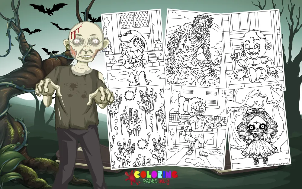
Free Horror coloring pages – 39 pages spanning the full visual vocabulary of the horror genre – classic Universal Monsters including Dracula, Frankenstein’s creature, the Mummy, and the Werewolf, haunted houses, ghosts, witches at their cauldrons, skulls and skeletons, jack-o’-lanterns, creepy clowns, zombies, atmospheric moonlit scenes, and Halloween imagery – free printable PDF and online coloring for horror fans and Halloween enthusiasts.
The horror genre has maintained its place at the center of human storytelling since humans began telling stories – because fear, as a psychological response, is one of the most reliable mechanisms for processing threat through narrative rather than through direct experience. The campfire story about what waits in the dark served the same function as Frankenstein, which served the same function as Night of the Living Dead, which serves the same function as the contemporary horror game that releases into a global market on the most significant commercial day of the horror calendar.
Mary Shelley published Frankenstein; or, The Modern Prometheus in 1818, making it one of the first modern horror novels and the first significant work to use scientific progress as the mechanism of horror – the creature is not supernatural but manufactured, which made it more threatening to a reading public just beginning to understand what science could actually produce. Bram Stoker published Dracula in 1897, establishing the vampire in its modern literary form – the Transylvanian Count, the castle, the coffin, the inability to enter without invitation, the reflection in the mirror – that all subsequent vampire fiction has engaged with, extended, or deliberately subverted.
Universal Studios produced the films that turned these literary characters into the visual archetypes the entire world recognizes: Dracula (1931) with Bela Lugosi, Frankenstein (1931) with Boris Karloff, The Mummy (1932) again with Karloff, The Wolf Man (1941) with Lon Chaney Jr. These films established not just the characters but their specific visual designs – the black cape, the green-tinted creature skin, the bandage wrapping, the partial transformation – that the coloring pages in this collection draw from directly.
These 39 free pages at ColoringPagesOnly.com span the full horror visual tradition. All free, PDF or PNG, print or color online.


What’s Inside
Classic Monsters – The Universal Legacy
The Universal Monsters are the foundational reference for Western horror’s visual vocabulary – the designs that established what a vampire, a monster, a mummy, and a werewolf look like before any other media had the opportunity to offer alternatives. Their visual specificity is the reason they remain immediately recognizable ninety years after their film debuts: the black cape and slicked hair of Dracula, the flat-topped head and neck bolts of Frankenstein’s creature, the wrapped linen of the Mummy, the partial-wolf face and tattered clothing of the Wolf Man.
Dracula – Bela Lugosi’s 1931 performance established the cape, the formal evening wear, the pale skin, and the hypnotic gaze as the vampire’s visual signature. The collar of the cape was folded up to frame the face. The widow’s peak hairline—the dark, penetrating eyes above high cheekbones. The fangs, barely visible at rest, extend when the threat is imminent.
Frankenstein’s Creature – Boris Karloff’s makeup in the 1931 film, designed by Jack Pierce, established the flat-top head, the heavy brow, the greenish-grey skin tone, the bolts at the neck (actually electrodes in the script, which became bolts in popular memory), and the stitching that indicates the creature’s patchwork origin. This design has been reproduced so extensively that many people do not know it originated in a specific makeup artist’s work for a specific film.
The Mummy – The linen-wrapped figure from ancient Egyptian funerary practice, animated by supernatural means, pursuing those who disturbed the tomb. The bandaging pattern – wrapping that covers most of the body while leaving the face partially visible – is the design’s most important element.
The Wolf Man – The partial transformation: a man still identifiably human in overall body shape, but with facial features shifted toward wolf, excessive body hair, and clawed hands. The horror of the Wolf Man is the retained humanity within the monstrous transformation, and the design captures this specifically.
Coloring classic monsters: Dracula – pale skin with a slight blue-grey shift to indicate cold, dark hair with the widow’s peak clearly defined, deep red lips (the vampire’s most consistently sinister detail), the black cape with its red or purple lining visible where it falls open. Frankenstein’s creature – grey-green skin, dark shadows in the deep-set eye sockets, the flat-top head in the same grey-green, the neck bolts in dark metallic grey. The Mummy – warm tan-grey bandaging, slightly darker in the shadow areas of the wrapping, with the skin visible between bandage gaps in a weathered darker tan.
Haunted Houses and Gothic Environments
The haunted house is horror’s most persistent architectural subject – the site where the supernatural makes its claim on the physical world. The visual language of the haunted house is well established: dark, bare trees silhouetted against a full moon, a multi-story Victorian or Gothic structure with broken windows and irregular rooflines, a wrought iron gate with a path leading to the door, the specific quality of a building that has been standing long enough to accumulate whatever it has accumulated.
The genre’s relationship with Gothic architecture is not accidental – Gothic architecture was designed to produce specific emotional responses through its scale, its pointed arches, its ribbed vaulting, and its gargoyle-populated exteriors. When the Gothic Revival of the nineteenth century produced Victorian houses built in the Gothic style, those houses inherited both the architectural vocabulary and the emotional associations. The haunted Victorian house is a direct visual consequence of that inheritance.
Coloring haunted house pages: The key is darkness – a haunted house should read as dark even when the surrounding environment provides some light. Apply the darkest available dark grey or dark blue-grey to the house’s windows (without interior light visible), the shadows under the eaves, and the shadowed sides of the architectural elements. The walls should be rendered in a cool medium grey – aged stone or wood, weathered to neutrality. The moon, if visible, should be the page’s brightest element – a warm, near-white that creates a specific contrast against the cool-dark house.
Witches – Cauldron and Broomstick
The witch is one of the oldest horror archetypes – present in folklore across virtually every culture, with the specific visual that most Western audiences recognize – the pointed black hat, the long dark dress, the hooked nose, the gnarled hands, the broomstick – settled into its current form through the accumulated visual tradition of fairy tale illustration, Halloween decoration, and the specific Western European folk belief that formed its foundation.
The cauldron is the witch’s most functionally important prop – the site of transformation, of preparation, of magic made material through a specific process of adding ingredients and applying heat. Pages showing a witch at her cauldron are the genre’s most process-focused images: the witch is not just threatening but actively working, which is the specific horror of the witch archetype – not that she is dangerous but that she is capable.
Coloring witch pages: The black hat should be fully saturated black – the definitive black of the Halloween visual vocabulary. The dress is similarly black, but shadow areas should be rendered in the deepest available dark to prevent the silhouette from reading as flat. The skin tone varies by depiction – green-tinted skin is the contemporary convention for the Halloween witch, while the older folklore illustrations show more naturalistic skin with emphasis on age indicators (wrinkles, hollow cheeks). The cauldron is dark grey metallic, and its contents – if the potion is visible – should be rendered in vivid green, purple, or any color that reads as supernatural.
Skulls and Skeleton Pages
The skull is the most universal of all horror imagery – present across cultures as the symbol of death, the reminder of mortality. The Day of the Dead (Día de los Muertos) tradition in Mexican culture uses the skull in a different register – decorated, colorful, celebratory rather than threatening – which gives the skull coloring pages a specific range of tonal possibilities. The horror skull is dark, empty-socketed, and anatomically accurate. The Day of the Dead skull is vivid, decorated, and a vehicle for personal and cultural expression.
Both registers appear in collections of this kind, and both reward different coloring approaches.
Coloring skull pages: For horror-register skulls, white or off-white bone as the primary surface tone. The eye sockets should be near-black – the darkest available dark in the eye area gives the skull the empty, void quality that makes it threatening. The nasal cavity is similarly dark. Zygomatic arches and teeth were rendered with careful attention to their actual form. For Day of the Dead skulls: the bone base receives any color the colorist chooses, and the traditional decorative elements – floral patterns, swirling designs, geometric borders – are applied in vivid, fully saturated contrasting colors.
Ghosts and Apparitions
The ghost is the oldest human fear in visual form – the image of death as a visible presence, the person who should be gone remaining in a recognizable if altered form. The visual language of the ghost ranges from the classic white-sheeted form (which is itself a simplified reference to the burial shroud) through the transparent, slightly luminous apparition of contemporary horror to the more complex spirit forms of specific horror properties.
The ghost’s specific visual challenge – depicting something that is not quite present, not quite solid, not quite part of the same physical world as the objects around it – is the most technically interesting coloring problem in the collection.
Coloring ghost pages: Two approaches: the classic Halloween ghost (white sheet with oval eye holes) should be rendered in pure white with very subtle cool blue-grey in the shadow areas – the sheet’s fabric has very little weight and falls in simple folds. The apparition ghost should be rendered with the same base color treatment but with deliberate underfilling – apply the ghost color at 60-70% of the pressure you would use for a solid figure, so the lines of the page show through slightly. This creates the transparency effect on paper that the apparition’s visual quality requires.
Jack-o’-Lanterns and Halloween Symbols
The jack-o’-lantern – a carved pumpkin illuminated from within – is Halloween’s most specific visual symbol, and one of the most vivid coloring subjects in the collection: the warm orange exterior of the pumpkin, the warm yellow-orange light visible through the carved features, and the specific quality of a face carved into vegetable matter that reads as simultaneously threatening and celebratory.
Other Halloween symbol pages – bats, black cats, spiders, spider webs – provide the collection’s most atmospheric decorative content.
Coloring jack-o’-lanterns: The exterior pumpkin is a specific warm orange – not red-orange, not yellow-orange, but the precise medium-warm orange of a ripe pumpkin. The carved features (eyes, nose, mouth) should be rendered in the warm yellow-orange of firelight visible through them rather than as black voids – the interior candle light gives these openings their characteristic glow. Apply the warm yellow-orange first inside the feature shapes, then a slightly cooler orange at the outer edges of each feature where the pumpkin wall meets the carved opening.
What These Pages Do
Horror is one of the oldest and most persistent storytelling genres in human culture because it processes fear through narrative distance. The psychological function of horror – experiencing the emotion of fear in a controlled context where the actual threat is fictional – is well documented. The 2005 Art Therapy Journal study on structured coloring and anxiety reduction applies with particular directness to horror-themed coloring: the focused, sustained attention required to render a haunted house or a classic monster produces the calm absorption the research identifies, within a subject matter that engages the emotional dimension that horror is designed to activate.
The Universal Monsters are one of the twentieth century’s most documented examples of character design becoming cultural vocabulary. The images created by makeup artist Jack Pierce for Boris Karloff in 1931 are now so deeply embedded in Western visual culture that most people have never thought about their origin – they simply are what Frankenstein’s creature looks like, as if the design preceded the film rather than being invented for it. Coloring these images is engaging directly with that inherited visual vocabulary.
The horror genre’s seasonal association with Halloween is one of the most consistent cultural rhythms in the Western calendar. The 31 days of October are now specifically the month of horror – a commercial, cultural, and decorative reality that makes the 39 pages in this collection specifically relevant across the fall season and throughout the year for horror fans who do not confine their engagement to October.
Fine motor development. The American Academy of Pediatrics identifies fine motor skill development as a key childhood milestone throughout early childhood. The wrapping detail of mummy pages, the architectural complexity of haunted house pages, the decorative detail of Day of the Dead skull pages, and the carved feature precision of jack-o’-lantern pages all provide motivated, sustained fine motor practice for the older children and adults who are this collection’s primary audience.
How to Color These Pages Well
Darkness is the primary tool – the most important color in a horror palette is the darkest available. Horror imagery communicates through contrast: the ghost reads as present because the background is darker than the ghost. The skull reads as threatening because the eye sockets are darker than the bone. The haunted house reads as sinister because its windows are darker than the moonlit sky. Before applying any other color to a horror page, decide where the darkest areas should be and commit to applying the darkest available tone there at maximum pressure.
Cool blues and grey purples create the horror atmosphere. The emotional quality of horror imagery is communicated primarily through color temperature – cool colors (blue-grey, grey-purple, cool green) produce the atmospheric unease that warm colors do not. When choosing between two possible color options for any background or atmospheric element, the cooler option is almost always the more horror-appropriate choice.
The monster skin tones are specific and should be learned. Vampire skin: cold, blue-green, and white. Frankenstein’s creature: grey-green – a cold, slightly sickly green-grey rather than a warm green. The Wolf Man: warm grey-brown with the natural undertones of an animal coat. The Mummy: warm tan-grey with a slight dusty quality. Each of these specific tones communicates “this is what this creature looks like” to an audience that has seen these designs reproduced thousands of times. Departing from them significantly reads as incorrect.
Interior light sources (candles, potions, moonlight) should be the warmest elements. In the otherwise cool horror palette, the specific warmth of a lit candle, a glowing cauldron, or moonlight through a window provides crucial visual contrast. Apply warm yellow or warm orange-yellow to any interior light source, and let that warmth spread outward to nearby surfaces in a gradual gradient that communicates the light’s natural behavior. The warmth of these light sources against the cool horror palette creates the visual drama that horror images depend on.
Transparency on ghost pages is achieved through pressure control, not through special materials. On any ghost or apparition page, render the ghost figure at approximately 60-70% of the pressure you would use for a solid figure of the same size. The lines of the printed page should remain partially visible through the color application. This controlled under-application of color produces the visual quality of a figure that is present but not fully material – the ghost’s essential visual characteristic.
5 Creative Craft Ideas
Monster Lineup – The Universal Gallery
Print one page for each classic Universal Monster: Dracula, Frankenstein’s creature, the Mummy, and the Wolf Man. Color all four in canonical monster palettes – the specific grey-green of the creature, the warm tan-grey of the Mummy, the pale blue-white of Dracula, the warm brown-grey of the Wolf Man.
Mount all four in a row on a dark backing sheet, gallery-style. Add at the top: “Universal Monsters – Est. 1931.” Below each character: the character name and the year of their Universal Studios film debut. The finished display is a fan tribute to the specific films and specific performances that established horror’s most enduring visual vocabulary.

The Haunted House at Different Hours
Print three copies of the same haunted house page. Color the first in deep midnight blues and near-blacks – the house at the darkest hour, no moon visible, the house itself the only visible silhouette. Color the second with a bright full moon illuminating the scene – warm near-white moon against a dark blue-purple sky, the house in cold grey lit from one side. Color the third in the specific orange and purple of the Halloween dusk – the last light of an October evening.
Mount all three in sequence. Add: “Dusk,” “Midnight,” “Dawn.” The display shows how color temperature and ambient light change the same composition – and how the horror genre uses those same tools deliberately.

Day of the Dead vs. Horror – The Skull Comparison
Print two skull pages. Color the first in the horror register: white-grey bone, near-black eye sockets and nasal cavity, the cold clinical treatment of a threatening memento mori. Color the second in the Day of the Dead register: a base color of the colorist’s choice, decorated with floral patterns (drawn in by hand), geometric borders, swirling designs, vivid saturated colors.
Mount both side by side: “La Calavera – Día de los Muertos” on the left, “Memento Mori – Horror” on the right. Below: “The same form. Two entirely different relationships with death. One mourns. One celebrates. Both are correct.”
The display makes a genuine cultural comparison using two coloring treatments of the same basic image.

The Jack-o’-Lantern Personality Collection
Print five copies of the same pumpkin page (or five different carved pumpkin pages). Color all five exteriors in the same warm orange, but give each carved face a different personality through the expression: terrifying, silly, surprised, melancholy, cheerful.
The key is that the same carved-out shapes can suggest different emotions through their relationships to each other – the angle of the carved eyebrow lines, whether the mouth curves up or down, and whether the eye shapes are angular or rounded. Use the warm yellow-orange interior light treatment for all five, but let the personality of each face’s expression be the differentiating element.
Mount all five in a row with the personality label below each. The finished display demonstrates that a jack-o’-lantern’s identity is determined by the face carved into it – a design lesson in how line direction communicates emotion.

Horror Palette Study
This craft is specifically about understanding the color choices that create a horror atmosphere. Print five identical copies of a simple ghost page – the simplest, most neutral ghost shape in the collection. Color each copy with a completely different color scheme:
Version 1: Green-based horror palette (sickly greens, dark olive background). Version 2: Classic Halloween orange and black. Version 3: Cool blue-purple moonlit palette. Version 4: Warm red-orange (the palette of danger). Version 5: Neutral grey-scale (no color at all – black, white, and greys only).
Mount all five side by side. The display demonstrates how the same image reads as differently threatening or differently atmospheric across different color choices – the horror genre’s most fundamental tool made visible.

Frequently Asked Questions
What is the horror genre, and how old is it? The horror genre – storytelling whose primary purpose is the controlled experience of fear – is as old as human storytelling itself. The oral tradition of ghost stories, monster warnings, and tales of the supernatural predates written literature by centuries. In written form, the Gothic novel of the late eighteenth century is the direct ancestor of modern horror fiction: Horace Walpole’s The Castle of Otranto (1764) is often cited as the first Gothic novel, and Mary Shelley’s Frankenstein (1818) is generally recognized as the first modern horror novel. The first horror film is typically dated to Georges Méliès’s Le Manoir du Diable (1896). The genre has maintained a continuous cultural presence across every medium since.
What are the Universal Monsters, and why are they significant? The Universal Monsters are a group of horror film characters produced by Universal Studios during the 1920s through the 1950s, whose visual designs established the archetypes that continue to define monster imagery in Western culture. The key films include Dracula (1931, Bela Lugosi), Frankenstein (1931, Boris Karloff), The Mummy (1932, Boris Karloff), The Invisible Man (1933), The Bride of Frankenstein (1935), The Wolf Man (1941, Lon Chaney Jr.), and Creature from the Black Lagoon (1954). The makeup designs – most notably Jack Pierce’s work for Boris Karloff – established what these creatures look like so definitively that subsequent productions have spent decades either following or deliberately departing from those original designs.
Where does the vampire archetype come from? The vampire as a literary figure was established primarily by Bram Stoker’s novel Dracula, published in 1897. Stoker drew on Eastern European folklore traditions – the nosferatu, the strigoi, the vrykolakas – combined them with the historical figure of Vlad III of Wallachia (known as Vlad the Impaler, c.1428-1477, whose father carried the surname Dracul), and added the specific details – the Transylvanian castle, the inability to cross running water, the requirement of invitation to enter a home, the reflection in mirrors, the stake through the heart – that have defined the vampire’s rules in popular culture ever since. The visual design of the vampire (the black cape, the widow’s peak, the pale skin, the fangs) was significantly shaped by Bela Lugosi’s performance in the 1931 Universal film.
What is the jack-o’-lantern’s origin? The jack-o’-lantern tradition originates in the British Isles – primarily Ireland and Scotland – where the Celtic festival of Samhain (October 31 to November 1) involved the carving of turnips, beets, and potatoes into lanterns to ward off evil spirits during the night when the boundary between the living and the dead was believed to be most permeable. Irish and Scottish immigrants to North America in the nineteenth century encountered the pumpkin – a much larger, easier-to-carve vegetable – and the carved pumpkin became the standard by the mid-nineteenth century. The name “jack-o’-lantern” derives from the Irish legend of “Stingy Jack,” a trickster who was denied entry to both heaven and hell and was condemned to wander with only a carved turnip lantern to light his way.
What age group are horror coloring pages appropriate for? Horror coloring pages are most appropriate for older children, teenagers, and adults. The specific content within any horror collection varies significantly – classical monsters and Halloween symbols (witches, jack-o’-lanterns, ghosts) are generally appropriate for children who enjoy mild spooky content and do not have significant anxiety about horror themes. More intense imagery – detailed skull work, darker monster designs, horror atmosphere pages – is most appropriate for ages ten and up. The collection at ColoringPagesOnly.com contains pages across this range. Parents should preview pages before printing for younger children, as some pages may include imagery that is more intense than others. Horror content that any child finds distressing should be set aside; the goal of the activity is enjoyment and creative engagement, not exposure.
Is the horror genre psychologically beneficial? Research on the psychology of horror has produced some consistent findings. Experiencing controlled fear through fiction – the mechanism of horror storytelling – allows emotional processing and anxiety rehearsal in a context where the actual threat is fictional, and the experience can be controlled by the participant (by closing the book, looking away from the screen, or choosing not to continue). Dr. Margee Kerr, a sociologist who studies fear, has documented that horror experiences can produce positive emotional states in willing participants through the neurological processing of the fear-then-safety sequence. The 2005 Art Therapy Journal study on structured coloring and anxiety reduction applies within this context: the focused, sustained creative engagement of horror-themed coloring combines the genre’s emotional activation with the calming mechanism of structured artistic activity.
Browse the full collection at ColoringPagesOnly.com. All 39 pages free, no sign-up, PDF or PNG, print or color online.
Mary Shelley wrote Frankenstein in 1818 and gave the horror genre its first modern masterwork – a story about a creature made from death, given life without consent, abandoned by its creator, and left to understand its own existence without help or precedent. The creature is the most sympathetic character in the novel.
Boris Karloff wore Jack Pierce’s makeup in 1931 and gave the same creature its face. That face has been reproduced so many times that most people don’t know where it came from.
The darkness of the eye sockets is the most important thing. Everything else follows from there.
Pick up your grey-green. The flat-top head comes first. Make the bolts as dark as metal. The eye sockets are the darkest point in the composition.
Share your work on Facebook and Pinterest and tag #Coloringpagesonly. We especially want to see the Monster Lineup galleries and the horror palette studies.
Color the dark. Render the eye sockets as black as you can make them. The monster has always been there. You’re just giving it color.
