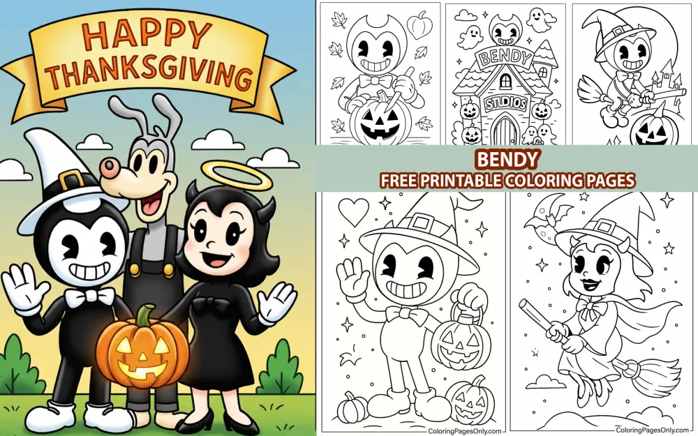
Free Bendy coloring pages – 90+ pages featuring Bendy the Dancing Demon, Boris the Wolf, Alice Angel, Twisted Alice, Sammy Lawrence, the Ink Demon, the Joey Drew Studios environments, action scenes, cute and horror-mode character variants, and pages from both Bendy and the Ink Machine and Bendy and the Dark Revival – free printable PDF and online coloring for fans of the ink-soaked horror game series.
Bendy and the Ink Machine began as an indie horror adventure game developed by Meatly (Mike Mood) and Bookpast at Joey Drew Studios – the real development studio – first released episodically beginning February 10, 2017, with the complete five-chapter experience arriving October 26, 2018. Its premise occupies a specific and previously unexplored intersection: the visual language of 1930s rubber hose animation – the pre-Disney era of cartoons, when characters were all curves and impossible elasticity, black and white on film, with the specific warmth of something made by hand before mechanical reproduction became precise – placed inside a survival horror framework in which those cheerful cartoons have gone horribly wrong.
The setting is Joey Drew Studios, a 1930s animation studio whose creator built a machine to bring his cartoon characters to life using ink. The Ink Machine worked, in a sense – the characters exist, inhabit the studio, and are capable of action. What they are is something no one who designed the machine intended. Bendy the Dancing Demon, the studio’s most beloved mascot, now exists as a massive, ink-saturated monster who stalks the studio’s flooded corridors. Boris the Wolf is present in multiple copies, some gentle and some terrifying. Alice Angel, “the prettiest angel,” has a face that reveals what happened when something went wrong with her creation.
The sequel, Bendy and the Dark Revival, released in November 2022 with a new protagonist – Audrey, a young artist – updated graphics, and a continuation of the universe’s mythology. The franchise has expanded through novels, comics, and merchandise, and the coloring pages in this collection span both games’ visual universes.
These 90+ free pages at ColoringPagesOnly.com cover the full Bendy cast in every mode. All free, PDF or PNG, print or color online.


What’s Inside
Bendy – The Dancing Demon (Mascot Form)
The cartoon Bendy – the character as Joey Drew designed him and as the studio’s original promotional materials presented him – is a product of 1930s animation’s most specific visual vocabulary. He is black and white, built from simple shapes: a round head, a body drawn in the rubber hose style that gave early cartoon characters their elastic impossibility, small devil’s horns that are part of his name but carry no actual threat in his mascot form, and the single most important element of his design: the permanent wide smile that is the cartoon’s promise to the audience that everything is fine and the horror game’s central irony.
His eyes in mascot form are the classic pie-cut design – circular eyes with a wedge cut from the iris, the standard animation shorthand for wide, innocent cartoon eyes used by Fleischer Studios and early Disney. His white gloves – the universal signifier of the cartoon character, from Mickey Mouse to every other anthropomorphic animal from the period – complete the design.
Pages showing mascot Bendy are the collection’s most accessible and historically referential – they are, effectively, pages of a 1930s cartoon character, and their visual logic is drawn from that era’s illustration style: bold outlines, simple shapes, no complex rendering, just the clean graphic language of early animation art.
Coloring mascot Bendy: Black and white is the canonical palette – he is a black and white cartoon character, and rendering him in that palette is historically correct. His body is black, his face is white (or very pale), and his gloves are white. The only element that breaks the black-and-white palette in some designs is a bow tie – typically red, the single color accent that early color-limited printing sometimes added to black-and-white cartoon merchandise.
Bendy – The Ink Demon
The Ink Demon is what Bendy has become in the Joey Drew Studios that Henry returns to – the mascot’s form taken to an extreme that the original design could not contain. The Ink Demon is massive: tall enough that the studio’s corridors barely accommodate him, wide enough that his presence fills a doorway, and built from the same basic Bendy design elements – the horns, the smile, the general shape of the head – distorted by scale and by the ink that constitutes his body.
He moves through the studio like a force of nature. He cannot be fought – only avoided. His presence triggers specific audio cues (the thud of heavy footsteps, the specific sound design that alerts the player to his proximity), and his appearance in the corridor ahead means the player must hide. The horror of the Ink Demon is not the jump scare but the sustained dread of a large thing looking for you that you cannot stop.
His visual design retains enough of the mascot Bendy’s shape to be immediately readable as the same character – the horns, the basic face proportion, the smile – while everything else has been scaled up and distorted into something that no longer reads as cartoon. The Ink Demon pages are the collection’s most dramatic and most tonally distant from the mascot page,s despite featuring the same character.
Coloring the Ink Demon: His palette is deep black with varying degrees of ink texture – he is made of ink, and his surface has the quality of something fluid rather than solid. The body’s shadow areas should be near-pure black; the highlight areas can receive a very subtle dark grey to indicate where light catches the ink surface. His eyes – in Ink Demon mode – are no longer the pie-cut cartoon eyes but something more direct and less friendly, and should be rendered in the white or pale yellow of something that generates its own minimal light against the surrounding darkness.
Boris the Wolf
Boris is the studio’s second major cartoon character – a simple wolf design in the rubber hose style, grey-bodied, with the gentle expression that makes him the emotional anchor of the first game. He and Henry share the studio’s flooded second chapter as allies, and the specific warmth of their relationship – the large, friendly wolf and the returned animator navigating impossible circumstances together – is what gives the game its emotional baseline before the horror deepens.
Multiple versions of Boris exist throughout the studio – the “Buddy Boris” who accompanies Henry, and the “Brute Boris” corruption who has been subjected to Alice Angel’s surgical obsessions and transformed into something considerably more threatening. These two versions give Boris pages in the collection a dramatic range: the gentle companion and the distorted threat from the same base design.
Coloring Boris: His canonical palette is grey – a medium warm grey for his body, darker grey in his shadow areas, lighter grey at the highlights. His face has the specific friendly-wolf design of 1930s cartoon animals: a round muzzle area, large eyes with the same pie-cut design as Bendy’s mascot form, and simple ears. The Brute Boris variant – if pages include it – shows the body with surgical stitching and modification visible, which should be rendered in darker, more specific detail than the clean Buddy Boris design.
Alice Angel – Original and Twisted
Alice Angel is the studio’s third major character – the “prettiest angel,” as her promotional materials describe her, designed as the feminine counterpart to Bendy’s devilish brand identity. Her original cartoon design shows a beautiful angel: dark hair in ringlets, a halo, a dark dress with a white collar and bow, dark wings, and a serene expression.
What the ink transformation did to Alice Angel is the game’s most visually specific horror. The right side of her face – in her “Twisted Alice” form – is melted, misshapen, and entirely unlike the left side’s relative beauty. She is aware of this. The specific horror of Twisted Alice is that her obsession with her original cartoon beauty drives her to harvest from other Boris copies, an attempt to accumulate the “perfect” version of herself that she was never allowed to fully be.
The Alice Angel pages span both the original cartoon design – which appears in promotional materials within the game, on the studio’s posters and advertisements – and the Twisted Alice form that Henry actually encounters.
Coloring original Alice Angel: Black and white primary palette with a few key accents. Her dress is dark – near-black – with a white collar and white bow. Her halo is yellow-gold. Her wings are dark. Her face is the palest element, with the specific beauty of the pre-transformation cartoon design. The ringlet curls of her hair should be rendered with slightly lighter highlights along their outer curves.
Coloring Twisted Alice: The left side of her face follows the original design; the right side requires deliberate asymmetry in the rendering – the same features but distorted, with the skin tone shifting to a more unnatural grey-white in the damaged areas. Her voice is heard more than her face is seen in some pages, but the pages that show the full face reward careful, specific attention to the two-sided design.
Sammy Lawrence – The Cultist
Sammy Lawrence was the head of music at Joey Drew Studios before the Ink Machine transformed him into one of the game’s most memorable characters. He now moves through the studio in an ink-blackened form, with a sack over his head and the specific vocal quality of a cultist who has found absolute certainty in the worship of Bendy the Ink Demon.
His famous address to Henry – “Sheep, sheep, sheep, it’s time for sleep” – became the most widely recognized audio moment in the game’s first release and contributed significantly to the game’s viral spread in 2017. His characterization is the game’s most deliberately theatrical: a former artist who has found religion in the worst possible form, and who delivers his conversion with the commitment of someone who genuinely believes.
His design: ink-black body, the wrapped sack that obscures his face (with cut-out eyes), and the general posture of a character who has accepted transformation as revelation.
Coloring Sammy: Near-black ink across his entire body – the same deep black technique as the Ink Demon, with subtle dark grey highlights to prevent the figure from reading as a flat silhouette. The sack covering his face is the most textured element of his design – a rougher, more fibrous material than the ink skin, rendered in a dirty warm-grey or tan that contrasts with the ink-black body around it.
The Joey Drew Studios Environment
Pages showing the studio environment – ink-flooded floors, film reel decorations, religious candles arranged in the patterns that Sammy’s cult uses throughout the building, the pipes and machinery of the 1930s industrial aesthetic – give the collection its most atmospheric non-character content.
The studio’s environment palette is distinctive: warm amber and sepia tones in the wooden architecture and period furniture, deep black in the ink flooding across floors and walls, warm yellow of candlelight, and the specific brown-grey of aged concrete and plaster. The contrast between the warm period materials and the cold black ink is the environmental visual language of the entire game.
Dark Revival Characters and Pages
Bendy and the Dark Revival pages introduce Audrey – the new protagonist, a young female artist who has a specific connection to the studio and its mythology – alongside updated designs for the existing characters and new threats particular to the sequel’s expanded world.
The Dark Revival’s visual upgrade – better lighting, more detailed environments, more complex character models – gives its coloring pages more surface detail than the original game’s pages, with more opportunity for the three-zone rendering technique and more complex background elements.
What These Pages Do
The rubber hose animation aesthetic is a specific piece of animation history. The 1930s cartoon style that Bendy uses as its visual language – the simple shapes, the pie-cut eyes, the black and white primary palette, the elastic proportions – is the style of the Fleischer Brothers, of early Disney, of a period in American animation before the medium developed the technical sophistication to render realistic light and form. Coloring the mascot Bendy pages is engaging directly with that historical aesthetic.
The horror-cartoon contrast is a genuinely creative visual innovation. The decision to use a cheerful 1930s cartoon character as the basis for a survival horror protagonist is not accidental – it depends on the specific warmth of that aesthetic, which makes its horror-mode counterpart more effective. The coloring pages that show both mascot Bendy and Ink Demon Bendy are two halves of a single design argument: what makes the cartoon friendly is exactly what makes the monster disturbing.
The black and white palette teaches tonal value. Most coloring pages work in color – they are exercises in hue selection and application. Bendy’s mascot pages, by contrast, work in value only: the relationship between black, white, and the grey tones between them. This is the fundamental language of light and shadow without the complicating variable of hue, and it teaches the most basic element of visual rendering in its simplest form.
Fine motor development. The American Academy of Pediatrics identifies fine motor development as a key childhood milestone. The ink texture on the Ink Demon pages, the stitching detail on Brute Boris, the candle and pentagram patterns in the studio environment – all provide motivated, sustained fine motor practice. The 2005 Art Therapy Journal study on structured coloring and anxiety reduction applies throughout.
How to Color These Pages Well
Black in this collection means ink, not flat black. The Ink Demon, Sammy Lawrence, the ink-flooded studio floors – all are rendered in ink, which is a fluid surface rather than a painted one. Ink catches light differently from flat black paint: it has a slight sheen at its surface, and its darkness has depth rather than flatness. Render ink black with a very subtle dark blue-grey highlight at the surface level – just enough to indicate the ink’s reflective quality – while keeping the majority of the surface in the darkest black available. The highlight should be used sparingly – ink is dark, and the highlight is just the minimum required to keep it from reading as a hole.
The mascot Bendy pages want a bold, clean application. The 1930s cartoon aesthetic uses flat, clean areas of black and white with clearly defined boundaries – no blending, no gradients, no subtle shading. Apply the black areas at full saturation and the white areas cleanly. The only shading that appears in canonical 1930s cartoon illustrations is a very simple cast shadow, typically in a single medium grey. Keep the mascot pages as graphically clean as possible – complexity works against the historical accuracy of the aesthetic.
Alice Angel’s facial asymmetry requires planning. The Twisted Alice page’s most important element is the clear visual difference between the left side (relatively intact) and the right side (corrupted). Before applying any color to the face, identify the dividing line – roughly the center of the face – and treat everything to the left with the normal skin-tone and beauty rendering, and everything to the right with the distorted, grey-shifted, more irregular rendering. The line between the two sides is the page’s most important edge.
Studio environment pages want amber-sepia warmth. The wooden architecture of the 1930s studio – the walls, the floor, the furniture – should be rendered in the warm amber-brown tones of old wood and aged varnish, not in cool greys. This warmth is what the ink’s cold black interrupts: the contrast between the warm historical material and the cold modern intrusion of the ink is the visual logic of the game’s environment. Keep all architectural elements warm; keep all ink elements cool and dark.
Sammy’s sack face requires texture differentiation. The sack over Sammy’s face is burlap or similarly coarse fabric – the weave should read as rougher and more fibrous than the smooth ink surface of his body. Apply the base dirty-grey or tan of the sack fabric broadly, then add light parallel lines in a slightly darker tone to suggest the weave direction. The contrast between the textured fabric of the sack and the smooth ink of his body is the key visual distinction of his design.
5 Creative Craft Ideas
Mascot to Monster: The Transformation Display
Print the most classic mascot Bendy page – the friendly cartoon design, the wide smile, the clean black and white. Color it in pure black and white: crisp, clean, historically accurate to the 1930s aesthetic.
Print the most dramatic Ink Demon page. Color it in deep, textured black with subtle ink highlights and an environment that conveys darkness and scale.
Mount both side by side on a dark backing sheet with a single curved arrow pointing from the mascot to the demon. Add a date notation below the mascot (“Joey Drew Studios, 1936”) and below the demon (“Joey Drew Studios, 1946”). The display tells the game’s premise in two images.
Joey Drew Studios Poster Design
The game’s studio walls are covered in in-universe promotional posters for Bendy, Boris, and Alice Angel – the kind of printed paper ephemera that 1930s studios produced for their characters. Print one Bendy mascot page, one Boris page, and one Alice Angel original design page.
Color all three in the black-and-white aesthetic of period cartoon illustration. Mount each on a separate rectangle of warm tan or cream card – simulating the paper of a period poster. Add a hand-lettered title above each: “Joey Drew Studios Presents: Bendy! The Dancing Demon,” Boris the Wolf!,””Alice Angel: The Prettiest Angel.”
Mount all three in a row on a dark wood-effect backing sheet. The finished display replicates the studio’s internal decoration as a fan-made set of in-universe promotional materials.
Character Comparison: Then and Now
This craft works with characters who appear in both their original cartoon form and their corrupted in-game form. Print the original Alice Angel design and the Twisted Alice design. Color both – the original in the clean black-and-white elegance of the cartoon character, the Twisted version with the specific half-and-half face treatment.
Mount both in a before-and-after layout: “Alice Angel – Joey Drew Studios Cartoon (1930s)” on the left, “Twisted Alice – What the Ink Machine Made (1946)” on the right. A single, precise dividing line between the two images. The display makes the transformation’s visual cost explicit.
The Ink Collection: Value Study
Print five different pages from the collection that all share a predominantly black ink element – the Ink Demon, Sammy Lawrence, an ink searcher, an ink-flooded corridor, and any other dark-palette page. Color all five using only black, white, and grey – no color at all.
The challenge: differentiate five distinct dark images using only value (lightness and darkness) without the aid of color. The Ink Demon’s surface versus the studio wall versus Sammy’s sack should all read as different despite using the same three tones. This is the fundamental exercise of light-and-shadow rendering, and the Bendy collection provides an ideal subject for it.
Mount all five in a grid with the title: “The Ink Collection – A Study in Value.” The finished display is both fan art and a genuine exercise in monochrome rendering technique.
Sammy’s Shrine
The game’s Sammy Lawrence areas contain elaborate ink-cult shrine arrangements – candles, Bendy symbols, and the specific visual language of the converted believer. Print the most elaborate studio environment page available, particularly one with candles or cult symbolism. Color the candles in warm yellow-gold at the flame tip, transitioning to orange at the base of the flame and to the cream-white of the candle body below. Color the Bendy symbols in the ink-black of their painted construction.
Mount on a dark backing sheet. Add Sammy’s famous words in hand-lettering at the base: “I am the Shepherd. And the Demon shall make me whole.” The finished display captures the most atmospheric element of the game’s world-building – the moment when the horror moved from survival to something theological.
Frequently Asked Questions
What is Bendy and the Ink Machine, and who created it? Bendy and the Ink Machine is an indie survival horror adventure game developed and published by Meatlyy (Mike Mood) and Bookpast at their studio, also named Joey Drew Studios, os after the game’s fictional setting. The game was initially released episodically beginning February 10, 2017, with the complete five-chapter version released on October 26, 2018. It is available on PC via Steam, PlayStation 4, Xbox One, Nintendo Switch, and mobile platforms. The game combines the visual aesthetic of 1930s rubber hose animation – the style of Fleischer Studios and early Disney – with survival horror gameplay mechanics, placing the player in an abandoned animation studio filled with ink monsters based on the studio’s cartoon characters.
Who is Bendy, and what are the different versions of the character? Bendy is the mascot character of the fictional Joey Drew Studios – a cartoon character designed in the 1930s rubber hose animation style, depicted as a small devil figure with horns, a wide smile, white gloves, and pie-cut cartoon eyes. There are two primary versions of the character in the game. The first is the original cartoon mascot Bendy – friendly, cheerful, the face of the studio’s promotional materials – who appears in the game’s early chapters through posters, merchandise, and animation cels. The second is the Ink Demon – the massive, corrupted version of Bendy that the Ink Machine created, which stands multiple times the height of a human, is made of living ink, and serves as the game’s primary antagonist and pursuer.
Who is Alice Angel in the game? Alice Angel is the third major cartoon character of Joey Drew Studios – designed as an angel counterpart to Bendy’s devil mascot, described in the studio’s materials as “the prettiest angel.” In the game, Henry encounters a version of Alice Angel called “Twisted Alice” – a corrupted entity created by the Ink Machine who retains the original character’s voice and general appearance on one side of her face, while the other side is melted and distorted by the transformation. Twisted Alice is aware of her corruption and is obsessed with achieving the beauty of the original cartoon design, which motivates her to conduct surgeries on Boris’s copies in an attempt to create what she considers a perfect version of herself.
Who is Sammy Lawrence, and why is he memorable? Sammy Lawrence was the head of music at the original Joey Drew Studios before the Ink Machine’s transformation made him one of the facility’s ink-corrupted inhabitants. He now worships Bendy the Ink Demon as a religious figure and moves through the studio as a cultist – his face obscured by a burlap sack, his body ink-black, delivering monologues about the Demon with the conviction of absolute belief. His famous address – “Sheep, sheep, sheep, it’s time for sleep” – became one of the most widely recognized audio moments in the game when it was released in 2017 and contributed significantly to the game’s viral spread. He is typically encountered in Chapter 2 of Bendy and the Ink Machine.
What is the rubber hose animation style that Bendy uses? Rubber hose animation is a style of early American animation from the 1920s and 1930s characterized by characters drawn with extremely simple, rounded shapes – limbs that taper to rounded ends like rubber hoses rather than having articulated joints, circular heads, and simplified features. The style was used by Fleischer Studios (creators of Betty Boop and the original Popeye cartoons), early Walt Disney Productions, and numerous other animation studios of the period, and was driven by practical necessity: simpler shapes were easier and faster to animate by hand. The style has a specific nostalgic warmth because of its associations with this early animation period, which Bendy and the Ink Machine deliberately exploits as the contrast that makes its horror effective.
What age group are these pages appropriate for? The Bendy collection spans a significant tonal range. The mascot Bendy pages – the friendly cartoon character in black and white – are appropriate for ages five and up and require no knowledge of the horror content to enjoy. The Ink Demon, Twisted Alice, and studio environment pages with cultist imagery are more appropriate for ages ten and up – the game itself is rated T for Teen in the United States by the ESRB, reflecting horror themes, violence, and some scary imagery. Parents of younger fans should preview the more intense pages before printing. The mascot-style and cute character pages are universally appropriate; the monster-mode and horror-atmosphere pages are better suited to the game’s intended teen audience.
Browse the full collection at ColoringPagesOnly.com. All 90+ pages free, no sign-up, PDF or PNG, print at home or color online. The Meatlyy and Bookpast built a game in 2017 about an abandoned animation studio where a machine to bring cartoon characters to life worked wrong. The characters exist – Bendy is real, Boris is real, Alice is real – but what the machine made of them is not what the people who designed it intended.
The mascot smiles from every poster in every corridor. The ink demon stalks those same corridors. They are the same character. The smile on the poster is the same smile on the demon’s face.
That detail – the persistence of the smile through the transformation – is the game’s most specific creative decision, and it is visible in every Bendy page in this collection.
Pick up your black. Clean edges for the mascot. Ink texture for the demon. The smile remains in both.
Share your work on Facebook and Pinterest and tag #Coloringpagesonly. We especially want to see the mascot-to-monster transformation displays and the Joey Drew Studios poster projects.
Color the demon. Mind the ink. The machine is still running.
More from our games and cartoon collections:


