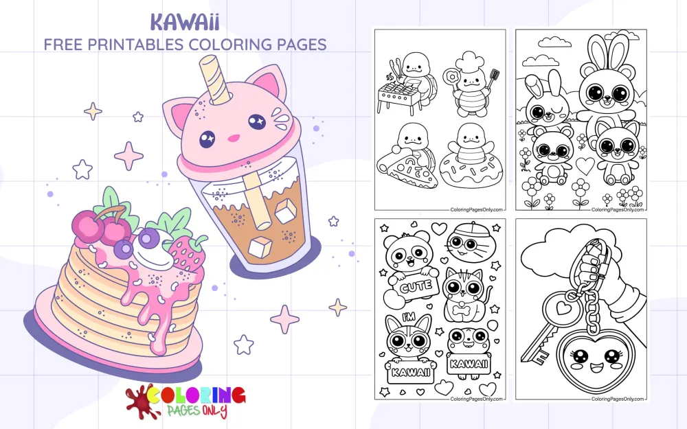
Kawaii Coloring Pages at ColoringPagesOnly.com brings together 26+ free pages in the kawaii style – cute cat portraits, smiling food characters, pastel cloud and heart scenes, stationery illustrations, keychain designs, animal groups, and a range of compositions spanning simple beginner outlines to more detailed pattern-filled pages. Download any page as a free PDF to print, or color online directly in your browser.
Kawaii overlaps with some of the site’s most popular character collections – explore Pusheen Coloring Pages, Unicorn Cat Coloring Pages, Chibi Coloring Pages, and Kawaii Animal Coloring Pages for more pages in this aesthetic.


What Is Kawaii?
Kawaii (かわいい, 可愛い) is a Japanese word typically translated as “cute” or “adorable,” but its cultural meaning runs significantly deeper than either English equivalent suggests. The kanji characters that compose the word – 可 (able) and 愛い (to love) – combine to mean something closer to “able to be loved,” embedding within the word itself a philosophy of endearment, vulnerability, and emotional protectiveness. The oldest root of the word traces back to the phrase kao hayushi, meaning “face aglow” – a reference to the blushing or flushing of someone’s cheeks in a moment of embarrassment or warmth. Over centuries, the word’s meaning shifted from “pitiable” or “fragile” toward the positive register of “lovable” and “charming” that defines its modern usage.
Modern kawaii culture emerged during Japan’s economic expansion in the 1970s, when consumer subcultures began to flourish among young people – particularly young women – who expressed themselves through a distinctive cute aesthetic in their handwriting, clothing, stationery, and personal style. The handwriting component, known as marui-ji (丸い字, “round writing”), koneko-ji (“kitten writing”), or simply manga-ji, spread among students who used newly available mechanical pencils to write Japanese hiragana characters in rounded, bubble-letter forms, adding small illustrations – hearts, stars, smiley faces – between words. Researchers later established that this writing style emerged from students themselves, spontaneously, before any commercial products had adopted it. The style was youth culture, generating its own aesthetic from the ground up.
The commercial turning point came in 1974, when the Japanese stationery company Sanrio – founded by Shintaro Tsuji, who had discovered that painting a flower on rubber sandals dramatically increased their sales – introduced a new character on a small vinyl coin purse: a white kitten with a yellow nose, black whiskers, a red bow on one ear, and no mouth. Hello Kitty, designed by Yuko Shimizu, became an immediate commercial success. Sanrio’s explanation for the absent mouth was precise and intentional: Hello Kitty has no mouth so that people can “project their feelings onto the character” – she is meant to be happy or sad together with whoever is looking at her, serving as a blank canvas for emotional identification rather than a fixed emotional state. By 1983, Hello Kitty had become UNICEF’s children’s ambassador to the United States. By 2008, she appeared on over 50,000 different products in more than 60 countries. Annual worldwide Hello Kitty retail sales reached $8 billion by 2013.
The global reach of kawaii expanded through the 1980s and 1990s as manga, anime, and Japanese video games – most significantly the Pokémon franchise, which became the highest-grossing media franchise in history at over $103.6 billion in total retail sales – carried the aesthetic worldwide. In the 1990s, Tokyo’s Harajuku neighborhood became the global hub of kawaii street fashion, where young people created layered, maximalist, pastel-saturated outfits that combined childhood accessories with high fashion. This wave of kawaii street style influenced Western designers and musicians throughout the decade. By 2008, the Japanese government formally recognized kawaii as a tool of cultural diplomacy, appointing official “Cute Ambassadors” to represent Japanese fashion internationally.
In the 2010s and 2020s, Sanrio expanded the kawaii character universe with figures that brought additional emotional complexity: Gudetama, the lazy egg who is perpetually exhausted, gave the kawaii aesthetic an ironic self-aware twist. Aggretsuko, the rage-metal-singing red panda, embedded workplace frustration and adult stress within the same visual language of round shapes and big eyes. This expansion confirmed something scholars had noted for decades: kawaii is not limited to simple cheerfulness. At its fullest, it is a framework for expressing vulnerability, charm, frustration, longing, rebellion, and warmth simultaneously – all within a visual register that remains immediately approachable and soft.
The Kawaii Design Language – What Makes Something Kawaii
Kawaii has a specific and learnable visual grammar that applies consistently across all pages in this collection. Understanding this grammar is what separates kawaii coloring from generic coloring-cute-things.
Proportion – big head, small body. The single most defining proportional choice in kawaii character design is the exaggerated head-to-body ratio. Kawaii characters typically have heads that are at least as large as their entire bodies, and often larger. This ratio consciously mirrors the proportions of infants and very young animals – creatures that trigger nurturing responses in human viewers. The large head makes every kawaii character read as small, young, and in need of care, regardless of what the character actually is. A kawaii cake, a kawaii cloud, a kawaii cat – all use the same proportional logic.
Eyes – large, expressive, and the face’s entire emotional vocabulary. Kawaii eyes are disproportionately large relative to the face. They are typically round or oval, placed in the lower half of the face, and rendered with a strong graphic clarity. In colored illustrations, the iris contains a base color, a darker ring at the outer edge, and a bright white highlight – usually a small circle in the upper portion of the iris – that creates the characteristic warmth and depth of kawaii character eyes. Different kawaii eye styles convey different emotional registers: large, round open eyes for innocence and curiosity, half-closed or drooping eyes for contentment or sleepiness, “sparkle” eyes with multiple highlight points for excitement, simple curved lines (U-shape or ^ shape) for smiling closed eyes.
Nose and mouth – minimal or absent. Kawaii characters typically have either no nose (especially animal-based characters like Hello Kitty), a single small dot, or a tiny “w” or triangle. The mouth, when present, is a small, simple shape – a gentle curve for happy, a slightly down-turned curve for sad, or an open “U” for delighted. The design philosophy is the same as Hello Kitty’s mouthlessness: the less specific the expression, the more it invites emotional projection from the viewer. Minimalism in the nose and mouth creates the space for the eyes to do all the emotional work.
Color – pastel dominance with accent pops. The canonical kawaii palette is built on pastels: baby pink, lavender, mint green, peach, butter yellow, powder blue, lilac, and cream. These are colors at high lightness and low-to-medium saturation – they read as soft, gentle, and non-threatening. Most kawaii compositions use two or three pastel tones for the main character and background, with one more saturated accent color for the eyes, a bow, a food item, or a detail element. Pure white is used heavily for highlights and clean areas. Black outlines are consistent in weight throughout – not varied the way realistic illustration outlines might be. The overall effect is graphic, flat, and immediately cheerful.
Blush marks. Round, light pink circles on the cheeks of a kawaii character – sometimes called “rosy cheeks” or blush marks – are one of the most recognizable kawaii details. They signal warmth, shyness, embarrassment, and happiness simultaneously, reinforcing the emotional vulnerability that is central to the kawaii aesthetic. Adding or deepening the blush marks on any kawaii character page increases the warmth of the expression.
Accessories and scatter elements. Kawaii compositions frequently include small background or surrounding elements: hearts, stars, sparkles, small flowers, polka dots, clouds, musical notes, and similar motifs. These elements fill negative space, add visual rhythm, and reinforce the sweet, cheerful register of the main subject.
Categories In This Collection
The 26 pages in this collection cover the main domains of kawaii illustration, each with its own specific coloring approach.
Kawaii food characters. The Kawaii Cake, Kawaii Macaron, and Kawaii Food pages are among the most visually distinct categories in kawaii art. Animating food – giving a slice of cake round eyes and a small smile, making a macaron blush – is one of the oldest kawaii illustration conventions, going back to stationery designs of the 1970s and 1980s. The challenge for these pages is distinguishing the “real” food colors from the character’s face features. A macaron page might use lavender for the macaron shell and a deeper lavender for the filling, while the face elements (eyes, blush) are rendered in darker contrasting tones.
Kawaii animals. The Kawaii Cat and Kawaii Animals pages follow the same proportional logic as character pages, but require thinking about fur texture and animal-specific coloring. Kawaii cats are typically white, cream, grey, or pastel-colored, with simplified ear shapes and the same large-eye formula. The kawaii transformation of an animal primarily involves rounding all edges – ears that would normally be pointed become softer, faces that would normally be narrow become wider and rounder.
Kawaii nature elements. The Kawaii Clouds and Tree Kawaii pages apply the kawaii face formula to non-animate subjects – a cloud with a sleepy expression, a tree with a smile and round eyes. These are fully within the kawaii tradition: Japanese kawaii culture routinely anthropomorphizes any object, from food to weather to household items, by applying the standard face vocabulary to it.
Kawaii stationery and accessories. The Kawaii Stationery and Kawaii Keychain pages connect directly to the historical origin of kawaii – the stationery and character goods that Sanrio and San-X built the entire aesthetic on in the 1970s and 1980s. Coloring these pages is a direct engagement with that origin point.
Pattern and group pages. The Kawaii of Cartoon and Food page and similar multi-element compositions use kawaii characters as repeating pattern elements. These pages reward patience with detailed work – coloring each element in a consistent palette while varying the individual tones enough to make the composition visually interesting.
Kawaii Subtypes – Beyond Standard Cute
The current kawaii collection is primarily classic kawaii, but it’s useful to know the wider kawaii landscape for context and for developing your own coloring direction.
Yumekawaii (夢かわいい, “dream-cute”) pushes the palette further into purple, indigo, and starry night tones – the pastel-meets-fantasy register associated with dreaming, clouds, and magical girl themes. Many of the cloud and star elements in the collection can be colored in a Yumekawaii direction by choosing deep lavender and soft indigo rather than standard baby blue and mint.
Gurokawa (グロカワ, “grotesque-cute”) is the subtype that mixes standard kawaii visual language with unsettling or morbid elements – stitches, bandages, hospital themes, or slightly off-kilter expressions. This is the aesthetic tradition that Labubu exists within: the “creepy-cute” that is now one of the most commercially successful kawaii variants globally. It’s worth noting that Gudetama (Sanrio’s perpetually despairing lazy egg) and Aggretsuko (the workplace-rage red panda) are both mainstream expressions of this ironic or uncomfortable edge within kawaii.
Pastel Goth is a Western-originated aesthetic that borrows kawaii visual conventions – pastel colors, big eyes, round shapes, sparkles – and combines them with gothic elements: bones, pentagram motifs, bats, black accents. Several pages in this collection can be colored in a Pastel Goth direction by using black as a primary accent against the pastel base.
Coloring Tips
Flat color is correct for kawaii – resist shading. The defining graphic quality of kawaii illustration is clean, flat areas of single colors with hard edges and consistent weight outlines. Unlike realistic or painterly coloring styles, kawaii does not require graduated shading or value transitions within a single color area. The visual effect you are aiming for is closer to graphic design than to watercolor or oil painting. Apply your base color flatly and evenly. This is both faster and more accurate to the aesthetic.
Eyes first, always. In any kawaii portrait page – animal, food character, or abstract – the eyes are the emotional center of the composition and should be established before any other colored area. The eye color sets the palette tone for the entire piece. Choose the eye color first, then build the surrounding palette to complement rather than compete with it. For classic kawaii: blue or purple eyes in a warm (pink, peach) body work naturally. Brown or amber eyes in a cool (mint, lavender) body create a warm-cool balance. Green eyes in a pink body is the most immediately “cute” combination in the Western kawaii tradition.
The white highlight is not optional. The bright white highlight dot in the upper portion of each eye is what gives kawaii characters their warmth and life. Without it, the eyes read as flat and lifeless. If you are using a colored pencil, leave the highlight as raw white paper and work around it. If you are using markers or watercolor, plan the highlight position before starting and either mask it or add white gel pen over the dry base color at the end. A single well-placed highlight transforms the eye.
The blush marks define warmth. The rosy pink circles on kawaii characters’ cheeks should be applied after the face base color has dried completely (if using wet media). Use a light, transparent layer of the warmest pink in your palette – rose or coral rather than hot pink – and apply it in a soft, diffused circle. The blush should read as a gentle warmth rather than a distinct painted circle. In colored pencil, use light pressure and circular strokes. This detail, more than almost any other, is what makes the finished page read as kawaii rather than generic cartoon.
Build the background from the character outward. Kawaii compositions typically have a relatively neutral or pastel background with small scattered decorative elements. Establish the character’s palette first, then choose a background color that is one or two values lighter than the lightest color in the character. This ensures the character reads forward from the background. For the scatter elements – hearts, stars, clouds, sparkles – use either the character’s accent color (the most saturated tone in the composition) or a complementary color that creates visual pop without competing with the character.
For kawaii food pages – use the actual food’s color as a starting point, then soften it. A kawaii strawberry should be the same recognizable red as a real strawberry, but one or two steps softer and lighter – slightly more pink, slightly less saturated. The kawaii transformation of food lies in the proportions and face elements, not in changing the food to an unrecognizable color. A bright red strawberry with round black eyes and pink cheeks reads as kawaii immediately. A pale pink blob with round eyes does not register as a strawberry at all. Start with identifiable food colors and soften toward pastel rather than abandoning the reference.
For stationery pages, the character colors should be the star. The Kawaii Stationery page likely shows pencils, notebooks, erasers, and similar items alongside or animated as kawaii characters. These items in real life come in bright, saturated colors – primary school-supply reds, blues, and yellows. For kawaii, soften those toward pastel versions: dusty rose rather than red, powder blue rather than cobalt, butter yellow rather than primary yellow. The composition works because everything is slightly desaturated to the same sweetness level, creating a unified kawaii palette across the entire scene.
5 Activities
The kawaii transformation challenge. Take any ordinary object from your immediate environment – a water bottle, a plant, a piece of fruit, a coffee cup. On a blank piece of paper, draw a simplified round version of that object and add kawaii face elements: two large round eyes with white highlights, a small mouth, and pink blush circles. Then color it in a pastel palette. The exercise is exactly what Sanrio’s designers have been doing since 1974: kawaii-ifying the ordinary world. After coloring the object, compare your result to the original. This exercise demonstrates the core kawaii design move – applying the face vocabulary and the proportional vocabulary to any subject – and builds fluency in the aesthetic faster than copying existing kawaii illustrations.
The palette-building exercise. Before coloring any page in this collection, build your kawaii palette intentionally. Choose one warm pastel (baby pink or peach), one cool pastel (mint or lavender), one neutral (cream or soft grey), one accent (the most saturated color you’ll use – a slightly richer pink, a cornflower blue, or a warm yellow), and a black for outlines. Use these five colors only. The constraint forces intentional color decisions and produces a more cohesive result than choosing colors arbitrarily as you go. After completing one page with this method, evaluate: Does the palette read as unified? Would you choose the same accent color again? Building a deliberate palette before starting is the single habit that separates competent kawaii coloring from truly polished kawaii coloring.
The Hello Kitty design study. Hello Kitty’s design contains every principle of kawaii character design in its simplest and most essential form: a round face, ears as the only head detail, two oval eyes, a dot nose, a small bow, and no mouth. Print a Hello Kitty page if available in the collection, or draw her simple silhouette on a blank page. Color her in the canonical black-white-red palette, then color a second version in a completely invented palette using only pastels. Consider what the color change does to the character’s perceived personality – does a lavender Hello Kitty feel different from a mint Hello Kitty? This exercise engages directly with Sanrio’s own design philosophy: Hello Kitty has no fixed personality and no mouth precisely so that color and context can define who she is in any given moment.
Kawaii food bento design. The kawaii bento (character lunch box) is one of the most developed practical art forms within kawaii culture, requiring real design skills: how do you arrange kawaii food characters within a rectangular space so the composition reads clearly? Print the Kawaii Food, Kawaii Cake, and Kawaii Macaron pages. Color each individually, then arrange them on a larger piece of paper as if designing the contents of a bento box. The composition challenge – balancing shapes, colors, and character expressions within a bounded space – is exactly the design problem that Japanese parents who specialize in character bentos solve every day. This is kawaii coloring with a functional design objective.
The Kawaii Emotion Map. Kawaii characters use a very limited vocabulary of facial expressions: happy (curved upward mouth, open or sparkling eyes), sleepy (half-closed eyes, soft expression), surprised (wide open, round eyes, small “O” mouth), shy (downward glance, prominent blush), and content (closed “U” eyes, soft smile). Print five copies of the same simple kawaii animal page. Color each in the same base palette, but change the eye and mouth expression on each one to represent a different emotional state. Label each with the emotion it represents. The exercise builds fluency in kawaii’s expressive vocabulary and demonstrates how much emotional range the style can contain within its seemingly simple graphic conventions.

