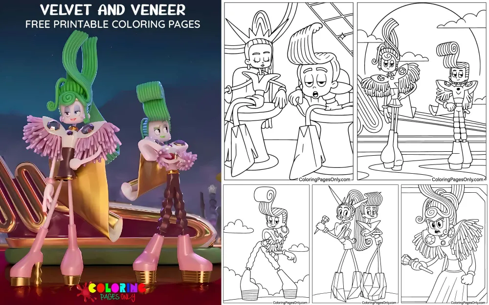
Free Velvet and Veneer coloring pages – 20+ pages featuring the twin antagonists from Trolls Band Together (2023) in their signature gold and crystal outfits, performance poses, individual portraits of Velvet in her purple-crystal accessories and Veneer in his indigo-blue accessories, duo compositions, and action scenes from DreamWorks Animation’s third Trolls film – free printable PDF and online coloring for fans of the franchise.
Velvet and Veneer are the twin villains of Trolls Band Together, DreamWorks Animation’s 45th full-length animated feature film and the third installment in the Trolls trilogy, directed by Walt Dohrn and Tim Heitz and released on November 17, 2023. The film earned $209 million at the global box office and is currently streaming on Netflix. Velvet is voiced by Amy Schumer, with Brianna Mazzola providing her singing voice; Veneer is voiced by Andrew Rannells, a Broadway performer and professional singer, in pointed irony for a character who is canonically incapable of carrying a tune.
The twins are Rageons – members of Mount Rageous society, which the Trolls universe depicts as humanoid creatures defined by their love of fame, materialism, and spectacle. Velvet and Veneer’s specific mission in the film is the theft of musical talent: they have imprisoned Floyd, a former member of the boy band BroZone, in a diamond-shaped bottle and have been draining his musical essence to power their fraudulent pop star careers. Their plan to extend this operation to the rest of BroZone – and the efforts of Branch, Poppy, and their friends to stop them – is the film’s primary narrative.
Their design is inspired by the Betty Spaghetty toy line introduced in 1998 – a rubber doll series characterized by spaghetti-like hair, pliable, spindly limbs, and a flexible body that gives the characters their specific visual quality. The twins’ pearly-white skin, flowing green hair, and thin, elongated proportions draw directly from that aesthetic.
These 20+ free pages at ColoringPagesOnly.com cover both twins across their full visual range. All free, PDF or PNG, print or color online.


What’s Inside
Velvet – Portrait and Fashion Pages
Velvet is the film’s primary antagonist – the older twin, the architect of the plan, the one who devised the troll-napping scheme and drives its execution while her brother follows her lead. Her design is the more elaborate of the two siblings: long green hair kept in a high ponytail with two long sections styled to vaguely resemble the letter V, pearly-white skin with lavender-pink cheeks, deep blue eyes with dramatic lashes, and layered sparkly violet eyeshadow and fuchsia lip gloss.
Her outfit is built around grape-purple crystals: a gold V-neck tank top worn beneath a matching crop top with dramatically pointed shoulder pads, a matching miniskirt, and a full complement of crystal accessories – a spiked tiara, two chokers (one with a diamond-shaped pendant), bracelets on both wrists, high-heeled boots, and grape-purple teardrop-shaped dangle earrings. The shoulder pads conceal the smoothie machines that function as her troll-talent-extraction devices – the film’s most specific piece of costume-as-villain-tool design.
The portrait pages capture Velvet in the register she is most comfortable in: the performance-ready confidence of someone who has never considered that they might be wrong about their own significance.
Coloring Velvet: Her pearly-white skin is not flat white – it has the subtle warmth of a doll-like surface, best rendered with the lightest possible warm cream shadow in the face’s deeper areas. Her green hair is a cool, medium green: apply it at full saturation across the ponytail mass and the two long decorative sections. Her eyes are deep blue with extensive lash work – apply the blue iris fully and render the dramatic lashes with confident dark strokes. Her grape-purple crystal accessories are the outfit’s dominant color – a vivid, warm purple-violet, applied at maximum saturation to all crystal elements (tiara, chokers, bracelets, boots, earrings). The gold of her crop top and shoulder pads is warm and vivid, slightly darker than the crystal purple, providing the warm-cool contrast that gives the outfit its visual energy.
Veneer – Portrait and Fashion Pages
Veneer is the younger twin – less dominant, more easily manipulated by Velvet, and carrying the specific comedy of a character who has been cast as a villain but is constitutionally unsuited for villainy. His arc across the film involves the gradual erosion of his willingness to follow Velvet’s direction, culminating in a moment of choice at the film’s climax.
His design shares the twins’ pearly-white skin, green hair, and spindly proportions, but is specifically differentiated: his green hair is shorter, styled into a long pompadour with gelled-back sections. He is noticeably shorter than Velvet even in his platform boots. His eyeshadow is grayish-cyan, and his lip gloss is green – cooler in palette than Velvet’s warmer purple and fuchsia. His crystal accessories are indigo-blue rather than grape-purple, and his outfit’s details are masculine in variation: short-shorts rather than a miniskirt, high-heeled platform boots, a single golden hoop earring on his right ear, a choker, and bracelets.
Coloring Veneer: The same pearly-white skin base as Velvet. His hair’s green is the same cool medium green as hers, but applied to a completely different shape – the pompadour requires directional stroke application outward from the forehead. His grayish-cyan eyeshadow is cooler and more muted than Velvet’s sparkly violet – a blue-grey applied at moderate saturation. His lip gloss is a medium green. His indigo-blue crystal accessories distinguish him from his sister – a deep, cool blue-purple that reads as noticeably different from Velvet’s warmer grape-purple. The gold outfit elements match Velvet’s exactly.
Velvet and Veneer Together
The duo pages – both twins in a single composition – give the collection its most complete visual statement. The twins are designed as visual counterparts: same species, same general design language, opposite in height (Velvet is taller) and in accessory color (warm grape-purple vs. cool indigo-blue). Their combined silhouettes – the matching gold outfits, the dramatic shoulder pads, the two different crystal palettes – create a visual unity that communicates “twins” before any other reading is available.
The duo pages also capture the specific dynamic between them: Velvet in the foreground or at a slightly higher position, Veneer beside or slightly behind, the visual hierarchy of their relationship encoded in the composition.
Coloring duo pages: Maintain the color distinction between the siblings throughout the entire page – Velvet’s grape-purple must remain clearly distinct from Veneer’s indigo-blue, and their height difference should read clearly. The shared elements (gold outfits, green hair, white skin, gold shoulder pads) should be rendered identically across both figures to emphasize their twin identity, while the differentiating elements (crystal colors, hair styles, accessory arrangements) should be clearly differentiated.
Performance and Action Pages
The performance pages capture Velvet and Veneer in their pop-star context – on stage, in the spotlight, with the specific physical language of a musical performance that the film uses extensively. Their performance aesthetic borrows from the 1990s pop diva visual vocabulary that the film’s director referenced explicitly: the stage presence, the dramatic outfits, the complete confidence of two performers who have never had to develop actual talent because they have been stealing it.
The action pages show the film’s confrontations – the moments when Branch and Poppy’s rescue mission intersects with the twins’ performance, the expressions of alarm and calculation as the plan begins to fall apart.
Coloring performance pages: Stage lighting creates specific challenges for character coloring – it tends to add warm yellow-gold light from above and potentially cool side-lighting. For performance pages with visible stage lighting context, shift the already-warm gold of the outfits slightly toward warm yellow in the directly lit areas, and add cool blue-grey shadows in the shade areas. The crystal accessories under stage lighting should receive their most saturated application – performance lighting is what makes crystals look most vivid.
Floyd in the Diamond Bottle
Some pages may reference Floyd, the imprisoned BroZone member in the diamond-shaped bottle that Velvet and Veneer carry. Floyd is a lavender-colored Troll with purple hair, and his presence in the diamond bottle is the film’s central image of exploitation. Pages that show the bottle alongside the twins give the coloring activity a specific moral context: the container of stolen talent in the hands of the people who stole it.
Coloring Floyd’s diamond bottle: The diamond-shaped container is clear glass or crystal with pink-purple interior lighting from Floyd’s trapped essence. Render the bottle’s exterior in very pale blue-grey (glass transparency), with the interior a vivid lavender-pink glow – the magical visual of captured musical talent that the film uses consistently.
What These Pages Do
Velvet and Veneer’s design is a specific lesson in how costume communicates character. Their shoulder pads – described as smoothie machines, actually functioning as troll-talent extraction devices – are the most specific example of villain costume design in recent DreamWorks animation: the weapon of their villainy is literally built into what they wear. Coloring the shoulder pad detail is coloring the film’s central dramatic irony.
The Betty Spaghetty toy line, introduced in 1998, directly inspired Velvet and Veneer’s visual design – a reference that rewards fans who recognize it and which gives the characters a specific nostalgic dimension. The rubber-doll aesthetic, with its pliable, spindly proportions and long flowing hair, is visible on every page of the collection.
The twins’ names from dentistry are the franchise’s most specific and least visible joke. Their names were derived from dental terms, as Velvet and Veneer’s parents were dentists in the movie. Velvet refers to descriptions of oral lesions, while Veneer is named after the protective shell that can be put on the front of teeth. This joke requires knowledge to be funny, which is exactly the kind of background detail that rewards attentive viewers and rewards coloring pages fans who know the context.
Fine motor development. The American Academy of Pediatrics identifies fine motor skill development as a key childhood milestone throughout early childhood. The crystal pattern on Velvet’s accessories, the pompadour hair direction on Veneer, the tiara spikes, and the lash detail in portrait pages all provide motivated, sustained fine motor practice. The 2005 Art Therapy Journal study on structured coloring and anxiety reduction applies throughout.
How to Color These Pages Well
The grape-purple vs. indigo-blue distinction is the twins’ most important color separation. Both siblings use crystal accessories, both have the same basic outfit structure, and both are visually similar in many respects. The crystal color – Velvet’s warmer grape-purple versus Veneer’s cooler indigo-blue – is the primary way to tell them apart at a glance in any page that shows both. Apply Velvet’s crystals in a warm, vivid purple-violet and Veneer’s crystals in a deep, cool blue-purple. These should read as clearly different colors even at a distance.
The Betty Spaghetty doll quality requires careful white skin rendering. The pearly-white, doll-like skin tone that both characters share is different from human skin and from Troll skin – it has a smooth, slightly plastic quality that should read as a surface made of something denser and more uniform than biological skin. Apply an extremely pale warm cream as the base, with only the most minimal shadow in the deepest areas of the face. The goal is skin that reads as luminous rather than organic.
Green hair on white skin requires value separation. Because the characters’ skin is very pale, the green hair must be applied at a sufficient contrast value to read clearly as separate from the skin. Apply the green at medium-to-full saturation and sufficient pressure that it reads as a vivid, saturated hair color rather than a pale pastel. The cool, medium green should be darker in value than the skin’s near-white.
The pointed shoulder pads are the outfit’s most important structural element. The dramatically pointed shoulder pads – which extend well beyond the natural shoulder width – give both characters their most exaggerated silhouette. Render the tips of the shoulder pads with the brightest highlight of the gold outfit, as the pointed extremities would catch the most overhead light. The gold should graduate from warm bright highlight at the tips to slightly deeper warm gold at the fabric’s fold areas.
The spindly limbs should be rendered with clear value separation from the background. Both characters’ notably thin arms and legs – a key element of the Betty Spaghetty-inspired design – should be rendered with clean, clear boundaries where they meet the background or costume. A thin, slightly darker edge along the outer edge of each limb gives the spindly quality, dimensional clarity without requiring complex shading.
5 Creative Craft Ideas
Twins Costume Comparison Card
Print one Velvet portrait and one Veneer portrait. Color both carefully – identical gold crop tops and shoulder pads, but Velvet’s accessories in grape-purple and Veneer’s in indigo-blue. Mount both side by side on a backing sheet.
Add labels comparing their specific accessory elements: “Velvet – Spiked tiara, two chokers, miniskirt, teardrop earrings, grape-purple crystals.” “Veneer – Pompadour, single hoop earring, short-shorts, platform boots, indigo-blue crystals.” The display is a costume reference guide that shows how the same basic outfit framework produces two visually distinct characters through specific accessory differentiation.
The Betty Spaghetty Connection
On a large backing sheet, print and color the most complete Velvet portrait available. Beside it, on the right half of the backing sheet, draw a simplified sketch of the Betty Spaghetty doll – long spaghetti-like hair, spindly pliable arms, sneakers, and skirt.
Add a label: “Betty Spaghetty – Introduced 1998” beside the sketch, and “Velvet – Trolls Band Together, 2023” beside the colored page. Add arrows pointing to the specific shared elements: the long flowing hair, the spindly limbs, the large button eyes.
The display honors the design inspiration that the film built on and that most viewers missed.
Before the Fame – The Name Origin Card
Print a simple Velvet or Veneer portrait. Color it carefully. Mount on cardstock.
On the back, write: “Their parents were dentists. Velvet: relates to oral tissue lesions. Veneer: the protective shell placed on teeth to repair their surface. Two children raised by dentists. Two names from their parents’ profession. Two teenagers who became fraudulent pop stars. Their parents were not responsible for any of it.”
The card connects the character’s backstory to their names through the specific dental terminology the writers chose – the kind of background detail that makes a coloring page into a reference object.
Gold and Crystal Outfit Design
Velvet and Veneer’s outfit structure – gold base with crystal accessories in a distinctive color – is a design template that can be extended. Print the most neutral character page available. Color the base outfit in gold as the twins wear it.
Then design your own crystal color for the accessories: not grape-purple (Velvet) and not indigo-blue (Veneer), but your own color. What crystal personality would you choose? Apply it to the tiara, chokers, bracelets, boots, and earrings. Name your new version at the bottom.
The exercise uses the franchise’s design system – gold base with crystal accent color – to create a personal version within that established framework.
Exposed – The Performance Climax
The film’s climax exposes Velvet and Veneer as talentless frauds during their live performance. Print a performance-pose page of the twins. Color both in their full performance outfits – the complete gold and crystal treatment, the stage lighting, the full pop-star visual.
Add a hand-lettered label beneath the image: “Mount Rageous Lifetime Achievement Award Ceremony. The smoothie machines. The diamond bottle. Branch and Poppy. Floyd. The end.”
The finished page is a document of the film’s defining confrontation – everything that was built for the performance, just before it came apart.
Frequently Asked Questions
Who are Velvet and Veneer? Velvet and Veneer are twin Rageon wannabe pop stars who try to capture and steal the essence of Floyd, a former Trolls boy band BroZone member. They are the villains of Trolls Band Together, DreamWorks Animation’s third Trolls film, released on November 17, 2023. Velvet is voiced by Amy Schumer, and Veneer is voiced by Andrew Rannells. The film earned $209 million at the global box office and is currently streaming on Netflix.
What movie are Velvet and Veneer from? Velvet and Veneer appear in Trolls Band Together, directed by Walt Dohrn and Tim Heitz and released on November 17, 2023. It is the third film in DreamWorks Animation’s Trolls franchise, following Trolls (2016) and Trolls World Tour (2020). The film stars Justin Timberlake as Branch and Anna Kendrick as Poppy, who work to rescue Branch’s brother Floyd from the twins’ imprisonment. The film earned a 63% on Rotten Tomatoes and $209 million at the global box office.
What do Velvet and Veneer look like? Velvet and Veneer are both spindly, attractive, doll-like, pearly-white-skinned humanoid giants with green hair, deep-blue eyes, lavender-pink rosy cheeks, and minimal makeup. Velvet’s hair is longer and wavier in a high ponytail, with sparkly violet eyeshadow and fuchsia lip gloss. Veneer has shorter hair in a pompadour style, with grayish-cyan eyeshadow and green lip gloss. They both wore V-neck gold tank tops under crop-tops with pointed shoulder-pads and crystal accessories – grape-purple crystals for Velvet and indigo-blue crystals for Veneer.
What toy inspired Velvet and Veneer’s design? Introduced in 1998, the toy Betty Spaghetty was a beloved rubber doll with pliable features, spindly limbs, and thin pasta-like angel hair. Despite the overt similarities between Betty Spaghetty and Velvet and Veneer, the obscure ’90s toy reference flew over most fans’ heads while watching the film. The director of the film described the characters as inspired by “90s Pop Divas,” and the Betty Spaghetty aesthetic – including the spaghetti-like hair, spindly limbs, and flexible doll proportions – is directly visible in both characters’ designs.
Why are their names Velvet and Veneer? Their names were derived from dental terms, as Velvet and Veneer’s parents were dentists in the movie. Velvet refers to “describe lesions in the mouth” or “a chemical in a special syringe for cleaning in between the teeth.” Meanwhile, Veneer is named after the protective shell that can be put on the front of teeth to protect from cracks, chips, or other structural and/or visual deformations.
Are Velvet and Veneer redeemed at the end of the film? The twins’ endings diverge. Crimp informed them both of their crimes for troll-napping, troll torturing, and fraudulence, while Clay added that they also committed tax evasion, and he would have to repossess their yacht. By Veneer’s approval, he and Velvet were then escorted by security. Veneer demonstrates a turn toward good behavior at the film’s climax, choosing Floyd’s survival over the plan, while Velvet shows no remorse. Both are arrested. Veneer’s softer side and his moment of choice leave his arc more open than Velvet’s.
What age group are these pages best suited for? The simpler character portrait pages work well from ages five to seven for fans of the Trolls franchise who know and enjoy the characters. The fashion-detail pages – with the crystal accessory pattern work, the tiara spikes, the dramatic lash rendering, and the complex outfit structures – are most rewarding from ages seven to ten. The duo pages requiring simultaneous color management of two distinct crystal palettes and two differently styled figures are most engaging for ages eight and up. The film itself is rated PG and is appropriate for all ages, with the coloring pages appropriate for the youngest colorists through adult Trolls fans.
Browse the full collection at ColoringPagesOnly.com. All 20+ pages free, no sign-up, PDF or PNG, print or color online.
Walt Dohrn and Tim Heitz gave the third Trolls film its villains from a 1998 rubber doll line that most of their 2023 audience had never seen, named them after dental procedures because their parents were dentists, and cast a professional Broadway singer as the character who cannot sing. All three of these decisions are invisible unless you are looking for them.
Velvet wanted fame. Veneer wanted Velvet to approve of him. Floyd wanted to survive. Branch wanted his brother back.
The shoulder pads were smoothie machines. The diamond bottle was a prison. The talent was never theirs.
Pick up your gold. Apply the grape-purple to Velvet. Apply the indigo-blue to the veneer. They are twins – same design, different crystals.
Share your work on Facebook and Pinterest and tag #Coloringpagesonly. We especially want to see the twins’ costume comparison cards and the Betty Spaghetty connection displays.
Color the divas. Name the crystals. The talent was always Floyd’s.

