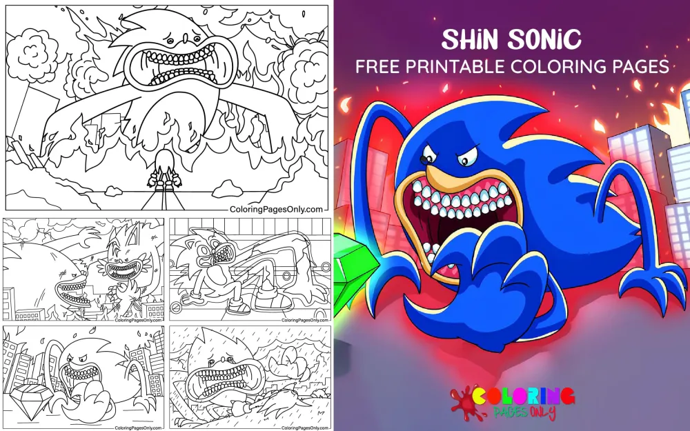
Free Shin Sonic coloring pages: 15 pages featuring reimagined, darker, and more dramatically rendered interpretations of Sonic the Hedgehog in the visual register of the “Shin” aesthetic that has become a significant trend in Japanese pop culture redesign. These pages present Sonic with more intense proportions, more detailed textures, more dramatic expressions, and the atmospheric depth that distinguishes “Shin”-style fan art from the clean, bright canonical Sonic design. All free, printable PDF and online coloring for Sonic fans interested in this darker creative direction.
Sonic the Hedgehog was created by Yuji Naka, Naoto Ohshima, and Hirokazu Yasuhara for Sega and first appeared in the video game Sonic the Hedgehog, released on June 23, 1991. The character has undergone several design evolutions across more than three decades: from the original “classic” design of the early 1990s Mega Drive games, through the taller, slimmer “modern” redesign introduced for Sonic Adventure in 1998, to the live-action film version designed by Tyson Hesse for Paramount Pictures following the widely discussed character design revision of 2019.
The “Shin” concept in this collection’s title references the Shin Japan Heroes Universe creative tradition, in which classic Japanese pop culture characters receive dark, realistic, philosophically intensified reimaginings. This tradition includes Shin Godzilla (2016, Toho, directed by Hideaki Anno and Shinji Higuchi), Shin Ultraman (2022), and Shin Kamen Rider (2023). The fan art practice of applying this aesthetic to non-Japanese characters, including Sonic the Hedgehog, has produced a significant body of work, of which this collection represents the coloring page form.
These 15 free pages at ColoringPagesOnly.com are available under the Cartoons and Sonic collections. All free, PDF or PNG, print or color online.


What’s Inside
The “Shin” Aesthetic: What It Means for Sonic’s Design
The word “shin” in Japanese carries the meanings of new, true, genuine, or divine depending on context and kanji. In the context of the Shin Japan Heroes Universe, it functions as “true” or “real” in the sense of a more authentic, unidealized, and philosophically serious treatment of characters that popular culture has typically presented in a simplified, heroic register.
Shin Godzilla (2016), which launched the contemporary wave of “Shin” reimaginings, depicted Godzilla as an actively evolving, biologically terrifying creature rather than the familiar rubber-suit monster of mid-century Toho films. The film used Godzilla as a vehicle for commentary on Japanese government bureaucracy and the 2011 Fukushima disaster, and its Godzilla design was deliberately unsettling, incomplete in its evolution, and genuinely frightening rather than iconic and familiar.
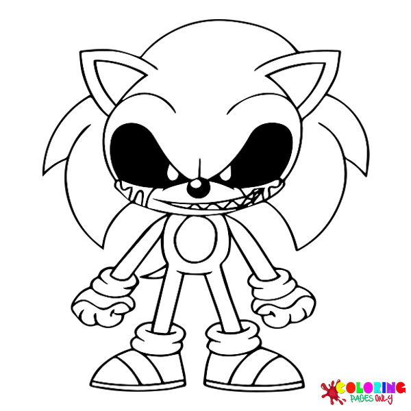
Applied to Sonic the Hedgehog by fan artists, this aesthetic typically produces: heavier, more detailed rendering of the fur texture; eyes with more intensity and depth than the clean circle-and-pupil of the official design; a more muscular or physically detailed body structure; a darker overall color palette; and compositional choices that emphasize drama and weight rather than speed and energy. The result is Sonic recognizable by his blue color and hedgehog silhouette, but transformed in emotional register from cheerful speed demon to something more complex and formidable.
The collection’s 15 pages present this design direction in coloring page form: the familiar character made strange and new by the application of a completely different visual philosophy.
Coloring “Shin” aesthetic pages: Darker, more muted versions of the canonical blue rather than the bright, fully saturated blue of standard Sonic pages. A deeper, slightly desaturated teal-blue for the main body, with near-black shadows at the deepest recesses of fur details. The eyes receive more complex internal rendering than the simple white sclera and black pupil of the original design: deeper color fields, more intense coloring, and the specific quality of eyes that communicate awareness rather than just presence.
Sonic’s Official Design History: Context for the Reimagining
Understanding what “Shin Sonic” reimagines requires understanding what the original Sonic design is and has been across its various evolutions.
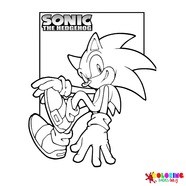
The classic Sonic design of 1991 to approximately 1998 featured a shorter, more compact body with a more circular head and smaller eyes. His spines were fewer and more compact. His running posture was almost entirely horizontal. This design appears in the original Mega Drive/Genesis games, the Sonic Mania (2017) revival, and in the animated series Adventures of Sonic the Hedgehog (1993) and Sonic the Hedgehog (SatAM, 1993).
The modern Sonic design, introduced with Sonic Adventure in 1998 for the Sega Dreamcast, made the character taller, slimmer, and with longer limbs. His eye design changed significantly: the two separate white sclera and dark pupils of the classic design became two black eyes with green irises. His spines became longer and more swept back. This design dominated from 1998 through the mid-2010s.
The film Sonic design, revised by Tyson Hesse after the original leaked design drew significant negative fan response in 2019, combined elements of both the classic and modern designs with modifications for realistic film production. The redesigned film Sonic first appeared in the official Sonic the Hedgehog (Paramount, 2020) trailer in November 2019 and was widely praised as an improvement over the original direction.
Coloring classic Sonic references: The bright, clean Sega Blue of the official game design. Pure white sclera with dark outlines. Clean, fully saturated blue with minimal shadow complexity. Coloring modern Sonic references: The slightly adjusted blue of the 3D era, vivid green irises, and the longer body proportions. The “Shin” versions of both build on these canonical baselines by adding darkness, texture, and complexity.
Dark Portrait Pages
Several pages in the collection show Sonic in close portrait format with the “Shin” aesthetic applied primarily to the face: the eyes rendered with greater depth and intensity than the canonical design, the fur given visible texture rather than the smooth single-color surface of the official art, and the overall expression shifted from confident cheerfulness to something more ambiguous and dramatically weighted.
These portrait pages are the collection’s most technically challenging and most rewarding: the face detail requires precise, careful application to achieve the mood the “Shin” aesthetic intends, and the contrast between the familiar blue of Sonic’s fur and the dark, intense rendering of the facial features is the page’s primary visual tension.
Coloring dark portrait pages: Apply the deep, slightly desaturated blue-teal base to all fur surfaces first. Then use near-black for the deepest shadow areas: the inner recesses of the ear, the shadow beneath each spine, and the area beneath the brow. The eye rendering requires a dark field surrounding the iris, with the iris itself colored in a specific tone (green for modern Sonic, black for classic, or a reimagined color for the “Shin” version) and a small but precise white highlight point in the upper corner. The contrast between the bright highlight and the dark surrounding field gives the eye its intensity.
Action and Power Pose Pages
Some pages show Sonic in combat or power poses that the “Shin” aesthetic frames with greater physical weight than the classic running or spin-dash imagery. These pages reference the specific visual vocabulary of Sonic’s various transformation forms from the game series: Super Sonic (achieved with all seven Chaos Emeralds, turning Sonic gold with red eyes), Hyper Sonic (a flashing multi-colored version from Sonic 3 and Knuckles), and Dark Sonic (an anime-exclusive dark form from Sonic X).
The “Shin” treatment of these powered forms typically uses darker, more intense versions of the canonical transformation colors, adding dramatic atmospheric effects (dark auras, intense speed-effect lines rendered with greater weight than the clean white speed lines of the original games) and compositional framing that emphasizes the power rather than the movement.
Coloring power pose pages: Super Sonic reference pages use a deep, slightly orange-shifted gold rather than the clean, bright yellow of the official design. Shadow areas should be a warm dark amber-brown rather than grey. Red eyes for Super Sonic should be vivid and saturated, the most intense element in the composition. For “Shin” dark form pages: deep grey-blue or near-black for the primary body color, with only the eyes providing vivid color contrast in vivid white or red.
Speed and Motion Pages
The “Shin” treatment of speed imagery shifts the visual vocabulary from the clean, bright speed lines and simple blur effects of the official franchise to something more physically intense: motion blur with greater weight, energy trails rendered with darkness and complexity rather than bright color, and the sense of velocity communicated through atmospheric distortion rather than cheerful speed lines.
Coloring motion pages: Speed trails in the “Shin” style are darker than canonical: deep blue-black rather than bright blue, with intensity concentrated at the edge closest to the figure and fading toward the trailing edge. Any energy or light effects should be rendered with a bright center (near-white or vivid blue) and a dark surrounding area (deep navy or near-black), creating the luminous quality of actual light rather than the flat color of a cartoon speed effect.
What These Pages Do
The “Shin” reimagining tradition is one of the most documented creative practices in contemporary Japanese pop culture, and its application to Sonic the Hedgehog represents a specific extension of that tradition into the global fan art community. Shin Godzilla earned $78.8 million worldwide and won seven Japan Academy Film Prizes, including Picture of the Year and Director of the Year. The film established that a “Shin” treatment could be both commercially successful and artistically ambitious, creating a creative template that fan communities across the world then applied to other characters.
The practice of fan art reimagining is itself a documented form of creative engagement with source material, and the “Shin Sonic” concept represents one of the more structurally sophisticated variations: it requires the artist to understand both the source design (Sonic’s canonical visual elements) and the aesthetic system being applied (the “Shin” philosophy of darkness, realism, and philosophical weight). The coloring pages in this collection give colorists the opportunity to engage with this creative synthesis.
The American Academy of Pediatrics identifies fine motor skill development as a key childhood milestone throughout early childhood. The more complex surface rendering of “Shin” style pages, including fur texture work, complex eye detail, and atmospheric shadow application, provides sustained fine motor practice at a higher difficulty level than standard cartoon coloring pages. The 2005 Art Therapy Journal study on structured coloring and anxiety reduction applies throughout, with the darker, more atmospheric pages offering a different meditative register from brighter collections.
These pages are most appropriate for older children and teenagers who are familiar with both the Sonic franchise and the darker creative tradition they reference.
How to Color These Pages Well
The blue must be deeper and more complex than standard Sonic blue. The “Shin” aesthetic depends fundamentally on reducing the brightness and increasing the complexity of the source character’s canonical colors. Standard Sonic blue is fully saturated, clean, and bright. “Shin” Sonic blue should be applied at the same saturation, but with a slightly greyer or slightly darker undertone. If using colored pencils, apply the standard blue at full pressure and then add a very light layer of dark blue or dark grey over the top, pressing just firmly enough to shift the value downward without muddying the hue.
Shadow logic in “Shin” style uses near-black rather than dark blue. In the official Sonic art style, shadows are typically rendered as a deeper, slightly more saturated version of the surface color: blue shadows on blue fur. In the “Shin” aesthetic, shadows go much darker, approaching near-black in the deepest zones. Apply near-black at full pressure to the shadow areas between fur sections, beneath spines, and in the facial recesses. The transition from the base blue-grey to the near-black shadow should be abrupt rather than gradual, creating the high-contrast definition of the “Shin” style.
Eye rendering determines the page’s emotional success. In the “Shin” aesthetic, the eyes are the single most important element. Apply a dark field surrounding the iris area first. Within that dark field, render the iris in the chosen color (deep green, vivid red, or the reimagined “Shin” choice) at full saturation. The pupil is very dark within the iris. A single precise white highlight dot at the upper edge of the iris is mandatory: this highlight is the point from which the eye’s intensity reads. Without it, the eye is flat. With it, the eye appears lit from within.
Speed effects in the “Shin” style have weight and darkness. When coloring motion or speed effect elements, resist the instinct to use bright, vivid colors. The “Shin” version of a Sonic speed trail is dark, atmospheric, and slightly threatening. Apply near-black at the densest point of the speed trail (closest to the figure) and graduate outward toward dark blue-grey. Any luminous energy in the speed effect should be a cooler, slightly blue-white rather than a warm yellow-white.
The overall value range should be much darker than standard Sonic pages. A completed “Shin Sonic” page should have a significantly darker average value than a standard Sonic coloring page. If the page is coming out looking like a bright, cheerful Sonic page, the “Shin” aesthetic has not been achieved. The darkest shadow areas should be very dark. The lightest areas (the white of the eyes, any energy highlights) should be reserved specifically for those focal points, making them read as genuine light sources within an otherwise dark composition.
5 Creative Craft Ideas
Classic vs. Shin: A Design Comparison
The contrast between the official Sonic design and the “Shin” reimagining captures the difference between two completely different philosophies of what a character should communicate. Print one standard Sonic page alongside one Shin Sonic page of a similar pose.
Color the standard Sonic page in full canonical Sega Blue at maximum brightness, clean white sclera, vivid green eyes. Color the Shin Sonic page in deep desaturated blue-grey, near-black shadows, and intense eye rendering.
Mount both side by side: “Sonic the Hedgehog. Official design. Sega, 1991. Blue: fully saturated. Speed: cheerful. Expression: confident.” and “Shin Sonic. Fan reimagining. Dark aesthetic applied to the same character. Blue: desaturated. Speed: weighted. Expression: complex.”

The “Shin” Universe Context
Shin Godzilla (2016) won seven Japan Academy Film Prizes, including Picture of the Year. Shin Ultraman (2022) earned 2.1 billion yen in its opening weekend in Japan. Shin Kamen Rider (2023) was directed by Hideaki Anno, the creator of Neon Genesis Evangelion.
Print a Shin Sonic portrait page. Color it with full “Shin” aesthetic intensity: dark blue-grey body, near-black shadows, vivid eye highlight.
On a backing card, write: “The Shin Japan Heroes Universe. Shin Godzilla (2016): seven Japan Academy Film Prizes. Shin Ultraman (2022). Shin Kamen Rider (2023): directed by Hideaki Anno. The idea: take a familiar character and make it true, complex, and frightening again. This is that idea applied to Sonic the Hedgehog.”

The Design Revision History
The Sonic the Hedgehog film (Paramount, 2020) underwent one of the most documented character redesigns in recent film history. The original leaked design in April 2019 received significant negative fan response, leading Paramount to delay the film and commission a full redesign by animator Tyson Hesse. The revised design was revealed in November 2019 and was widely received as an improvement. The film went on to earn $319.7 million worldwide.
Print a Shin Sonic page and color it with maximum “Shin” aesthetic intensity. On the backing card: “2019: Sonic the Hedgehog film’s original design leaked. Fan response: significant negative. Paramount: delayed the release and redesigned. Tyson Hesse: revised the character design. Film box office: $319.7 million. Shin Sonic: a different kind of reimagining, from a different creative tradition, arriving at a different result.”

The Speed Study: Three Registers
Sonic’s speed has been communicated differently across three distinct visual contexts. In the classic games: simple speed lines and blur effects in bright colors. In modern 3D games, atmospheric motion blur with blue energy trails. In the “Shin” fan art tradition: dark, weighted speed effects with near-black trails and intense atmospheric distortion.
Print three pages showing Sonic in motion, or three copies of one page. Color the first in classic speed style (bright blue, simple white speed lines). Color the second in modern style (vivid blue, clean blue-white energy). Color the third in full “Shin” style (dark blue-grey, near-black trailing shadows, minimal bright elements).
Mount all three in sequence: “Speed: three ways of showing the same thing.”

The Intensity Scale
The “Shin” aesthetic operates on a scale of darkness and intensity. At one end, slightly darker and more textured than the official design, still recognizably cheerful Sonic in a more detailed rendering. At the other end: near-complete transformation of the character’s emotional register into something genuinely unsettling.
Print five copies of the same Shin Sonic page. Color each at a different point on the scale: the first with standard bright blue and minimal dark shadowing (approximately 20% “Shin”), through progressively darker and more desaturated applications to the fifth at maximum “Shin” intensity: deepest desaturated blue, near-black shadows, maximum eye intensity.
Mount all five in sequence. The display shows a continuous transformation of the same character across a complete tonal range from bright to dark.

Frequently Asked Questions
What is Shin Sonic? Shin Sonic is a fan art concept and creative tradition that applies the “Shin” aesthetic from the Shin Japan Heroes Universe to Sonic the Hedgehog, reimagining the character in a darker, more realistic, more dramatically intense visual register. The “Shin” concept originates in a series of Japanese films that gave darker, philosophically complex reimaginings to classic characters: Shin Godzilla (2016, directed by Hideaki Anno and Shinji Higuchi), Shin Ultraman (2022, directed by Shinji Higuchi), and Shin Kamen Rider (2023, directed by Hideaki Anno). “Shin Sonic” applies this approach to Sonic the Hedgehog, producing a version of the character with deeper coloring, more textured fur rendering, more intense eye design, and heavier compositional framing than the official Sega character design.
Who created Sonic the Hedgehog? Sonic the Hedgehog was created by a team at Sega, including character designer Naoto Ohshima, game programmer Yuji Naka, and level designer Hirokazu Yasuhara. The character first appeared in the video game Sonic the Hedgehog, released on June 23, 1991, for the Sega Mega Drive (called the Sega Genesis in North America). Sonic was created specifically to be Sega’s answer to Nintendo’s Mario, designed to be faster and edgier in personality than the Nintendo mascot. His blue color was chosen to match Sega’s corporate blue, and his design was inspired partly by the image of a hedgehog with speed, a character running with attitude, and the visual energy of American cartoons of the era.
What is the “Shin” creative tradition, and where does it come from? The “Shin” creative tradition originates with the Shin Godzilla Universe, a series of Japanese films produced by Toho (for Shin Godzilla) and Khara/Tsuburaya Productions/Toei (for subsequent entries). “Shin” (新/真) in Japanese can mean new, true, real, or divine. Shin Godzilla (2016), directed by Hideaki Anno and Shinji Higuchi, reimagined Godzilla as an actively mutating biological terror rather than the familiar giant monster of classic Toho films, using the creature as a vehicle for commentary on Japanese bureaucracy and nuclear anxiety. The film won seven Japan Academy Film Prizes, including Picture of the Year in 2017. Its approach of taking a familiar pop culture character and reimagining it with greater darkness, realism, and thematic weight became a template that fan artists applied globally to many characters, including Sonic.
How is Shin Sonic different from standard Sonic? Standard Sonic, as designed by Naoto Ohshima and revised for the modern era, uses a fully saturated, bright Sega Blue for the primary body color, clean and simple eye design (white sclera with green iris and dark pupil in the modern design), smooth single-color surfaces with minimal texture rendering, and compositional framing that emphasizes speed, energy, and cheerful confidence. Shin Sonic, as interpreted by fan artists, typically uses a darker and more desaturated version of the same blue, adds visible fur texture, renders the eyes with greater complexity and intensity, applies near-black shadows in the deepest areas rather than simply darker blue, and uses compositional framing that emphasizes physical weight and emotional complexity rather than speed and brightness.
What forms and transformations of Sonic do the Shin Sonic pages reference? The collection may reference various transformation states from the official Sonic franchise, reimagined in the “Shin” aesthetic. Super Sonic, achieved by collecting all seven Chaos Emeralds in the Sonic game series, turns the character gold with red eyes and grants greatly enhanced speed and near-invincibility. This transformation first appeared in Sonic the Hedgehog 2 (1992). Dark Sonic, a rare dark-form transformation that appeared in the Sonic X anime series (2003 to 2006), depicts Sonic in dark colors with intense white eyes. Hyper Sonic, exclusive to Sonic the Hedgehog 3 and Knuckles (1994), produces a flashing multi-colored form. The “Shin” aesthetic applied to these transformations typically produces darker, more weighted versions of each form.
What is the history of Sonic’s design changes? Sonic the Hedgehog’s design has changed significantly across more than three decades. The original “Classic Sonic” design of 1991 to approximately 1998 featured a shorter, more compact body with smaller, separate eyes. The “Modern Sonic” redesign introduced with Sonic Adventure in 1998 for the Sega Dreamcast created a taller, slimmer character with longer limbs and merged eyes with green irises. The Sonic the Hedgehog film (Paramount, 2020) required a full character redesign in 2019 after the original design received negative fan response: the revised design by animator Tyson Hesse was universally praised, and the film earned $319.7 million worldwide. The film has since produced sequels in 2022 and 2024, each maintaining the revised design.
What age group are these pages best suited for? Shin Sonic coloring pages are most appropriate for older children, teenagers, and adult fans of both the Sonic franchise and the “Shin” aesthetic tradition. The darker visual register and more complex rendering techniques required by the “Shin” style demand the fine motor precision and sustained attention of colorists aged twelve and older. The cultural references embedded in the concept, including familiarity with both the Sonic franchise’s design history and the Shin Japan Heroes Universe creative tradition, are most fully meaningful to teenagers and adults. The collection is not appropriate for very young children, both because of its visual darkness and because the cultural context is outside the typical experience of children under ten.
Browse the full collection at ColoringPagesOnly.com. All 15 pages free, no sign-up, PDF or PNG, print or color online.
Naoto Ohshima designed a blue hedgehog for Sega in 1991. The character was meant to be fast, edgy, and distinctly different from Nintendo’s Mario. He was blue because Sega was blue. He first ran on June 23, 1991.
Thirty-three years later, fan artists are asking what happens when the same character receives the aesthetic treatment that Shin Godzilla gave to Godzilla in 2016. The answer, in coloring page form, is these fifteen pages: the same blue, darker, and more complex. The same hedgehog, heavier and more intense. The same character, made strange and new by a completely different visual philosophy.
Pick up your deepest available blue. Shift it slightly grey. Apply it at full pressure. The near-black shadows come second. The eye’s white highlight comes last and is the most important mark on the page.
Share your work on Facebook and Pinterest and tag #Coloringpagesonly. The Classic vs. Shin comparison displays, and the intensity scale pages are particularly worth sharing.
Color the darkness. Apply the shadows. The hedgehog is the same. The aesthetic is not.
