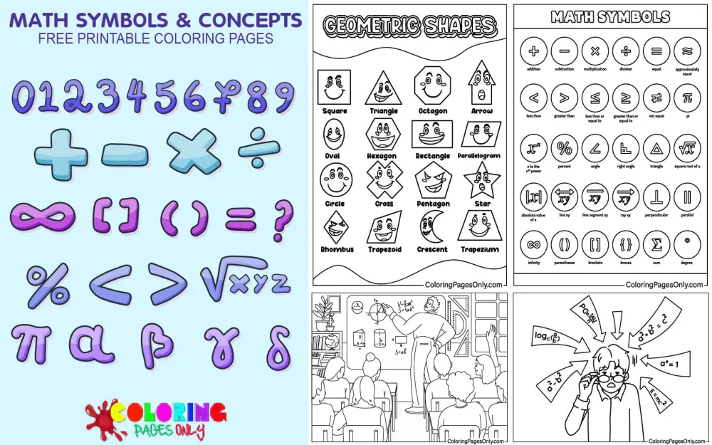
Math Symbols & Concepts Coloring Pages at ColoringPagesOnly.com brings together 30+ free printable pages covering the visual language of mathematics – the operators, symbols, signs, and conceptual illustrations that form the foundation of how humans write and communicate mathematical ideas. The collection includes reference chart pages showing families of math symbols, scene-based illustrations featuring students working with equations and formulas, standalone symbol portraits, and conceptual diagrams. Download any page as a free PDF to print, or color online directly in your browser.
This collection sits within the Educational Coloring Pages hub. For number learning activities, see Numbers Coloring Pages and Fun Counting Coloring Pages. For number-guided coloring activities, see Color by Number Coloring Pages.


What Is a Math Symbol – And Why Do They Exist?
Before the 15th century, there were no math symbols as we know them. Every mathematical operation – every addition, subtraction, comparison, or equation – had to be written out in full sentences, in whatever language the mathematician happened to work in. A simple problem like “three plus four equals seven” was written as three words: tres et quatuor æquales septem. A complex algebraic equation might require a full paragraph. Mathematics existed, was practiced, and produced genuine advances – but without symbolic notation, sharing it across cultures and languages was enormously difficult, and performing complex operations in writing was brutally slow.
Math symbols were invented to solve a communication problem. They are a shorthand – a compressed visual language that transcends spoken language, allows mathematical statements to be written compactly, and enables anyone who knows the notation to read a mathematical expression regardless of what language they speak. A child in Vietnam and a physicist in Germany both read “2 + 2 = 4” identically. That universality is what mathematician Bertrand Russell described when he wrote that all mathematics is, at its core, symbolic logic.
The symbols in this collection represent the accumulated notation choices of about five centuries of mathematicians across Europe, the Middle East, and Asia – each symbol invented by a specific person at a specific moment in history, for a specific reason, and then gradually adopted (or rejected) by the mathematical community that followed. These are not arbitrary squiggles. Every one of them has a story.
The Core Symbols – History, Meaning, and Visual Character
+ (Plus / Addition)
The plus sign first appears in print in 1489, in Mercantile Arithmetic by German mathematician Johannes Widmann, originally to indicate a surplus of goods in commercial warehouse accounting, not addition in the mathematical sense. The symbol derives from the Latin word et (meaning “and”), which the French philosopher Nicole Oresme had already been abbreviating as a cross-like mark in the 14th century. Welsh mathematician Robert Recorde introduced the + sign to English-speaking readers in his 1557 book The Whetstone of Witte – the same book that gave us the equals sign.
The + symbol is among the most visually simple in all of mathematics: two lines of equal length crossing at a right angle, perfectly symmetric both horizontally and vertically. For coloring pages that feature the plus sign, this symmetry is the defining visual characteristic – neither axis is dominant, neither stroke is heavier, and the four arms are identical. It is the most balanced symbol in mathematics.
− (Minus / Subtraction)
The minus sign has the same origin as the plus sign – Widmann’s 1489 Mercantile Arithmetic – where it indicated a deficit of goods. The symbol’s precise origin is debated: some scholars trace it to a horizontal line used in medieval German manuscripts to mark abbreviated words; others trace it to a tilde (~) placed over numbers to indicate subtraction. In any case, the horizontal dash became universally standardized as the subtraction operator and has remained essentially unchanged for over five centuries.
The minus sign is the mathematical symbol with the fewest possible components: a single horizontal line. Its extreme simplicity makes it the contrast to the plus sign in every visual composition, where + has four arms radiating in two axes, and − has one stroke in one axis. Pages that display both symbols together demonstrate this visual opposite quality immediately.
× (Multiplication)
The multiplication cross was introduced in 1618 by Scottish mathematician John Napier and gained widespread adoption through a popular 1631 textbook by English mathematician William Oughtred. Technically, the multiplication symbol is not the letter X – it is a slightly smaller, slightly raised character of the same shape, created to avoid confusion with the algebraic variable x (a confusion that so annoyed Gottfried Leibniz, the co-inventor of calculus, that he preferred a dot instead). The cross shape itself may be the “Cross of Saint Andrew,” the diagonal cross of Scotland’s patron saint, which would give the symbol a specific cultural origin.
The × symbol presents an interesting contrast to the + sign: both are two-line crosses, but the + is axis-aligned (horizontal and vertical) while the × is diagonal (45 degrees from horizontal). For coloring, this means the × requires the same symmetry awareness as the +, but with a rotated orientation.
÷ (Division – the Obelus)
The division sign as used in elementary arithmetic – a horizontal line with a dot above and below – is called the obelus, from the Greek word for a sharpened stick. It was introduced by Swiss mathematician Johann Rahn in his 1659 book Teutsche Algebra. Rahn may have borrowed it from an earlier editorial mark that manuscript scribes used to indicate a questionable passage – a mark of uncertain lineage given a precise mathematical meaning.
The obelus has a peculiar distinction: it is the only one of the four basic arithmetic operators that has been officially deprecated by international standards organizations. The ISO currently permits only the solidus (/) or fraction bar for division. The obelus persists in elementary school curricula and on calculator keyboards, but professional mathematicians and scientists almost never use it, making it a symbol that children learn early and then largely abandon. For coloring purposes, it is one of the most visually distinctive symbols: the combination of a horizontal line with precisely positioned dots above and below creates an unusual and elegant arrangement.
= (Equals)
The equals sign is one of the most precisely documented symbol inventions in history. Robert Recorde, a Welsh physician and mathematician, introduced it in 1557 in The Whetstone of Witte – the first English-language algebra book – explicitly because he was exhausted from writing “is equal to” repeatedly. His solution was two parallel horizontal lines of equal length. He chose parallel lines because, as he wrote, “no two things can be more equal” than two perfectly parallel, identical lines. The symbol he originally drew was much longer than the modern equals sign – something closer to === – and it took about a century before it was shortened to the compact form used today.
The equals sign carries profound mathematical meaning beyond its visual simplicity. It asserts a relationship of identity between two expressions – that they represent the same value – and is the foundation of algebra, equations, and all of formal mathematics. Without the equals sign, there are no equations; without equations, there is no algebra; without algebra, there is no calculus or higher mathematics.
> and < (Greater Than and Less Than)
These two symbols were introduced together in 1631 by English mathematician Thomas Harriot in his posthumously published book The Analytical Arts Applied to Solving Algebraic Equations. They are a visual mnemonic: the wide open end of the symbol faces the larger quantity, the pointed end faces the smaller quantity. “Greater than” (>) opens toward the left (the first quantity, which is larger); “less than” (<) opens toward the right (the second quantity, which is larger).
The symbols are elegant in their paired logic – they are mirror images of each other, which immediately communicates that they represent opposite relationships. They are also among the few symbols where the visual design of the symbol directly encodes its meaning: a child who understands that the wide mouth “eats” the bigger number has internalized the symbol’s logic, not just memorized its appearance.
√ (Square Root)
The square root symbol was first introduced in 1525 by German mathematician Christoph Rudolff in his book Coss. The symbol derives from the Latin word radix (root) – the initial letter r, stylized over centuries into the checkmark-like symbol with an overbar that we use today. René Descartes contributed the vinculum (the horizontal bar extending from the top of the √ symbol) in the early 17th century, which distinguishes the square root from the cube root and higher roots by allowing the expression under the bar to extend as far as needed.
The √ symbol is visually the most distinctive and recognizable symbol in elementary mathematics – its diagonal ascending line, sharp upward tick, and horizontal extension make it immediately identifiable. For coloring, the symbol divides naturally into two components: the root symbol itself (the checkmark portion) and the vinculum (the horizontal bar), which can be treated as two visual elements or unified as one.
∞ (Infinity)
The infinity symbol – the lemniscate – was introduced by English mathematician John Wallis in his 1655 book De sectionibus conicis. Wallis gave no explanation for why he chose this shape, and its precise origin remains debated. One hypothesis links it to the Roman numeral for 1,000 (which used a different but similarly looped form); another connects it to the ancient ouroboros (the snake eating its own tail, a symbol of cyclical endlessness). The 7th-century Cross of Saint Boniface features a similar form.
The ∞ symbol is the only mathematical symbol that depicts an abstract concept – not an operation, not a quantity, not a relationship, but a quality: endlessness itself. Its form – a continuous loop with no beginning and no end, tracing a figure-eight on its side – visually represents what it means: a path that continues forever without stopping. For coloring, the ∞ symbol is a single continuous closed curve, making it one of the most satisfying symbols to render: trace the outer boundary in one color, the inner crossing point in a slightly darker shade, and the entire form reads as a unified, flowing loop.
π (Pi)
The Greek letter π was first used to represent the ratio of a circle’s circumference to its diameter by Welsh mathematician William Jones in 1706. He found the notation in the work of English mathematician John Machin and adopted it because π is the first letter of the Greek word perimetron (περιμετρον), meaning perimeter. The notation gained international currency when Swiss mathematician Leonhard Euler adopted it in 1737 and used it throughout his enormously influential publications – making Euler, not Jones, the primary reason that π is universal today.
Pi’s value – approximately 3.14159265358979… – is irrational and transcendental, meaning its decimal expansion never terminates and never repeats. It connects circle geometry to countless branches of mathematics, physics, and engineering in ways that continue to surprise researchers. For coloring pages that feature π, the letter’s visual character – two vertical stems supporting a horizontal crossbar – is immediately recognizable as both the Greek letter and as mathematics’ most famous constant.
Categories of Pages in This Collection
The 30+ pages span several visual formats, each suited to a different educational purpose.
Reference chart pages display multiple math symbols together on a single page – operators (+, −, ×, ÷), comparison signs (=, >, <), and potentially special symbols (√, ∞, π) – in a visual reference layout. These pages function as posters or study aids: when colored and displayed, they provide children with a constant visual reference for the symbols they are learning. They are particularly valuable in homeschool environments or classroom math corners.
Scene-based illustrations show characters – students, teachers, or cartoon figures – engaging with math in a learning context: a student at a blackboard, a classroom with equations on the board, figures surrounded by floating math symbols. These pages humanize mathematical content, connecting abstract symbols to the act of learning and doing mathematics. They are the most narratively engaging pages in the collection and the most rewarding for colorists who enjoy figural illustration.
Concept and equation pages show mathematical statements, equations, or diagrams in a coloring page format – numbers and symbols arranged as they would appear in an actual math problem or formula. These pages bridge the gap between symbol recognition and symbol use, showing children the symbols in the context of actual mathematics rather than as isolated icons.
Large standalone symbol pages feature one or two symbols prominently centered on the page, with decorative or patterned background elements. These are closest in format to the letter portrait pages from the Alphabet collection – the symbol is the subject, the coloring is the activity, and the goal is deep familiarity with the visual form of a specific symbol through extended, focused engagement.
Why Visual Engagement With Math Symbols Matters
Research on mathematical learning consistently finds that children who develop strong visual familiarity with mathematical notation make the transition to formal algebra and equation-solving more smoothly than children who encounter symbols primarily through rote writing practice. When a child has spent time coloring a large, detailed equals sign – tracing its two parallel lines, considering its proportions, placing it in relation to other symbols on the page – the symbol has entered their visual memory through a channel that rote copying on worksheets does not reach.
This visual encoding matters because algebra is, at its core, a visual parsing task: reading an expression like 3x + 7 = 22 requires the eye to identify each symbol, assign it its correct meaning, and understand the relationships between them instantaneously. Children who hesitate at symbol identification lose cognitive resources that should be going toward the mathematical reasoning itself. Coloring activities that build fluent, automatic visual recognition of mathematical notation reduce this cognitive load before children encounter it in formal instruction.
The collection’s breadth – from the simplest four arithmetic operators through comparison signs, roots, and advanced constants – means that children can build this visual familiarity progressively across their early education, beginning with + and − and expanding to √ π as their mathematical vocabulary grows.
Coloring Tips for Math Symbol Pages
Treat symbols as graphic design, not just math. Each mathematical symbol is also a piece of visual design – a form with specific proportions, balance, and visual weight. When coloring a large symbol page, look at the symbol the way a graphic designer would: Where is the center of visual weight? (The crossing point of ×; the horizontal bar of ÷; the parallel midpoints of =.) What are the symbol’s axes of symmetry? (+ and × have two; − and = have one; < and > have bilateral symmetry.) Let these observations guide color choices – symmetrical symbols often look most striking with symmetrical color treatment.
For reference chart pages – use color as a categorization system. When a page shows multiple symbols together, consider color-coding them by category: all four arithmetic operators (+, −, ×, ÷) in warm colors (reds and oranges); all comparison symbols (=, >, <, ≠, ≤, ≥) in cool colors (blues and greens); special constants and symbols (π, ∞, √) in accent colors (purples or golds). This intentional categorization transforms a reference chart into a memorable visual taxonomy – the color grouping encodes the categorical information alongside the symbol recognition, making both easier to retain.
Black and white works powerfully for math symbols. Unlike character illustrations or landscape scenes, where color tells most of the story, math symbols are inherently graphic – their meaning is in their shape, not their color. For symbol-focused pages, consider rendering the symbol itself in a single strong dark color (navy, deep red, forest green) and leaving the background or surrounding decorative elements in lighter tones. This high-contrast approach makes the symbol visually primary and communicates its importance relative to the surrounding content.
For scene pages – establish spatial depth through color temperature. Classroom or study scenes typically have a foreground figure (a student), a middle ground (a desk or board), and a background (walls, windows, equations). Use warm colors for foreground elements and cool colors for background elements to create spatial recession – the warm figure advances visually, the cool background recedes, and the page gains three-dimensional depth. The mathematical content (equations, symbols) on chalkboards or paper within the scene should be rendered in contrasting colors that make them legible even at the scale of the illustration.
The equals sign’s two lines must be visually identical. Of all the symbols, the equals sign is the most visually unforgiving: if one horizontal line is noticeably thicker, darker, or differently positioned than the other, the symbol loses its identity. When coloring an equals sign, apply the same pressure, the same color, and the same stroke direction to both lines. The symbol’s meaning – equality, sameness, balance – should be reflected in the perfect equivalence of its two components.
Pi (π) benefits from a warm, golden palette. The mathematical constant π has an almost mythological status in mathematics – it appears in the most unexpected places, connects geometry to analysis, and has fascinated mathematicians for thousands of years. When coloring π, a warm golden or amber palette honors its cultural significance and makes it visually regal against a cooler or more neutral background. The two vertical stems of the Greek letter support a horizontal cap – rendering the cap and stems in slightly different shades of the same warm color family creates visual hierarchy without breaking the letter’s unity.
5 Activities
The math symbol scavenger hunt. After coloring any reference chart page from this collection, take it on a walk around your home, school, or neighborhood. For each symbol on the page, find a real-world example of that symbol being used – a + on a pharmacy sign, an = on a price tag equation, a × on a multiplication worksheet, a > or < on a number line or thermometer. Mark each found symbol on the chart with a checkmark. This activity moves math symbols from the abstract world of the page into the concrete world of daily experience, building the recognition that mathematical notation is genuinely present and functional in the real environment, not just in textbooks.
Symbol inventor cards. After coloring any of the symbol-focused pages, create a simple illustrated card for each symbol on the page. On the front, draw the symbol large and color it. On the back, write the inventor’s name, the year introduced, and one sentence about why it was invented: “Robert Recorde invented = in 1557 because he was tired of writing ‘is equal to.'” “Johannes Widmann invented + in 1489 to track warehouse surpluses at sea ports.” This activity transforms the passive activity of coloring into an active research and writing exercise, and the cards become a personal deck of math symbol history references. Children who create these cards retain the history – and the symbol – more durably than children who only color.
The symbol design challenge. Show your child the history of how mathematical notation developed – how mathematicians before 1489 had to write “three and four equals seven” in full words, and how symbols replaced those words over time. Then set a challenge: if you were a mathematician in 1400, with no math symbols existing yet, what symbol would you invent for addition? Draw and color your proposed symbol. What about subtraction? Multiplication? This creative exercise develops a genuine understanding of why symbols exist (to save time and enable cross-language communication), what makes a good symbol (unambiguous, visually distinctive from other symbols, easy to write quickly), and how the symbols we have today were not inevitable – they were choices made by specific people, and different choices could have been made.
The equation coloring sequence. Print any equation or formula page from the collection. Before coloring, identify each component: the numbers (what values are shown?), the operators (which operations are being performed?), the equals sign (what is being asserted to be equal?), and any special symbols present. Color each category in a consistent color family across the whole equation: all numbers in one color, all operators in another, the equals sign in a third, any variables or special constants in a fourth. When the page is complete, the color-coded equation makes the grammatical structure of mathematical notation visible – numbers are nouns, operators are verbs, and the equals sign is the assertion. This activity helps children who are beginning algebra to understand equations as structured statements rather than arbitrary arrangements of symbols.
The symbol evolution timeline. Using a long piece of paper, create a horizontal timeline from 1400 to today. Place each math symbol learned from this collection on the timeline at the year it was invented, with a hand-drawn colored version of the symbol and the inventor’s name. The timeline should include: + and − (1489, Widmann), = (1557, Recorde), × (1618, Napier/1631, Oughtred), √ (1525, Rudolff), ÷ (1659, Rahn), ∞ (1655, Wallis), π (1706, Jones/1737, Euler). The completed timeline reveals a remarkable fact: virtually all of the mathematical notation children learn in school was invented within a 250-year window, from roughly 1450 to 1710. Before 1450, none of these symbols existed. After 1710, the basic notation was largely in place. Displaying this timeline on a wall or in a notebook gives children a concrete historical frame for the abstract symbols they use daily.

