How to Color Anime Characters covers the specific techniques, color logic, and tool choices that separate a flat, lifeless anime coloring page from one that looks vivid, polished, and true to the source material. Whether you are coloring a Naruto page, a Demon Slayer scene, or any other anime character, the principles in this guide apply universally.
Anime has a visual language unlike any other illustration style. Its color rules are specific, its light-and-shadow system is distinctive, and the techniques that work well with regular coloring pages often produce poor results with anime. This guide explains exactly why – and what to do instead.

Understanding the Anime Color System
Before picking up a single pencil or marker, it helps to understand what makes anime coloring visually distinctive. Anime character art is built on cell shading – a system of flat color fills with hard-edged shadow areas rather than the soft, gradual blending typical of realistic illustration.
In traditional anime production, each character’s area (skin, hair, clothing) was filled with a single flat base color, then a single flat shadow color was applied in specific zones to suggest three-dimensional form. A white or pale highlight was added for shine on hair, eyes, and glossy surfaces. That is the complete system: three tones per area – base, shadow, highlight – with hard edges between them, not gradients.
Understanding this three-tone cell-shading logic is the single most important insight for coloring anime pages well. Every technique in this guide flows from it.
What this means in practice:
- Avoid blending colors into each other smoothly – cell shading uses distinct, flat zones
- Shadow areas in anime are typically cooler and more saturated than the base, not simply darker versions of the same color
- Highlights are typically pure white or very pale – not a lighter version of the base color
This color system is what gives anime its clean, graphic quality. When you replicate it with physical or digital tools, the result looks intentionally anime rather than accidentally flat.
Section 1: Coloring Anime Skin
Skin is typically the largest single area on an anime character page and the one that most determines whether the finished result looks convincingly anime or merely generically colored.
Choosing the Base Skin Tone
Anime skin tones cluster around a narrower range than realistic portrait illustration. Most anime characters – regardless of implied ethnicity – use a warm peach or light tan as their primary skin base, with darker characters using a warm medium brown. The specific shade matters less than its temperature: anime skin bases are almost always warm (leaning toward orange-yellow) rather than cool (leaning toward pink-gray).
Common base skin color starting points with colored pencils:
- Light skin: Peach, Pale Peach, or Light Peach – warm, low-saturation
- Medium skin: Light Tan, Beige, or Cream – slightly deeper but still warm
- Dark skin: Light Brown or Sienna – warm, medium-depth
With alcohol-based markers (Copic), the E-series (Earth tones) provides the standard anime skin palette: E000, E00, E11, E21 for light skin; E33, E34, E35 for medium skin tones; E47, E57 for darker skin tones.
Applying the Shadow Color
This is where most beginners go wrong. The instinct is to use a darker version of the same peach/tan base for shadow – a slightly deeper peach. This produces a flat, uninteresting result.
Anime shadow on skin uses a color that is simultaneously darker AND shifted toward pink or coral. The shadow on a peach-base skin leans into pink-mauve rather than deeper peach. This cooler-toned shadow against the warm base creates the contrast that reads as a three-dimensional form.
In colored pencils: add a salmon, light rose, or muted coral over your base tone in the shadow zones, then lightly layer the base color over it to integrate. The result should be visibly cooler and slightly more saturated than the lit base skin.
Shadow placement for anime faces (standard rules):
- Under the chin and jaw
- Beneath the hair where it falls over the forehead
- The side of the nose (one side only, usually the side away from the implied light source)
- Under the lower lip
- The neck, where the head casts a shadow
Avoid adding shadow to the center of the forehead, the bridge of the nose, and the cheek centers – these stay at base tone or receive a pale blush dot (for feminine characters).
Adding the Blush
The circular cheek blush is one of anime’s most recognizable design elements. It reads as both health and emotion. Apply a very pale pink or light coral in a small, softly-edged circle on each cheek, centered below the outer corner of the eye. Keep it subtle – barely visible rather than obvious. A blush that is too vivid reads as clown makeup rather than a delicate anime effect.
The Highlight: Leave It or Add White
In anime, skin highlights appear on the tip of the nose, sometimes on the forehead center, and on the lower lip. On printed coloring pages, these may already be indicated by small white areas in the line art. If so, leave them uncolored (the white of the paper) or use a white gel pen after coloring to restore coverage if you accidentally colored over them.
If the page does not indicate highlights, adding a tiny white gel pen dot to the tip of the nose and the center of the lower lip after coloring is complete will significantly improve the anime appearance of the face.
Section 2: Coloring Anime Hair
Anime hair is the most visually complex area of most character pages – it covers significant surface area, has elaborate shapes, and carries strong character identity. Getting the hair right has more impact on the finished result than any other single element.
The Three-Tone Hair System
Anime hair uses the same three-tone logic as skin, but more dramatically:
Base color: The flat mid-tone that covers most of the hair area. This is the character’s canonical hair color: Naruto’s yellow-blonde, Nezuko’s black, and Rem’s blue.
Shadow color: Applied in the deepest zones – the undersides of large hair chunks, the area where hair meets the forehead, and the regions between large hair clumps. Anime hair shadow is noticeably darker than the base and typically shifted cooler – blue-black shadow on black hair, dark violet on purple hair, deep navy on blue hair.
Highlight: The bright reflection stripe or zone that appears on the top or crown of the hair where light strikes. Anime hair highlights are typically white or very pale-tinted white – not a lighter version of the base color. A white or near-white highlight stripe running along the top curve of the hair mass is the most characteristic element of anime hair.
Applying the Three-Tone System – Step by Step
Step 1: Apply the base color across the entire hair area. Keep coverage even and moderately light – you need room to layer the shadow on top.
Step 2: Identify the shadow zones. In anime hair, these are:
- The area immediately adjacent to the scalp where hair parts
- The underside of large hair chunks
- Where one hair chunk overlaps another
- Where hair falls in front of the face or ears
Apply the shadow color in these zones with a hard edge on the boundary facing the light source and a slightly softer edge on the side facing deeper into the hair mass.
Step 3: Lightly apply the base color over the shadow edges to integrate slightly without fully blending – this maintains the cell-shading quality while avoiding a harsh cut.
Step 4: Add white or near-white highlight. Using a white colored pencil or white gel pen, draw the highlight zone on the crown of the hair where light would logically strike first. In anime, this is typically a slightly curved stripe or patch near the top of the head.
Hair Color Reference by Common Anime Characters
| Character | Base color | Shadow color | Highlight |
| Naruto Uzumaki | Golden yellow | Deep amber-orange | White |
| Sasuke Uchiha | Blue-black | Dark navy-black | White/pale blue |
| Nezuko Kamado | Black | Dark navy | White |
| Tanjiro Kamado | Black (red-tipped) | Dark navy | White |
| Rem (Re: Zero) | Medium blue | Dark navy-violet | White |
| Zero Two (Darling in the FranXX) | Bright pink | Deep rose-magenta | White |
| Gojo Satoru | White/silver | Cool pale gray | Bright white |
Common Hair Coloring Mistakes
Using only one color for the entire hair area. Single flat color hair looks unfinished and two-dimensional. Even a minimal two-tone approach (base + one shadow zone) dramatically improves the result.
Using a shadow color that is just a darker version of the base. Dark yellow, as the shadow for yellow hair, reads as dirty rather than dimensional. Shift the shadow toward a cooler or more saturated version of the base – dark amber-orange for yellow hair, dark navy for blue hair.
Making the highlight too colored. Anime hair highlights are white or near-white, not a light version of the base color. A light yellow highlight on yellow hair reads as bleaching, not light reflection. Use white.
Section 3: Coloring Anime Eyes
Anime eyes are the most technically demanding and most visually important element of any character page. Readers look at eyes first – and well-colored anime eyes can elevate an otherwise average page significantly.
The Four-Layer Eye System
Professional anime eye coloring uses four distinct layers:
Layer 1 – Base color: Fills the main iris area. This is the character’s canonical eye color – Naruto’s blue, Sasuke’s dark gray, Rengoku’s gold. Apply evenly and moderately across the entire iris.
Layer 2 – Dark ring: A darker, more saturated version of the base color applied around the outer edge of the iris in a ring or arc. This creates the characteristic anime eye depth – the iris appears deeper at the outer edge and lighter toward the center. This layer should cover roughly the outer 30–40% of the iris width.
Layer 3 – Light center: A lighter, less saturated version of the base applied to the lower-center portion of the iris. In many anime styles, this is barely tinted – almost white with a hint of the base hue. This creates the impression of light passing through the iris.
Layer 4 – White highlight: A crisp white dot or oval in the upper portion of the iris, typically off-center toward the light source. This is the most characteristic anime eye element – the bright catch-light that gives anime eyes their vivid, alive quality. Apply with a white gel pen after all other layers are complete.
The Pupil
Anime pupils are typically dark but not pure black – very dark navy, very dark violet, or very dark brown, depending on the eye color. A pure black pupil in an anime eye creates a harsh, flat effect. Use the darkest available shade of the eye’s color family for the pupil.
Upper Shadow
Many anime eye designs include a shadow at the top of the iris where the upper eyelid casts a shadow. Apply a band of the shadow color (the dark ring color or slightly darker) across the top 15–20% of the iris, immediately below the upper eyelid line. This shadow deepens the eye and adds significant realism to the anime style.
The Sclera (White of the Eye)
Do not color the sclera pure white with colored pencil or marker – the paper’s natural white is cleaner and more luminous than any applied white medium. Leave the sclera as the paper’s white, adding only the faintest suggestion of very pale blue or gray in the far corners if you want to suggest subtle shadow.
Eye Color Reference by Common Anime Characters
| Character | Base eye color | Shadow/ring | Special notes |
| Naruto Uzumaki | Bright blue | Deep navy | Simple circular iris |
| Sasuke Uchiha | Dark gray-black | Very dark navy | Sharingan = red with a pattern |
| Nezuko Kamado | Pale pink | Deeper rose | Often partially lidded |
| Tanjiro Kamado | Deep teal-green | Dark forest green | Warm brown in flashbacks |
| Rengoku Kyojuro | Gold-amber | Deep amber-brown | Flame pattern visible |
| Gojo Satoru | Pale blue (under blindfold) | Soft gray | Infinity eyes = deep teal |
For Sharingan, Rinnegan, and other special anime eye designs, the pattern should be drawn in after the base coloring is complete – use a fine-tipped red or purple marker or gel pen over the base color.
Section 4: Coloring Clothing and Accessories
Clothing in anime follows the same three-tone cell-shading system as skin and hair, but with greater flexibility in shadow placement, since clothing has more geometric, predictable folds.
Reading Clothing Folds
Anime clothing folds follow a standardized visual vocabulary. Shadow falls in:
- The valley of each fold – the deepest crease between fabric peaks
- The underside of fabric that curves away from the light source
- Behind overlapping layers – where one garment passes in front of another
For most anime coloring pages, fabric fold shadows are already clearly indicated in the line art – the outline suggests where the shadow should go. Apply the shadow color within these indicated zones.
Clothing Shadow Colors
Like skin and hair, clothing shadows should not simply be a darker version of the base. A muted, slightly cooler version of the base color reads as natural fabric shadow. For vivid clothing colors (the bright reds, blues, and greens common in anime), the shadow color should be noticeably cooler and slightly more saturated – deep navy shadow on a bright blue garment, deep burgundy on a bright red.
For black clothing (common in anime, particularly for antagonist characters), shadow is indicated with very dark navy or dark charcoal rather than pure black – adding shadow to a pure black base is difficult, but using slightly cooler near-black establishes dimension.
Section 5: Choosing Your Tools
Different tools produce different results for anime coloring, and each has a clear best use case.
Colored Pencils
Best for: Beginners, detailed pages, long coloring sessions, budget-conscious colorists
Colored pencils are the most forgiving tool for anime coloring and the best starting point for most people. They allow gradual color building, easy correction (by layering), and fine detail work.
For anime specifically: Use a burnishing technique – apply multiple light layers rather than one heavy layer – to build the flat, even coverage that anime’s cell-shading style requires. A colorless blender pencil used over completed areas smooths the texture for a cleaner anime look.
Recommended set size: 36–48 pencils gives sufficient range for anime skin, hair, and clothing palettes without overwhelming choice.
For detailed technique guidance, see our coloring tips for beginners.
Alcohol-Based Markers
Best for: Vivid flat color, fast coloring, professional-looking results, experienced colorists
Alcohol-based markers (Copic, Prismacolor Brush, Ohuhu) are the closest physical tools to the flat cell-shading system anime uses. They lay down vivid, even flat color in a single pass and blend seamlessly into each other when wet. Many professional anime colorists and fan artists use Copics specifically because the results most closely resemble actual anime production coloring.
For anime specifically: Work from light to dark – apply lighter colors first, then add darker colors on top. Unlike colored pencils, you cannot effectively layer a lighter color over a darker marker. Plan your color sequence before starting.
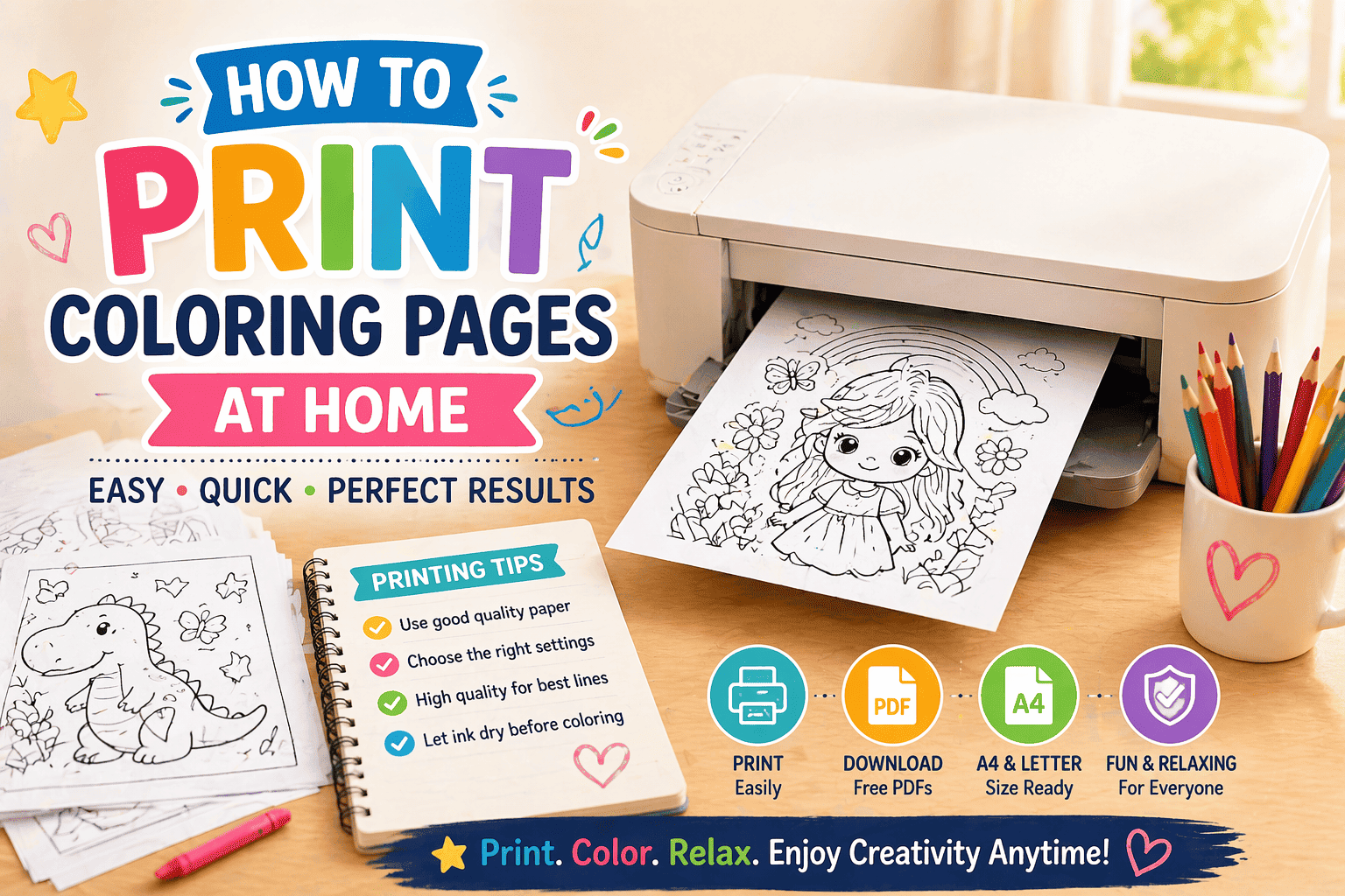
Paper requirement: Alcohol-based markers require 160gsm+ paper to prevent bleed-through. See our How to print coloring pages guide for paper weight recommendations.
Watercolor
Best for: Softer, more painterly anime styles (Studio Ghibli aesthetic, shoujo manga)
Watercolor produces a looser, more atmospheric result than colored pencils or markers – less suited to the clean cell-shading of action anime (Naruto, Demon Slayer) but well suited to the softer, more naturalistic style of films like Spirited Away or My Neighbor Totoro.
For watercolor on printed pages, 160–200gsm paper is essential. For dedicated watercolor anime coloring, printing on cold-press watercolor paper produces the best results.
Fine-Tip Pens and Gel Pens (Supplementary)
A white gel pen is the single most useful supplementary tool for anime coloring, regardless of primary medium. It is used for:
- Hair highlights
- Eye catch-lights
- Small details highlight clothing and accessories
- Correcting accidentally colored white areas
A set of fine-tip black pens (0.05–0.3mm) allows redrawing line art that was softened during coloring, sharpening the crisp black outlines that define the anime style.
Section 6: Common Mistakes and How to Fix Them
Coloring everything the same way. Skin, hair, eyes, and clothing each have specific rules in anime. Treating every area with the same blending approach produces inconsistent results. Use the appropriate technique for each area.
Ignoring the white of the paper. In anime coloring, white areas are intentional – they represent highlights and light sources. Coloring over every white area removes the luminosity that makes anime eyes and hair distinctive. Leave indicated white zones uncolored.
Using too many colors in a single area. Anime’s visual power comes from its restraint – three tones per area, clearly separated. Adding five or six different tones to a single hair mass or skin area does not add realism; it produces visual noise. Commit to three tones and make them count.
Choosing shadow colors that are too light. The contrast between base and shadow in anime is high – higher than in realistic illustration. If the shadow area does not appear clearly different from the base at a normal viewing distance, it is too light.
Skipping the eye highlights. A finished anime face without eye highlights looks flat and lifeless, even when everything else is colored well. The white gel pen eye highlight takes 10 seconds and has more visual impact per second than any other single step.
Using pure black for dark areas. Pure black in shadow zones produces a harsh, unfinished look in anime coloring. Use very dark navy, very dark brown, or very dark versions of the area’s color family instead.
Getting Started: Which Pages to Practice On
If you are new to anime coloring techniques, start with pages that isolate specific challenges rather than presenting all challenges at once.
For practicing skin: Choose a close-up portrait page with a single character showing face and shoulders. My Hero Academia coloring pages include many character portrait pages ideal for practicing facial coloring.
For practicing hair: Pages showing a character from a three-quarter or side angle give the best view of hair volume and fold structure. Demon Slayer coloring pages feature characters with distinctively colored and patterned hair that makes the three-tone system visually rewarding to apply.
For practicing eyes: Any close-up face page works. Start with single-color eyes (blue, green, brown) before attempting two-tone or patterned designs like Sharingan.
For practicing full-character coloring, Naruto coloring pages feature characters in bold, clearly defined outlines with large flat-color zones that respond well to the cell-shading approach. The iconic orange-and-blue color scheme is a strong test of warm-cool contrast.
For a broader selection of anime characters across multiple series, browse our full anime coloring pages collection.
FAQs
Do I need special supplies to color anime pages well? No. A set of 36 high-quality colored pencils and a white gel pen covers most anime coloring techniques. Alcohol-based markers produce more vivid results but cost significantly more and require heavier paper. Start with colored pencils and add markers once you are comfortable with the technique.
How do I color Sharingan and other special anime eyes? Color the base iris first – typically a deep red or red-orange for Sharingan – then use a very fine black pen or marker to draw the tomoe pattern over the colored base. Finish with a white gel pen highlight. The sequence is: base color → pattern linework → highlight. Never try to leave the pattern as an unpainted white area – the lines are too complex.
What is the correct skin color for Japanese anime characters? Most anime characters – including those from Japanese-set series – use a warm peach skin base that is lighter and warmer than realistic Japanese skin tones. Anime skin is a design convention, not a realistic depiction. Apply the standard warm peach base unless the character is specifically designed with darker skin.
My colored pencil anime coloring looks streaky – how do I fix it? Streakiness in colored pencil work comes from applying too much pressure in a single layer. Apply multiple, lighter layers instead of a single heavy layer, working in small circular or crosshatching strokes rather than parallel lines. A colorless blender pencil applied over the completed area smooths the surface and removes the streaky texture.
How do I make anime eyes look vivid and not flat? Apply all four eye layers – base, dark outer ring, light center, and white highlight. The white gel pen highlight is the most important single step. Without it, anime eyes look flat regardless of how carefully the base and shadow colors are applied. The white catch-light creates the impression of depth and life.
Can I use regular watercolor paint for anime coloring? Yes, but print on 160–200gsm paper first. Watercolor on standard printer paper will buckle immediately. For the soft anime aesthetic (Ghibli-style), watercolor produces beautiful results on appropriate paper. For action anime with crisp cell-shading, colored pencils or markers produce more characteristic results.
How do I handle characters with very light or white hair? Use the paper’s white as your base – do not apply a white base color. Apply a very pale cool gray or pale lavender for the shadow zones, and use a slightly deeper version of the same pale tone for the deepest shadow areas. A white gel pen for the highlight creates a clean reflective quality that a pale-colored pencil cannot achieve.
Browse our complete anime character collection at ColoringPagesOnly.com. For specific series, explore Naruto coloring pages, Demon Slayer coloring pages, My Hero Academia coloring pages, and the full anime coloring pages collection.