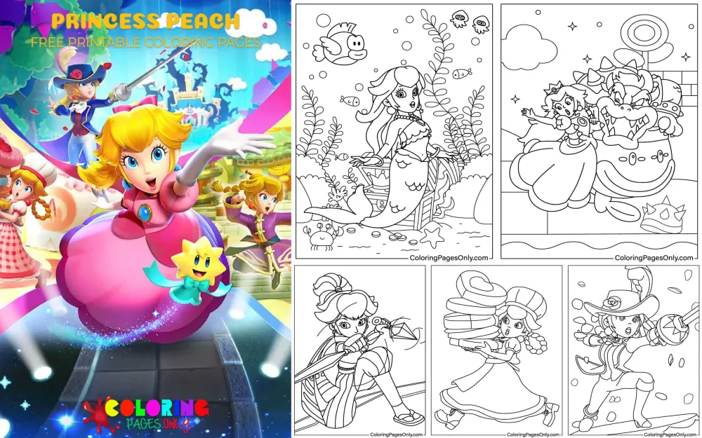
On this page, you’ll find 41 free Princess Peach coloring pages – all free to download as PDFs or color online! This collection covers the full range of Peach’s 40-year history: her iconic pink princess gown in the Mushroom Kingdom, action poses including sword practice and battle stances, and the theatrical transformations from Princess Peach: Showtime! (Mermaid Peach, Swordfighter Peach, and more), joyful scenes of dancing and flower-picking, duo pages with Mario and Luigi, tense moments alongside Bowser, and the quirky “Princess Peach Playing with King Boo” that only longtime fans will truly appreciate!
These pages are perfect for Mario fans of all ages – younger kids who love the pretty pink princess, older players who grew up with the games, and everyone who saw Anya Taylor-Joy’s iconic take on Peach in The Super Mario Bros. Movie. Once colored, use them as room decorations, party favors, or fan art to display!
While you’re here, grab these related pages! Super Mario Bros Coloring Pages · Mario Coloring Pages · Princess Coloring Pages · Games Coloring Pages


Princess Peach – 40 Years of Nintendo’s Most Iconic Princess
Princess Peach made her debut on September 13, 1985, in Super Mario Bros. for the Nintendo Entertainment System – the game that launched the most commercially successful video game franchise in history. The Mario franchise has since sold over 600 million units across hundreds of games, and Peach has appeared in more of them than any other female character in video game history. She is, by any measure, the most consistently featured female character across all of video gaming.
She was created by Shigeru Miyamoto, the legendary Nintendo designer also responsible for Mario, Donkey Kong, and The Legend of Zelda. Miyamoto’s design brief for Peach was specific and has proven enduringly influential: he asked fellow designer Yōichi Kotabe to make her eyes look “a little cat-like” and wanted her to look “stubborn, but a little cute” – a combination of qualities that was harder to achieve than it sounds, and that explains why Peach’s expression across her 40-year history has such a particular quality. She is always elegant but never passive; always graceful but with something sharp underneath.
In the West, she was initially released as “Princess Toadstool” – a name used in North American and European localizations from 1985 until Super Mario 64 in 1996, when the Japanese name “Princess Peach” was first adopted for Western markets. In Japan, she has always been ピーチ姫 (Pīchi-hime) – Princess Peach – from the very beginning. The sapphire brooch she wears on her chest has been part of her design since her debut on October 18, 1985.
When Nintendo’s Miyamoto later reflected on Peach’s evolution, he acknowledged the deliberate creative decision-making behind her character arc: “Although Nintendo had intentionally kept Peach as a damsel in distress who is rescued by Mario for a while,” the goal was always to eventually develop her into “a more powerful princess” by featuring her as a capable playable character and giving her a major role beyond rescue. That transformation – from the princess in the castle to the princess who saves the theater – is the story of Peach across four decades.
The Canonical Design – Peach’s Pink Palette Explained
Princess Peach has one of the most specific and color-consistent character designs in all of gaming – a palette so established that any significant deviation from it reads as an alternate costume or a different game mode rather than just a coloring choice.
The dress. Peach’s signature garment is a floor-length pink ball gown with puffy, rounded sleeves, a high collar, and magenta panniers (the fabric panels that widen the silhouette at the hip, referencing historical European court fashion). The pink of the main dress is a warm, medium-saturation pink – distinctly pinker than peach, lighter than hot pink, and warmer than rose. Think of the pink of a candy pink crayon rather than a watercolor blush or a neon pink. The panniers and collar are a slightly darker, more saturated magenta that creates subtle contrast within the overall pink palette. Most versions of Peach also include a white petticoat visible beneath the hem.
The gloves. Peach wears long white gloves extending above the elbow – a classic element of royal and formal feminine fashion that has remained consistent across every era of her design. The gloves should be rendered in a warm off-white, slightly warmer than the crisp white of her crown, to prevent them from reading as two different elements.
The crown. A relatively small gold crown with red and blue gem settings – not the large ornate crown of Western fairy-tale tradition, but something more refined and precise. The crown’s gold should be a warm amber-gold (not yellow-gold and not the cold metallic of silver), with the red and blue gems as vivid accent points.
The sapphire brooch. A small blue gem brooch at the neckline of her dress – easy to overlook on a quick glance, but consistently present since 1985. Rendered in deep sapphire blue, it provides the dress’s only cool-toned accent against the warm pink.
Hair and features. Long golden blonde hair – a warm honey-gold blonde rather than pale platinum – styled with a characteristic triangular bang at the center of the forehead and two sideburn curls framing the face. Fair skin, vivid blue eyes with the cat-like quality Miyamoto specified. Pink lips. The overall impression is warm and luminous – every element of her color palette is warm-toned except the sapphire brooch, making her appear to radiate a gentle, internal light.
40 Years of Character Evolution – From Damsel to Protagonist
The most compelling story about Princess Peach is not any single game’s narrative but the 40-year arc of how her character role has changed within the franchise.
1985–1990: The Original Damsel. In Super Mario Bros. (1985), Peach exists entirely as motivation for Mario’s journey – the character who has been kidnapped by Bowser, who waits at the end of each world, and who thanks Mario at the game’s conclusion. This is the foundational “damsel in distress” pattern that Peach would both perpetuate and periodically break for the next four decades.
Even in these earliest appearances, however, there were signs of something more. In Super Mario Bros. (1985), Peach’s white magic is established as the only force capable of undoing the chaos Bowser has inflicted on the Mushroom Kingdom – making her the essential magical key to the story’s resolution, not simply a passive recipient of rescue. And in Super Mario Bros. 3 (1988), when Mario finally defeats Bowser and reaches Peach, she delivers one of gaming’s best comic lines, saying: “Thank you, but our princess is in another castle! Just kidding! Ha ha ha! Bye bye.” – a self-aware, genuinely funny acknowledgment of her own franchise role that revealed a personality with considerable wit.
1988: First Playability. Super Mario Bros. 2 (1988) was the first game in which Peach was a playable character, and it introduced her signature gameplay ability: a prolonged floating jump – she jumps slightly lower than the other characters but hangs in the air significantly longer, allowing precise mid-air navigation that other characters can’t achieve. This floating ability, derived from her light weight and flowing dress, has remained her defining playable characteristic across dozens of subsequent appearances. It is simultaneously a mechanical ability and a character statement: Peach moves through the world with a different relationship to gravity than everyone else.
2005: The First Solo Star – Super Princess Peach. Super Princess Peach for the Nintendo DS was Peach’s first true solo console game – and it reversed the franchise’s foundational premise entirely. Mario and Luigi have been kidnapped by Bowser. Peach must rescue them. She does so using a Vibe Scepter (a magical parasol named Perry) and four emotion-based powers: Joy (which heals her and gives her flight), Gloom (which makes her cry, the tears damaging enemies and watering plants), Rage (which fills her with fire, literally), and Calm (which restores her health). This emotion-based power system was both mechanically inventive and culturally significant – Peach defeating enemies not with physical strength or weapons but with the controlled deployment of emotional states, each one powerful in a different way.
2024: Princess Peach: Showtime! Peach’s second major solo title – released on March 22, 2024, for Nintendo Switch – is perhaps the clearest statement yet of where Nintendo wants the character to go. The premise: Peach arrives at the Sparkle Theater to enjoy a theatrical performance, only to find it under attack by the villainous Grape and her minions, the Sour Bunch. Working with Stella, the theater’s ribbon guardian, Peach must save every performance on the theater’s stages by transforming into different theatrical personas – each one a complete reimagining of her abilities and aesthetic.
2023: The Movie Peach. The Super Mario Bros. Movie gave the world an entirely new version of Peach, voiced by Anya Taylor-Joy – a Peach who rules the Mushroom Kingdom actively and competently, who trains Mario in a gauntlet challenge, and who leads the defense of her kingdom against Bowser’s forces. Miyamoto specifically noted that Peach was “one of the characters in the film that evolved the most,” changing from a princess who needs protection to one who fights for her kingdom. The movie’s worldwide gross of over $1.3 billion demonstrated that audiences were entirely ready for this version of the character.
Princess Peach: Showtime! – The Transformation Guide
The Princess Peach: Showtime! transformations are directly represented in this collection – several tiles depict Peach in her theatrical costume variants, each requiring a completely different color approach.
Swordfighter Peach – depicted in “Princess Peach Sword Practice” – transforms Peach into a sword-wielding warrior in a darker, more dramatic costume variant. Her canonical Swordfighter design features a deep blue-purple and gold color scheme far from her usual pink, with a flowing cape and a gleaming rapier. This transformation is one of the most visually striking departures from Peach’s typical design – the darker palette emphasizing her competence and determination.
Mermaid Peach – depicted in “The Mermaid Princess Peach” – is one of the collection’s most colorful pages. Peach in her mermaid form has an aquatic color palette: her tail in graduated blues and teals transitioning from deep turquoise at the base to lighter aqua near the waist, with fins in a slightly more vivid, saturated blue. Her upper body retains more of her typical coloring – blonde hair, fair skin – but with additional aquatic accessories and a seashell crown. The contrast between her warm skin and hair tones and the cool marine palette of her tail is this page’s primary visual challenge.
Kung Fu Peach – the “Princess Peach Fight” tile likely depicts this martial arts transformation. Kung Fu Peach wears a red and gold martial arts costume with distinct Chinese-inspired design elements. The red of this costume is a vivid, saturated crimson – a completely different color family from her usual pink – paired with gold trim and a distinctive fighting stance that replaces her usual graceful posture with something more grounded and powerful.
Detective Peach – appears in crime-solving scenarios in a more muted, investigative aesthetic. Her Detective costume features darker, more neutral tones – browns, creams, and deep burgundy in a vintage mystery-story aesthetic. This transformation is the most understated of the group, requiring a more sophisticated approach to warm neutral tones.
Figure Skater Peach – appears in a skating rink setting in a costume that brings back the pink palette but in a performance-focused variant: tighter, more athletic in cut, with sparkle and movement details that reflect the theatrical nature of competitive figure skating.
Patissier Peach – the baker transformation, featuring a white chef’s costume with pastel accent colors appropriate to a pastry chef working with beautiful food. This is the warmest and most domestic of the transformations, with the white apron, the cute dessert-themed accessories, and Peach’s characteristic warm pink visible in smaller design elements.
Mighty Peach – the power transformation, featuring Peach in a larger, more formidable form with enhanced physical capability. This is the most physically imposing of the transformation pages and the one that most directly contradicts the traditional damsel image.
The Collection’s Pages – Complete Scene Guide
Classic princess pages – “Princess Peach in Kingdom,” “Princess Peach Picking Flowers,” “Princess Peach Dancing” – depict Peach in her traditional pink gown within the warm, cheerful aesthetic of the Mushroom Kingdom. These are the most beginner-friendly pages in the collection: the canonical pink palette is well-established, the scenes are serene, and the coloring challenge is maintaining the consistent warm pink across different lighting conditions implied by each scene.
Action and ability pages – “Princess Peach Sword Practice,” “Princess Peach Fight,” “Princess Peach Carrying Many Things” – show Peach in active, dynamic poses that break from the passive princess stereotype. These pages are the most compositionally complex in the collection and produce the most dramatically interesting finished results.
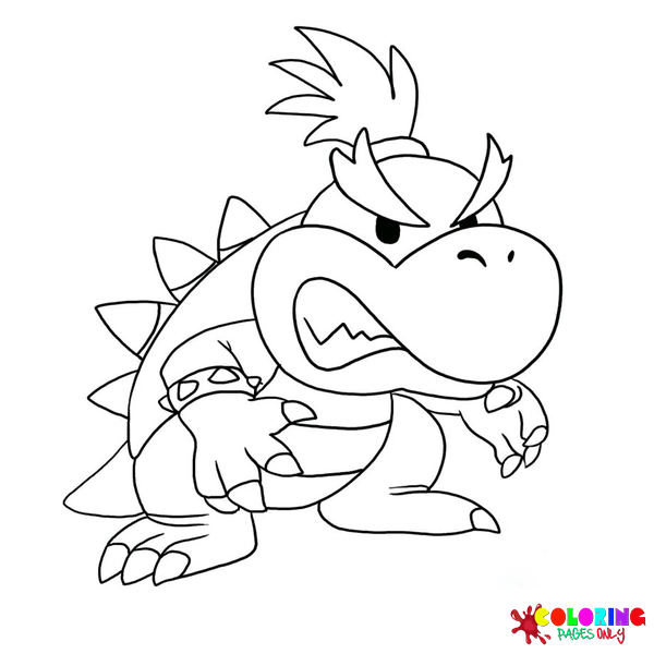
Character interaction pages – “Princess Peach, Mario, and Luigi,” “Princess Peach and Bowser,” “Princess Peach Playing with King Boo” – place Peach in relationship with other significant Mario franchise characters. The Bowser page, in particular, offers a striking visual contrast: Peach’s soft, warm pink against Bowser’s dark green and orange, one of gaming’s most recognizable visual character pairings. The King Boo page is a fan-favorite quirk – the ghostly white villain and the pink princess in an unexpectedly playful interaction.
Showtime transformation pages – “The Mermaid Princess Peach,” “Princess Peach Sword Practice” and related tiles – depict the 2024 theatrical persona transformations that represent Peach’s most recent character evolution.
Coloring Tips for Princess Peach Pages
The warm-pink mastery – three tones of the same color. Professional illustration of Princess Peach uses at least three distinct tones within the pink family: a lighter, almost pastel warm pink for the dress’s highlighted surfaces (where light hits the fabric directly), the canonical medium warm pink for the main dress surfaces, and the darker magenta for the panniers, collar accents, and shadow areas within the dress folds. Using a single pink throughout produces a flat, two-dimensional result; the three-tone approach gives the dress the sense of luxurious volume that a full ball gown actually has.
The crown gems – complementary contrast. The red and blue gems on Peach’s crown are the only significant complementary contrast in her otherwise warm-dominant palette. Red and blue are not directly complementary in classical color theory (red-green and blue-orange are), but they create a deliberate visual tension within the crown’s small space. Both gems should be rendered at maximum saturation for their respective colors – the most vivid red and the deepest sapphire blue available – because the crown is so small on most pages that muted tones will be invisible from normal viewing distance.
Hair – warm honey gold, not yellow. The most common coloring mistake on Peach pages is using yellow for her hair. Princess Peach’s hair is not yellow – it is a warm honey gold with amber undertones, the color of actual golden-blonde human hair rather than cartoon yellow. Use golden yellow as the main tone, then add a slightly darker, amber-toned layer at the hair’s root areas and deep sections, leaving the very outermost highlights as the lighter golden-yellow base. The result looks like actual blonde hair catching light rather than a monochrome yellow shape.
Swordfighter and Kung Fu transformation pages – full palette shift. When coloring the Showtime transformation pages, resist the temptation to bring Peach’s usual pink into the transformation costume. The whole creative point of the transformations is that Peach becomes something genuinely different – Swordfighter Peach in blue-purple and gold, Kung Fu Peach in crimson and gold, are not pink. The only element that carries across from her standard design is her blonde hair, fair skin, and blue eyes. Everything else should commit fully to the transformation’s palette.
The Bowser duo page – maximum contrast. “Princess Peach and Bowser” is the collection’s most visually dramatic two-character page, because the canonical palettes of these two characters are almost complete opposites: Peach is warm pink, light value, soft; Bowser is dark green and orange, high contrast, heavily textured with spikes and shell. When coloring this page, render each character in their most fully saturated canonical colors – don’t compromise either palette toward the other. The tension between the two fully realized palettes is what makes the page visually interesting; a softened version of either character reduces the impact of the contrast.
5 Activities
The Showtime transformation wardrobe. After coloring any two or three Showtime transformation pages (Mermaid, Swordfighter, Kung Fu, and so on), create a simple “wardrobe chart” on a separate piece of paper: six labeled boxes, one for each transformation, with a small color swatch showing the dominant palette of that transformation. Then, using the chart as a reference, invent a seventh Peach transformation that doesn’t exist in the game: choose a theatrical genre (pirate, astronaut, firefighter, archaeologist, deep-sea explorer), design the costume in a color palette that fits that genre, and draw Peach in that costume. Name the transformation (following the game’s “[Adjective/Noun] Peach” naming convention: “Pirate Peach,” “Stargazer Peach,” “Explorer Peach”). Display the seven-transformation set together as a complete theatrical wardrobe. This activity engages costume design thinking – the same creative process Nintendo designers used when developing the Showtime transformations.
The 40-year timeline portrait series. Princess Peach’s visual design has evolved significantly from 1985 to 2024. Research what Peach looked like in each of the following eras – her original 1985 NES sprite appearance (simple, limited colors), her Super Mario Bros. 2 (1988) sprite, her Super Mario 64 (1996) 3D model, her Super Princess Peach (2005) DS era design, her Super Mario Odyssey (2017) design, and her 2024 Showtime! design. Color any page from this collection six times, each time approximating the color palette and design aesthetic of that era – from the simplified four-color sprite palette of 1985 to the fully rendered, detail-rich 2024 design. Display all six as a visual timeline showing how one of gaming’s most enduring characters has evolved across four decades. This activity combines art history, color theory, and character analysis in a single extended creative project.
The emotion power-up exercise. In Super Princess Peach (2005), Peach defeats enemies using four emotion-based powers: Joy (healing and flight), Gloom (water and tears), Rage (fire), and Calm (restoration). After coloring any Peach page from the collection, design four additional pages – each one the same Peach pose but surrounded by a different emotional power effect. Joy Peach: warm golden light radiating outward, flowers blooming, upward movement lines. Gloom Peach: water and rain effects, tear-shaped designs, downward movement in blues. Rage Peach: fire effects in reds and oranges, sharp, radiating lines. Calm Peach: soft circles expanding outward, gentle curves, pale blues and greens. Each version requires understanding both the emotion’s visual vocabulary in illustration and how it interacts with Peach’s warm-pink canonical palette. The resulting set of four pages is a color theory exercise in depicting emotional states through color and compositional elements.
The Mushroom Kingdom character color chart. Using pages from the collection featuring Peach with Mario and Luigi (“Princess Peach, Mario, and Luigi”), color the three characters in their canonical palettes as precisely as possible – Peach in warm pink, Mario in red and blue, Luigi in green and blue. Then analyze the palette relationships: Peach’s warm pink is analogous to Mario’s red (both warm-toned, similar value); Luigi’s green is the complement of Mario’s red, creating contrast between the brothers; Peach’s pink sits between them, mediating the color tension. Write a brief color analysis on the back – how does the color relationship between the three characters reflect their relationship in the story? (Peach = the warm emotional center between the two brothers.) This activity builds both color theory vocabulary (analogous, complementary, warm/cool) and the skill of reading narrative meaning from visual design choices.
The princess through history comparison. Princess Peach belongs to a long tradition of princess characters in storytelling – from Cinderella and Sleeping Beauty through modern active-princess designs like Moana, Merida, and Mirabel. After coloring any Peach page, research and briefly describe three ways the 2024 version of Princess Peach (from Showtime! and The Super Mario Bros. Movie) is similar to and three ways she is different from a traditional fairy-tale princess. Then consider: what has changed in how we tell stories about princesses from 1985 to 2024, and how is Peach’s evolution a reflection of that broader cultural shift? Write the comparison on the back of the finished colored page. This activity connects the specific creative product (the colored page) to a wider cultural conversation about representation, character agency, and how the stories we tell about female royalty reflect the values of the time they’re made in.
