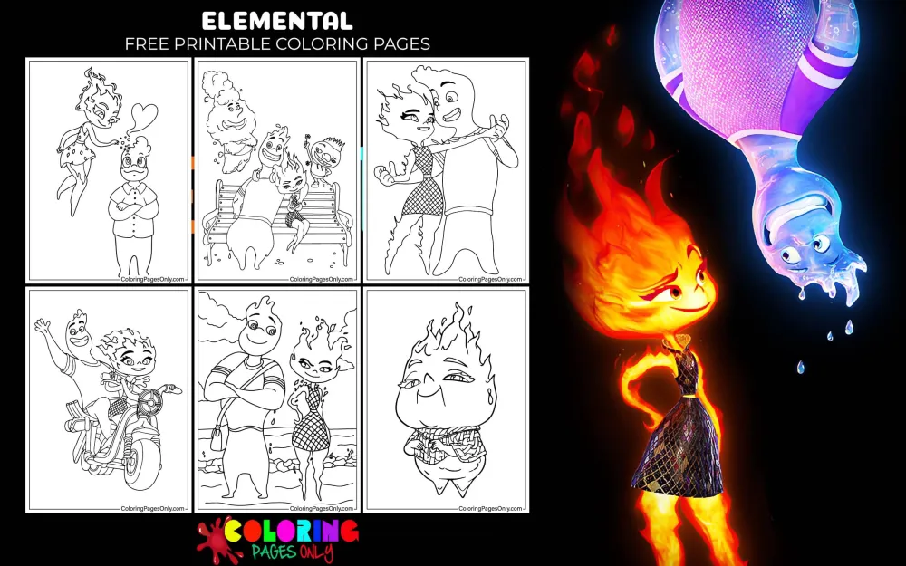
Free Elemental coloring pages: 27 pages featuring Ember Lumen in her fire-form with the color-shifting flame body that changes from warm yellow-orange to deep purple-red based on her emotions, Wade Ripple in his translucent blue water form with his characteristically expressive face, Ember and Wade together in the film’s romantic and comedic central relationship, Bernie Lumen’s older fire element design, scenes from Element City’s distinct neighborhood settings, Ember using her fire abilities, Wade’s water-form transformations, action scenes combining both element types, and the full visual vocabulary of Pixar Animation Studios’ 2023 film whose most technically ambitious animation challenge was rendering a fully expressive fire character whose entire body communicates her emotional state through color and intensity. All free, printable PDFs and online coloring for fans of the film.
Elemental was produced by Pixar Animation Studios and released theatrically on June 16, 2023, directed by Peter Sohn and produced by Denise Ream, with music by Thomas Newman. The film’s opening weekend of $29.6 million in the United States was the second-lowest opening in Pixar’s theatrical history, initially leading to coverage of the film as a commercial disappointment. After its theatrical run concluded and it became available on Disney+ on September 13, 2023, the film found a substantially larger audience, and the overall response has shifted considerably: the worldwide theatrical total of approximately $496 million, combined with its streaming performance, established it as a commercially significant Pixar production rather than the outlier its opening suggested.
The film is set in Element City, a metropolitan world where fire, water, earth, and air elemental beings live as citizens, and follows Ember Lumen (a fire element played by Leah Lewis) and Wade Ripple (a water element played by Mamoudou Athie) as they develop an unlikely romantic relationship across the boundary that supposedly makes them incompatible. Director Peter Sohn has described the film as his most personal work, drawing directly on his experience as the son of Korean immigrants who ran a convenience store in the Bronx, New York, and on the specific pressures and relationships of the immigrant family experience.
These 27 free pages at ColoringPagesOnly.com cover the full cast and key scenes. All free, PDF or PNG, print or color online.


What’s Inside
Ember Lumen: The Film’s Central Challenge
Ember is the film’s protagonist and the character whose design represents one of Pixar’s most technically demanding animation achievements: a fully articulate, expressively detailed humanoid character whose entire body is made of fire, and whose emotional state is directly communicated through the color and intensity of that fire.
At her baseline emotional state, Ember is a warm, vivid orange-yellow: the specific warm, vivid orange of a healthy flame burning cleanly, with the characteristic internal variation of fire (lighter toward the center, slightly deeper toward the edges of each flame surface, with the natural flicker and movement of combustion creating continuous, subtle variation). As her emotions intensify, particularly in anger (which she struggles throughout the film to control), her color shifts toward deep red, then further toward purple-red, the specific color of a very hot, oxygen-compressed fire at maximum intensity. Her happiest and most genuinely excited moments produce the warmest, most vivid yellow-white at the center of her flame body.
This emotional color-shift is the film’s most visually specific storytelling device: Ember’s interior state is never hidden from the viewer because it is visible in her own body. Her attempts to control her temper are literally attempts to control her color, and her failure at those attempts is visible before she can speak.
Her body form is humanoid in proportions (head, torso, arms, legs in approximately human configuration) but entirely fire in material: no solid surfaces, no hard edges, the continuous movement and transparency of flame throughout. Her hair, if it can be called that, is a dramatic upward flame formation that rises from her head and is one of her most immediately recognizable visual elements.
Coloring Ember portrait pages: The fire body uses the center-to-edge gradient technique applied throughout the full figure: the warmest, most vivid yellow-orange or pale yellow-white at the body’s center (where the flame’s core is most concentrated), graduating through orange-yellow to deeper orange-red at the body’s outer edges. Any pages showing her emotional state shifting to anger or frustration use deeper red-orange or vivid red applied progressively from the outer edges inward, with purple-red at maximum anger. Happy or excited states use the lightest, most vivid yellow at the body’s center.
Wade Ripple: The Water Element
Wade is the film’s male lead and the character whose design creates the specific visual challenge of a transparent, fluid, and completely expressive humanoid figure made of water. Where Ember’s challenge is rendering an opaque-ish fire with emotional color shifts, Wade’s challenge is rendering a transparent water figure with full facial expression visible through the translucency.
His design is a vivid medium blue-teal transparency: blue at full saturation but at a reduced opacity that allows the suggestion of his interior structure and the environment behind him to show through his body. His facial features are surface-level formations of the water that make up his body, shaped into eyes, a nose, and a mouth whose expression communicates the full range of his personality: Wade is the film’s most openly emotional character, whose tears (which are simply an extension of his body) flow freely with laughter, sadness, admiration, and sentimentality.
His tendency to cry at almost any emotional stimulus, and the fact that his tears are part of his body that flows back into him, is one of the film’s most consistent comedic elements and also one of its most specific visual design choices: his emotional openness is physically literal in a way that complements Ember’s emotional containment (who cannot cry, whose emotions show only through color and intensity).
Coloring Wade portrait pages: The base water body uses vivid medium blue-teal at full saturation, applied at slightly less than full pressure to suggest translucency. The interior of the body can show lighter blue where the translucency allows more light through, and slightly deeper blue-teal at the surface where the water is densest. His facial features are the same blue family at different concentrations: the eyes use slightly more intense blue where the water surface forms the iris area. Any tears or flowing water extensions use the same vivid blue, slightly more fluid-looking at their edges.
Ember and Wade Together: The Film’s Central Relationship
The visual of fire and water characters in close proximity, touching, or interacting requires the most technically specific coloring decisions in the collection: fire and water are physically incompatible (water extinguishes fire; fire evaporates water), and the film’s central premise is that the emotional reality of the relationship between Ember and Wade transcends this physical incompatibility. The scenes where they touch or are very close together are the film’s most visually demanding and most emotionally significant.
In the film’s animation, the specific moments where Ember and Wade touch each other required new Pixar technology to render: rather than simply showing the expected outcome (fire being extinguished, water evaporating), the film shows a contact that is unexpected and that neither character fully understands at first. The visual of their different elemental natures in contact is one of the film’s most beautiful and most technically accomplished sequences.
Pages showing both characters together require managing the full color contrast between the warm, vivid orange-yellow of Ember’s fire and the vivid, medium blue-teal of Wade’s water: these two colors are near-complementary (orange and blue are across from each other on the color wheel) and create the maximum color contrast available between two saturated hues. This contrast is deliberate in the film’s visual design: it communicates their difference even as the narrative argues for their connection.
Coloring duet pages: Plan the color placement before beginning. Apply Ember’s warm orange-yellow to all her fire surfaces. Apply Wade’s vivid blue-teal to all his water surfaces. The contrast between the two should be at maximum saturation to reflect the film’s visual design intention. At the boundary where their elements are close, the specific visual interaction (warm glow of fire reflecting in water, the specific way fire and water light each other) can be suggested by applying a very light warm orange touch at the edges of Wade’s body closest to Ember, and a very light cool blue reflection at the edges of Ember’s body closest to Wade.
Bernie Lumen: The Father
Bernie Lumen, Ember’s father, is the film’s most emotionally significant supporting character and the character whose story underlies the film’s thematic content. Bernie and his wife, Cinder, emigrated from a place called Fireland to Element City when Ember was very young, establishing the Fire Shop as both their livelihood and their home, building a community among the fire element immigrants who settled in the Fire Town neighborhood.
His relationship with Ember is the film’s primary emotional architecture: the love between them is absolutely genuine, and so is the specific pressure that his hopes create. He has invested his entire life in the shop and in the dream of his daughter taking it over. His story is, in the film’s clearest expression of its thematic content, the story of every immigrant parent who built something in a new country and hoped their child would carry it forward.
Bernie’s visual design is an older fire element: his flame is deeper red-orange rather than Ember’s more vivid orange-yellow, the specific visual of an older flame that has burned longer and perhaps with different intensity. His warmth and his love and his stubbornness all read in his voice before he speaks.
Coloring Bernie pages: His fire body uses deeper, slightly warmer red-orange rather than the vivid bright orange of Ember’s younger flame. The deeper tone communicates age and experience within the same fire element family as his daughter.
Element City: The Setting
Element City is the film’s world-building achievement: a metropolitan environment designed to accommodate four fundamentally incompatible physical types of residents, with infrastructure, architecture, and urban planning all shaped by the requirements of fire, water, earth, and air inhabitants. The fire neighborhood has flame-friendly materials and specific fire element infrastructure; the water neighborhoods have liquid-accessible pathways and water-based transit; the earth neighborhoods have naturalistic growth and plant integration; the air neighborhoods exist at height and in accessible draft corridors.
The city as a metaphor for a multicultural immigrant metropolis (specifically the film’s version of New York City as Sohn experienced it) is legible in the design: neighborhoods defined by their inhabitants’ nature, infrastructure built to serve those inhabitants, and the complex negotiation of different groups’ needs in a shared urban space.
Coloring Element City pages: The fire neighborhood uses warm, amber-lit tones: the specific warmth of streets lit by fire elements and designed for their comfort. The water neighborhood uses cooler, more blue-grey tones. Any architecture shows the specific adaptations for different element types: flame-resistant or flame-welcoming materials for fire areas, water-permeable surfaces for water areas.
What These Pages Do
Peter Sohn’s personal investment in Elemental as a film about the immigrant experience and the specific pressure of being a first-generation American child is documented across multiple interviews given during the film’s production and release cycle. He has described his parents’ convenience store in the Bronx as the direct inspiration for Bernie Lumen’s Fire Shop, and his own conflicted feelings about the shop’s future as the source for Ember’s narrative arc. The decision to make the film’s central conflict not the romantic one between Ember and Wade but the generational one between Ember and her father, with the romance serving as the catalyst that forces the generational conflict to resolution, reflects a level of autobiographical specificity that Pixar had not previously applied to an immigrant family narrative at the center of a feature film.
The film is the first Pixar feature to be directed by an Asian-American filmmaker at the helm of the studio’s main creative product, and the first to place an immigrant family’s story at its thematic center rather than as supporting context. The response to the film after its home video release, particularly from children of immigrants who recognized their families’ specific experiences in the Lumen family’s dynamic, is documented in social media discourse from the film’s home video period.
The American Academy of Pediatrics identifies fine motor skill development as a key childhood milestone throughout early childhood. Ember’s fire body gradient work, the specific translucency rendering of Wade’s water form, the two-character contrast management in duet pages, and the Element City architectural setting work all provide sustained fine motor challenge across the collection’s age range. The 2005 Art Therapy Journal study on structured coloring and anxiety reduction applies throughout.
How to Color These Pages Well
Ember’s fiery body requires the center-to-edge gradient applied in warm tones throughout her full figure. Apply the lightest, most vivid yellow-orange at the body’s interior center first. Then work outward through orange to deeper orange-red at the figure’s outer edges. The gradient should be visible across the full body: no large flat areas of a single color. Fire has natural variation, and Ember’s body should communicate that variation even at rest. Her emotional state pages shift this gradient: for angry/intense Ember, start the deep red-orange earlier and apply it across more of the body.
Wade’s blue-teal must be applied at slightly less than maximum pressure to suggest translucency without appearing grey. The instinct when rendering a transparent character is to reduce color saturation (mixing in white or grey). For Wade, reduce pressure slightly rather than reducing saturation: the color should remain vivid blue-teal, but applied at 70-80% pressure, which creates the suggestion of a less-than-fully-opaque surface while maintaining the vivid color that distinguishes him from a grey or pale character.
The complementary contrast between Ember’s orange and Wade’s blue creates the composition’s visual energy in duet pages. Do not mute either color when they appear together. Apply both at full saturation: the orange and the blue should be at maximum contrast against each other. This is the film’s visual design intention: their difference is visible even in the most intimate moments. The contrast communicates the story without words.
Bernie Lumen’s older fire uses deeper red-orange rather than Ember’s bright orange-yellow. The specific distinction between the two fire element characters’ colors communicates their generational difference within the same elemental type. Keep Ember’s body noticeably brighter and more yellow-orange than Bernie’s deeper, more red-orange. If both are the same color, the generational visual distinction is lost.
Element City backgrounds use the specific ambient light of each neighborhood’s element type. Fire neighborhood scenes: warm amber-orange ambient light on all surfaces. Water neighborhood scenes: cooler, slightly blue-grey ambient light. Earth sections: warm brown-green natural light. This ambient light can be suggested by applying a very light wash of the relevant warm or cool tone over all background architectural surfaces before applying specific building colors.
5 Creative Craft Ideas
The Emotional Color Palette Study
Ember’s fiery body changes color based on her emotional state: this is the film’s most specific visual storytelling device. Print four copies of the same Ember portrait page. Color each in the color associated with a different emotional state.
Resting/calm state: warm, vivid orange-yellow. Happy/excited state: pale vivid yellow-white at the center, bright orange at the edges. Frustrated/starting to lose control: deeper orange-red, less yellow in the center. Full anger/losing control: deep red or purple-red from the center outward.
Mount all four in a row: “Ember Lumen’s emotional color palette. Her body is fire. Fire’s color depends on temperature and emotional state. Calm: orange-yellow. Happy: yellow-white. Frustrated: orange-red. Angry: red to purple-red. The film’s premise: she is learning to control her temper. The visual: the temper is literally visible in her body. The challenge: not to lose control. The thing that helps: Wade, whose tears are simply part of him, and who cries at everything, and who never seems bothered by any of it.”

The Peter Sohn Immigration Story Page
Peter Sohn, the film’s director, was raised in the Bronx, New York, as the child of Korean immigrants who ran a convenience store. The film’s Fire Shop, the fire element neighborhood’s immigrant-owned store, is directly based on his parents’ store. Ember’s conflicted feelings about the store’s future are based on his own. The film was Pixar’s first immigrant family story, placed at the center of a feature narrative.
Print a Fire Shop scene page or a Bernie-and-Ember scene page. Color in warm fire tones.
On the backing card: “Director Peter Sohn. Born in the Bronx, New York. Parents: Korean immigrants who ran a convenience store. Elemental (2023): The Fire Shop is based on their store. Bernie Lumen’s hope that Ember will take over the shop is based on conversations Sohn had with his own parents. Ember’s conflict between that hope and her own path: based on his own experience. The film: the first Pixar feature about an immigrant family’s experience at the center of the narrative. Production time: approximately 8 years. What it took to get it right: a director putting his own family’s story on screen.”

The Incompatibility Study
Fire and water are physically incompatible: water extinguishes fire, and fire evaporates water. The film’s premise is a romance between two characters whose elemental natures supposedly make them incompatible. The film argues that what is true for the elements is not always true for the people.
Print an Ember page and a Wade page. Color Ember in vivid warm orange-yellow. Color Wade in vivid cool blue-teal.
Mount both with the color swatches visible: “Physical incompatibility of fire and water. Water extinguishes fire (phase transition: fire to extinction). Fire evaporates water (phase transition: liquid to vapor). What the film argues: the physical rule applies to elements. It does not necessarily apply to the people made of them. The film’s premise is approximately 101 minutes of this argument. Ember Lumen. Wade Ripple. Fire and water. The narrative says: look again. The visuals say: the contrast is real. Both are correct.”

Crafting Elemental Masks
The Box Office Recovery Story
Elemental’s opening weekend of $29.6 million was the second-lowest in Pixar theatrical history, leading to significant coverage describing the film as a commercial disappointment. After its Disney+ release on September 13, 2023, the film found a substantially larger audience. Its worldwide theatrical total was approximately $496 million. It became one of the most-watched films on Disney+ in the weeks following its streaming debut.
Print a warm, happy scene page featuring both Ember and Wade. Color with the full vivid orange-blue contrast.
On the backing card: “Elemental (2023). Opening weekend: $29.6 million (second-lowest Pixar theatrical opening). Coverage at the time: ‘disappointing,’ ‘Pixar slump.’ Worldwide theatrical total: approximately $496 million. Disney+ release: September 13, 2023. Streaming response: among Disney+’s most-watched debuts. Lesson: what a film opens to is one measurement. What an audience eventually does with it is another matter. Some films find their audience at different times. Elemental found more of its audience at home.”

Decorating a Pencil Box with Elemental Pages
The Four Elements City Design
Element City’s design accommodates four fundamentally incompatible physical types: fire, water, earth, and air. The city infrastructure, architecture, and urban planning all reflect this diversity of elemental inhabitants.
Print any Element City scene page. Color using the specific ambient light of the neighborhood type shown (fire: warm orange-amber; water: cool blue-grey; earth: warm green-brown; air: very pale grey-white).
On the backing card, draw a simple four-quadrant city map: “Element City. Fire Town: immigrant neighborhood, warm infrastructure, flame-resistant/flame-welcoming materials. Water district: aquatic-accessible pathways, cooler architecture. Earth section: naturalistic growth, plant integration. Air sector: elevated, open to drafts. The city: designed to accommodate four incompatible physical types sharing one urban space. The metaphor: every multicultural city that has tried to do the same thing. What the city gets right: the infrastructure is there. What the city doesn’t always get right: the assumptions about who should mix with whom. The film: the story of when two people who weren’t supposed to mix did.”

Frequently Asked Questions
What is Elemental, and who directed it? Elemental is a 2023 animated film produced by Pixar Animation Studios and distributed by Walt Disney Pictures, directed by Peter Sohn and produced by Denise Ream, with music by Thomas Newman. The film was released theatrically on June 16, 2023. It is set in Element City, a metropolitan world where fire, water, earth, and air elemental beings live as citizens, and follows Ember Lumen (a fire element) and Wade Ripple (a water element) as they develop an unlikely romantic relationship. Director Peter Sohn described the film as his most personal work, drawing directly on his experience as the son of Korean immigrants who ran a convenience store in the Bronx, New York.
Who are the main characters in Elemental? The main characters are Ember Lumen, a fire element young woman voiced by Leah Lewis, whose body is made of fire that changes color based on her emotional state and who struggles to control her temper while working at her family’s shop; Wade Ripple, a water element young man voiced by Mamoudou Athie, whose body is made of translucent water and who works as a city inspector and is openly and freely emotional; Bernie Lumen, Ember’s father voiced by Ronnie del Carmen, who emigrated from Fireland to Element City and runs the Fire Shop with the hope that Ember will take it over; Cinder Lumen, Ember’s mother; and Gale Ripple, Wade’s mother, an air element.
What is the film’s central theme? Elemental explores the immigrant experience and the specific pressures placed on children of immigrants to fulfill their parents’ dreams. Director Peter Sohn drew directly on his own family’s story: his Korean immigrant parents ran a convenience store in the Bronx, and his conflicted feelings about his responsibility to that store versus his own path became the foundation for Ember’s narrative. The film also explores the possibility of love and connection between people from different backgrounds, using the elemental incompatibility of fire and water as a metaphor for the social assumptions that say certain people should not or cannot connect. The romantic relationship between Ember and Wade is the catalyst that forces the generational conflict to a resolution rather than the primary conflict itself.
How was the fire character Ember animated? Ember was one of Pixar’s most technically challenging character animation projects: a fully articulate, expressively detailed humanoid character whose entire body is made of fire, and whose emotional state is directly communicated through the color and intensity of that fire. Pixar developed new simulation technology to render Ember’s body, which required continuous real-time rendering updates as her emotional state changed the color and intensity of her fire throughout each scene. In the scenes where Ember and Wade touch each other, new techniques were required to show the specific interaction of fire and water elements in contact rather than simply showing fire being extinguished or water evaporating.
How did Elemental perform at the box office? Elemental opened with $29.6 million in its opening weekend in the United States, the second-lowest opening weekend in Pixar’s theatrical history, leading to widespread coverage characterizing the film as a commercial disappointment. After its theatrical run, the film was made available on Disney+ on September 13, 2023, where it found a substantially larger audience and became one of Disney+’s most-watched debuts in the weeks following its streaming release. The film’s worldwide theatrical total was approximately $496 million, and its combined theatrical and streaming performance established it as a commercially significant Pixar production, particularly for the audience of children of immigrants who recognized their families’ experiences in the Lumen family’s story.
What is the significance of the different element colors in the film? The four element types in Elemental each have a specific color palette that communicates their fundamental nature. Fire elements use warm, vivid orange-yellow to deep red-purple, with fire element characters like Ember shifting through this range based on their emotional state: calm produces warm orange-yellow, anger produces deep red to purple-red. Water elements use vivid translucent blue-teal. Earth elements use warm earthy greens and browns. Air elements appear as nearly transparent swirling forms in pale grey-white. For Ember specifically, her body’s color is a real-time emotional display: her interior state is constantly visible to everyone around her, making her attempts at emotional control both a practical and a visual challenge throughout the film.
What age group are these pages best suited for? Elemental coloring pages serve the film’s broad audience range. The simplest Ember and Wade portrait pages with large, clearly defined body areas are accessible from ages three and four, where the vivid warm orange-yellow of Ember and the vivid blue-teal of Wade provide immediately clear and contrasting coloring targets. The emotion-shift pages requiring different color applications for different emotional states are most engaging from ages five to nine, where children who have seen the film can apply the emotional color logic they observed in the animation. The more complex duet pages requiring management of the complementary orange-blue contrast, the Element City setting pages with neighborhood-specific ambient light, and the thematic craft projects connecting the film to the immigrant experience are most meaningful for older children, teenagers, and adults who can engage with the biographical and thematic context behind the story.
Browse the full collection at ColoringPagesOnly.com. All 27 pages free, no sign-up, PDF or PNG, print or color online.
Peter Sohn grew up in the Bronx, New York, as the child of Korean immigrants who ran a convenience store. The store is the Fire Shop. Bernie Lumen’s hope is his parents’ hope. Ember’s conflict is his conflict. He spent approximately eight years making a film about it.
The film opened to $29.6 million. Coverage called it a disappointment. Then it came to Disney+. Children of immigrants recognized their families. The film found its audience.
Ember’s body changes color when she loses control. Yellow is calm. Red is anger. Purple is beyond control. She is trying not to go purple. Wade cries at almost everything. His tears are part of him. He does not find any of this embarrassing. This is the relationship.
Pick up your most vivid warm orange-yellow. Ember’s fire body goes first with the center-to-edge gradient. Pick up your vivid blue-teal for Wade. Apply at slightly less than full pressure for the translucency. Apply both at full saturation when they appear together. The contrast is intentional.
Share your work on Facebook and Pinterest and tag #Coloringpagesonly. The emotional color palette study and the incompatibility study pages are particularly worth sharing.
Color the fire warm to the edge. Apply the water vivid and translucent. They were not supposed to work. The film is 101 minutes of why they do.

