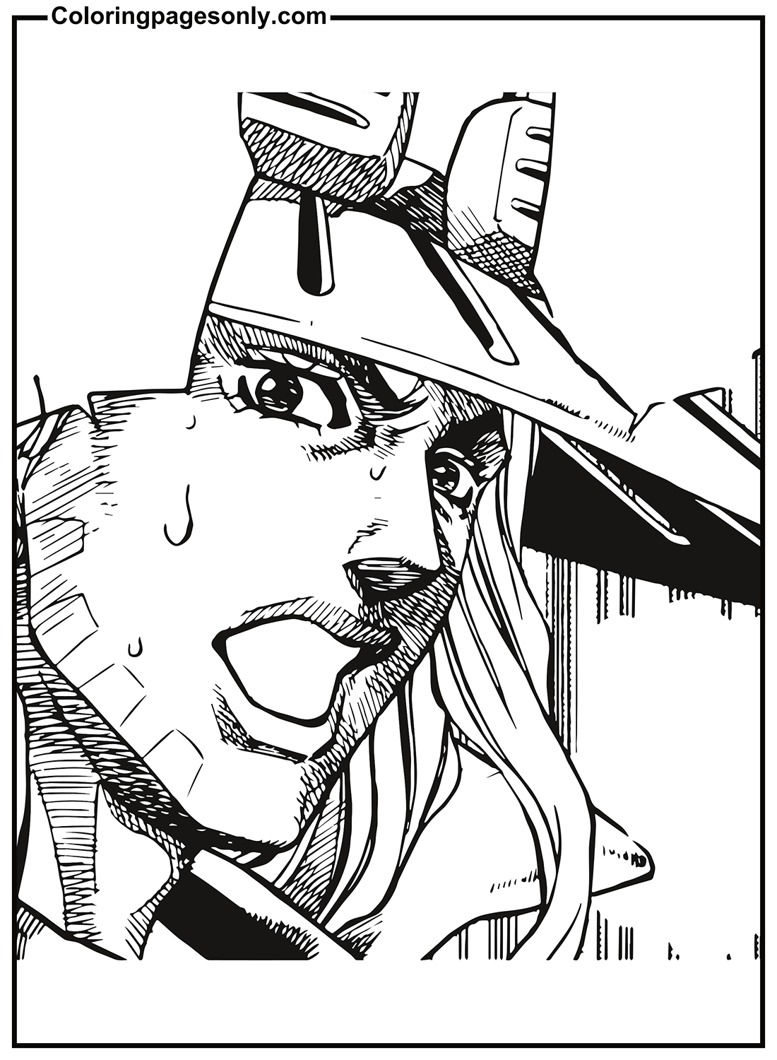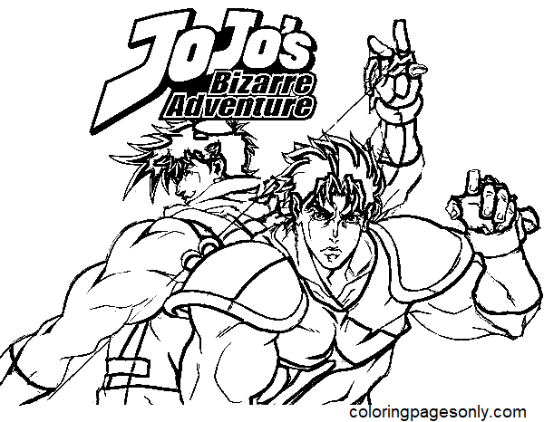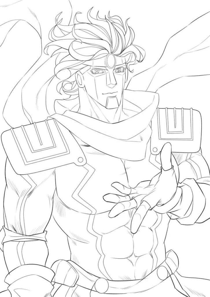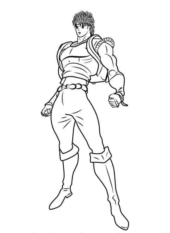
Free JoJo’s Bizarre Adventure coloring pages – 30+ pages featuring Jotaro Kujo, Giorno Giovanna, Dio Brando, Jonathan Joestar, Jean-Pierre Polnareff, Noriaki Kakyoin, Josuke Higashikata, Star Platinum, Silver Chariot, and more – free printable PDF and online coloring for fans of Hirohiko Araki’s landmark manga series.
JoJo’s Bizarre Adventure began serialization in Shueisha’s Weekly Shōnen Jump on January 1, 1987 – which means it has been running, continuously, for nearly 40 years. The manga was created by Hirohiko Araki, who is now in his early 60s and still writing it. Each of the series’s nine parts follows a different member of the Joestar family across different time periods, different countries, and different supernatural power systems – from the Ripple energy of Victorian England in Part 1 to the Stand abilities that define Parts 3 through 9. The anime adaptation, produced by David Production, began broadcasting in October 2012 and has covered Parts 1 through 6 as of its most recent season.
What makes JoJo genuinely unusual as a franchise – and as a coloring subject – is its explicit relationship to fashion and visual art. Araki is an avid fashion follower who has cited Versace, Gucci, and Armani as influences on his character design. The manga’s color pages, which he paints personally, famously use unexpected, non-naturalistic color choices. These 30+ free pages at ColoringPagesOnly.com are the place to honor that tradition. All free, PDF or PNG, print or color online. WRYYY.
The Characters and Their Parts
Jonathan Joestar – Part 1: Phantom Blood
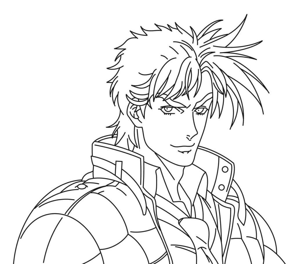
Handsome Jonathan Joestar and Cool Jonatin Joestar introduce the first JoJo – Jonathan Joestar, a Victorian English gentleman and the original bearer of the Joestar bloodline. Part 1, Phantom Blood, is set in 1880s England and follows Jonathan’s conflict with Dio Brando, his adoptive brother who steals the Stone Mask and becomes a vampire. Jonathan is the most classically heroic of all the JoJos: physically enormous, morally uncomplicated, and possessed of a gentlemanly code that makes him both the most straightforward and, in some ways, the most poignant protagonist in the series.
His power is the Ripple – a form of energy that mimics sunlight and is lethal to vampires, transmitted through controlled breathing. Jonathan’s Ripple does not have a Stand. He is one of only two JoJos (alongside Joseph in early Part 2) who fight without one.
Coloring Jonathan: His design is deliberately classical – the broad-shouldered silhouette of a Victorian gentleman-athlete, formal waistcoat, cravat. His canonical color palette in the manga color pages uses unexpected choices: Araki has painted him in everything from blue to purple to pink across different editions. The anime standardizes him in blue and gold. Both are valid starting points. His hair is dark – rendered in blue-black in the anime, warm brown in some manga color pages.
Jotaro Kujo – Part 3: Stardust Crusaders
Jotaro Kujo is the most recognized JoJo globally and the one most associated with the franchise’s mainstream recognition. He is the protagonist of Part 3, Stardust Crusaders – set in 1989, following Jotaro and a group of companions traveling from Japan to Egypt to defeat Dio Brando, who has acquired a powerful Stand called The World. He reappears in Parts 4, 5, and 6 as an adult and established figure.
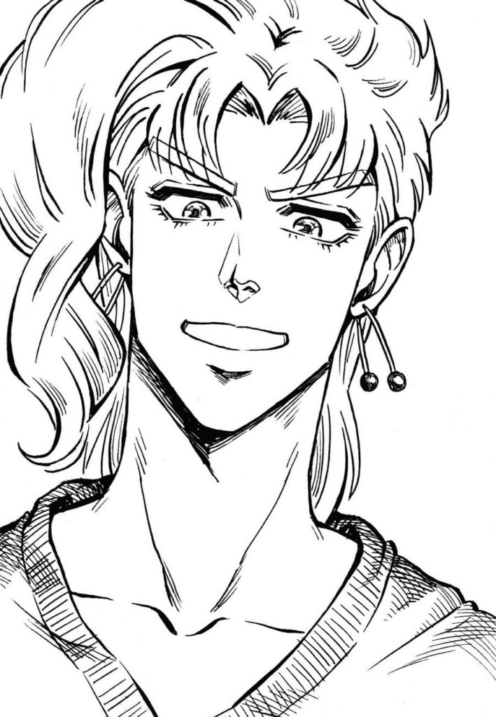
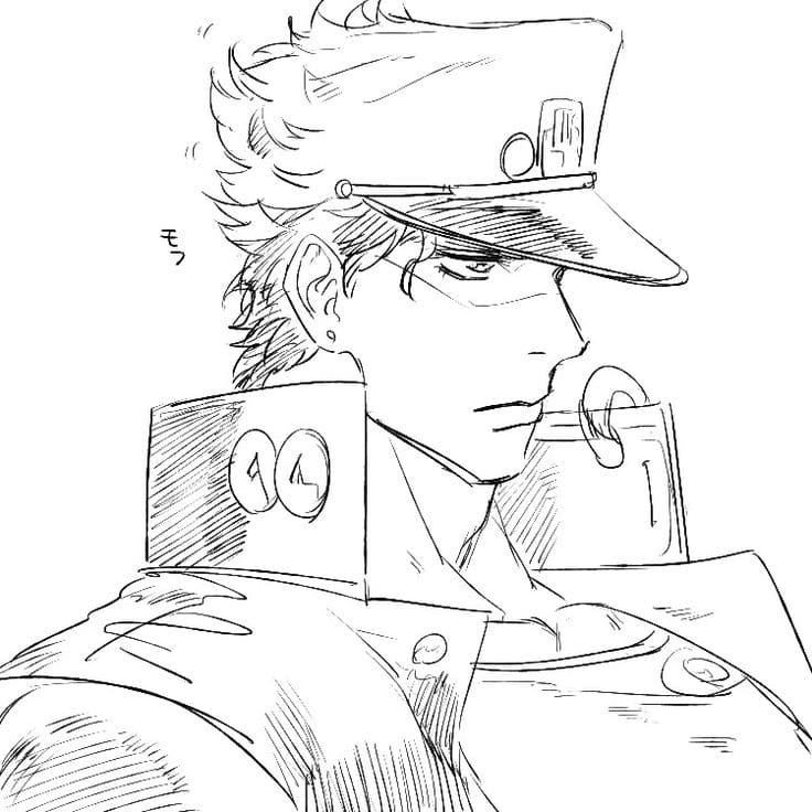
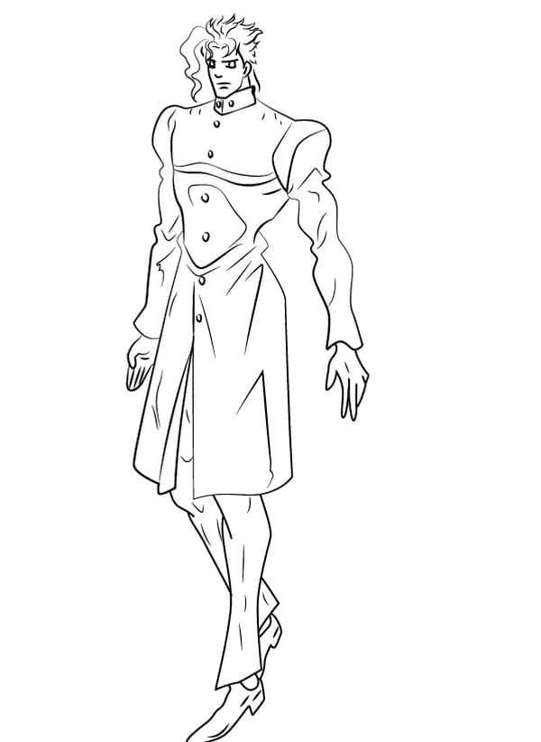
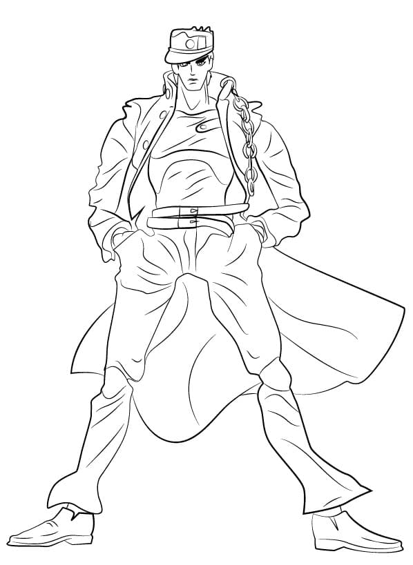
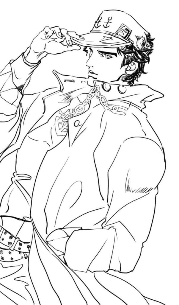
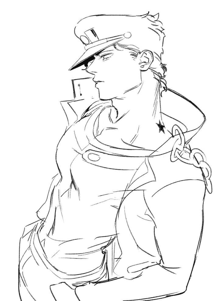
Kujo Jotaro, Jotaro, Jotaro Kujo, Handsome Jotaro Kujo, and the Star Platinum – Jotaro page (showing him together with his Stand) give the collection its most extensive single-character coverage. His design is one of the most referenced in all of anime: the long black coat with a turned-up collar and chain, the student cap with the brim obscured by his black hair (they appear to merge), and the muscular physique that made the JoJo character design template famous globally.
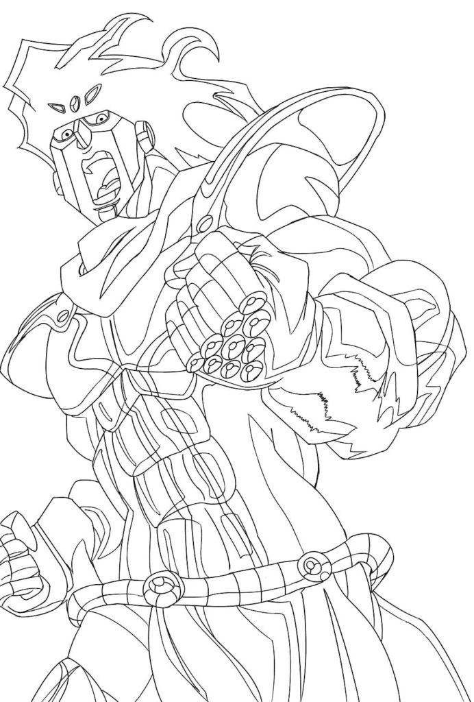
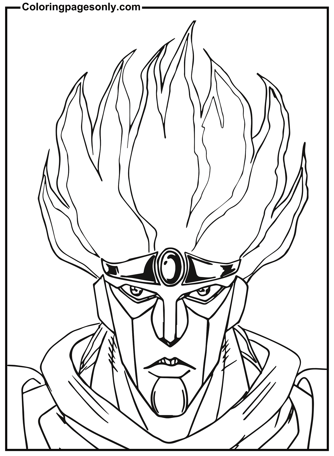
Star Platinum – his Stand – is a close-range Power type with superhuman strength, speed, and precision. Its signature ability is Star Platinum: The World (which stops time), mirroring Dio’s own World Stand. The Jojo’s Bizarre Adventure Star Platinum, Star Platinum in battle, and Cool Star Platinum pages depict Star Platinum in its distinctive purple-and-gold humanoid form with its characteristic mask-like face.
Coloring Jotaro: His canonical anime colors are a black coat, a dark navy or black cap, and a green or dark teal undershirt. The coat and cap merging into a single black mass at the top of his silhouette is the visual trick that defines his design. Star Platinum is primarily deep purple with gold accents – vivid purple, not a dark or muted tone. The gold should be warm and bright.
Josuke Higashikata – Part 4: Diamond is Unbreakable
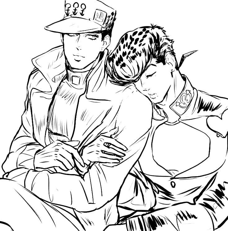
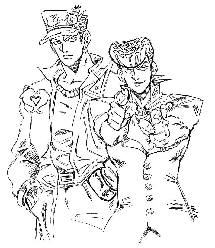
Jotaro Kujo and Josuke are the collection’s only page featuring both characters – a meeting that happens in Part 4 when Jotaro travels to Morioh, Japan, to meet his previously unknown nephew, Josuke (the result of Joseph Joestar’s affair).
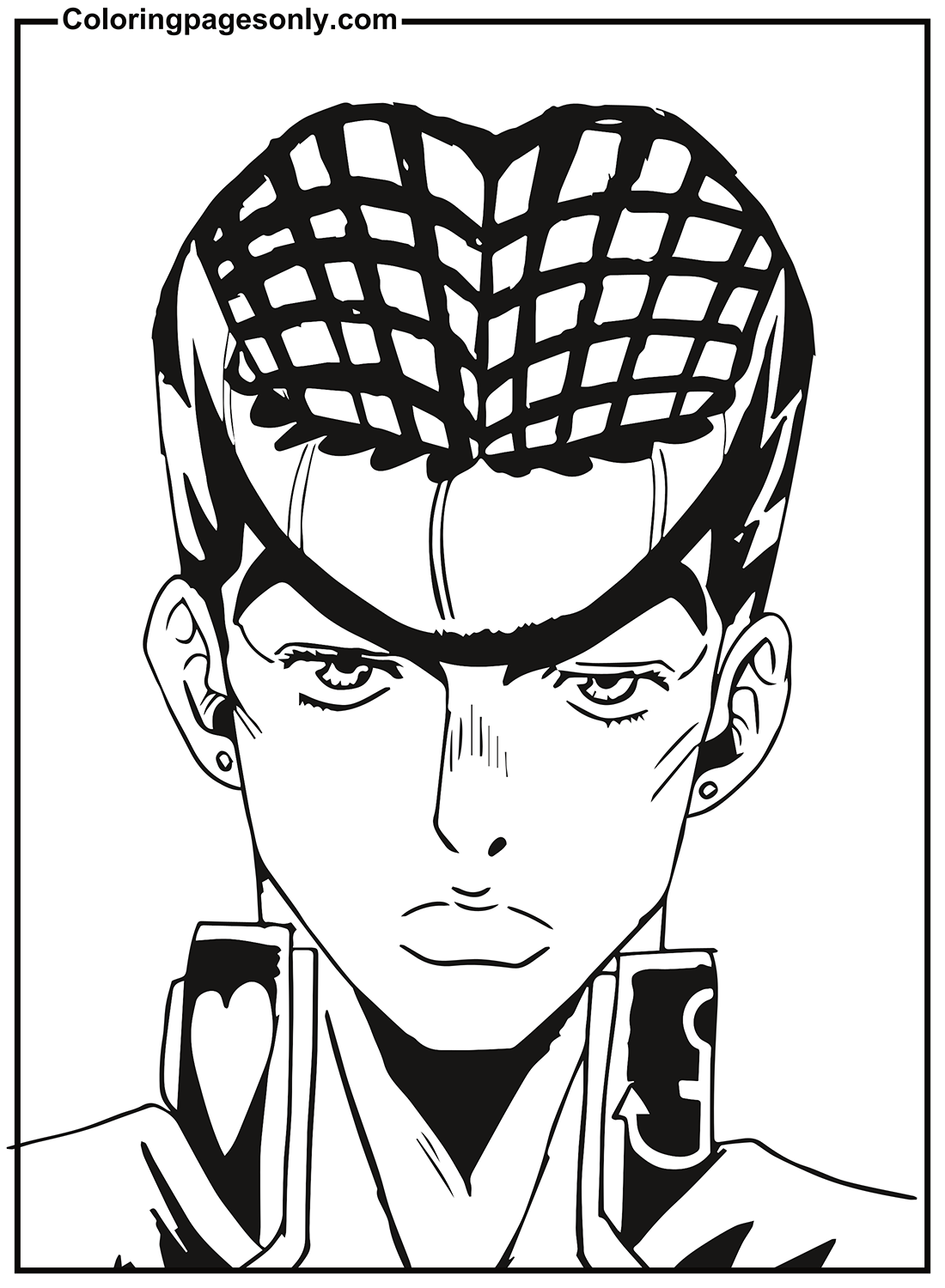
Josuke is distinctive for two things: an elaborate pompadour hairstyle that he is violently sensitive about having insulted, and his Stand Crazy Diamond, which can restore objects and people to a previous state – healing injuries, repairing broken objects – but cannot heal himself. He is warm, community-oriented, and genuinely good-natured in a way that distinguishes him from the more intense JoJos.
Coloring Josuke: His pompadour is the design element that requires the most care – it is an elaborate, architecturally precise structure of dark hair swept upward and back. His school uniform is dark navy with gold buttons. His Stand Crazy Diamond is not shown in this collection’s pages, but should you add it: predominantly pink, which is an excellent example of Araki’s unexpected color choices.
Giorno Giovanna – Part 5: Golden Wind
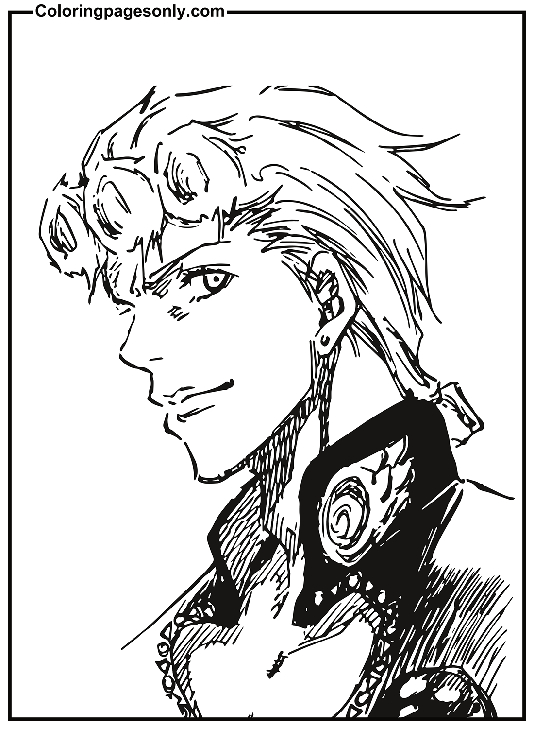
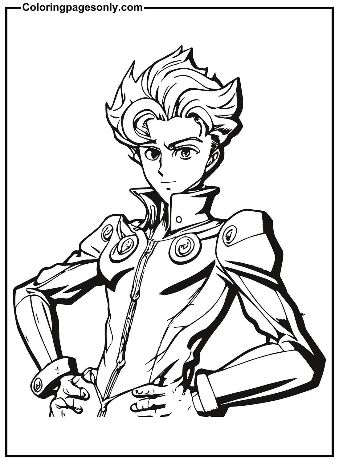
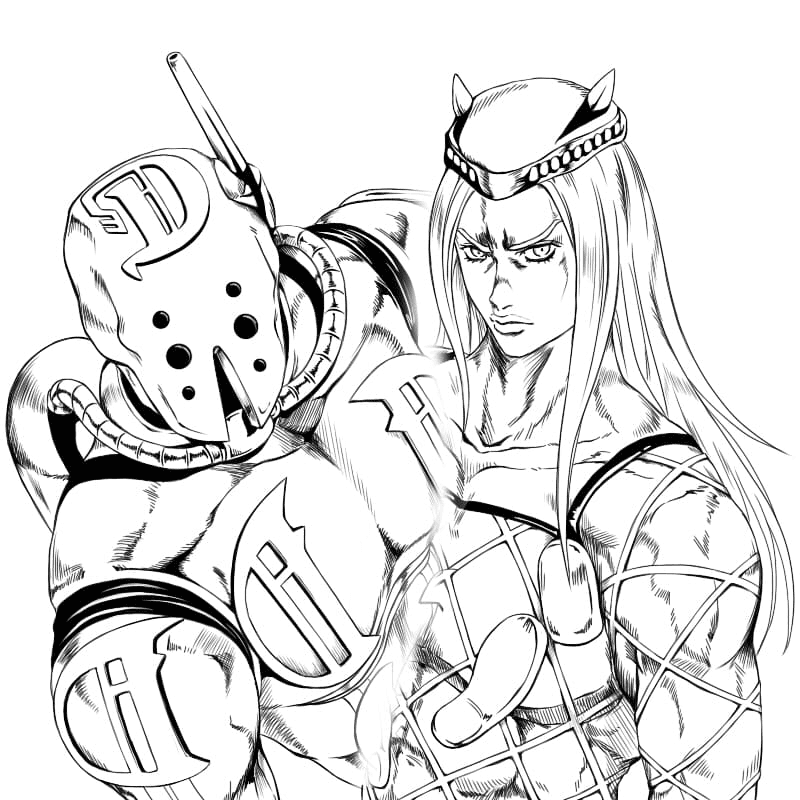
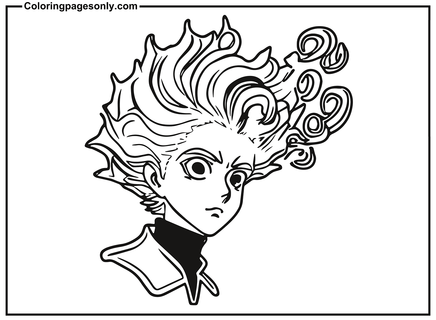
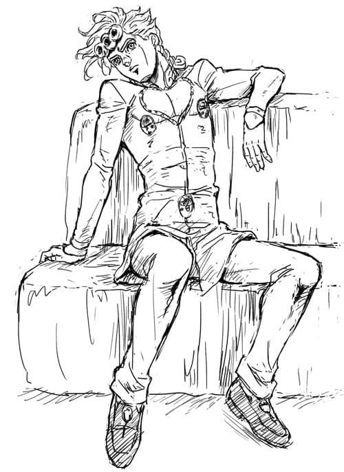
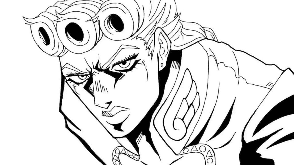
Giorno Giovanna has multiple pages in this collection: JoJo’s Bizarre Adventure Giorno Giovanna, JoJo’s Bizarre Adventure – Giorno Giovanna, and Cool Giorno Giovanna. He is the protagonist of Part 5, Golden Wind, set in 2001 Italy, and is biologically Dio Brando’s son, conceived while Dio inhabited Jonathan Joestar’s stolen body, making Giorno both a Joestar and a Brando.
His goal is to become a “Gang-Star” – to join and then reform the Naples mafia from within, eliminating the drug trade he believes is destroying the city. His Stand is Gold Experience (later Gold Experience Requiem), which can imbue life into inanimate objects and, in its Requiem form, eliminate the very concept of achieving an outcome.
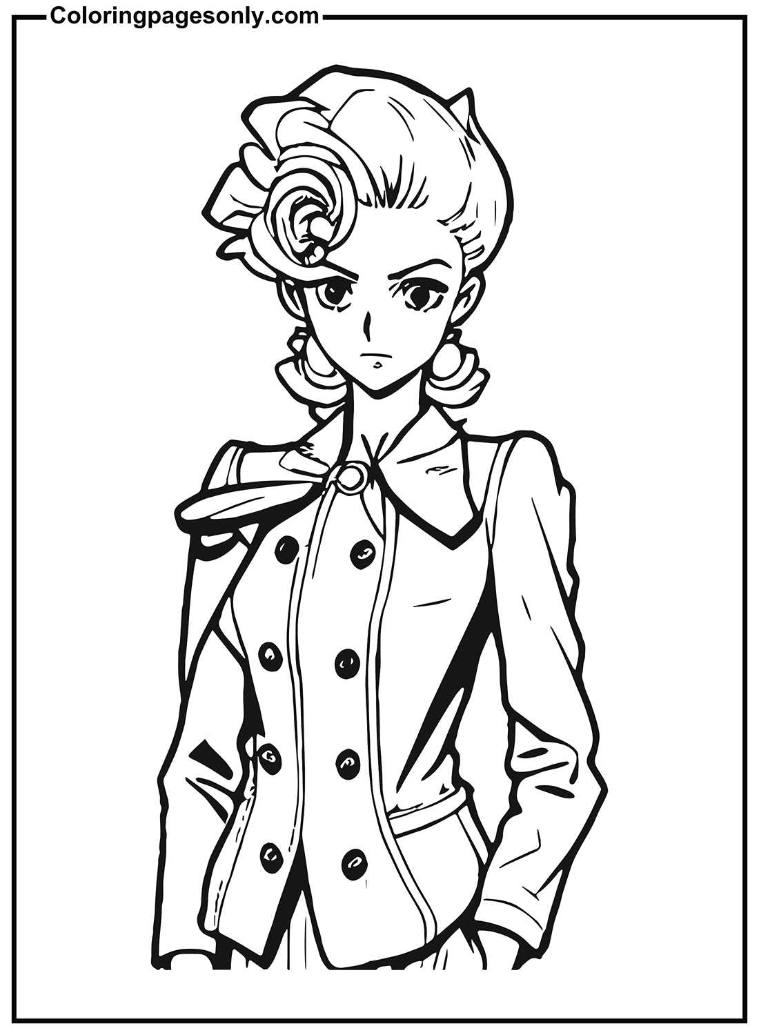
His design is one of JoJo’s most ornate: a fitted suit with a beetle-shaped brooch at the chest (the Joestar birthmark echoed in the design), long blonde hair with small cylindrical rolls at the front, and an overall aesthetic that reads as Italian fashion elevated to anime exaggeration.
Coloring Giorno: His canonical anime palette is golden yellow and dark navy – the gold of his hair and suit accents against the dark of his fitted jacket. His hair is a warm, vivid gold. The beetle brooch at his chest is a specific rich burgundy-red. The ladybug motifs that appear throughout his design add small red-and-black detail elements that reward close attention.
Jean-Pierre Polnareff – Part 3
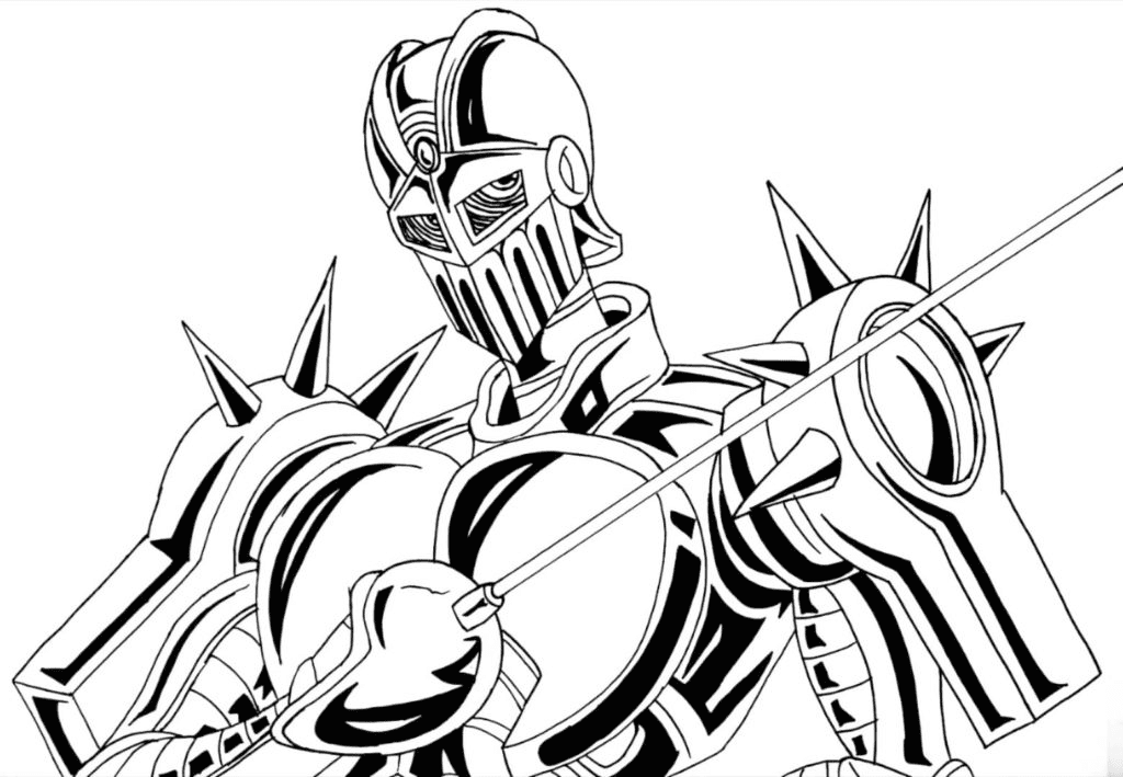
Jean-Pierre Polnareff is a French Stand user who joins Jotaro’s group in Part 3, bringing his Stand Silver Chariot – a fencing-armored humanoid Stand that fights with a rapier at extraordinary speed. He is one of the most beloved supporting characters in the franchise for his combination of flamboyant personality, genuine courage, and unexpectedly moving character arc across Parts 3 and 5.
The Silver Chariot JoJo page depicts his Stand – the armored knight figure with its rapier – in the metallic silver aesthetic that gives it both its name and its visual character.
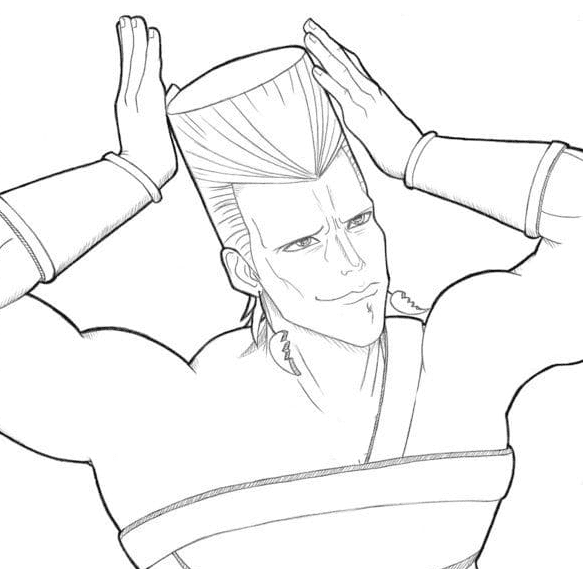
Coloring Polnareff: His hair is silver-white, styled in an elaborate upward spike that echoes (and predates) many anime hair conventions. His outfit in Part 3 is a white jacket. Silver Chariot is rendered in metallic silver – use the three-tone metallic technique (light at the top, mid-tone primary, dark in shadow areas) to give the armor its dimensional quality.
Noriaki Kakyoin – Part 3
Noriaki Kakyoin and Noriaki Kakiyon (a variant spelling in one page title) give two pages to the Japanese Stand user who joins the Part 3 journey. Kakyoin is notable for his cherry-obsession character quirk and his Stand Hierophant Green – a flexible, emerald-colored Stand that can extend its body through space and fire a signature Emerald Splash attack. He is one of the most mourned characters in the fandom for what happens to him in the final arc of Part 3.
Coloring Kakyoin: Red hair – a specific vivid red, not auburn, not orange-red, but a clear, saturated red. His school uniform is white. Hierophant Green is emerald green – a rich, jewel-tone green.
Dio Brando – Parts 1, 3, and Beyond
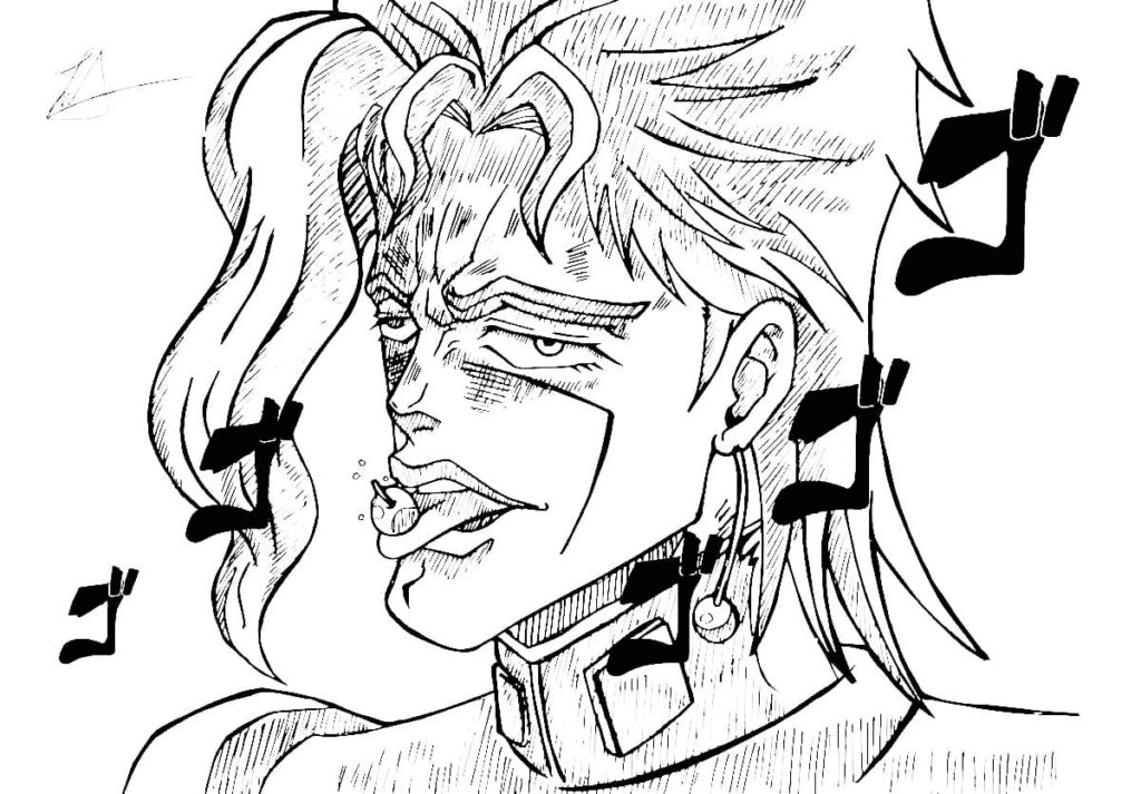
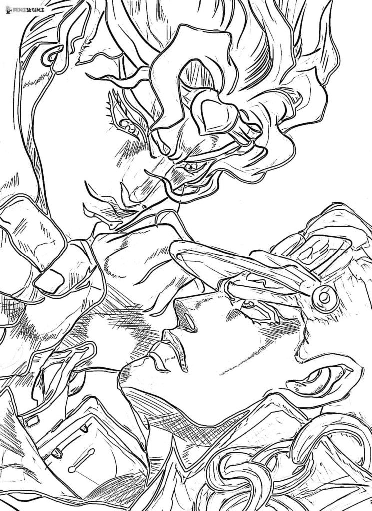
Dio Brando, Jotaro Kujo, and Dio and Mir are the collection’s villain pages – featuring the Joestar family’s immortal nemesis across the moments that define the franchise’s central conflict.
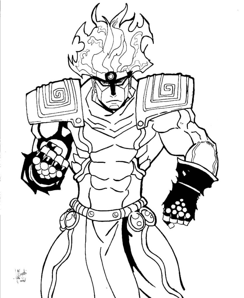
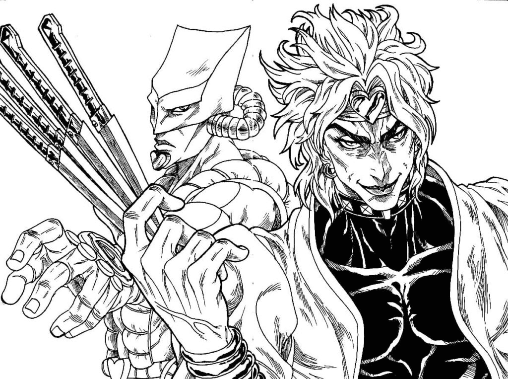
Dio Brando is the adopted brother who stole Jonathan’s body, became a vampire through the Stone Mask, and whose existence has shaped the fate of the Joestar family across multiple generations. He acquired a Stand – The World – during the century he spent dormant at the bottom of the ocean, and his ability to stop time for five to nine seconds in his peak form makes him one of the most powerful antagonists in the series. His WRYYY battle cry and his MUDA MUDA MUDA MUDA MUDA (Useless) Stand rush have become among the most widely recognized anime memes in global internet culture.
Coloring DIO: His canonical anime palette is vivid yellow-gold hair, coat, and accouterments – against a white shirt. He is flamboyant, maximally saturated, and completely committed to his own magnificence. Use the most vivid, warm gold available. His skin is pale – vampire-pale – with cool undertones that suggest the absence of living warmth.
Jolyne Cujoh – Part 6: Stone Ocean
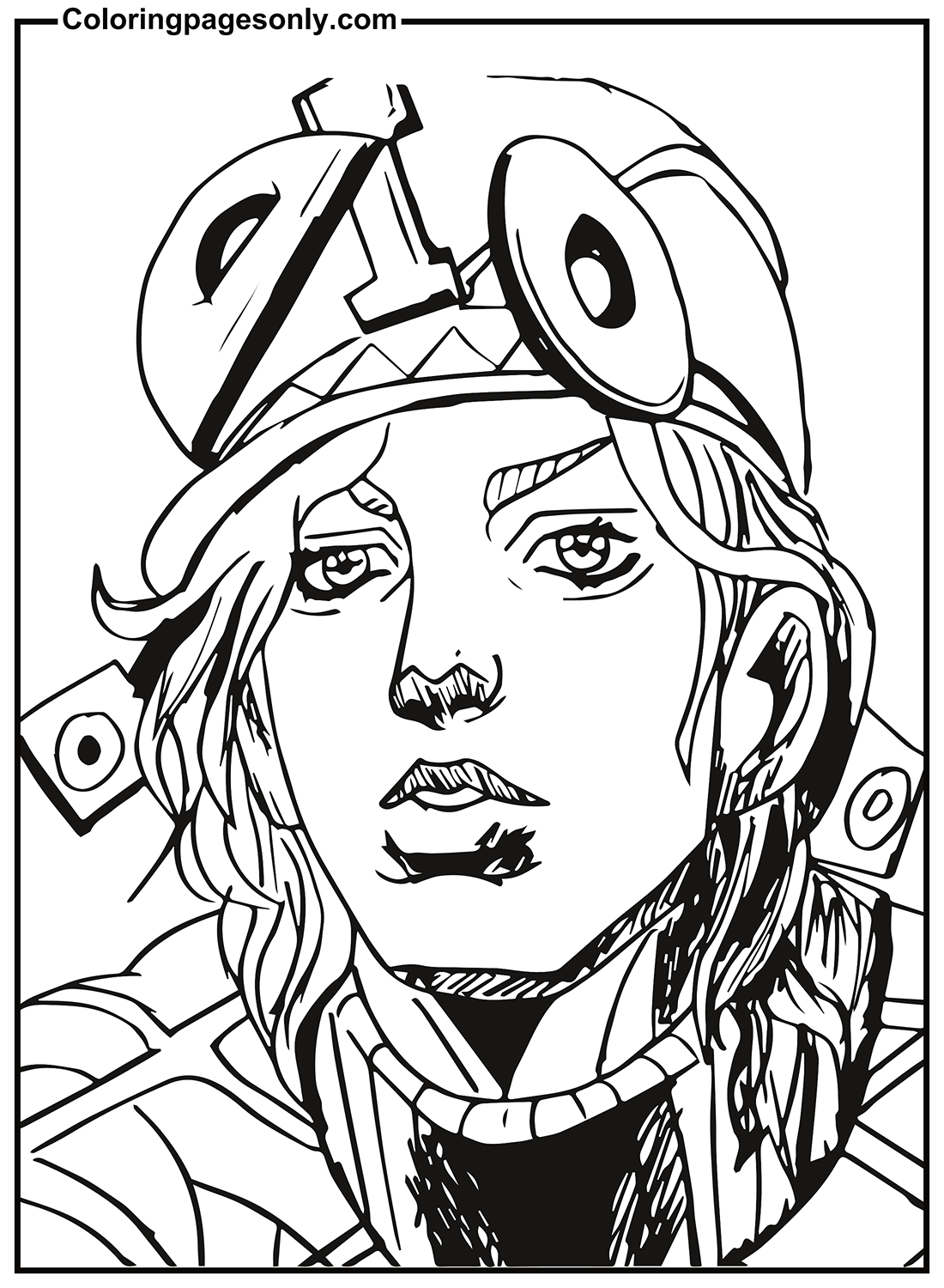
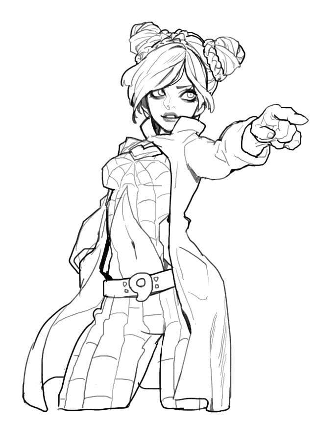
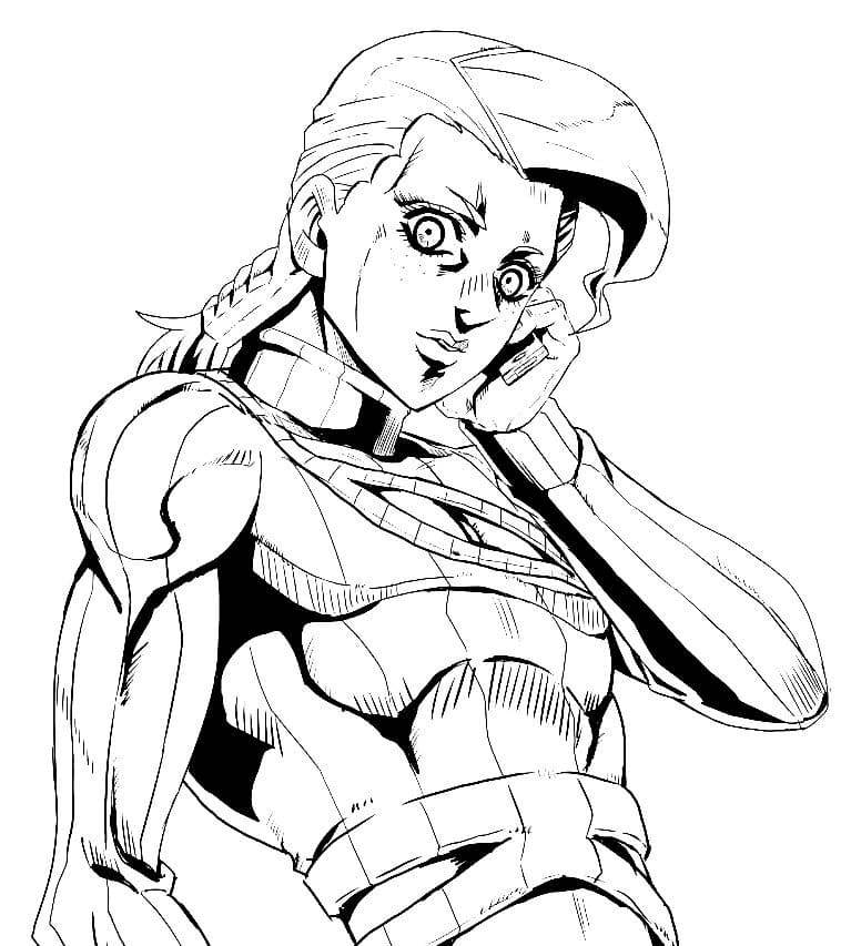
Jolyne Cujo (spelled “Cujo” in these pages), Cool Jolene Cujo, and Jolene Cujo give three pages to Part 6’s protagonist – the only female JoJo protagonist in the mainline series. Jolyne is Jotaro’s daughter, imprisoned in Green Dolphin Street Prison in Florida in 2011 for a crime she did not commit. Her Stand Stone Free allows her to unravel her own body into a thin string, which she can use for attack, defense, and manipulation of her environment.
Part 6, Stone Ocean, received its anime adaptation on Netflix in December 2021 – the most recent arc to be animated and the most recently accessible entry point for new fans.
Coloring Jolyne: Her design uses a green and white palette with butterfly motifs – her prison uniform is white and green, and her hair has a distinctive braided style with a pattern that suggests stone or string texture. Her eyes are a vivid blue-green. The butterfly imagery that runs through her design rewards careful attention to small decorative details.
Understanding JoJo’s Color Philosophy
One of the most distinctive creative decisions in JoJo’s Bizarre Adventure is Hirohiko Araki’s approach to color: he does not use naturalistic colors. The manga’s monthly color pages, which he paints by hand in watercolor, consistently use unexpected, emotionally expressive palettes – characters appear in pink, in teal, in orange, in colors that have no relationship to what a human being would “realistically” look like. Araki has cited this as a deliberate artistic choice: he wants color to communicate feeling and identity rather than physical reality.
The anime adaptations standardize these colors into a consistent palette that differs substantially from Araki’s own manga color work. There is no single “correct” color for any JoJo character, which is one of the most artistically liberating properties in the entire coloring page library. The pages in this collection invite you to make Araki’s own creative choice: choose colors that feel right for the character’s emotional energy, not colors that match photographic reality.
Jotaro does not need to be black and teal because the anime says so. He can be purple and silver. Giorno does not need to be gold and navy. He can be pink and white. The source material explicitly authorizes this approach.
How to Color These Pages Well
Commit to non-naturalistic color. The single most important thing to understand about coloring JoJo pages is that conventional “realistic” color choices will always look slightly wrong, because the source material is not realistic. Araki’s work rewards bold, unexpected palettes – a Jotaro in deep purple and copper reads more authentically JoJo than a Jotaro in the colors you’d choose for a realistic portrait. Give yourself permission to be as bold as the source material.
Stand pages want complementary contrast with their user. The visual relationship between a Stand and its user is one of JoJo’s most important design elements – each Stand is designed to visually echo or contrast with its user in ways that communicate their relationship. Star Platinum’s purple and gold against Jotaro’s black creates a dramatic contrast. Hierophant Green’s emerald against Kakyoin’s red hair is a complementary color pair that vibrates visually. When coloring the Stand pages, think about the color relationship between the Stand and the person who uses it, and lean into it.
Dio should be as vivid as possible. He is not subtle. He has never been subtle. The gold of his design should be the warmest, most saturated gold available. His presence on the page should feel like an event. If your finished Dio page looks restrained, color it again with more confidence.
Jotaro’s coat-cap merger is a technical coloring challenge. The visual trick of his design – where the coat’s collar rises, and the cap’s brim falls so that the two black elements appear to merge – requires careful handling in a coloring page context. Apply the same value of black (or very dark navy) to both elements without adding variation that would read them as separate. The monolithic quality of the black mass at the top of his silhouette is the design’s entire point.
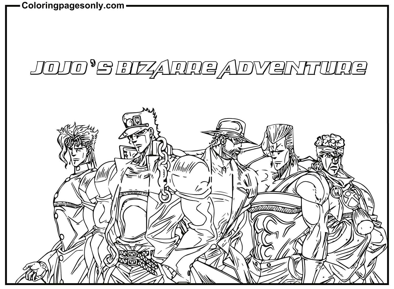
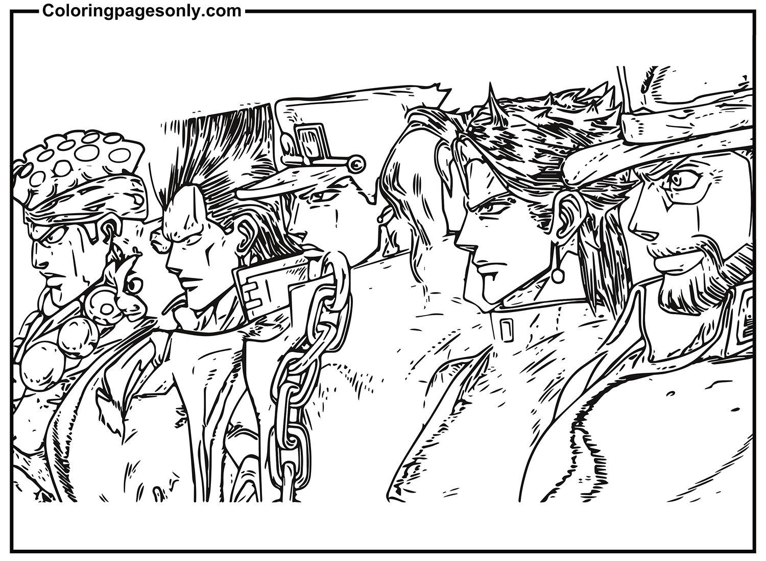
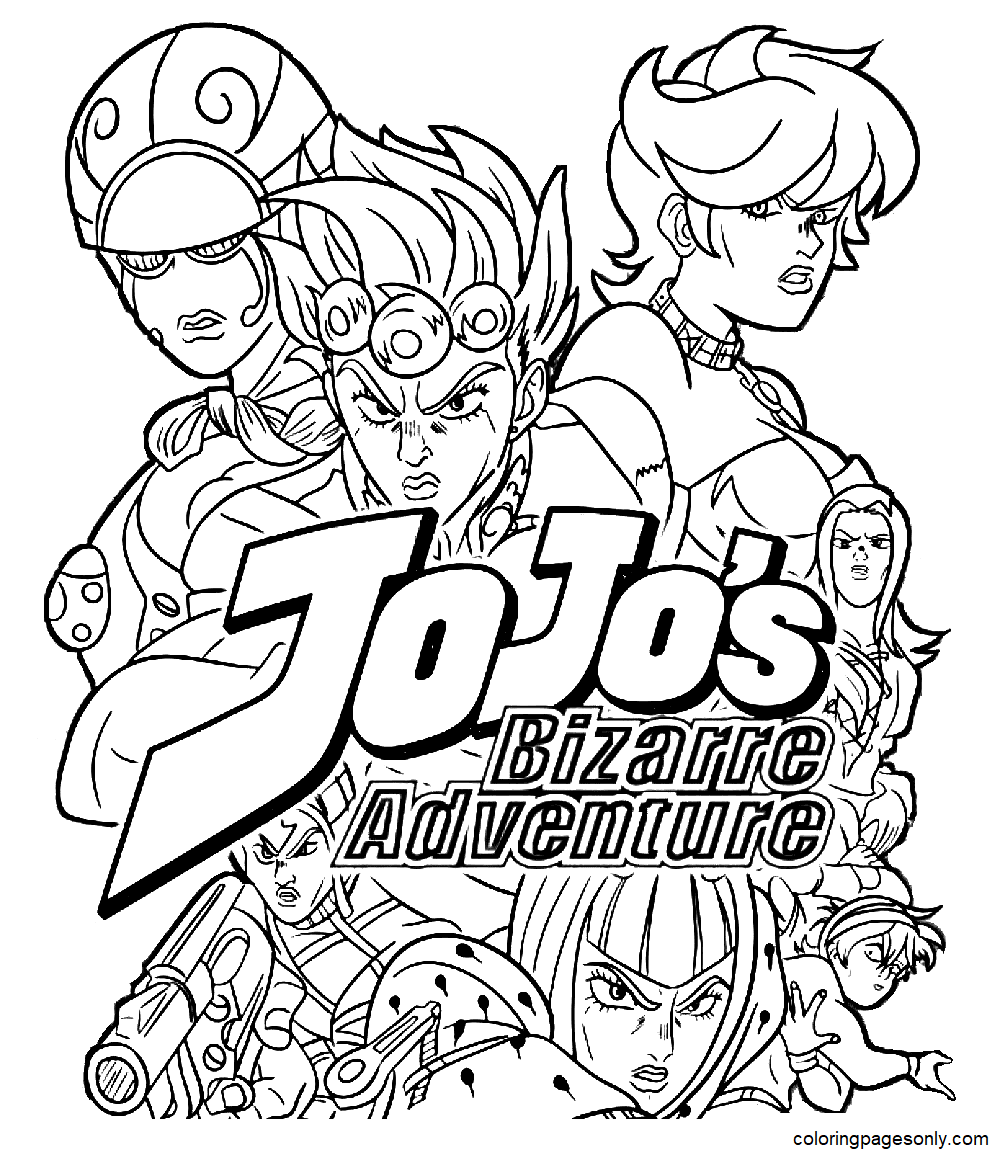
For group pages, establish clear color territories. The JoJo’s Bizarre Adventure Characters page likely shows multiple characters from the same part together. Before adding any color, identify each character’s canonical palette and note where their color territories border each other. Characters who would be hard to distinguish if colored too similarly should be differentiated by palette before you start, not after.
5 Creative Craft Ideas
Part-by-Part Timeline Display
Create a display that organizes the characters in this collection chronologically by Part, making visible the generational structure that is JoJo’s defining formal feature. Print all character pages. Color each one in its canonical or personally chosen palette.
On a large horizontal strip of poster board, mark time periods from the 1880s through the 2010s. Mount each character in their chronological position: Jonathan (1880s), Jotaro (1988), Josuke (1999), Giorno (2001), Jolyne (2011). Draw a thin connecting line between characters who appear in multiple parts – Jotaro in Parts 3, 4, 5, and 6; Dio across Parts 1 and 3.
The finished display makes visible something that reading the manga or watching the anime obscures through sheer narrative immersion: the extraordinary timespan of the Joestar family story, and the way each generation is shaped by the consequences of previous ones.
Stand User and Stand Comparison Cards
For each character who has both a character page and a Stand page in this collection – Jotaro and Star Platinum most prominently – print both pages and color them as a pair, deliberately choosing the Stand’s palette in relation to the user’s palette.
Mount each pair side by side on cardstock, character on the left, Stand on the right. Between the two images, write in your own words: the Stand’s name, its primary ability, its range and power classification, and the visual relationship you see between the user and the Stand’s design.
The finished card set is a reference guide and fan art display simultaneously – the kind of knowledge that distinguishes genuine JJBA fans from casual viewers.
Araki Color Study – Same Character, Different Palettes
This craft directly engages with JoJo’s most distinctive creative feature. Print three identical copies of the same character page – the Jotaro or Giorno pages work best. Color each one in a different palette: one in the anime canonical colors, one in Araki’s own manga color version (which you can look up from official manga color pages), and one in a completely original palette of your own invention.
Mount all three versions side by side on a backing sheet with a label under each: “Anime Version,” “Manga Color Version,” “My Version.” The comparison makes explicit what JoJo’s relationship to color actually is – not a single correct answer but a creative choice each time.
Villain Versus Hero Confrontation Display
Use the Dio Brando and Jotaro Kujo page – the collection’s most narratively charged image – as the centerpiece of a larger confrontation display. Color the duo page. Then, separately, color the best solo Jotaro page and the best solo Dio page available in the collection.
Mount the duo page at the center. Mount the solo Jotaro page to the left, the solo Dio page to the right. Between the solo pages and the central confrontation, write in marker: on the Jotaro side, “Star Platinum: The World” – on the DIO side, “The World.” Between them, a single word: “TIME.”
This display captures the thematic center of Part 3 – the mirroring of user and Stand, the mirroring of protagonist and antagonist, the convergence of two time-stopping abilities in a final confrontation – in a format that works as wall art.
JJBA Pose Reference Sticker Set
JoJo’s Bizarre Adventure is famous for its poses – elaborate, fashion-inspired compositions that characters hold between action beats, often in groups, that have become some of the most widely imitated and memed images in anime history. The collection’s pages capture several of these iconic poses.
Print all pages at 40% of full size – sticker scale. Color each one. Apply clear contact paper, cut along each character’s outline with a 2mm border, and add adhesive backing. The resulting sticker set – Jotaro, Giorno, Jonathan, Dio, Jolyne, Polnareff, Kakyoin, Josuke in their respective poses – is a portable JoJo fan collection.
Apply to a laptop lid in a casual overlapping arrangement that itself resembles a JoJo group composition. If you position them correctly, you will have accidentally recreated the single most recognizable compositional feature of the entire franchise.
Frequently Asked Questions
What is JoJo’s Bizarre Adventure, and who created it? JoJo’s Bizarre Adventure is a manga series by Hirohiko Araki, serialized in Shueisha’s Weekly Shōnen Jump since January 1, 1987. It is one of the longest-running manga in Jump history, currently in its ninth part (The JOJOLands, begun in February 2023). The story follows successive generations of the Joestar family – each protagonist nicknamed “JoJo” – across different time periods and locations, fighting supernatural threats using first the Ripple (Hamon) energy and later Stands (psychic manifestations of fighting spirit). The anime adaptation by David Production began in October 2012.
What are Stands and why are they significant? Stands are psychic manifestations of a person’s fighting spirit – physical, usually humanoid entities that only Stand users can see, and that fight alongside or in place of their user. They were introduced in Part 3 (Stardust Crusaders, 1989) and became the franchise’s primary combat system from that point forward. Each Stand has a unique ability – Star Platinum’s superhuman speed and strength, Crazy Diamond’s restoration power, Gold Experience’s life-giving ability, The World’s time stop – and each is named after a tarot card, a Major Arcana designation, or a musical reference. The conceptual variety of Stand abilities is one of the manga’s primary creative engines, producing a new, unique power in nearly every story arc.
Why does Araki use such unusual colors for his characters? Hirohiko Araki has explicitly stated that he uses color expressively rather than naturalistically – colors should communicate the character’s emotional identity and the scene’s feeling rather than represent physical reality. He cites his love of fashion and visual art (he has designed window displays for luxury fashion houses, including Gucci) as influences on his approach to color. The result is that JoJo has no single canonical color for any character – Araki himself has painted the same character in multiple different palettes across different official publications.
Is JoJo’s Bizarre Adventure appropriate for younger children? No. The manga and anime are rated for older teens and adults – JoJo’s Bizarre Adventure contains graphic violence, body horror, and mature themes throughout its run. The anime adaptation is typically rated TV-MA or its equivalent in most territories. The coloring pages themselves contain no inappropriate content – they are line drawings of character art – but the source material is not appropriate for young children, and the content of each part is most meaningful to viewers old enough to follow its complex narratives and appreciate its mature themes.
What is the significance of “WRYYY” and “MUDA MUDA MUDA”? “WRYYY” is Dio Brando’s signature battle cry – an onomatopoeia for his vampire shriek, used when attacking and when expressing his megalomaniacal contempt for his opponents. “MUDA MUDA MUDA MUDA MUDA” (無駄, meaning “useless” in Japanese) is the vocal accompaniment to Dio’s The World Stand’s rapid punch barrage – he shouts it while delivering dozens of strikes in rapid succession. Both phrases have become extremely widely recognized memes in global internet culture – they appear in countless JoJo references, remixes, and cultural citations that have extended the franchise’s reach significantly beyond its anime viewership.
Which JoJo part is best for newcomers? The community’s most common recommendation for newcomers is Part 3 (Stardust Crusaders), which introduced the Stand system and features the franchise’s most iconic characters, including Jotaro, DIO, and the Part 3 Crusaders group. Part 1 (Phantom Blood) is the canonical starting point and is short (nine episodes in the anime). Parts 1 and 2 together are typically recommended as the proper introduction – they establish the Joestar family’s history and set up the events of Part 3. Watching from Part 3 without Parts 1 and 2 misses significant emotional context for DIO’s relationship to the Joestar bloodline.
What coloring supplies work best for JoJo pages? Given the franchise’s emphasis on bold, non-naturalistic color, broad-tip markers are particularly appropriate for JoJo pages – their flat, saturated application suits the graphic, fashion-forward aesthetic of Araki’s character designs better than the softer blended look of colored pencils. Fine-tip markers are valuable for the detailed work on Stand pages, where the elaborate surface patterning of characters like Star Platinum rewards precision. For the metallic elements – Silver Chariot’s armor, Star Platinum’s golden accents – a combination of metallic markers and standard grey colored pencil produces the most convincing results.
Browse the full collection at ColoringPagesOnly.com. All 30+ pages free, no sign-up, PDF or PNG, print at home or color online.
Hirohiko Araki has been drawing the Joestar family for nearly 40 years and shows no signs of stopping. In that time, the franchise has accumulated nine parts, nine protagonists, hundreds of Stand users with hundreds of unique abilities, and a global fandom that produces an extraordinary volume of fan art, cosplay, and cultural references. The coloring pages in this collection are a small part of that creative tradition – an invitation to engage with the work at the level of close visual attention that Araki’s fashion-influenced, art-reference-filled, unexpectedly colored character designs reward.
Choose your palette. Ignore naturalism. Color something bizarre.
Share your work on Facebook and Pinterest and tag #Coloringpagesonly. We especially want to see the Araki color studies and the timeline displays.
Color the bizarre. Honor the pose. It was me, DIO.
More from our anime collections: