Pennywise Coloring Pages
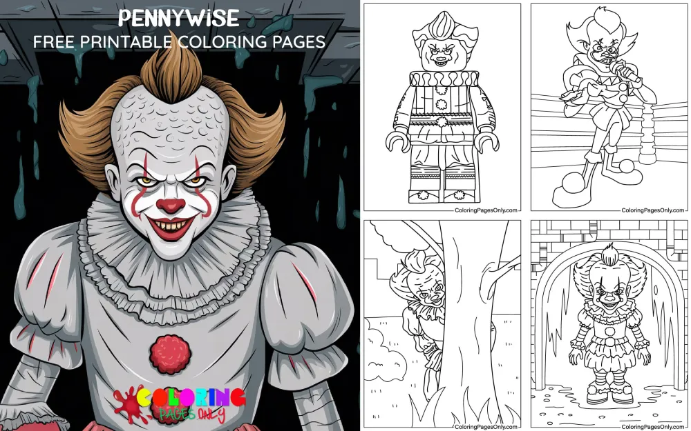
Free Pennywise coloring pages: 60+ pages featuring Pennywise the Dancing Clown in full-face portrait with the distinctive wide red-lipped grin, the red balloon floating against gravity in the storm drain setting, the Elizabethan ruff collar and silver costume of Bill Skarsgård’s 2017 film design, the theatrical white-and-silver costume of Tim Curry’s 1990 television portrayal, the signature walleye expression with one eye floating independently, Pennywise emerging from the sewer drain in the scene that opens both the 1990 miniseries and the 2017 film, full-body standing compositions showing the complete costume, close-up face studies emphasizing the white base makeup and red markings, and the full visual vocabulary of one of horror’s most recognizable characters across two major screen adaptations. All free, printable PDF and online coloring for horror fans and Stephen King enthusiasts.
Pennywise the Dancing Clown is a character from It, a novel by Stephen King published on September 15, 1986, by Viking Press, one of King’s longest novels at approximately 1,138 pages. The entity that takes the Pennywise form is an ancient shapeshifting evil of unclear cosmic origin, referred to in the novel simply as “It,” that has inhabited the fictional Derry, Maine, for centuries. It awakens approximately every 27 years to feed, primarily on children, choosing the clown form because clowns are figures children are conditioned to trust or be attracted to.
The character was first portrayed on screen by Tim Curry in the ABC television miniseries It, which aired in two parts on November 18 and November 20, 1990. Curry’s performance established the character’s cultural footprint for a generation of horror viewers. Andy Muschietti’s theatrical film IT (released September 8, 2017) portrayed Pennywise with a new interpretation by Bill Skarsgård, delivering a substantially different costume design and performance approach alongside a substantially different box office result: $701.8 million worldwide on a $35 million budget, making it the highest-grossing R-rated horror film at the time of its release. The sequel, IT Chapter Two (2019), followed the same characters as adults and earned $473.1 million worldwide.
These 60+ free pages at ColoringPagesOnly.com cover Pennywise across both major screen designs. All free, PDF or PNG, print or color online. These pages depict a horror character and are intended for mature audiences.


What’s Inside
Tim Curry Pennywise: The 1990 Design
Tim Curry’s 1990 television Pennywise, designed for the ABC miniseries, represents the theatrical clown tradition applied to horror: the makeup and costume are legible as an exaggerated version of classic American circus clown design, which is specifically what makes the performance unsettling. The recognizable elements of the clown archetype (white face, wide red lips, colorful costume, orange hair) are present and intact, but pushed into an emotional register where cheerfulness becomes menace.
Curry’s costume used a primarily silver-white base with colored pom-pom buttons running down the chest, an exaggerated ruff collar, orange frizzy hair, and yellow-tinted contact lenses that gave the eyes an inhuman quality. The white face makeup was applied in the classic theatrical tradition, with the red lip design extending well beyond the natural mouth to produce the exaggerated wide grin associated with the character.
Tim Curry (born April 19, 1946, in Grappenhall, Cheshire, England) brought to the role the specific combination of theatrical training and physical presence that made his Pennywise function in the miniseries’ television context. His extensive stage and film experience, including The Rocky Horror Picture Show (1975) and Clue (1985), equipped him to produce a performance calibrated to the slower pacing and less graphic visual environment of 1990s network television while maintaining a consistent undercurrent of genuine threat.
Coloring Tim Curry Pennywise pages: The costume base is silver-white or very pale warm white for the main body fabric. The pom-pom buttons down the chest use alternating vivid colors: vivid red, vivid yellow, vivid blue, vivid green, in the sequence used across the production. The face is white base makeup with vivid red applied for the extended lip design and any red face accent markings. The orange hair uses vivid warm orange. The eyes use vivid yellow or pale yellow with the specific intensity that the contact lens design produces.
Bill Skarsgård Pennywise: The 2017 Film Design
The 2017 film’s Pennywise design, created by costume designer Janie Bryant and makeup effects artist Sean Sansom, took a deliberately different approach from the 1990 version: rather than the theatrical American circus clown tradition, the design references the Elizabethan and early Victorian periods, giving the character an anachronistic quality that suggests extreme age and that places the clown costume in a historical period before modern American clown conventions existed.
The costume’s most distinctive element is the ruff collar: a layered fabric ring around the neck in the Elizabethan tradition, white and structured, that reads immediately as period clothing rather than as a modern theatrical costume choice. The main costume body uses silver-grey fabric with orange-red pom-pom accents and triangular-shaped fabric inserts in orange-red positioned across the body. The asymmetrical details across the costume, slightly different between the left and right sides, contribute to the sense of something designed to appear human but not quite calibrated correctly.
Bill Skarsgård (born August 9, 1990, in Vällingby, Sweden, son of actor Stellan Skarsgård) performed the role with specific physical techniques that significantly contributed to the design’s effect. He trained himself to independently control each eye, producing the “walleye” effect where one eye drifts laterally. At the same time, the other maintains forward focus, which he deployed in specific scenes for maximum disorientation. He can also produce voluntary drool, which appears in several shots as a practical rather than CGI effect.
Coloring 2017 film Pennywise pages: The costume body uses pale silver-grey or very pale warm grey as the primary fabric color, applied across the main costume panels. The ruff collar uses clean, bright white with the structured, slightly three-dimensional quality of layered fabric. The orange-red accents (pom-poms, triangular inserts) use vivid warm orange-red rather than pure orange or pure red. The face uses a white base with specific red markings: triangular red shapes under each eye and the red line extending from the corners of the mouth. The hair uses the same vivid warm orange-red as the costume accents.
The Red Balloon Pages
The red balloon that floats against gravity, appearing to children as an omen of Pennywise’s proximity, is one of horror iconography’s most specifically recognized single objects: red, round, on a string, floating upward rather than downward, appearing where it has no business appearing. It is the visual by which the 2017 film’s marketing campaign established the entire film’s aesthetic register before a single scene was shown in trailers, and it functions in both the novel and the film adaptations as the simplest possible visual shorthand for the character’s presence and intent.
The balloon’s specific red is fully saturated vivid red, the specific warm red of the classic round latex balloon, without any orange shift toward coral or any blue shift toward crimson. Its roundness and simplicity, a perfect sphere on a white string against whatever background it appears against, create a compositional element whose horror function is entirely contextual: a red balloon is a cheerful object. A red balloon that floats upward instead of falling, that appears in a storm drain or in a dark basement or in a place where no one released it, is a different kind of object.
Pages featuring the red balloon typically show it in relationship to the storm drain (the setting of the novel’s and both screen adaptations’ opening scenes), with Pennywise visible within the drain, or floating alone against dark backgrounds suggesting sewer or basement environments.
Coloring red balloon pages: The balloon uses the most vivid warm red available at full saturation. It must read as clearly red from any distance without any orange or crimson shift. The string is pale grey or very light tan. The storm drain setting uses very dark near-black for the drain opening, with slightly lighter dark grey for the surrounding street material. Any sewer interior visible behind Pennywise uses the specific dark warm grey of aged concrete, suggesting age and moisture without appearing as simple flat dark grey.
Pennywise in the Storm Drain
The storm drain scene, in which a child follows their paper boat to a storm drain opening and finds Pennywise inside looking out, is the inciting event of both the novel and the screen adaptations. In the novel and the 2017 film, this scene involves Georgie Denbrough, the six-year-old younger brother of the protagonist Bill, in October 1957 (novel) or 1988 (film). The storm drain’s perspective, with Pennywise visible at the bottom of a dark shaft looking up at a child at the top, is the scene’s defining spatial relationship: something that should not fit inside a narrow drain is there, comfortable in a space that should exclude it.
The storm drain imagery has been reproduced across horror merchandise, poster art, Halloween decoration, and costume design to an extent that makes it one of the 2017 film’s most immediately recognizable single compositions. It combines the specific geometry of a circle (the drain opening viewed from above) with the disturbing image of a face where no face should be, looking up from below.
Coloring storm drain pages: The drain opening is viewed from above: the exterior concrete or asphalt uses warm grey or slightly greenish grey, suggesting a wet street surface. The interior of the drain is deep, dark, and shadowed: very dark grey or near-black with the specific quality of the underground beyond the drain’s edge. Pennywise’s face visible within the drain uses the white base makeup that stands out against the surrounding darkness: the white face and the colored elements of the costume create the only vivid color in what is otherwise a near-monochromatic dark composition.
Full Body and Costume Detail Pages
Full-body standing compositions of Pennywise show the complete costume design in its most detailed form: the ruff collar, the main costume body’s panel construction, the sleeve details, the extended shoulders, and the specific proportion of the clown figure relative to a standard human body. These pages provide the collection’s most extensive costume detail work and the most complex coloring challenge in terms of managing multiple design zones within a single figure.
The 2017 costumes’ triangular geometric shapes embedded in the main fabric panels are the most specifically complex detail to render. These triangular forms appear across the chest and legs of the costume, slightly orange-red against the silver-grey main fabric, and require identifying their exact distribution on the page before applying any color to avoid missing them in the sequence.
Expression study pages and face close-up pages isolate the makeup design: the specific dimensions of the white face base, the exact position and shape of the red lip extension, the placement of the red triangular markings under each eye, and the specific quality of the eyes themselves.
Coloring full body pages: Work the costume in this sequence: apply the silver-grey base first across all main costume fabric panels. Then apply the white ruff collar. Then the orange-red triangular design elements across the costume’s body. Then the orange-red pom-pom accents. Finally, apply the face details over the white base: red lip extension and red markings after the base white is established. This sequence ensures the base colors are in place before the accent details are added.
What These Pages Do
Stephen King’s It is among the most extensively analyzed works in American horror fiction, with academic and critical attention focused on its treatment of childhood fear, community complicity in violence, and the specific horror of things that appear safe but are not. King’s choice of the clown form for its primary manifestation draws on what researchers in the field of evolutionary psychology describe as hyperactive agency detection: the human tendency to perceive threatening intent in ambiguous stimuli, particularly in faces. Clown makeup distorts the natural facial features that humans use to assess emotional intent, creating a face that cannot be read through the normal channels of social intelligence. The comedian Jenny Radesky and colleagues at the University of Sheffield published research in 2016 documenting that clown imagery was one of the most universally disliked environmental elements in pediatric hospital settings, confirming the design principle that King’s character exploits.
The 2017 IT film’s box office performance is documented as a significant event in horror film commercial history: its $701.8 million worldwide gross against a $35 million budget represented a multiple of approximately 20 times production cost and established a commercial benchmark for the R-rated horror category at the time of its release. The marketing campaign, which used the red balloon as its primary visual across a sustained pre-release period, is studied in film marketing contexts as an example of a single visual element doing the communicative work of an entire iconographic system.
The American Academy of Pediatrics identifies fine motor skill development as a key childhood milestone throughout early childhood. However, Pennywise pages depict a horror character with disturbing imagery intended for adult and mature teen audiences: the fine motor challenge for these pages lies in the complex makeup rendering, the fabric panel detail work, and the high-contrast dark-to-white compositions. The 2005 Art Therapy Journal study on structured coloring and anxiety reduction applies in the context of adult horror enthusiasts who find the specific activity of rendering horror imagery in controlled artistic form a form of controlled engagement with the genre’s themes.
How to Color These Pages Well
The white face base must be established as the first and most complete element before any red markings are applied. The clown makeup’s white base is not simply the paper’s natural white: it should be applied as a very pale warm white or very light cream across the full face area to create a consistent, slightly opaque quality suggesting actual theatrical face makeup. After this base is complete and established, the red lip extension and red face marking details can be applied over it. Attempting to apply red markings to unprepared white paper without this base often results in the red reading as a design element rather than as applied makeup.
The 1990 and 2017 designs use different white qualities. Tim Curry’s 1990 theatrical makeup reads as warmer and more applied, with the specific quality of greasepaint: apply a warmer, slightly cream-tinted white for his face. Bill Skarsgård’s 2017 design reads as cooler and more mask-like, with a flatter, more opaque quality: use a slightly cooler, brighter white for his face. These are subtle distinctions, but they communicate the difference between the two designs’ aesthetic intentions.
The red elements (lips, face markings, balloon, and 2017 costume accents) all use vivid warm red, applied at full saturation. The character’s visual system depends on vivid red against white: this contrast is the composition’s primary design principle in both the face makeup and the balloon imagery. Apply the most vivid available warm red at maximum saturation to every red element. Any desaturation of this red reduces the contrast that makes the design effective.
The 2017 film’s silver-grey costume uses a very specific neutral grey with slight warmth. The main costume fabric in the 2017 design is neither cool blue-grey nor warm tan-grey but a balanced neutral grey with just enough warmth to read as fabric rather than as metal or plastic. Apply this to even coverage across the main costume panels. The aging and slight soiling of the costume can be suggested by applying very subtle warm tan-grey at minimum pressure in the recessed areas of each costume fold.
Dark backgrounds in storm drain and sewer pages must be applied at maximum depth before any Pennywise elements are placed. The character’s white face and colorful costume read at maximum visual impact against the darkest possible backgrounds. Apply the near-black or very dark grey of the sewer and storm drain environment at full coverage across all background areas before addressing the figure. Any Pennywise element placed before the background is at complete risk of having the background color contaminate the lighter makeup and costume tones.
5 Creative Craft Ideas
The Two Pennywises Comparison Study
The 1990 ABC miniseries Pennywise (Tim Curry) and the 2017 theatrical film Pennywise (Bill Skarsgård) represent two distinct design approaches to the same character: the 1990 design uses American theatrical circus clown conventions, while the 2017 design references Elizabethan period costuming. Costume designer Janie Bryant’s specific research for the 2017 design focused on the 1400-1600 period, finding references in historical portraits and theater documentation.
Print one page clearly referencing the 1990 design and one referencing the 2017 design. Color the 1990 design with warmer white and the colored pom-pom buttons. Color the 2017 design with cooler white and the orange-red triangular fabric elements.
On the backing card: “Pennywise the Dancing Clown: two screen interpretations. 1990 ABC miniseries: Tim Curry (born April 19, 1946). Design reference: American theatrical circus clown tradition. Ruff collar: present but less structural. 2017 Warner Bros/New Line theatrical film: Bill Skarsgård (born August 9, 1990). Design reference: Elizabethan period costuming, 1400-1600. Costume designer: Janie Bryant. The deliberate difference: the 2017 design needed to be recognizable as Pennywise while being clearly not Tim Curry. Both interpretations: fully successful in their respective contexts.”

The Red Balloon Staging Study
The red balloon’s role in the It visual system functions as a sign: it appears in places where no balloon should be as an indicator of Pennywise’s proximity or intent. In the 2017 film’s marketing campaign, the red balloon was used as the campaign’s sole image across initial releases: a red balloon against black, floating upward. No character, no face, no text except the film’s release date. The campaign is documented in entertainment marketing analysis as achieving complete character communication through a single object.
Print a red balloon page and color the balloon in the most vivid warm red available. Alongside it, draw or print a simple circle representing a storm drain opening.
On the backing card: “The red balloon. Function in It: a sign of Pennywise’s proximity. Properties in the narrative: floats upward rather than downward. Appears where no balloon was released. Color: vivid red (specific: always red in all adaptations). 2017 film marketing campaign: used the balloon as the sole marketing image before the film’s release. No face. No character visible. Date only. Result: immediate, universal recognition of the character from a single object. Stephen King, It (1986): ‘They float down here. You’ll float too.'”

The Costume Architecture Study
The 2017 Pennywise costume is documented in film production materials as one of the most specifically researched costume designs in recent horror film production. Janie Bryant has described the design process in interviews as requiring extensive research into historical period costuming, with the specific intention of making Pennywise appear as though he had been wearing this costume for centuries, not as though the costume was new and made for a contemporary production.
Print the most detailed full-body Pennywise costume page in the collection. Before coloring, label all distinct costume zones: the ruff collar, the main body panels, the sleeve details, the triangular inserts, and the pom-pom accent positions.
On the backing card: “Pennywise costume, IT (2017). Designer: Janie Bryant. Design reference period: 1400-1600 Elizabethan. Key elements: structured ruff collar (Elizabethan period neck ruff). Main fabric: silver-grey. Accent color: orange-red. Triangular inserts: distributed across chest and leg panels. Asymmetrical construction: slightly different between the left and right sides. Practical aging: applied to suggest centuries of wear. Bill Skarsgård’s physical contributions: independent eye control (walleye effect), voluntary drool used in multiple scenes as a practical effect.”

The Publication History Page
Stephen King’s It was published on September 15, 1986, by Viking Press. The novel was the result of King’s specific intention to write the ultimate novel about childhood fear and specifically about the experience of growing up in a small American town where adults fail to protect children from the things that prey on them. King has discussed in multiple interviews the novel’s length as a deliberate choice: the full weight of the material required room.
Print a Pennywise portrait page. Color in canonical white makeup and vivid red accents.
On the backing card: “Stephen King, It. Published: September 15, 1986. Publisher: Viking Press. Length: approximately 1,138 pages. Setting: Derry, Maine (fictional). The entity’s feeding cycle: approximately every 27 years. Main documented awakening: 1957-1958 (Losers as children); 1984-1985 (Losers as adults). First screen adaptation: ABC miniseries, November 18-20, 1990. Tim Curry as Pennywise. Second adaptation: Warner Bros/New Line theatrical film, September 8, 2017. Bill Skarsgård as Pennywise. Box office: $701.8 million worldwide. Budget: $35 million. The ratio: approximately 20:1. Sequel, IT Chapter Two (2019): $473.1 million worldwide.”

The Coulrophobia Study
Coulrophobia, the fear of clowns, is a recognized specific phobia with documented prevalence across multiple research studies. The University of Sheffield conducted research in 2016 examining children’s responses to hospital environments and found that clown imagery in pediatric hospital decor was among the most negatively received visual elements, with children across age groups responding negatively to clown faces that appeared friendly but registered as threatening. The research concluded that the uncanny valley effect, in which faces that are almost-but-not-quite human produce a sense of unease, specifically applies to heavily made-up clown faces that obscure natural facial reading cues.
Print a Pennywise close-up face page. Color with careful attention to the specific uncanny quality: the white base that obscures natural skin tone, the red that extends the mouth beyond its natural position.
On the backing card: “Coulrophobia: the fear of clowns. Documented prevalence: reported across multiple age groups in psychological research. University of Sheffield study (2016): found clown imagery to be among the most negatively received environmental elements in pediatric hospital settings. Mechanism: clown makeup distorts the facial features used for normal social-emotional reading—the result: a face that cannot be assessed through normal channels. Stephen King’s design principle for Pennywise exploits the specific visual confusion of a face that signals both friendliness and danger simultaneously. The uncanny valley: applied to the clown.”

Frequently Asked Questions
What is Pennywise, and where does the character come from? Pennywise the Dancing Clown is the primary form taken by “It,” the ancient shapeshifting evil entity at the center of Stephen King’s 1986 novel It, published on September 15, 1986, by Viking Press. Within the novel’s mythology, it is an entity of uncertain cosmic origin that has inhabited the fictional Derry, Maine, for centuries, awakening approximately every 27 years to feed on fear and flesh. It adopts the clown form because clowns are figures children are conditioned to trust or be attracted to, exploiting the natural childhood comfort with the clown archetype as a predatory lure. The character has been portrayed in a 1990 ABC television miniseries starring Tim Curry and in Andy Muschietti’s 2017 theatrical film and its 2019 sequel, with Bill Skarsgård in the role.
Who played Pennywise in the 1990 miniseries, and how was the character designed? Tim Curry (born April 19, 1946, in Grappenhall, Cheshire, England) played Pennywise in the It ABC television miniseries that aired in two parts on November 18 and November 20, 1990. Curry’s Pennywise design used the American theatrical circus clown tradition as its visual reference: white face makeup, a silver-white costume with colored pom-pom buttons, an orange frizzy hair arrangement, and yellow-tinted contacts providing an inhuman eye quality. The performance was calibrated to the specific context of 1990s network television, where graphic visual horror was not possible, relying instead on Curry’s theatrical presence and voice performance to produce the character’s effect. Curry’s Pennywise defined the character in popular culture for the generation who saw the miniseries.
Who played Pennywise in the 2017 film, and how does the design differ from Tim Curry’s? Bill Skarsgård (born August 9, 1990, in Vällingby, Sweden) played Pennywise in Andy Muschietti’s 2017 theatrical film IT and its 2019 sequel IT Chapter Two. The 2017 design, created by costume designer Janie Bryant, deliberately distinguished itself from Tim Curry’s version by referencing Elizabethan period costuming (approximately 1400-1600) rather than the American circus clown tradition: the structured ruff collar around the neck, the silver-grey fabric with orange-red triangular inserts, and an asymmetrical construction give the costume an anachronistic quality suggesting extreme age. Skarsgård contributed physical techniques, including independent eye control (the “walleye” effect in which one eye drifts laterally) and voluntary drool used in practical effects. The 2017 film earned $701.8 million worldwide against a $35 million budget.
What is the significance of the red balloon in the It franchise? The red balloon that floats against gravity, appearing as an omen of Pennywise’s proximity to children, is one of the most recognized single objects in contemporary horror iconography. It appears in Stephen King’s 1986 novel and in both major screen adaptations as an object that should be harmless (a child’s red balloon) but signals danger through its behavior (it floats upward rather than falling, and appears where no one released it). The 2017 film’s marketing campaign used the red balloon as its sole visual identifier in initial release materials: a red balloon floating against black, with no character visible and only a release date. The campaign achieved immediate, universal character recognition through a single object with no direct character depiction.
What is the story of the Losers’ Club in Stephen King’s It? The Losers’ Club consists of seven children in the fictional Derry, Maine, who first confront It in the summer of 1958: Bill Denbrough, whose younger brother Georgie was It’s first documented victim; Beverly Marsh; Stan Uris; Richie Tozier; Eddie Kaspbrak; Ben Hanscom; and Mike Hanlon. The seven form a bond through their shared experience of being outsiders and their collective resistance to it when adults in Derry are unable or unwilling to acknowledge the predatory entity in their community. The novel alternates between their experiences as children in 1958 and as adults who return to Derry in 1985 when the killing cycle resumes. Mike Hanlon, the only member who remains in Derry as an adult, calls the others back when the pattern repeats.
How did the 2017 IT film perform commercially, and why was it significant? IT, directed by Andy Muschietti and released September 8, 2017, earned $701.8 million worldwide against a production budget of $35 million, representing a commercial return of approximately 20 times its production cost. At the time of its release, it was the highest-grossing R-rated horror film in the history of the category, surpassing records that had stood for decades. The sequel, IT Chapter Two (September 6, 2019), directed by Muschietti with the same cast returning as adults alongside the younger cast in flashback sequences, earned $473.1 million worldwide on a $79 million budget. The commercial performance of both films established the It property as one of the highest-earning horror franchises in theatrical history.
What age group are these pages recommended for? Pennywise coloring pages are intended for mature audiences and are recommended for ages thirteen and older. The character is drawn from Stephen King’s It, an adult horror novel with themes of child endangerment, violence, and communal failure, and from R-rated theatrical films (the 2017 and 2019 adaptations are both rated R in the United States). The coloring pages themselves depict the character’s horror design elements, including the unsettling clown makeup, sewer drain imagery, and the atmospheric darkness associated with the source material. These pages are appropriate for horror genre enthusiasts, Halloween-themed art projects, and fans of Stephen King’s work in the mature teen and adult age range. They are not appropriate for young children.
Browse the full collection at ColoringPagesOnly.com. All 60+ pages free, no sign-up, PDF or PNG, print or color online.
Stephen King published It on September 15, 1986. The novel was 1,138 pages. It took him years to write. He wanted to write a book about what children fear when adults have failed to protect them.
Tim Curry played Pennywise in 1990. The miniseries aired on ABC in two parts. It was network television. He produced the effect without the tools available to theatrical horror.
Janie Bryant researched Elizabethan costuming from the 1400-1600 period to design Bill Skarsgård’s version. The ruff collar is period-accurate. The costume is designed to appear as though it has been worn for centuries. Skarsgård trained his eyes to move independently. He can drool voluntarily. Both of these appear in the film.
The 2017 marketing campaign showed a red balloon against black. background No face. No character. Just the balloon. The campaign worked.
Pick up your white for the face base. Apply across the full face area. Pick up your most vivid warm red for the lip extension and face markings. Apply after the white base is established and complete.
Share your work on Facebook and Pinterest and tag #Coloringpagesonly. The two Pennywises comparison study and the red balloon staging study are particularly worth sharing.
Apply the white face base first and completely. The red goes over it. The dark background goes before the figure. The balloon is the most vivid warm red available. Float down here.
