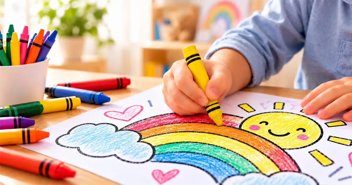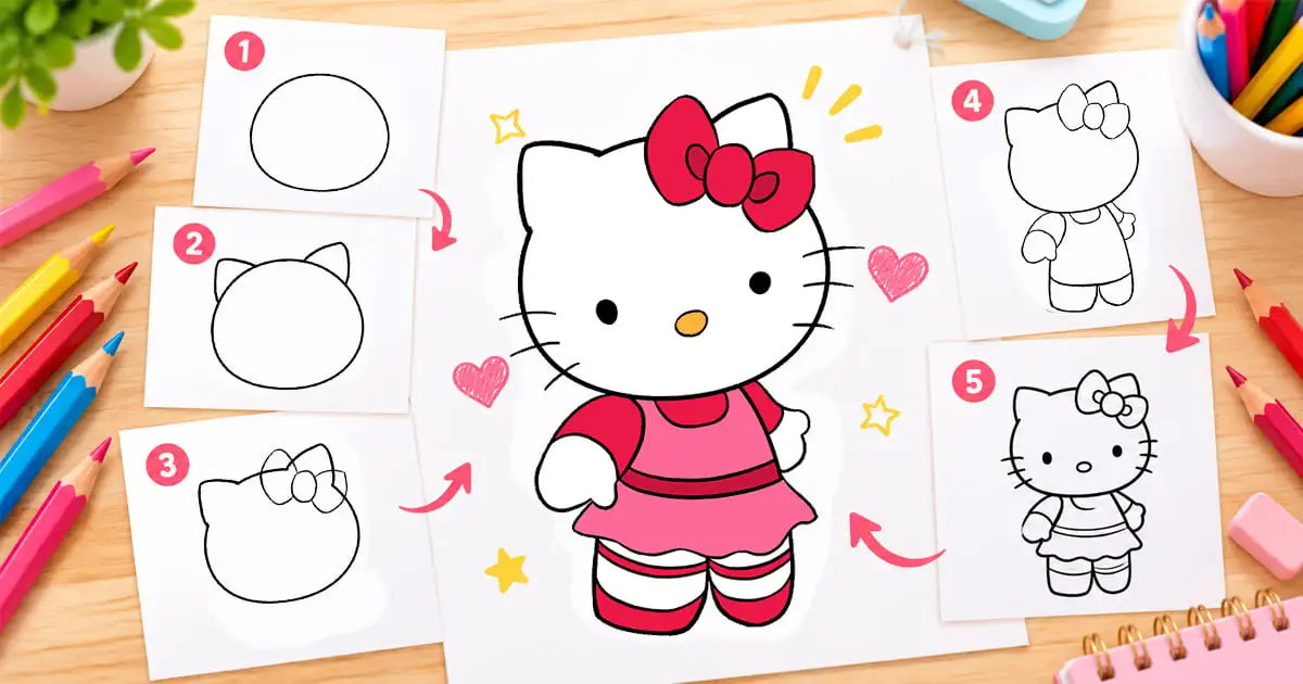
Better coloring comes from a few habits: keep tools sharp, build color in light layers, shade with two similar colors, and change stroke direction between layers. This guide explains those tips and the techniques behind them, with a table for choosing tools, a short color wheel refresher, and fixes for common mistakes. It works for printable pages colored with crayons, colored pencils, or markers.
Technique descriptions are based on guides by Sarah Renae Clark, who publishes adult coloring tutorials, and by the art supplies maker Mont Marte. Color wheel terms come from Adobe. Parts marked editorial are ColoringPagesOnly’s own suggestions, not findings from those sources. Sources were reviewed in October 2026.
Five Tips That Help Most
- Keep pencils sharp. Clark notes that a sharp pencil is easier to work with.
- Start with light pressure. Mont Marte advises light pressure for underlayers and firm pressure only for the final layer.
- Shade with two similar colors. Layer one slightly darker and one slightly lighter color with light pressure, as Clark describes.
- Change stroke direction on each layer. Clark suggests working in small circles and changing direction on each layer to reduce visible lines.
- Test colors first. Try each color on scrap paper before using it on the page. This tip is editorial.
Choose Your Tools
| Tool | Good for | Watch for | Basis |
|---|---|---|---|
| Crayons | Large areas, bold color, pressure shading, gradients | Less control for fine detail | Mont Marte crayon guide. The detail limit is editorial |
| Colored pencils | Detail, layering, blending, shading | Layers take patience, and hard and soft pencils behave differently | Mont Marte pencil guide |
| Markers | Fast, bold fills, or a base layer under pencils | Can bleed through thin paper | Clark |
| Gel pens and paint pens | White highlights, sparkles, eyes | Gel pens can skip. Clark prefers fine point acrylic paint pens | Clark |
| Watercolor or pastel | A quick base layer before pencils | Watercolor needs paper that handles moisture | Clark |
Paper matters. Clark reports that upgrading her paper changed her results more than upgrading her pencils, and she recommends Neenah Bristol Vellum for printed pages. She also says that for coloring books, working with the paper you have is not a dealbreaker. For printable pages from this site, the printing guide covers paper and settings.
Techniques That Build Better Color
These techniques work on printable pages. Pencil techniques follow Mont Marte’s coloured pencil guide, crayon techniques follow its crayon guide, and the two color shading and stroke tips follow Clark.
| Technique | How to do it | Best with |
|---|---|---|
| Pressure shading | A light hand gives pale tones and a heavy hand gives darker ones. Lighter pressure also makes smoother gradients | Pencils, crayons |
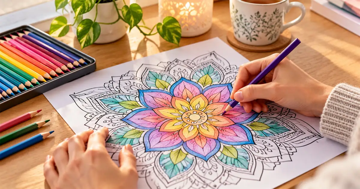
| Layering for optical blending | Lay down a first color, then a second, then a third. Where they overlap, the colors appear blended | Pencils, crayons |
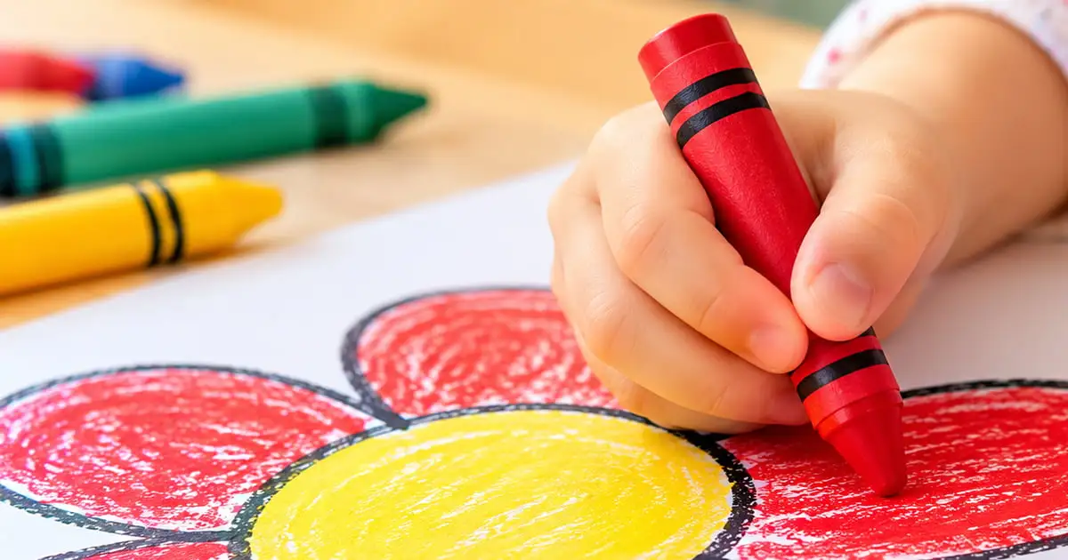
| Crayon gradient | Start with a dark crayon and add lighter shades from the same color family, coloring in one direction | Crayons |
| Two color shading | Layer a darker and a lighter version of a color with light pressure | Pencils |
| Hatching and crosshatching | Parallel lines close together give darker tones and lines farther apart give lighter tones. Crosshatching layers a second set of lines in another direction | Pencils, crayons |
| Small circles | Tight rounded scribbles, made thicker and denser for darker tones. Changing direction each layer reduces visible lines | Pencils |
| White pencil blending | Color as usual, then go over the colors with white for a soft, hazy blend. Deepen the colors again afterward and add highlights | Pencils |
| Burnishing | Build layers from light to dark, then press firmly on the last layer to push color into the paper and give a waxy sheen. Once a page is burnished, little more color can be added | Pencils |
| Highlights | Add white with a paint pen or gel pen for sparkles, reflections, and eyes | Any finished page |
Grip changes the result. Clark holds the pencil closer to the point for control and detail, and farther back for lighter layers and large areas.
Color Basics for Colorists
The traditional color wheel, as Adobe describes it, has 12 colors: three primary (red, blue, yellow), three secondary (green, orange, violet), and six tertiary colors made by mixing a primary with a secondary, such as blue-green or red-orange.
- Complementary colors sit directly opposite each other, for example blue and orange, red and green, or yellow and violet. Side by side they make each other look more intense.
- Analogous colors sit next to each other on the wheel, typically two or three colors such as blue, blue-green, and green. They give a harmonious, cohesive look.
- Warm and cool: red, orange, and yellow are warm. Blue, green, and violet are cool.
Mont Marte also describes underpainting, which means laying a light base in the final color or a complementary one, such as green under red, and then building shadows on top.
Editorial suggestion: for a calm page, stay with analogous colors and add one complementary accent for contrast.
Common Mistakes and Fixes
These fixes are editorial, with sources noted where they apply.
| Mistake | Why it happens | Fix |
|---|---|---|
| Pressing hard too early | The paper fills up before the shading is built, and a burnished page takes little more color (Mont Marte) | Start light and increase pressure with each layer |
| Streaky color | A dull pencil or strokes in only one direction | Sharpen the pencil, work in small circles, and change direction each layer (Clark) |
| Marker shows through the page | Thin paper (Clark) | Slip a spare sheet under the page and test on the back of a page first |
| Flat looking areas | One tone used for the whole area | Add a darker and a lighter version of the color |
| Too many colors | Every area gets a different color | Choose a small palette for each page |
| Shadows on random sides | No light source chosen | Pick one side for the light and shade the opposite side |
| Subject looks like it is floating | The background is left white | Add a light layer of an analogous or contrasting color around the subject |
Set Up Your Workspace
These are editorial suggestions.
- Sit near good light, with the page flat on a firm surface.
- Keep a spare sheet under the page to protect the table and catch bleed through.
- Keep your tools within reach and sharpen pencils before you start.
- Take short breaks to rest your hand.
Your First Practice Session
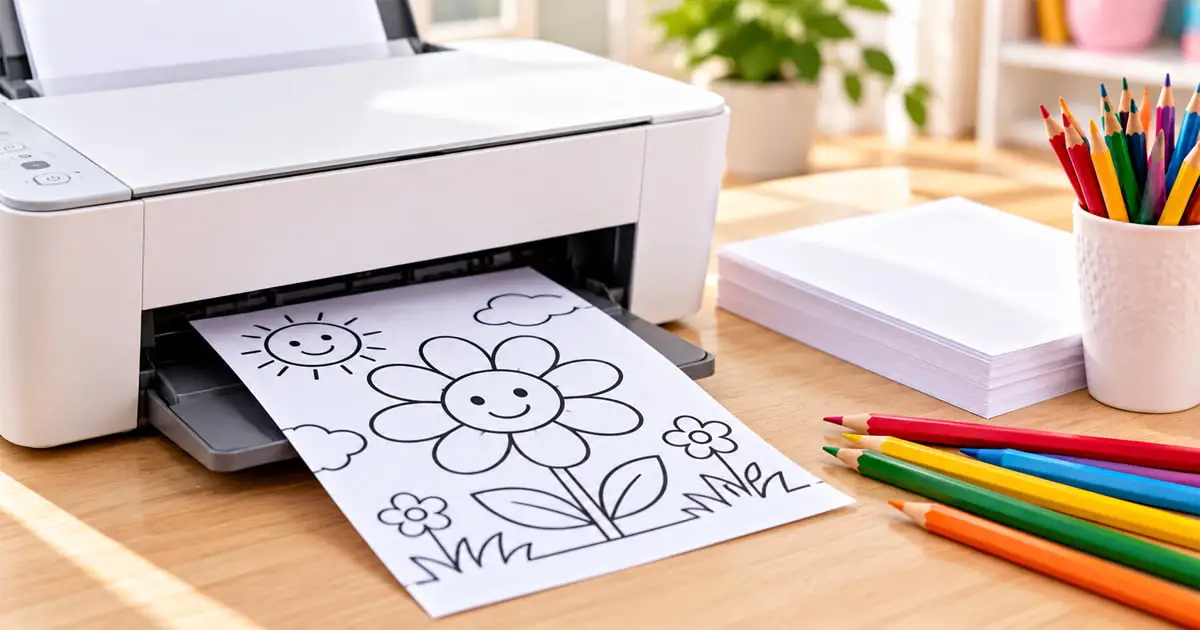
- Print a simple page. The printing guide explains the settings.
- Draw a small swatch of each color you plan to use on scrap paper.
- Color one area in two layers with light pressure, using a darker and a lighter shade of one color.
- Change stroke direction on the second layer.
- Add one highlight with a white pen.
A page with large, open areas such as Color by Number or a bold Mandala makes a good first practice page.
Try Colors Before You Commit
The online coloring tool lets you test a palette on screen before you use pencils or markers. It has Fill, Brush, and Eraser tools, Undo and Redo buttons, and a Clear button, so you can try several color combinations on the same page. Testing on screen is an editorial suggestion, and screen colors will not match pencils exactly, so still swatch the real colors on paper.
Where to Practice
Browse the Adult Coloring Pages collection, read about the benefits of coloring for adults, or look at the coloring pages for kids hub when coloring with a child. For tips on teaching children, see the age-by-age guide.
Frequently Asked Questions
What are the best coloring tips for beginners?
Keep your tools sharp, use light pressure for the first layers, shade with two similar colors, and change stroke direction on each layer. Test colors on scrap paper first. These tips come from guides by Sarah Renae Clark and Mont Marte, with the last one editorial.
How do I blend colors on a coloring page?
Layer colors so they overlap, which Mont Marte calls optical blending: a first color, then a second, then a third. Another way is to color as usual and go over the colors with a white pencil for a soft, hazy blend, then deepen the colors and add highlights.
How do I shade a coloring page?
Use pressure and two similar colors. A light hand gives pale tones and a heavy hand gives darker ones, and Clark layers a darker and a lighter version of a color with light pressure. Hatching with lines close together also makes darker tones.
Why does my coloring look streaky?
Streaks often come from a dull pencil or from strokes that all go the same way. Sharpen the pencil, work in small circles, and change direction on each layer, which Clark says reduces visible lines.
What should a beginner use to color, crayons, pencils, or markers?
Crayons suit large areas and bold color, pencils suit detail and layering, and markers suit fast fills. Pencils and crayons are easier to layer, while markers can bleed through thin paper. Tools can be mixed, for example a marker base under pencil layers, as Clark describes.
How do I stop markers from bleeding through paper?
Thin paper is the usual cause. Slip a spare sheet under the page, test the marker on the back of a page first, and use thicker paper for pages you plan to color heavily.
Sources
- Sarah Renae Clark, “Easy Coloring Tips” (March 10, 2022, updated February 5, 2024): https://sarahrenaeclark.com/easy-coloring-tips/
- Mont Marte, “Coloured pencil techniques” (June 5, 2022): https://montmarte.com/blogs/tips-techniques/coloured-pencil-techniques
- Mont Marte, “10 crayon techniques to try” (March 27, 2024): https://www.montmarte.com/blogs/tips-techniques/10-crayon-techniques-to-try
- Adobe, “Colour Wheel Combinations” (UK edition): https://www.adobe.com/uk/creativecloud/design/discover/color-wheel.html